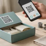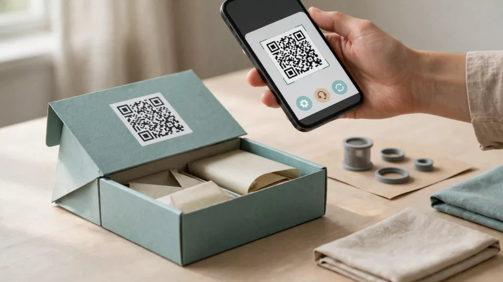
A well-designed product journey takes customers directly to a useful task: setting up what they bought, fixing a problem, or ordering the right replacement. Each scan needs a clear promise and a reliable destination.
Product packaging may remain in circulation for years, while product pages and support systems change. Start with the customer’s task, then design the user experience behind the printed code.
Key Takeaways
- Send setup, support, and repeat-order scans to separate, product-specific destinations. Show the right model or exact item so customers can complete the task without identifying it again.
- Label each code with a clear promise and place it where the task happens. Include a short URL for customers who can’t scan.
- Size and print codes for their viewing distance, data density, and packaging conditions. Test the final print, destination, and full task on real devices.
- Maintain branded destinations, protect private customer information, and measure task completion rather than scan counts alone.
1. Choose QR, a short URL, or NFC by task
Masahiro Hara and his team at Denso, now Denso Wave, invented QR codes in 1994 to track automotive parts. Denso Wave’s QR Code development story describes those industrial origins.
Today, choose an entry point that saves customers effort and gives them contextual information about what they’ll reach. A product-specific setup guide usually earns its place; a generic brand homepage rarely does.
Choose the entry point according to the situation.
| Entry point | Good fit | Main limitation |
|---|---|---|
| Code | Moving from packaging to product-specific help with one scan | Requires a camera and visible code |
| Short URL | Returning visits and manual access | Requires typing |
| NFC | Tapping a tagged product for recurring access | Requires a compatible device and discoverable tag |
A code helps customers avoid typing an unfamiliar product identifier. However, people can’t remember its pattern for later visits. Keep support discoverable through your website, account area, and search.
NFC can complement packaging, but users still need a visible explanation of where to tap and what will happen.
2. Separate setup, support, and repeat-order journeys
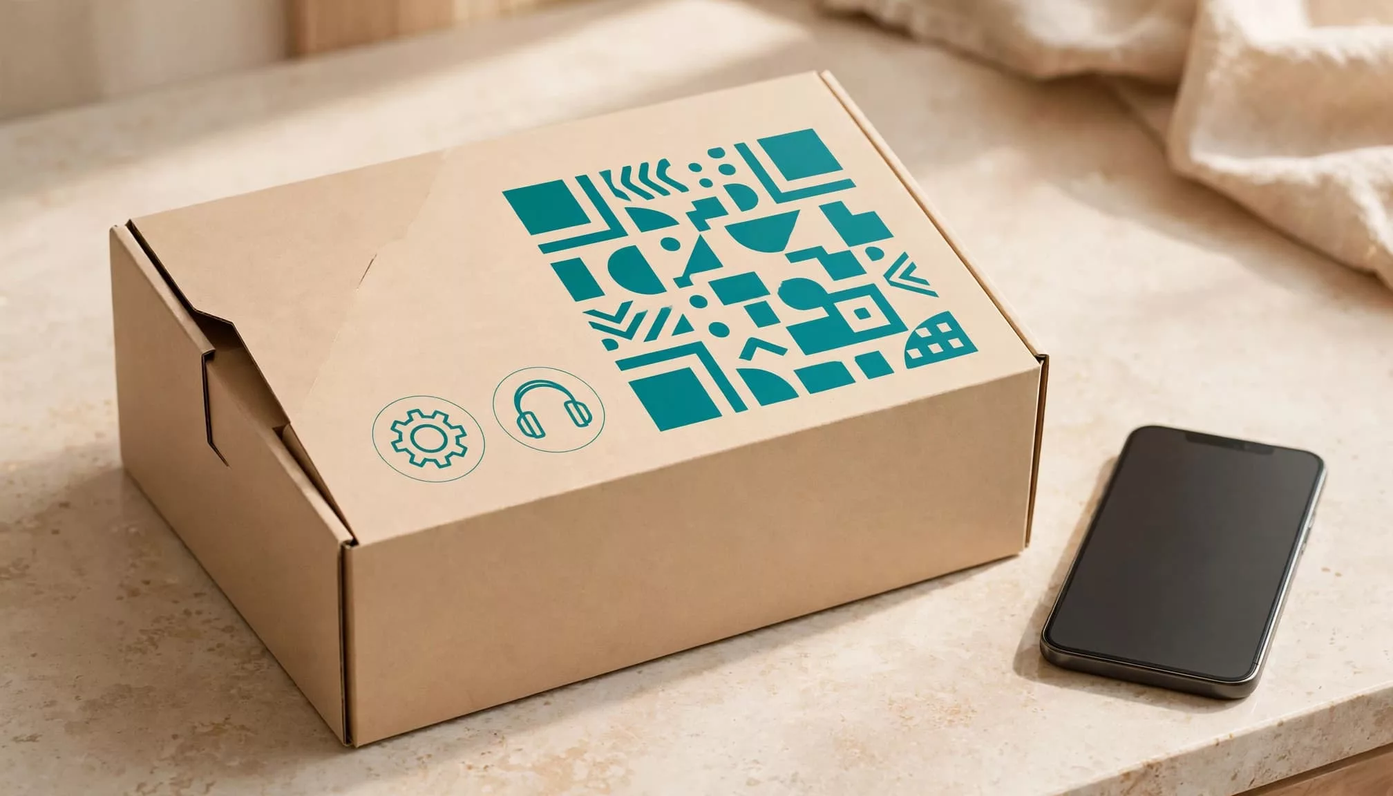
Good QR code UX gives setup, support, and reorders separate destinations because each task needs different information.
Setup should lead to the first successful use
A setup code should open the correct model’s instructions and product information, with prerequisites and the first action visible. Keep essential safety instructions available on the product or printed insert.
Don’t force registration or account creation before ordinary setup help. When registration is useful, explain its benefit and separate it from account creation. Our product registration UX guide covers identification, saved records, and recovery without unnecessary barriers.
Support should preserve product context
Carry the model into troubleshooting and any support handoff. However, distinguish a model-level code from a serial number identifying one unit.
Show detected details for confirmation, and provide manual identification if the scan fails. A code doesn’t establish ownership, authenticity, or warranty eligibility. Never expose receipts, addresses, or support conversations through a publicly scannable identifier.
Repeat orders should preserve the exact item
For reorders, the scan should identify the exact SKU, variant, and pack size. Before checkout, show current price, availability, quantity, and compatibility where relevant.
Let customers review the order before paying. Don’t turn a scan into an automatic purchase or subscription enrollment. If the original item is unavailable, explain whether a replacement is compatible rather than silently substituting it.
For interrupted purchases, checkout session recovery should retain valid cart details without risking duplicate charges.
3. Label the outcome and place the code deliberately
Replace “Scan me” with a clear promise
QR code UX needs a clear promise because the printed pattern has no inherent information scent: its appearance doesn’t explain the destination. Nielsen Norman Group’s QR-code usability guidelines emphasize contextual information and relevant landing pages.
Use task-based labels such as “Scan for setup instructions” or “Scan for troubleshooting.” Add a short URL beneath the code so customers can type the address instead.
Set expectations before scanning. If the destination requires an app, say so. Don’t promise instructions and then open a sales page.
Put the code where the task happens
Good UX design puts setup access beside opening instructions. Place support access on a durable product label and replenishment access where customers notice supplies running low.
Allow at least 15 seconds for someone to notice and scan a code. Treat that as an interaction allowance, not the camera’s decoding time. Roadside billboards and rapidly rotating digital signage are poor placements.
On packaging, avoid seams, strong curves, tear strips, and areas customers discard before needing help. A support code hidden underneath a heavy appliance creates another obstacle.
4. Design code size and contrast for real packaging
Use distance and density together
Set QR code size by viewing distance and data density. A commonly cited official minimum is 1 cm x 1 cm, while 2 cm x 2 cm is a more reliable starting point. Neither dimension guarantees success on every code or surface.
As a rule of thumb, allow 1 cm of width and height for every 10 cm of viewing distance. A code viewed from 30 cm away should start around 3 cm square. Test the actual print rather than treating this ratio as certification.
A Model 2 QR code ranges from version 1, with 21 x 21 modules, to version 40, with 177 x 177 modules. Version 40 holds up to 7,089 numeric characters at maximum capacity. That’s a technical ceiling, not a sensible packaging target. Choose an error correction level that fits the print conditions, since higher levels add data and can make the pattern denser.
A short destination URL reduces density and helps keep modules readable.
Protect contrast and blank space
Use a dark foreground on a light background because some scanners can’t read inverted colors. Preserve the quiet zone, the blank border around the code, at least four modules wide for standard codes.
Error correction can recover from limited damage, but it can’t compensate for folds or poor printing. Keep the code flat and intact wherever possible, since even error correction has limits.
5. Build fast, accessible, resilient destinations
Deep-link to a mobile task page
After a scan, open the specific product guide, troubleshooting flow, promotion, or app store listing. Don’t send customers to a homepage and make them identify their product again.
For good product QR code UX, show the product name and promised action immediately. Include contextual information on the landing page so customers can confirm they reached the right product and task. Use lightweight pages, compressed images, and minimal scripts. Avoid autoplay video and promotional overlays before instructions.
Prefer readable web instructions over a mandatory PDF download. When video helps, provide captions and equivalent written steps. Test enlarged text, keyboard navigation, and screen-reader use across the task, including errors.
Always preserve a non-camera route for customers who can’t scan, using the printed URL and manual product lookup.
Keep printed destinations under your control
A static QR code’s encoded content can’t change after creation. A dynamic QR code contains a stable redirect URL whose destination can change after printing.
Use a branded domain you control, keep redirects short, and assign someone responsibility for maintaining them. Understand whether a QR service subscription controls continued access.
A printed code can outlive a campaign, subscription, or website redesign. Its destination needs an owner for the product’s useful life.
Retired campaigns should open a current page explaining that the offer or event has ended, with relevant next steps. NN/g illustrates this problem with a 2019 flier scanned in 2023. Preserve old setup and support access rather than redirecting everything to your newest homepage.
6. Protect customers and measure useful outcomes
Make the destination recognizable
QR code UX builds trust when customers can recognize the destination before opening it. Codes can conceal phishing pages, malicious downloads, or payment requests that send money to unauthorized recipients. Attackers can also place fake stickers over legitimate codes. The FTC’s QR-code scam warning explains how harmful links hide behind familiar-looking patterns.
Print the expected branded domain beside the code. Protect redirect administration with strong authentication and restricted permissions. For publicly accessible displays, include checks for overlaid stickers in routine maintenance.
Never treat possession of a scannable code as permission to access a customer’s private records.
Measure completion without collecting unnecessary data
A scan count measures entry, not success. Track setup completion, useful troubleshooting outcomes, assisted handoffs, and completed repeat orders separately.
Compare those signals with support contacts and returns across the ecommerce customer journey. A rising scan total alongside more setup complaints can indicate confusing instructions.
Use campaign, product, and placement identifiers in analytics where sufficient. Avoid sending raw serial numbers, email addresses, receipt contents, or access tokens.
Explain tracking in your privacy information and apply consent requirements where relevant. A code interaction doesn’t authorize marketing enrollment. A normal web visit doesn’t automatically reveal precise GPS location, so request location permission only when the task needs it.
7. Test the complete journey before printing
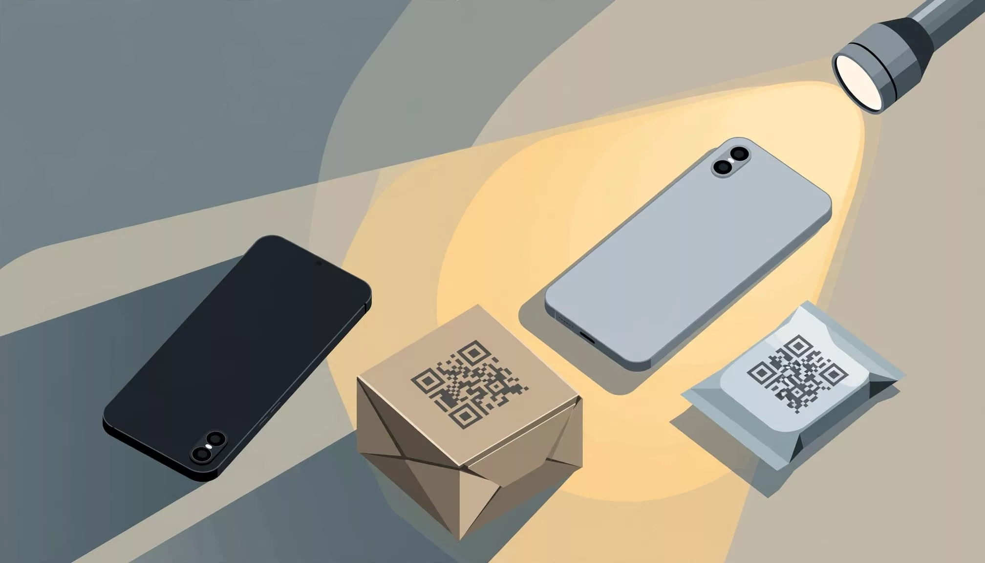
Test production-like packaging, not just a code displayed on a monitor. Include final material, print size, finish, and assembly. The US Department of Energy’s QR-code standards and best practices also provide a useful production reference.
Run this pre-launch checklist through to task completion:
- Scan on several iPhone and Android models, including older devices, using their normal camera apps.
- Try bright light, dim light, glare, different distances, and oblique angles.
- Simulate packaging folds, seams, light wear, and the way customers naturally hold the item.
- Open the destination on slow mobile connections and test every redirect, language route, and app fallback.
- Complete the task with enlarged text, assistive technology, manual identification, and the short URL instead of scanning.
- Trigger failures, including unknown models, unavailable products, expired promotions, denied permissions, and interrupted checkout.
Give participants tasks such as finding setup instructions without pointing out the code. Observe whether they notice it, understand its promise, and reach the intended outcome.
Record discovery problems separately from decoding failures and landing-page failures. Each needs a different fix. Finally, assign an owner and a retest date before approving the packaging.
Frequently Asked Questions
What should a product QR code open?
It should open the specific setup guide, troubleshooting flow, or reorder page promised beside the code. Carry product context through the task, and show the exact item before checkout.
How large should a product QR code be?
A 2 cm x 2 cm code is a more reliable starting point than the commonly cited 1 cm x 1 cm minimum. As a rule of thumb, allow 1 cm of width and height for every 10 cm of viewing distance, then test the actual print.
Should a product QR code be static or dynamic?
A static code’s encoded content can’t change after creation. A dynamic code uses a stable redirect URL whose destination can change, so keep it on a branded domain you control and assign someone to maintain it.
How should teams test product QR code UX before printing?
Test production-like packaging on several phones under different lighting, distance, and angle conditions. Have participants complete the task, including with a short URL or manual lookup, and record discovery, scanning, and destination problems separately.
Make Every Scan Deliver on Its Promise
Product QR code UX succeeds when customers finish the task printed beside the code. Setup, support, and repeat orders need different destinations, even when they share the same technical infrastructure.
Keep a dependable alternative for customers who can’t use a camera. Maintain each destination as carefully as the packaging, so customers can find useful help long after unboxing.