
A packing slip gets ignored until someone can’t find one. Then it turns into a dock delay, a support ticket, or a finance follow-up that should never have been needed.
In B2B portals, packing slip download UX has to work for receiving teams, AP staff, and account owners at the same time. It needs clear labels, honest file states, and access rules that match how orders ship.
The best portals make the right document easy to spot without forcing users to guess. That starts with the order record itself.
What buyers are trying to do when they open order history
Most buyers are not browsing for fun. They’re trying to confirm a shipment, match a PO, or hand a file to a warehouse or finance team.
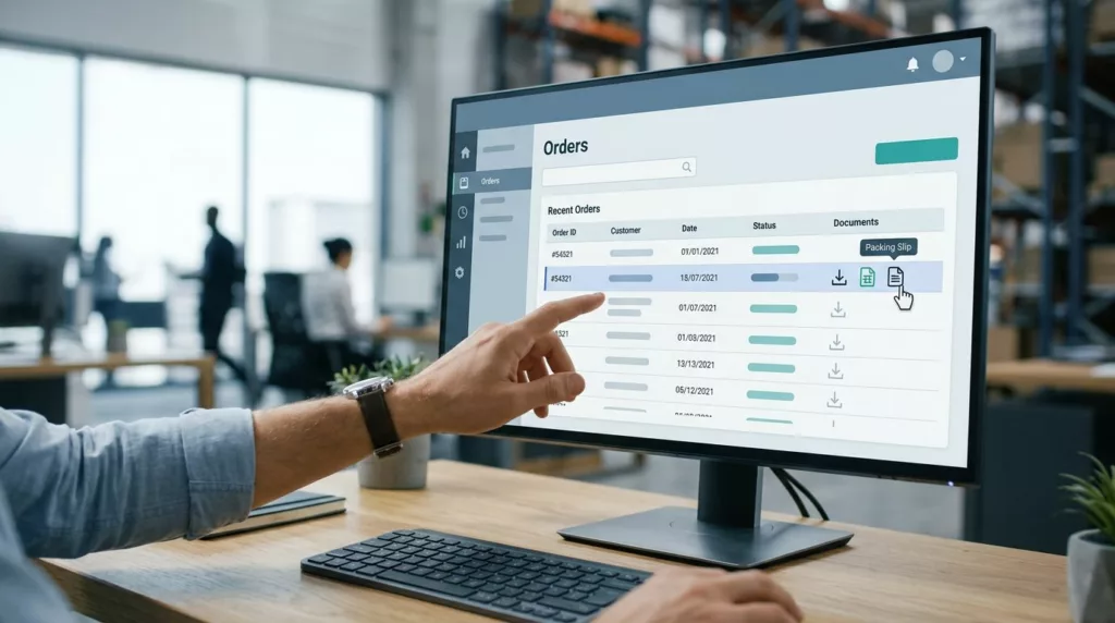
If the portal hides documents behind a vague “Files” tab, every step gets slower. Strong order history filters help because buyers can narrow by date, status, warehouse, PO number, or ship-to location. That shortens the path between a user and the right slip.
A task-first order view works even better. Show the shipment, the document, and the status in one place. If you’re shaping the wider portal flow, a customer portal build guide is a useful reference for placing self-service actions next to the order record, where people actually look.
A B2B portal should answer three questions fast:
- Which order is this?
- Which shipment is this?
- Is the packing slip ready yet?
If the answers are visible at a glance, users don’t need support.
Packing slips, invoices, and receipts need different paths
These documents sound close, but they do different jobs. A packing slip confirms what shipped. An invoice shows what the buyer owes. A receipt confirms payment.
When portals mix them together, users waste time opening the wrong file. That’s a common source of confusion in both receiving and finance teams.
| Document | Main use | Best portal label |
|---|---|---|
| Packing slip | Receiving, shipment checks, warehouse intake | Packing slip PDF |
| Invoice | Accounts payable, payment review, tax records | Invoice PDF |
| Receipt | Payment confirmation | Payment receipt |
The takeaway is simple. Label documents by business meaning, not by file format alone. A PDF is not enough context.
If possible, keep document groups task-based. A buyer should see “Shipment documents” before they see a file list. Then each file can carry a precise label, such as “Packing slip for Shipment 2” or “Commercial invoice for Export Order.”
If the label sends the wrong signal, users assume the whole portal is unreliable.
For broader portal patterns, B2B ecommerce website best practices is a useful companion read. The same idea applies here, task-focused navigation beats clever labels.
Make the download state honest
The button text should say exactly what happens. “Download packing slip PDF” works. “Download” does not.
If the file is still being generated by the OMS or WMS, say so. A buyer can handle a short wait. What they won’t forgive is silence.
A good state system usually includes these conditions:
- Ready: show the file name, format, and size if useful.
- Preparing: tell users the document is being created from shipment data.
- Partial: show which shipments have slips and which do not.
- Unavailable: explain why the file can’t be downloaded yet.
- Failed: offer a retry and a support path.
This matters more in ERP-driven setups. Some systems generate slips only after pick, pack, or ship confirm. Others create one slip per shipment, not one per order. The portal should reflect that timing instead of pretending every order is complete.
A split shipment needs extra care. If one order ships in three boxes from two warehouses, each shipment row should carry its own packing slip, status, and tracking detail. Users should never wonder whether a file is missing or just not released yet.
Short status copy helps here. “Packing slip not ready yet” is better than “Error.” “Available after ship confirm” is better than a spinner that never explains itself.
Handle split shipments, multiple warehouses, and access rules
B2B shipping rarely stays neat for long. One order can ship from different warehouses on different days. A portal that treats the order as a single document bucket will confuse users fast.
Group files by shipment, then roll them up under the order. That lets a buyer see the warehouse code, ship date, and tracking number next to the packing slip. If a supervisor needs all documents for a single order, they can still expand the parent view.
Guest users need a different path. When someone places an order without a full login, give them a secure order lookup link with clear expiration terms. Logged-in users should keep access inside the account portal, as long as their role permits it.
Permissions matter just as much as shipping logic. A regional manager may need access to every slip under their account. A local site contact may only need documents for one ship-to location. The portal should follow those rules without making the user ask for help.
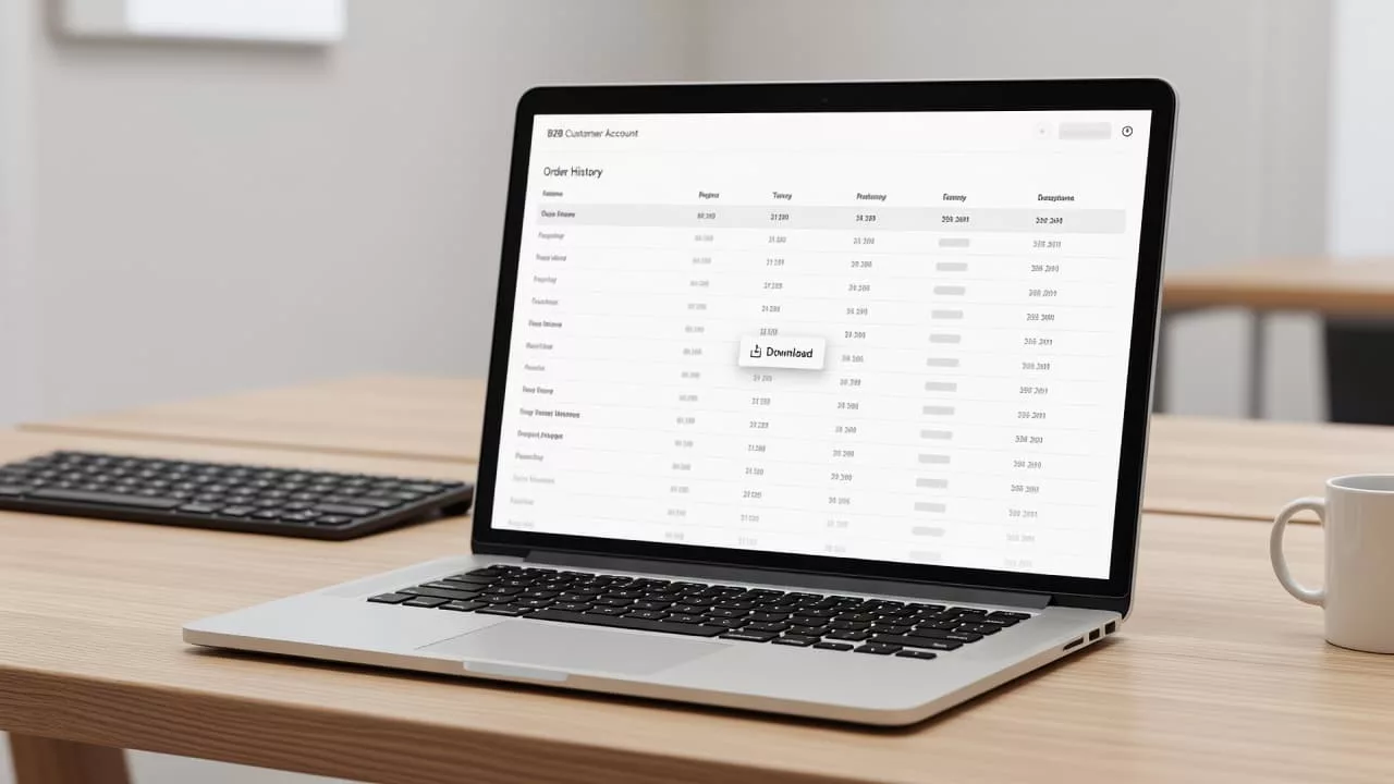
Bulk download support is another practical need. AP teams often want 10, 20, or 50 packing slips at once. Give them multi-select, a batch download button, or a ZIP export. Before the export starts, show exactly which files are included.
The same task-first pattern appears in customer account page UX patterns. Buyers move faster when the portal puts orders, documents, and next actions in one clear path.
Build for accessibility, auditability, and support
Accessibility starts with naming. An icon-only button is too vague. A button that says “Download packing slip PDF” is clear for everyone, including screen reader users.
Keyboard users also need visible focus states. Color alone should never be the only cue that a file is ready. If a document is disabled, the reason should appear in text, not just as a faded button.
Audit trails matter in B2B because document questions come up later. Log who downloaded the file, when they did it, which order it came from, and which shipment version they received. That gives support teams a clean record when someone says the wrong slip was attached.
The same trail helps when documents change after fulfillment. If the ERP updates the slip after a shipment closes, the portal should keep the version history clear. Users need to know whether they are looking at the current file or an older one.
Error handling should be plain and direct. “Packing slip not ready yet” is useful. “Something went wrong” is not. Offer retry, refresh, or contact support, depending on the failure.
A good portal also keeps printing and saving in mind. Many users still print packing slips on the warehouse floor. That means the PDF has to be readable, the labels need enough contrast, and the layout should hold up on paper, not just on screen.
Conclusion
When buyers can find the right slip in a few clicks, the portal feels dependable. When they can’t, every missing label and vague state turns into avoidable work.
The strongest packing slip download UX keeps the document types separate, shows honest availability, and follows the rules of the order system behind it. It also respects permissions, split shipments, and accessibility from the start.
If the portal can answer “which shipment, which file, which status” in a glance, it’s doing its job.