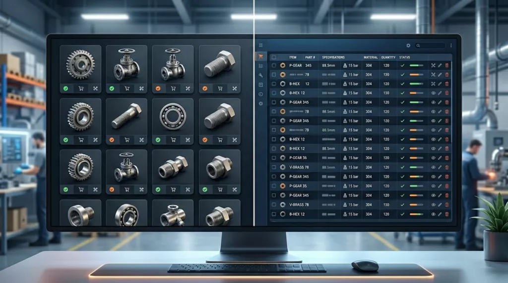
Grid vs Table View for Industrial Category Pages
Industrial buyers do not browse a catalog the way a consumer shopper does. They compare part numbers, specs, availability, and...
Parametric Landing Pages That Rank Without Losing Buyers
Parametric landing pages can pull in search traffic and still help people narrow a purchase, but only when they are...
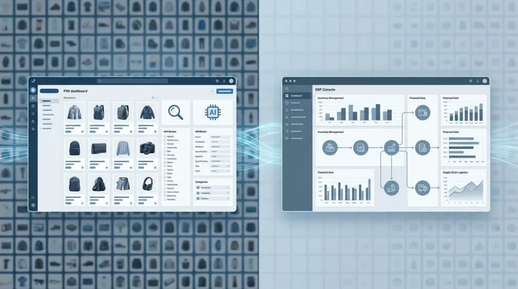
PIM vs ERP for Large Ecommerce Catalogs in 2026
Large ecommerce catalogs do not fail because they are large. They fail when inventory, finance, and product content sit in...

How to Turn Internal Search Reports Into SEO Wins
Internal search reports show what people could not find fast enough. That makes them one of the clearest sources of...
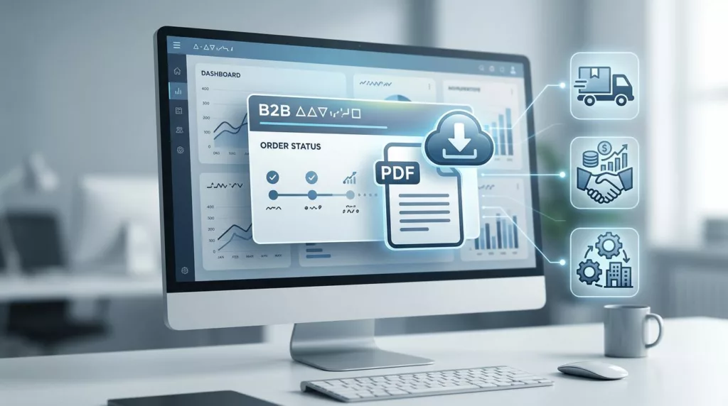
Order Acknowledgment Download UX for B2B Portals
When a buyer needs an order acknowledgment, they usually need it right away. They are checking a PO match, confirming...

Job Name Field UX in Contractor Checkout
A blank job name field can cause trouble long after the order is placed. In contractor ecommerce, that small text...

Proof of Delivery UX for B2B Account Portals
Customers do not open account portals for decoration. They open them when a shipment needs proof, a finance team needs...
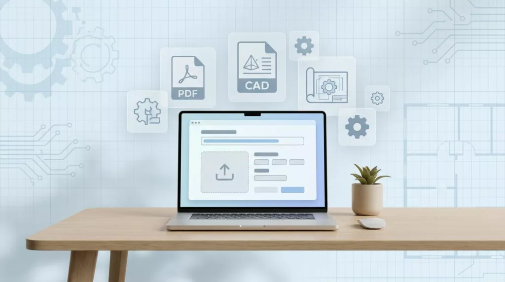
Drawing Upload UX for Manufacturing Quote Requests
Technical buyers do not mind uploading drawings. They mind guesswork, failed uploads, and waiting for a reply that never comes....
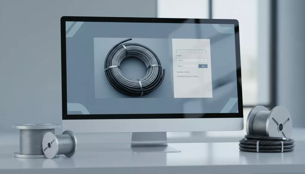
Cut-to-Length Ordering UX for Wire and Hose Pages
One wrong number can turn a wire or hose product page into a support ticket. When buyers need a custom...
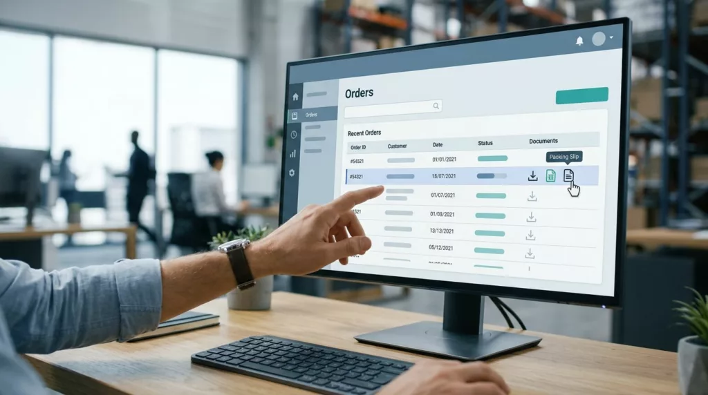
Packing Slip Download UX for B2B Portals
A packing slip gets ignored until someone can’t find one. Then it turns into a dock delay, a support ticket,...