

That’s where unconventional navigation patterns can help. Think layouts and controls that go beyond the classic top bar and dropdowns, like sticky bottom menus, thumb-first category hubs, swipeable collections, guided “shop by vibe” flows, or search-first screens that behave more like an app.
Used well, these patterns reduce hunting, shorten paths to product pages, and make small screens feel less cramped. Used poorly, they hide the basics and confuse first-time visitors.
This guide breaks down when unconventional navigation patterns are worth testing, the benefits they can bring to conversion and product discovery, and the practical guardrails that keep the experience clear for new and returning customers alike.
YouTube video: (no URL available, the YouTube search returned an error)
Unconventional navigation patterns, explained without the hype
“Unconventional” navigation sounds like a design flex, but it shouldn’t feel experimental to shoppers. In e-commerce, unconventional navigation patterns are simply non-traditional ways to move through categories, search, and product pages that go beyond standard top links and the basic hamburger menu.
The point is practical: help people find products faster, with fewer taps and clearer choices. If the pattern makes the store look different but slows down shopping, it’s not progress, it’s friction.
Common patterns shoppers already understand (even if you don’t call them “unconventional”)
Most “new” navigation ideas are already familiar because shoppers have learned them from retail apps and large marketplaces. Here are e-commerce examples you can use without needing a tutorial screen:
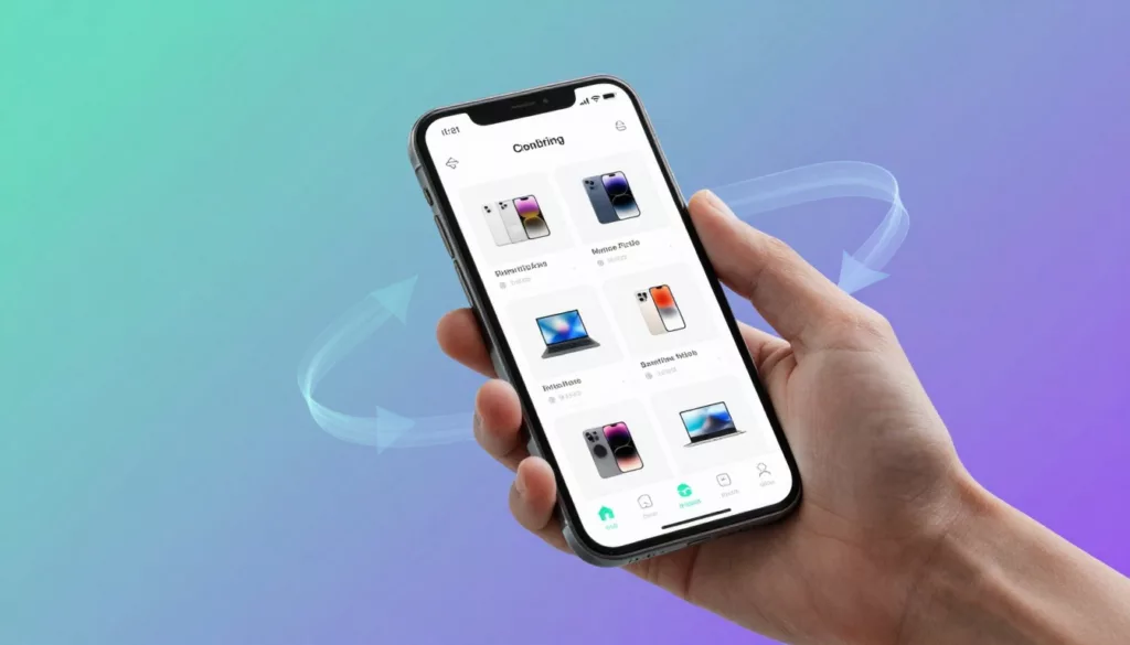
- Bottom navigation bar on mobile: Keeps Home, Search, Cart, and Account within thumb reach for quick task switching.
- Sticky header with search and cart: Lets shoppers search or check the cart from any scroll position on category and product pages.
- Mega menu with images: Helps shoppers scan departments fast (useful for apparel, home, beauty) by showing top categories and visual cues at once.
- Slide-out drawer paired with bottom tabs: Uses tabs for the “big four” actions, then a drawer for the long tail (brands, help, store locator).
- Breadcrumbs for deep categories: Helps shoppers backtrack from “Women > Shoes > Boots > Chelsea” without losing context.
- Predictive search with suggestions: Shortens time to product by suggesting queries, categories, and popular items as the shopper types.
- “Shop the look” image-based paths: Turns lifestyle photography into a guided route to multiple products (great for bundles and higher AOV).
If you want a quick gut-check on what tends to work on phones, compare these patterns to common mobile norms like mobile navigation patterns that work in 2026.
What makes a pattern “work” or “fail” for real users
Helpful novelty feels like a shortcut. Confusing novelty feels like a scavenger hunt.
A pattern usually works when it reduces effort without changing the rules midstream. It often fails when it hides basic shopping actions (categories, search, cart) behind extra taps, gestures, or mystery icons.
Use these rules as guardrails:
- Make key actions visible: Search, cart, and core categories should be easy to spot at a glance.
- Use clear labels: Icons alone are risky, label them (“Search”, “Cart”, “Deals”) unless space is truly tight.
- Keep behavior consistent: A tap should do the same thing everywhere, don’t make “Back” behave differently on PDPs vs PLPs.
- Show current location: Highlight the active tab, show the selected category, and keep filters obvious.
- Provide an obvious way back: Breadcrumbs, a back button, and a clear route to top categories prevent dead ends.
- Don’t hide core categories behind extra taps: If “Women” and “Men” require two layers, you’re adding friction to the most common intent.
One more reality check: fancy navigation is worthless if it slows the site. If you’re adding sticky UI or mega menus, keep weight under control, the same “lighter is better” thinking from performance-first UX for sustainable shopping applies here too.
Where unconventional navigation fits best in the shopping journey
The easiest way to choose unconventional navigation patterns is to match them to the shopper’s moment. Different screens, different needs.
Discovery (finding what’s interesting)
This is where visual paths shine. Image-led mega menus, “shop by vibe” tiles, and “Shop the look” flows help people browse like they would in-store. Sticky filters also belong here, because the fastest way to browse is to narrow quickly without losing your place.
Comparison (checking options and revisiting candidates)
Comparison is repetitive by nature, so persistence matters. A sticky search makes it painless to change direction. “Saved” or “favorites” access should be one tap away, so shoppers can bounce between PLPs and PDPs without mental load.
Decision (committing to buy)
When intent is high, the interface should stop playing hide-and-seek. Keep quick cart access visible, and consider a sticky add-to-cart on long PDPs where sizing, shipping, and reviews push the button far below the fold. The goal is simple: remove the “now where was that button?” moment.
Recovery (fixing mistakes and escaping dead ends)
Shoppers get lost, even on good sites. This is where breadcrumbs, clear back paths, and obvious category links quietly save the sale. If someone lands deep in a subcategory from search, recovery tools help them widen the net without starting over.
The real benefits: how these patterns can raise sales, not just clicks
Unconventional navigation patterns only matter if they change shopper behavior in ways that show up in revenue. The strongest patterns do three things well: they cut the time it takes to find a product, they help people discover more items without confusion, and they remove friction right before a shopper buys.
The upside is measurable: fewer rage taps, fewer dead ends, fewer category exits, more add-to-carts, and more completed checkouts. Results still vary by audience, device mix, and catalog size, so treat these as testable hypotheses, not design “rules.”
Faster product finding means fewer drop-offs
“Hunt time” is the hidden tax on e-commerce. Every extra tap to open a menu, re-open filters, or get back to search increases the odds a shopper gives up. On mobile, that cost is higher because screens are smaller and attention is thinner (mobile already makes up most global web traffic, so small navigation delays add up fast).
Patterns that reduce hunt time tend to share one trait: they keep the next likely action always available.
- Bottom bars on mobile: Put the “big four” tasks where people need them most, Home, Search, Cart, and Account. When those controls sit at the bottom, a shopper can switch tasks without re-gripping the phone or scrolling back to the top.
- Sticky search: Search is often the shortest path to a product, especially for repeat buyers (“same protein powder as last month”). Keeping a search field or icon visible lets shoppers course-correct instantly when a category path starts to feel wrong.
- Predictive search: Suggestions reduce typing and prevent dead ends. The best versions show a mix of query suggestions, categories, and products, so shoppers can jump straight to a useful result instead of landing on a “0 results” page.
- Category shortcuts: Think small, clear tiles for top departments (New, Best sellers, Sale, Gifts, Under $50) that appear on the home screen, in the menu, and sometimes in sticky elements on PLPs. This gives shoppers a fast reset button when they feel lost.
A simple mobile example: a shopper is scrolling a long category list, then remembers they need to check sizing or shipping. If Search and Cart stay within thumb reach, they can act right away and return to browsing with less friction.
This aligns with what large-scale UX research keeps finding: many stores still underperform on basic navigation and category UX, which is why improvements here can produce outsized gains for bounce rate and category exits. Baymard’s ongoing research is a good reference point for common pitfalls and why they matter for sales behavior, not just aesthetics (homepage and category navigation UX findings).
What to measure when you test
If you change navigation to reduce hunt time, watch metrics that reveal “getting stuck”:
- Category page exits and bounce rate (especially on mobile)
- Time to first product view (from landing to first PDP)
- Search usage rate and search refinement rate
- “No results” search rate and search-to-cart rate
More product discovery without turning the site into a maze
Discovery is where unconventional navigation patterns can lift revenue, but only if they keep shoppers confident. The goal is not to show more options, it is to show better paths. A maze makes people quit; a guided path makes people explore.
Strong discovery patterns work like a well-merchandised store aisle: you can scan quickly, spot what matters, and move forward without second-guessing.
Visual mega menus and thumbnail categories help shoppers choose faster because they reduce reading. Instead of decoding “Accessories” (which could mean anything), a shopper sees “Belts”, “Hats”, “Sunglasses”, each with a small image and a count, then picks with confidence. This can increase pages per session because the next click feels low-risk.
“Shop the look” adds a second layer of discovery that feels natural. Shoppers already think in outfits, room sets, routines, and bundles. When lifestyle images become a shopping path, cross-sells stop feeling like pop-ups and start feeling like “that makes sense.”
Guided collections (sometimes called shop by need, shop by occasion, or shop by goal) work best when your catalog is wide or your products require context. Examples:
- “Build your routine” in beauty
- “Workwear essentials” in apparel
- “Back-to-school setup” in home and tech accessories
The sales benefit shows up when discovery flows into bigger baskets. A shopper who planned to buy one item ends up buying two or three because the path makes the add-ons feel like part of the plan. That is how pages per session turns into average order value, not just “engagement.”
The key is clarity. If a mega menu becomes a wall of links, discovery collapses into decision fatigue. To avoid that, keep the structure consistent:
- Start with a small set of top-level departments.
- Show a limited set of high-intent subcategories.
- Add a few visual “featured” shortcuts (New, Best sellers, Sale, Bundles).
- Leave the long tail to search and filters.
If you want a deeper research-backed view on how homepages and category pages support comparison and browsing, Nielsen Norman Group has a dedicated e-commerce UX report that covers navigation and product comparisons (e-commerce UX research on navigation).
What to measure when you test
Discovery improvements should move more than one metric. Look for:
- Pages per session and PDP views per session
- Add-to-cart rate from collection and category pages
- Cross-sell attach rate (items per order)
- Average order value, split by mobile vs desktop
- “Back” usage spikes (a sign people feel unsure)
Higher conversion rates by removing friction at key moments
Conversion drops rarely happen because people “change their mind” out of nowhere. More often, they hit a moment of friction: they cannot find the cart, they lose the add-to-cart button after scrolling, or they are unsure where they are in the store.
Unconventional navigation patterns can help most at these high-intent moments, when the shopper is close to buying and every interruption increases the chance of abandonment.
Persistent cart access reduces hesitation. If the cart icon is always visible (and ideally shows a clear item count), shoppers do not need to hunt for the next step. They can confirm progress and move to checkout when they are ready. This matters on mobile, where going “back” can feel risky because it often loses scroll position or filter state.
Sticky add-to-cart on product pages (PDPs) is another direct conversion helper, especially for long pages with:
- Size selectors and fit guides
- Long descriptions
- Reviews and Q&A
- Shipping, returns, and payment details
On these pages, the shopper often scrolls to reduce risk (“Will it fit?” “Can I return it?”). A sticky add-to-cart keeps the buying action available without forcing them to scroll back up and re-find the button. That reduces the “I’ll do it later” moment that turns into an abandoned session.
Quick-buy drawers (or slide-in carts) can raise completion rates by keeping people oriented. Instead of sending shoppers to a full cart page every time, a quick drawer confirms the add and offers the next step: checkout, continue shopping, or view cart. When done well, it supports faster decision-making and reduces pogo-sticking between pages.
Finally, “where am I?” cues quietly protect conversion:
- Breadcrumbs on deep categories and PDPs
- Highlighted active states in menus and bottom tabs
- Clear category titles and filter chips that confirm what is selected
These details reduce doubt. Doubt is expensive because it creates pauses, backtracking, and second-guessing. Baymard’s navigation research repeatedly points to orientation and clarity problems as common issues in e-commerce flows, which helps explain why these “small” cues can produce meaningful conversion changes (common navigation UX pitfalls).
What to measure when you test
Friction removal should show up closest to purchase:
- Add-to-cart rate on mobile PDPs
- Cart-to-checkout rate and checkout starts
- Checkout abandonment rate (especially on mobile)
- Time from first add-to-cart to checkout start
- Session recordings or funnel drop-offs at “view cart” and “checkout” steps
Better mobile usability and one-handed shopping
A lot of “mobile UX” talk is vague. Here’s the simple version: most people hold their phone in one hand and use their thumb to tap. Your thumb can comfortably reach the bottom half of the screen. The top corners are the hardest.
That’s the idea behind thumb zones. If your main shopping controls live in hard-to-reach areas, you create tiny friction on every action. Tiny friction repeated across a session becomes lost sales.
This is why bottom navigation often wins on phones. It puts key actions in the easiest place to tap, which reduces mis-taps and speeds up switching between tasks. It also helps on big phones, where reaching the top can require a full hand shift.
A few mobile-friendly details that matter more than they sound:
- Large tap targets: When buttons and links are too small, people make mistakes and lose confidence. If your filters, size selectors, and menu items are cramped, shoppers will bounce even if your products are great.
- Sticky controls during long scrolling: Category pages and search results can be endless. Sticky filters, sticky sort, and persistent search help users refine without losing their place. The same logic applies to PDPs, where sticky add-to-cart keeps the buying action available while the shopper checks details.
- Clear visual state: On mobile, it is easy to forget what is selected. Showing active states (selected filters, current tab, chosen size) reduces errors and keeps shoppers moving forward.
The practical benefit is fewer “reset moments,” where someone has to stop, scroll back, re-open a menu, or re-apply filters. When those reset moments disappear, shopping feels easier, and easier usually converts better.
How to test without breaking your store
Mobile patterns are powerful, but they are not one-size-fits-all. A small catalog with five categories does not need the same system as a 20,000-SKU store. Start with A/B tests or staged rollouts, and segment results by device and traffic source. If a pattern helps returning customers but confuses first-time visitors, you will see it in bounce rate, category exits, and search behavior changes.
Patterns that shine in 2025 to 2026 (and what to watch out for)
Unconventional navigation patterns are moving from “nice idea” to practical advantage, mostly because mobile shopping keeps speeding up. People don’t want to learn your site, they want to finish a task. The best patterns in 2025 to 2026 do one thing well: they reduce effort without making shoppers feel like the rules keep changing.
Below are four patterns worth testing, plus the traps that can quietly erase the upside.
AI-personalized menus and predictive navigation
AI-personalized menus adjust what shoppers see first. That can mean reordering categories, pinning likely destinations to the top, or suggesting shortcuts like “Reorder,” “Continue browsing,” or “Popular near you.” The inputs are simple in theory: behavior (views, searches, buys), device (phone vs desktop), and location (language, shipping region, seasonal demand).
When it works, it feels like walking into a grocery store where your usual aisle is already highlighted.
Where it helps most
- Less searching, fewer wrong turns: Returning shoppers get quicker routes to the same categories and products.
- More relevant options on small screens: Mobile menus are cramped, so surfacing the top 6 to 10 most useful items can reduce scrolling.
- Better “first click” quality: Predictive suggestions (like a pre-filled category chip) can reduce bounce from broad landings.
What to watch out forThe risk is not “AI is wrong” (it will be sometimes). The real risk is orientation loss. If the menu keeps shifting, shoppers stop building a mental map of your store. That uncertainty leads to extra taps, backtracking, and abandoned sessions.
Also, personalization can create blind spots. If someone came to buy a gift, but your menu keeps pushing their usual category, it can feel pushy or simply unhelpful.
Guardrails that keep it usable
- Keep a stable “Browse all” path: Make it obvious and always present. This is your safety exit.
- Use clear labels for personalized areas: A small cue like “Suggested for you” sets expectations and reduces confusion.
- Never hide core categories: Departments that define your catalog (like Women, Men, Sale, New) should stay visible and in consistent positions.
- Limit movement: Instead of fully reordering the whole menu, pin one “Recommended” row at the top, then keep the rest stable.
If you’re looking at this trend more broadly, it’s often part of larger AI-led commerce shifts, including recommendation surfaces and “searchless” discovery. Euromonitor’s take is useful context for why visibility is changing across shopping journeys (AI-led commerce and searchless discovery).
Voice and conversational search as a navigation shortcut
Voice is not replacing navigation, it’s replacing typing. It shines when a shopper has clear intent and needs speed, like: “find black running shoes size 10,” “kids rain jacket under $50,” or “refill filters for my model.”
This can be a big win on mobile because a keyboard is a speed bump. It also supports accessibility for shoppers who find typing hard.
Where voice helps most
- Hands-full moments: Cooking, holding a baby, commuting, or shopping while doing something else.
- High-intent queries: Size, color, brand, and product-type requests map well to ecommerce filters.
- Accessibility: Voice input can reduce friction when text entry is a barrier.
What to watch out forVoice can also create a new kind of failure: the shopper feels heard, then gets a messy results page. If voice captures the query but results are unclear, it’s worse than a normal search bar because the shopper expected it to be “smart.”
Common failure points:
- Accents and background noise: Misheard terms can send people into irrelevant results.
- No graceful recovery: If someone says the wrong thing, they need an easy way to edit the query.
- Voice becomes a gate: If voice overlays block standard search, it turns into a gimmick.
Cautions and practical requirements
- Always show clear results: After voice input, display the recognized text and results in a normal, scannable layout.
- Support corrections: Let shoppers tap to edit the query, not re-speak it.
- Handle typos and near matches: Voice recognition errors should behave like misspellings, with “Did you mean…” support.
- Never block standard search: Keep the standard search field available at all times.
One more tip: treat voice as a shortcut into your existing search system, not as a separate experience. If your search already handles synonyms, filters, and “no results” recovery well, voice becomes much easier to roll out safely.
Hybrid mobile navigation: bottom tabs plus a drawer (best of both worlds)
This is the pattern most likely to feel “normal” to shoppers because it borrows from apps. The core idea is simple: 3 to 5 main actions stay visible (usually Home, Search, Categories, Cart, Account), and everything else goes into a drawer.
Bottom tabs handle the common tasks. The drawer handles the long tail, like brands, gift cards, store locator, help, shipping info, and policies.
Why it works
- Thumb reach: Key actions sit where the thumb naturally lands.
- Fewer “scroll to top” moments: People don’t need to climb back to the header to switch tasks.
- Clear priorities: The UI tells shoppers what matters most.
A solid baseline set of tabs for many stores:
- Home
- Search
- Categories
- Cart
- Account
What to watch out forHybrid navigation fails when it tries to do too much at once.
Common pitfalls:
- Too many icons: Once you go past five, scan speed drops, and mis-taps rise.
- Unclear labels: Icons without text force guessing. Guessing costs time and trust.
- Competing sticky elements: A bottom bar plus sticky promos plus cookie banners plus chat widgets can crowd the screen and cover content.
Guardrails that keep it clean
- Use labels under icons: Even short labels beat icon-only designs for first-time visitors.
- Make “Categories” predictable: Tapping it should always open the same structure (not a different menu on different pages).
- Control sticky stacking: Decide which element gets priority. If the bottom bar is essential, reduce other sticky UI or collapse it on scroll.
- Keep the drawer tidy: Group long-tail links into a few clear buckets, so the drawer doesn’t become a junk drawer.
If you want unconventional navigation patterns that still feel familiar, this is the safest place to start testing.
Visual-first category navigation (thumbnails, tiles, and guided paths)
Visual-first category navigation replaces long text lists with thumbnails, tiles, and guided paths like “Shop by room,” “Shop by occasion,” or “Shop by style.” It works because many ecommerce choices are visual. People often know what they want when they see it, even if they can’t name it precisely.
Think of it like signage in a physical store. A good photo on a tile can do the job of five words.
Where visuals shine
- Fast scanning: Images help shoppers choose a department without reading every option.
- Lower cognitive load: This is helpful when categories are similar or jargon-heavy.
- Guided discovery: “Shop by vibe” or “Complete the set” paths can increase basket size when they’re grounded in real shopping goals.
What to watch out forVisual menus can fail quietly if they slow the site or create ambiguity.
Key risks:
- Slow loading: If thumbnails pop in late, the menu feels broken.
- Inconsistent imagery: If one tile is a lifestyle photo and another is a product cutout, scanning gets harder.
- No text labels: Images alone are not clear enough for accessibility, and not clear enough for many shoppers.
Guardrails for performance and clarity
- Always pair images with text: Use short labels like “Running shoes” or “Skin care,” not clever names.
- Keep image style consistent: Same aspect ratio, similar framing, similar background treatment.
- Optimize for speed: Small, compressed images, lazy loading where it makes sense, and avoid heavy animations in menus.
- Don’t make every category visual: Use visuals for top-level browsing and popular paths, then switch to text lists deeper in the tree.
For a broader view of how UI trends are shifting toward more inclusive, expressive patterns (and why that can help scanning and comprehension), UX studio’s 2026 UI trend roundup offers useful framing (UI trends for 2026).
How to introduce an unconventional nav without confusing loyal customers
Unconventional navigation patterns can make shopping faster, but loyal customers have muscle memory. If you move their “Categories” or “Cart” without warning, you risk turning quick visits into frustrated exits. The safest rollout feels like rearranging a well-known grocery store: you can improve the aisles, but you keep the signs clear and the essentials in familiar places.
A practical rollout plan that fits a real e-commerce team looks like this: decide the goal, pick one change, test it, measure impact, then iterate. Keep the rest stable while you learn.
Start with one problem, not a full redesign
The fastest way to avoid confusion is to treat unconventional navigation patterns like a targeted fix, not a makeover. You’re not “redoing the menu,” you’re solving one shopping pain. That framing keeps scope under control and makes success measurable.
Start by choosing the pattern that matches your biggest complaint. Use this quick checklist before design work begins:
- Biggest complaint (pick one)
- Can’t find products quickly (search and category structure problem)
- Too many taps to reach key pages (mobile reach and priority problem)
- Cart is hard to reach (high-intent action visibility problem)
- Device split
- Mostly mobile: prioritize bottom tabs, sticky search, and thumb-friendly placement
- Mostly desktop: prioritize mega menu clarity, hover behavior, and predictable category grouping
- Catalog depth
- Shallow catalog (few categories): keep nav simple, don’t add layers
- Deep catalog (many SKUs): invest in search-first, better category grouping, and clear “browse all”
- Top tasks (rank your top 3)
- Search for a specific product
- Browse categories to compare options
- Find deals and sale items
- Reorder a past purchase
- Check cart and start checkout
Then pick one change that maps to that problem. Examples:
- If “too many taps” is the issue, test a mobile bottom bar with labeled icons for Home, Search, Categories, Cart, and Account.
- If “can’t find products” is the issue, test a search-first header with better suggestions and an easy way to recover from zero results.
- If “cart hard to reach” is the issue, test a persistent cart button (and keep it in the same place on PLPs and PDPs).
If you need examples to sanity-check what other stores are doing, skim a few real-world layouts in ecommerce navigation examples and best practices. Don’t copy patterns blindly, use them to spot what feels instantly familiar.
Use small cues so people instantly understand what changed
Most confusion isn’t caused by the new pattern itself. It’s caused by “mystery UI,” when shoppers can’t tell what a button does, or where it went. Your job is to reduce guessing to near zero.
A few small cues do most of the work:
Put labels under icons (even short ones).
Icon-only navigation is a bet that shoppers interpret symbols the same way you do. Many won’t. A simple label like “Categories” under a menu icon beats a hamburger alone.
Use microcopy that matches shopper language.
Choose plain words that describe outcomes:
- “Categories” (not “Shop”)
- “Deals” or “Sale” (not “Offers”)
- “Reorder” (if you have repeat purchases)
- “Account” (not “Me” unless your audience expects it)
Add a one-time tip for first sessions.
Keep it short and skippable. One line is enough:
- “New: Categories are now at the bottom for faster browsing.”
- “Tip: Use Search to jump to products faster.”
Treat these as training wheels you can remove later. They should appear once per device, not on every visit.
Keep placement consistent across the site.
If “Cart” is bottom-right on the home page, it should stay bottom-right on search results, category pages, and product pages. Loyal shoppers forgive change, they don’t forgive change that keeps changing.
As a guardrail, limit your primary navigation to a small set of core options. Research-backed best practices often land on a tight set of main categories and clear naming, because long lists slow scanning and increase wrong turns. Baymard’s ongoing findings on common pitfalls are a useful reference when you’re choosing labels and structure (homepage and navigation UX best practices).
Test what matters: findability, scroll depth, and checkout completion
When you introduce unconventional navigation patterns, don’t grade them by aesthetics or “engagement.” Grade them by whether shoppers can find products, keep moving, and finish checkout. A lightweight testing plan can run in parallel with daily work, without turning into a six-month project.
Use this simple loop: baseline, test, measure, iterate.
1) Start with behavior diagnostics (1 to 2 weeks).
- Heatmaps: Are people tapping where you expect, or rage-tapping dead areas?
- Session recordings: Where do they hesitate, backtrack, or open search repeatedly?
2) Run an A/B test (2 to 4 weeks).
Change one thing only (for example, add a labeled bottom bar). Keep everything else stable so you can trust the result.
3) Do task-based user tests with 5 to 8 people.
This is the fastest way to catch “I don’t get it” moments. Give realistic tasks:
- “Find a black hoodie under $50 and add it to cart.”
- “Find the sale section and filter by size.”
- “Reorder your last purchase” (if relevant).
Listen for language like “Where is it?” and “I expected…” That feedback is gold.
Track a short set of metrics that map to shopping success:
What you’re testingMetric to watchWhat a problem looks likeProduct findabilitySearch usage rateSearch spikes because category paths got harderSearch qualityZero-results rateMore dead ends, more exits after searchCategory clarityCategory exitsPeople bail from PLPs without viewing productsProduct interestAdd-to-cart rateTraffic stays flat, adds drop on mobileCheckout intentCheckout start rateMore carts, fewer checkouts startedBottom-line impactConversion rateFlat or down after rollout, especially for returning users
Segment results by new vs returning users. Loyal customers are often the first to show you what broke, because they know how it “used to work.”
Don’t break accessibility or trust while trying something new
Unconventional navigation patterns still need to feel dependable. If shoppers can’t tap it easily, read it clearly, or use it with a keyboard, the pattern fails, even if it looks modern.
Keep these basics in place:
Keyboard focus and visible states
Interactive elements should show a clear focus outline as people tab through links and buttons. If focus gets lost inside a drawer or overlay, you’ve created a dead end for keyboard users.
Readable labels, not icon guessing
Text labels help everyone, including people using screen readers. If an icon must stand alone, make sure it has a clear accessible name, but the better move is still pairing icons with visible text.
Sufficient contrast and legible type
If your bottom bar uses light gray text on a white background, it may look minimal but it won’t read quickly. Keep contrast strong enough that labels are easy to scan in bright light (a common mobile shopping scenario).
Tap target sizes that forgive fast thumbs
Tiny icons cause mis-taps, and mis-taps feel like “the site is broken.” Give primary nav items enough space so people can tap confidently while walking, holding a coffee, or shopping one-handed.
Predictable back behavior
When someone hits Back, they should return to the prior page and keep context when possible (scroll position, filters, and selected category). If your new nav resets state, it will feel untrustworthy fast.
One more caution: hidden navigation can hurt discoverability. If your core departments, search, or cart are tucked behind a gesture or a mystery icon, shoppers will miss them. Keep critical links visible and easy to reach, then place long-tail links (help, policies, gift cards) in secondary areas like a drawer.
If you want an accessibility-oriented checklist tailored to complex site structures, this guide on accessible navigation UX in 2026 is a helpful reference for what to validate before you scale a rollout.
Conclusion
Unconventional navigation patterns work when they make shopping feel easier on small screens. Done right, they cut hunt time, keep key actions within thumb reach, and improve product discovery without adding extra thinking. The best patterns still feel familiar because they keep Search, Categories, and Cart obvious, and they make “where am I?” clear with visible states and simple wayfinding.
Use a simple decision guide before you build. Unconventional patterns are great when they reduce steps, improve mobile reach, and help shoppers find products faster. They’re a bad idea when they hide the basics, change too often, or add visual noise that crowds the screen. Your goal is clarity, not novelty.
Pick one unconventional navigation pattern to test (for example, a labeled bottom bar or sticky search), define success metrics (time to first PDP, search-to-cart rate, add-to-cart rate, and checkout starts), then iterate based on real shopper behavior. Thanks for reading, share what pattern you plan to test first.