
A tax-exempt buyer should not have to hunt through email, resend files, or guess what happens after upload. When the tax exemption certificate upload step is clear, checkout feels faster and the tax team gets better records.
That sounds simple, but the flow breaks easily. A small file error, a vague label, or a missing status message can turn a normal order into a support ticket.
Why the upload belongs in checkout, not email
B2B buyers expect the checkout to handle business rules. If the order is tax exempt, the document step should appear right where the buyer declares that status. Waiting for a follow-up email makes the process feel like an afterthought.
The strongest flows collect the certificate while the buyer is already focused on the order. That reduces drop-off, cuts back-and-forth, and keeps the purchase moving. It also gives finance and compliance teams a clean record tied to the order itself.
If the buyer has to leave checkout to find a file, the process already feels broken.
That is why placement matters as much as the form field itself. If your team is still deciding where the step belongs, optimizing checkout flows for B2B ecommerce can help you choose between a single screen and a step-based layout.
The same idea shows up in requesting exemption certificates from new customers, where the certificate request is part of onboarding, not a follow-up task. That approach works because it removes uncertainty at the exact moment the buyer needs direction.
Designing the upload step for first-time buyers
First-time submission is where most friction appears. Buyers need to know what a certificate is, where to upload it, and whether the order will move forward while it’s reviewed.
Start with a clear label. “Upload tax exemption certificate” is better than a legal phrase that sounds like back-office language. Then add short help text that answers three questions, what file types you accept, whether mobile photos are okay, and how long review usually takes.
A good upload area gives people confidence before they click. Include a visible file picker, drag-and-drop support if the desktop layout allows it, and an inline list of accepted formats. If your rules are strict, say so in plain words. A buyer should never wonder whether a PDF scan is acceptable or whether a photo taken on a phone will pass.
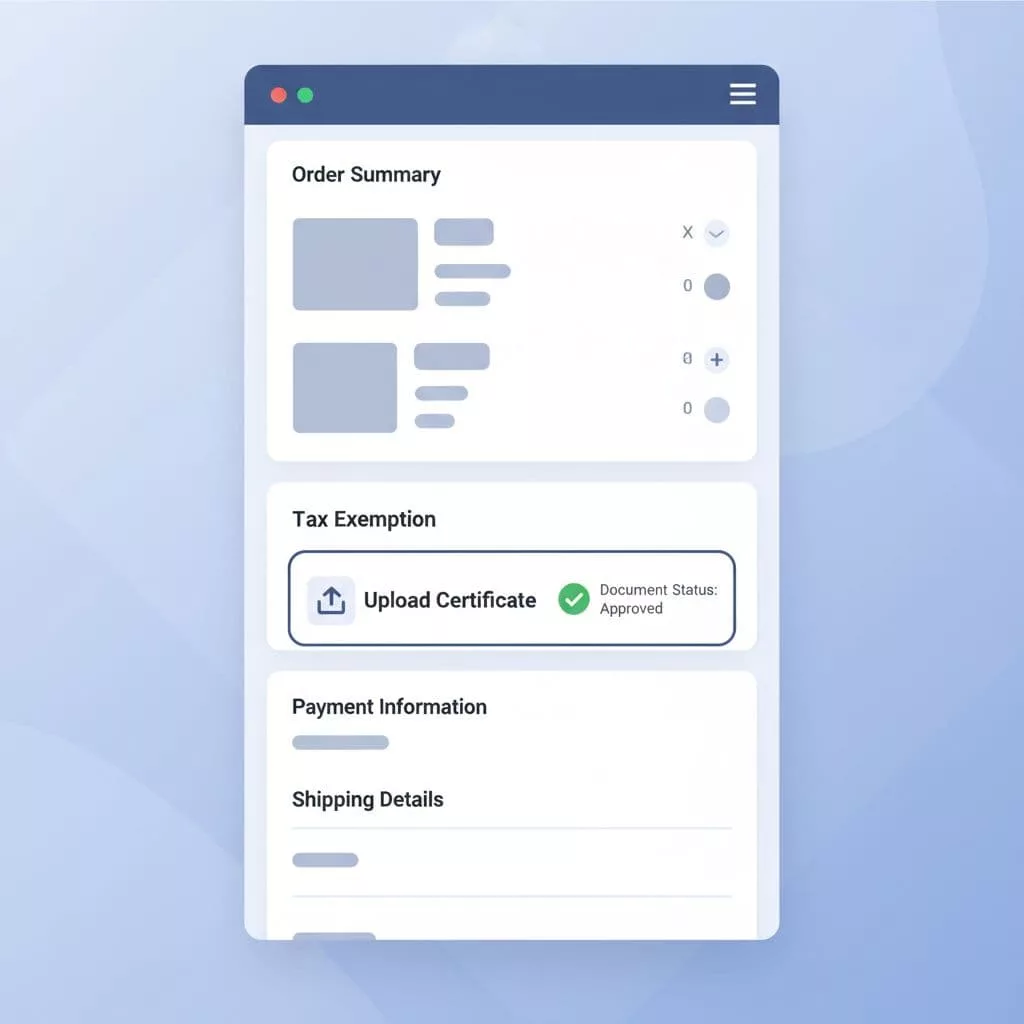
Keep the rest of the checkout calm. Place the upload area near tax status, company name, or account type, not buried after shipping details. If you collect tax IDs and exemption certificates together, the placement logic in improving cross-border B2B checkout UX applies here too. Group related business fields together, then use short copy to explain why each one matters.
A small note about tax handling helps as well. If the order will be taxed until the certificate is approved, say that early. Buyers accept clear rules far more easily than surprise charges.
Helping returning customers skip repeat work
Returning exempt customers should not upload the same document on every order. That creates frustration and makes your checkout feel forgetful.
Instead, show certificate status in the account or company location record. A simple message like “Certificate on file” gives the buyer confidence. Add the last verified date and the renewal date, so they know where they stand. If a certificate expires, the same area should explain what changed and why a new upload is needed.
This is where a little memory goes a long way. For repeat buyers, the best UX is quiet. It should confirm that the exemption is active, then get out of the way.
A simple matrix helps teams design the right behavior for each case.
| Buyer scenario | Best UX pattern | Why it works |
|---|---|---|
| First-time exemption request | Show upload fields with short guidance | The buyer gets context and can finish without leaving checkout |
| Returning exempt customer | Show “certificate on file” with status and renewal date | The buyer avoids repeat work and trusts the system |
| Manual review case | Show pending status and next step | The buyer knows the order is moving, even if approval takes time |
The takeaway is simple, first-time buyers need direction, returning buyers need memory, and everyone needs status. That same lifecycle shows up in managing exemption certificates for B2B online sales, where storage, validation, and tax application work together.
Validation and manual review without friction
Validation is where many teams lose the buyer. The file uploads, then nothing happens for a while. Or worse, the page throws a generic error with no clue what went wrong.
Good validation states are easy to read. Use four clear moments, received, checking, approved, and needs attention. Each state should tell the buyer what happens next. If the file is too large, unreadable, or in the wrong format, the message should say that directly.
A strong error message might say, “PDF, JPG, or PNG files only.” Another might say, “We couldn’t read this file, please upload a clearer copy.” Short messages work because buyers are already in a task-focused mindset.
Manual review needs a similar level of clarity. If a certificate requires human approval, say who reviews it and how long that usually takes. A vague “pending” status creates anxiety. A clear “Our team will review this within one business day” keeps the order moving in the buyer’s head, even if the tax status is still in progress.
Some certificates also need renewal. Others expire on a fixed schedule. That’s why best practices for managing exemption certificates matter when you design the workflow. If your product team doesn’t plan for expiration and renewal, the checkout will keep asking for the wrong thing at the wrong time.
A few details make this part much better:
- Show the file name after upload.
- Confirm the document was received.
- Explain whether tax is still applied.
- Give a direct path to re-upload if the file fails review.
That keeps the process honest without making it feel heavy. For B2B buyers, honesty is often what builds trust fastest.
Balancing compliance with conversion
The best tax-exempt checkout flows do two things at once. They protect the business from bad records, and they keep the buyer from feeling blocked.
That balance starts with measurement. Track upload completion rate, validation failure rate, manual review time, and the share of orders that need follow-up. Those numbers show where friction lives. If buyers are abandoning at the certificate step, the problem might be copy, placement, or too many required fields.
Also, ask only for what you truly need. A lot of teams add extra fields because they are worried about compliance. The better move is to collect the minimum required data, then explain why each piece matters. When the buyer understands the rule, they are more likely to follow it.
Tone matters too. Avoid legal-sounding labels where a plain label will work. “Upload certificate” is friendlier than a phrase that sounds like it belongs in a policy manual. If tax is charged until approval, tell the buyer before payment. If the order ships only after approval, make that clear as well.
If the upload step is only one weak spot, practical checkout UX improvements for B2B can help you clean up the rest of the path. The same discipline that reduces abandonment elsewhere also helps here, especially on mobile, where file uploads are more painful.
Conclusion
A strong tax exemption certificate upload flow is clear, calm, and well timed. It gives first-time buyers direction, lets returning customers move faster, and keeps manual review from feeling like a dead end.
When the status is visible and the next step is obvious, checkout feels more trustworthy. That matters because B2B buyers want to finish the order, not manage a paper trail.
The best designs treat compliance as part of the purchase, not a separate task. When that happens, the checkout works better for buyers, finance teams, and the business behind it.