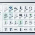

A sample request page has one job, get the right buyer to raise a hand without making them work too hard. On B2B product pages, that balance matters because every extra field, unclear promise, or hidden step can send a good lead away.
The best sample request UX patterns do two things at once. They make the next step feel simple, and they give your sales team better context.
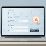
If your page gets traffic but weak sample submissions, the fix is often in the request flow, not the offer. Small choices in layout, wording, and form structure can change lead quality fast, and you can see the same principle in how UX design improves conversion rates.
Start with the buyer’s job, not the form
Most sample request pages fail because they lead with company needs instead of buyer intent. The visitor is trying to answer a basic question: “Will this product fit my use case?” Your page should help them answer that before it asks for contact details.
A strong page gives the buyer a clear path. It shows the sample offer, the product they are requesting, and what happens after the form is sent. That simple sequence lowers anxiety and keeps people moving.
The CTA should also be specific. “Request a Sample” is stronger than a vague “Submit” button because it matches the buyer’s goal. If there are different sample types, name them clearly, such as “Request Material Samples” or “Request a Product Demo.”
When the page looks calm and the next step feels obvious, the request starts to feel safe. That matters in manufacturing, SaaS, and other B2B flows where buyers are often comparing options, not impulse buying.
Make the CTA easy to find and easy to trust
The best CTA patterns reduce doubt before they ask for commitment. That usually means the button appears near the product summary, near proof, and again after key details. Buyers should not hunt for the action.
Visual hierarchy matters here. Use one primary action, then keep supporting links quiet. If you offer pricing, technical sheets, or documentation, place them near the request path so buyers can check details without leaving the page.
Trust signals should sit close to the CTA. Shipping time, sample cost, minimum order notes, response time, and contact expectations all help. When those details are hidden, sales teams get more low-intent submissions and more follow-up friction.
If the request feels like a mini interview, many buyers will leave. If it feels like the next logical step, more qualified leads move forward.
This is also where product page FAQs that remove buying friction can do real work. A short FAQ near the sample button can answer the exact questions that stop people from clicking.
Ask for enough detail to qualify, then stop
Form design is where many teams lose the plot. They want lead quality, so they keep adding fields. The result is a form that feels heavy and returns fewer submissions.
A better approach is progressive disclosure. Ask for the few details that help you route the lead, then collect more after the first step or after the submission. For B2B product pages, that often works better than one long form.
Here is a simple way to think about the fields:
| Field | Best use | Why it helps |
|---|---|---|
| Work email | Early step | Keeps spam down and gives sales a real contact |
| Company name | Early step for B2B | Helps qualify account fit |
| Use case or project type | Early or second step | Tells the team what the buyer is trying to solve |
| Volume, size, or application | Second step | Helps sales judge whether the request is serious |
| Phone number | Later step or optional | Useful for high-touch sales, but often too early |
| Shipping address | After approval or later step | Avoids friction before the buyer is invested |
The pattern is simple. Ask for what you need to sort the lead, then move the rest downstream. That keeps conversion healthier and gives sales better context.
Short helper text can also improve quality. A line like “We use this to match the right sample set to your project” explains why the field exists. People fill out forms more willingly when the reason is clear.
Put proof where hesitation starts
A sample request page works best when it answers the buyer’s next worry before that worry becomes a bounce. That means showing proof near the form, not burying it below long page copy.
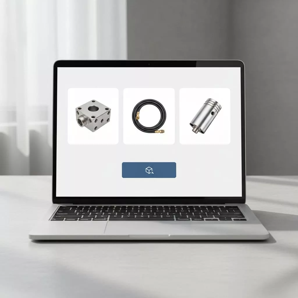
For physical products, proof often includes certifications, testing notes, material specs, and use-case photos. For SaaS, the equivalent might be security notes, onboarding steps, or a clear demo path. Either way, the point is the same. Buyers need to know the request leads to a real outcome.
Use concise proof blocks, not dense walls of text. A short testimonial, a customer logo row, or one focused case study link can do more than a long paragraph. Buyers scan. They do not read every line before clicking.
The same goes for expectations. If samples ship within three business days, say that. If the sales team reviews requests first, say that too. Clear process details reduce surprise, and surprise is expensive on lead-gen pages.
A useful pattern is to place proof near the action, then repeat the key promise lower on the page. That keeps momentum strong without forcing people to scroll back for reassurance.
Use FAQs to remove the last objections
A good FAQ section is not filler. It is a pressure valve for the objections that appear right before the request. If buyers keep asking the same questions in chat or email, those answers belong on the product page.
The most useful questions are the ones tied to risk. Sample cost, shipping time, minimum order requirements, refund rules, approval criteria, and whether the sample is free all matter. For SaaS, the same logic applies to trial limits, setup support, and what happens after the form is sent.
Keep the FAQ close to the form or the CTA block. That placement helps the page feel complete without forcing a long hunt for answers. It also helps support teams, because fewer visitors need manual follow-up.
A strong FAQ section can do one more job. It can filter weak leads before they reach sales. If your answers make eligibility clear, fewer unfit requests come through, and the ones that do come through are easier to work.
Test the flow like a funnel, not a design mockup
A sample request flow should be measured by more than form starts. If you only watch clicks, you can miss bad lead quality. If you only watch submission volume, you can miss revenue.
Track the steps that show real intent. Form views, form starts, completion rate, lead quality, sales acceptance, and sample-to-opportunity rate all matter. In B2B, the best page is often the one that gets fewer but better requests.
That is where experimentation helps. Compare a short form against a longer one. Test CTA copy, field order, and whether proof sits above or below the form. If the request path is high value, a structured test plan like A/B testing strategies to reduce ecommerce hesitation gives you a clean way to judge changes without guessing.
The goal is not to remove every ounce of friction. Some friction is useful because it keeps poor-fit leads out. The goal is to remove the friction that stops good-fit buyers from acting.
Conclusion
Sample request pages win when they feel clear, credible, and low effort. The strongest patterns keep the CTA visible, ask for only the fields that matter, and answer the buyer’s doubts before they stall.
That balance is what turns a form into a useful lead channel. If your page is getting traffic but weak sample requests, the fix is usually in the flow, not the offer.
Focus on clarity before quantity. When the page respects the buyer’s time, it also improves the quality of every request that comes through.