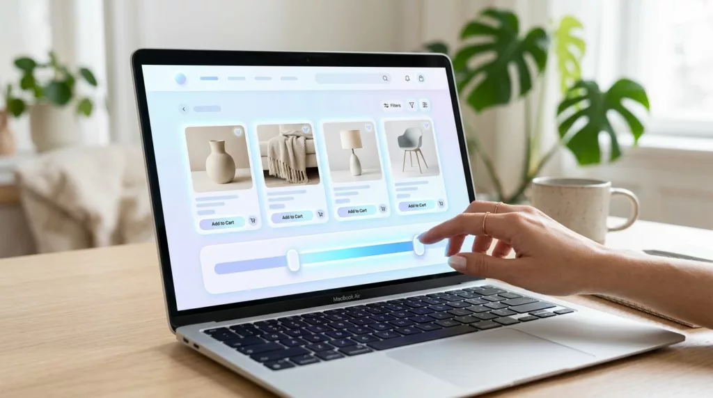
A price filter should save time. When it doesn’t, shoppers start second-guessing the whole category.
A strong price range filter UX gives people a fast way to narrow choices, see what fits their budget, and move on with less effort. The best versions feel simple because they remove hidden work.
That matters on product listing pages, where every extra tap or drag can slow a purchase decision. If the filter answers “what can I afford?” in a second or two, the rest of the page gets easier to use.
Why shoppers abandon slow price filters
Most price filters fail because they ask for too much thinking. The shopper has to guess the range, test it, and wait for feedback. That is a lot of work for a control that should feel quick.
Price also carries emotion. A range that starts too wide can make every item feel out of reach. A range that updates too slowly can make the page feel stuck. Either way, the control stops helping and starts getting ignored.
Common friction points show up fast:
- The range is too wide to be useful.
- The handles are too small for touch screens.
- The chosen values disappear after a sort change.
- The page updates without any visible confirmation.
That is why the filter should support fast choices, not just precise ones. A good control helps a shopper move from “maybe” to “this fits” without extra thought.
What a fast, clear price filter shows
A clear filter always gives the shopper context. It shows the full range, the active selection, and the result count in a way that is easy to scan.

The clearest filters show range and state without extra clutter.
When the shopper drags a handle, the result should respond right away. Even if the page uses a short loading state, the feedback has to feel instant. That speed builds confidence.
Labels matter here too. “$50 to $100” is faster to read than a slider with no values. If your catalog uses common break points, show them. “Under $75” or “$100 to $250” gives the shopper a clear next step.
The best filters also keep the active range visible after the selection is made. A shopper should not have to reopen the panel to remember what was chosen. If the range is shown near the top of the list or in a sticky filter bar, it feels easier to control.
If shoppers have to guess what the filter did, they won’t trust it.
A filter that feels trustworthy gets used more often. That alone can shorten the path to a product page.
Slider, inputs, or chips? Pick the right control
No single price control works for every store. The right choice depends on how your shoppers think about price in that category.
| Control | Best when | Watch out for |
|---|---|---|
| Range slider | Shoppers browse a wide catalog and want a fast first pass | Handles can be hard to use on small screens |
| Min and max fields | Budget is tight and precision matters | Typing slows people down on mobile |
| Preset chips | Most shoppers start with common bands like under $50 or $50 to $100 | Too many chips make the filter feel busy |
For many ecommerce categories, the best answer is a hybrid. A slider helps people scan quickly, while typed values support shoppers who know their budget. Preset chips work well when most buyers start with a ceiling instead of an exact number.
That mix is useful in categories like apparel, home decor, or gifts, where price often matters more as a signal than as a hard limit. In contrast, spare parts, bulk supplies, or B2B catalogs may need more exact entry.
The key is to match the control to the task. If shoppers compare lots of options, speed matters most. If they shop with a firm budget, accuracy matters more.
Remove the friction points that kill trust
A price filter can look fine and still feel clumsy. The small details around the control often decide whether shoppers keep going.
Start with state. Keep the chosen range visible when users sort, scroll, or reopen the filter. If the values disappear, the shopper has to rebuild their own memory. That adds friction right away.
Then look at the reset path. A clear “Clear” or “Reset” action should sit near the active values. It should read like an easy exit, not a hunt through the interface. If a shopper cannot undo the filter quickly, they will use it less.
The zero-results state matters too. When no products match, say that plainly and offer a nearby option. A helpful message like “No products in this range, try $50 to $150” keeps the shopper moving. A blank result set does not.
Formatting should stay consistent across the page. If one place says “$100”, another says “100.00”, and another says “$ USD 100”, the filter feels unfinished. Keep the price style simple and stable.
These details matter across the whole collection page. Designing effective ecommerce category pages means treating sorting, filters, and product cards as one system, not separate features.
A few practical checks help here:
- Keep the active range visible while scrolling.
- Show a clear result count after the change.
- Put reset actions next to the selected values.
- Help shoppers recover fast when no products match.
That is how the control earns trust instead of demanding it.
Make it work on mobile and with assistive tech
If the filter is hard to use with one hand, it is hard to use.
Mobile shoppers need more than a scaled-down desktop control. They need space, clear touch targets, and a layout that keeps context intact. A bottom sheet often works better than a long sidebar because it keeps the shopper in the category page.
Two handles on a narrow screen can get messy fast. Give them enough separation so users don’t grab the wrong one. Keep the track easy to see, and make the selected range stand out with strong contrast.
Accessibility needs the same care. Keyboard users should be able to move through the control without getting stuck. Screen readers should hear the current range and the result count after the change. Focus states should be obvious, not faint.
A few details make a real difference:
- Use plain labels for min and max values.
- Keep touch targets large enough to tap without misses.
- Announce range changes and result updates.
- Preserve focus so users don’t lose their place.
This is also where layout decisions connect to broader ecommerce UX. If your category page already has solid filter placement, readable cards, and predictable sorting, the price range control has less work to do. That is one reason how ecommerce UX influences conversion is so closely tied to filtering quality.
In short, the filter should feel easy on every device, not only on a large desktop screen.
How to test speed to product discovery
A good price filter does one job well, it helps people get to products faster. So the best tests focus on speed, not just clicks.
Start by watching the points where shoppers hesitate. Do they open the filter and close it without changing anything? Do they widen the range right after applying it? Do they sort first because the filter feels risky? Those signals tell you where friction sits.
Track a small set of metrics that tie to discovery:
- time to first product click after filtering
- filter apply rate
- zero-results rate
- backtrack rate after sorting or paging
Then test one change at a time. Compare a slider alone, a slider with preset chips, or a slider with typed values. You may find that one version gets more use, while another gets faster selection. Pick the version that reduces effort for your main buyers.
Session replays and search logs help too. They show whether shoppers use price as a first filter or as a fallback after other options fail. That pattern tells you how prominent the control should be.
The most useful test is simple. If shoppers narrow faster and reach product pages with less backtracking, the filter is doing its job.
Conclusion
A strong price filter does more than set limits. It gives shoppers a clear range, visible feedback, and a quick way out when the first choice misses.
When the control is easy to read, easy to touch, and easy to recover from, product discovery speeds up. That is the real value of price range filter UX.
The goal is simple. Help people narrow faster, trust the page more, and spend less time fighting the interface.