
BOPIS UX That Cuts Pickup Confusion at Every Touchpoint
What turns a convenient pickup order into a support ticket? Usually, it’s not the product. It’s the gap between what...
Shopify Customer Account Page UX That Drives Repeat Purchases
Most merchants spend hard to win the first order, then send repeat buyers into an account area that feels like...
Shopify Bundle Builder UX Patterns That Increase AOV Without Confusion
A bundle can feel like a helpful set menu, or like a complicated order form. The difference is UX. A...
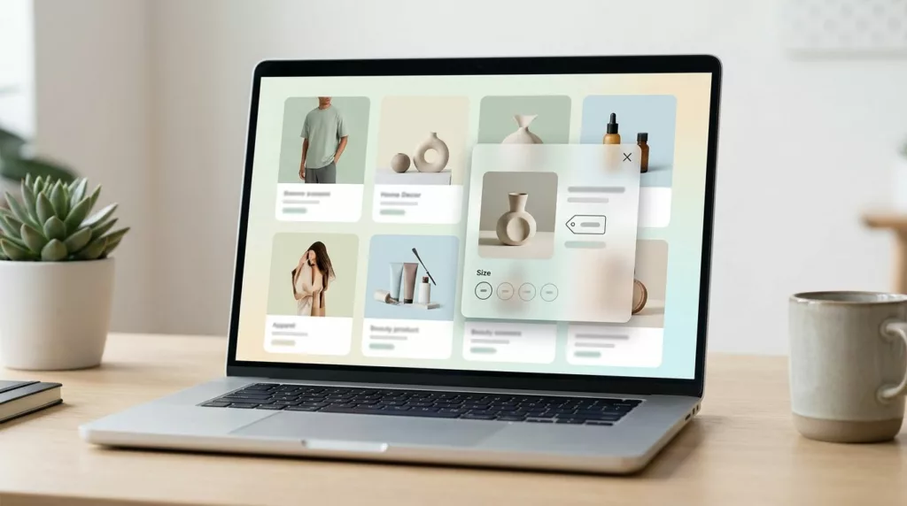
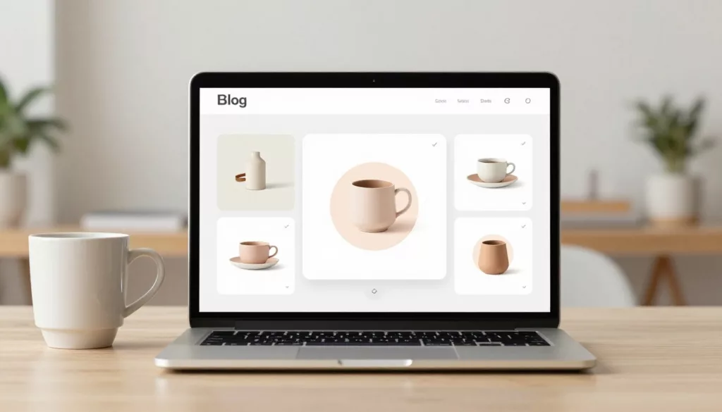
Quick View Modal UX Patterns That Boost Product Discovery
A quick view modal should feel like a tasting spoon, not a full meal. It lets shoppers sample key details,...
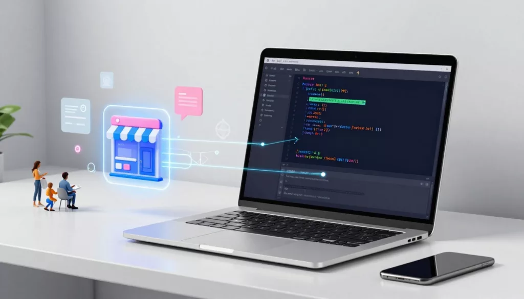
Headless Commerce UX Guide for Small Teams (2026): When It’s Worth It and How Workflows Change
Headless sounds like freedom: design what you want, ship faster, and stop fighting a rigid theme. Then reality hits. A...
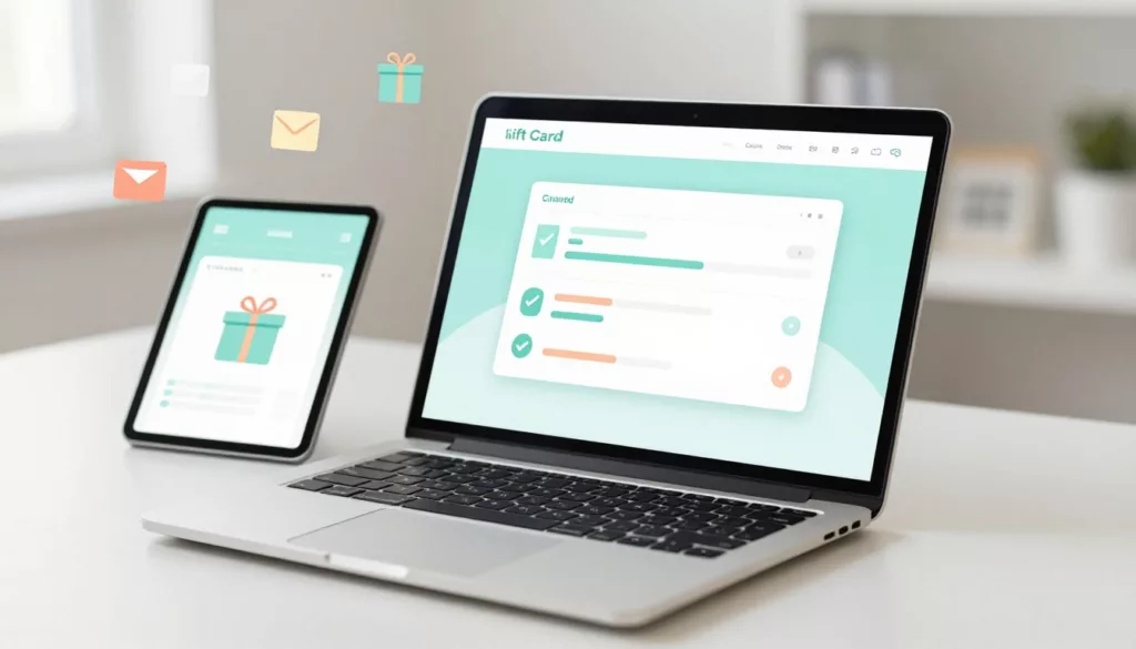
Gift Card Page UX That Increases Purchases and Cuts Confusion
Gift cards should be the easy win in your store. The shopper already wants to buy, they just need to...

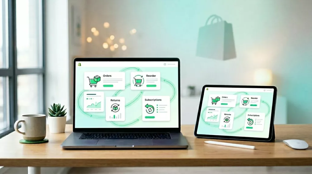
Reorder Flow UX in 2026: Repeat Purchases, Subscriptions, and Account Pages That Sell
A first-time purchase is a handshake. A second purchase is trust, and trust is where margins get healthier. In 2026,...
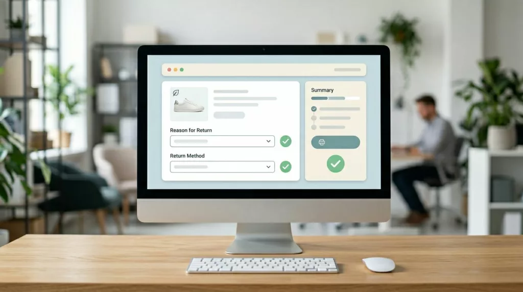
Returns and Exchanges Page UX That Cuts Refund Requests
Refund requests in ecommerce returns don’t start at the warehouse. They start when a customer feels stuck, unsure, or suspicious....

Cart Page UX Checklist for 2026 That Protects Conversions
Your cart page is the last “pause” before checkout, and pauses invite doubt. If shoppers can’t confirm the total, delivery,...

Checkout Form UX Patterns That Reduce Address Entry Time
Every extra second spent typing an address feels like waiting in a slow line. Shoppers aren’t comparing your checkout to...