
A quick order pad UX can save minutes on every repeat purchase, and those minutes add up fast for wholesale teams. When buyers order the same SKUs every week, they want speed, accuracy, and a clear path to checkout.
That sounds simple, but many B2B ordering flows still make people hunt, scroll, and double-check too much. The best reorder experience keeps the buyer focused on the work, not the interface.
Why B2B buyers need a faster reorder path
B2B reorders are not casual shopping. Buyers often know the item codes, pack sizes, and usual quantities before they even open the page. They are trying to place an order between calls, meetings, or warehouse checks.
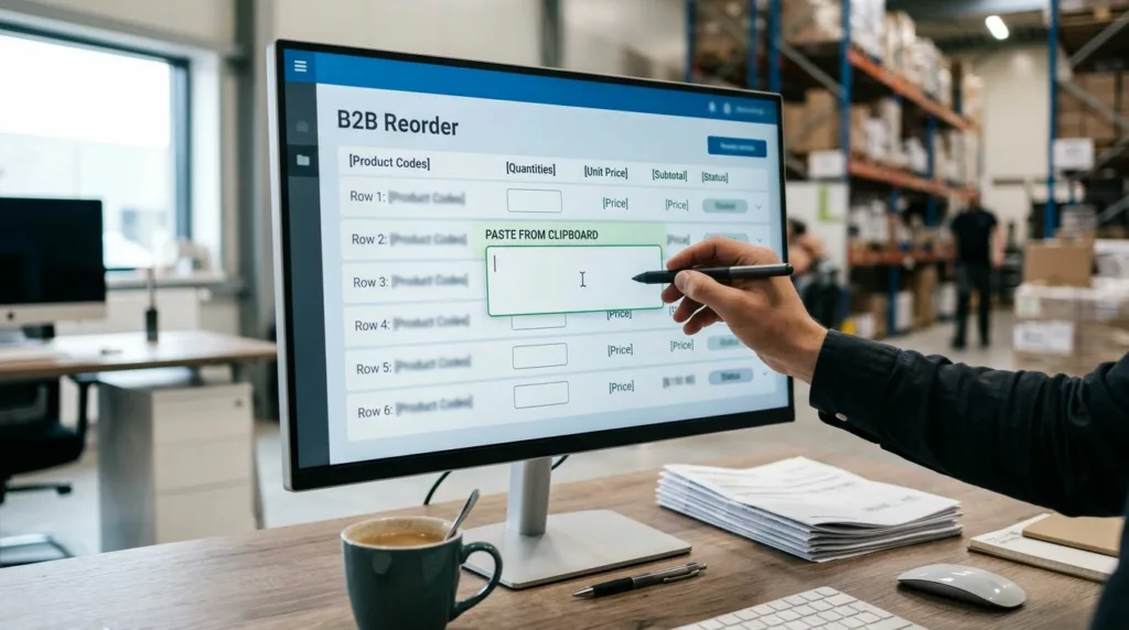
That means the interface should act like a work tool. Put the repeat tasks in front of the user, then hide the extras until they matter. A purchasing manager should be able to paste a list, adjust quantities, and move on without opening ten product pages.

A good reorder flow also respects account-based buying. Different team members may have different roles, but they still need the same order history, the same price logic, and the same saved items. If the system forces everyone to start over, it creates friction that feels small on one order and expensive across a quarter.
The best order pad does less talking and more remembering.
That is the real test. If the pad saves context, buyers feel faster without having to think about speed.
Build the pad around how teams actually buy
The strongest quick order pad UX mirrors the way wholesale buyers work in real life. They usually do not browse for inspiration. They arrive with a list, a budget, and a deadline.
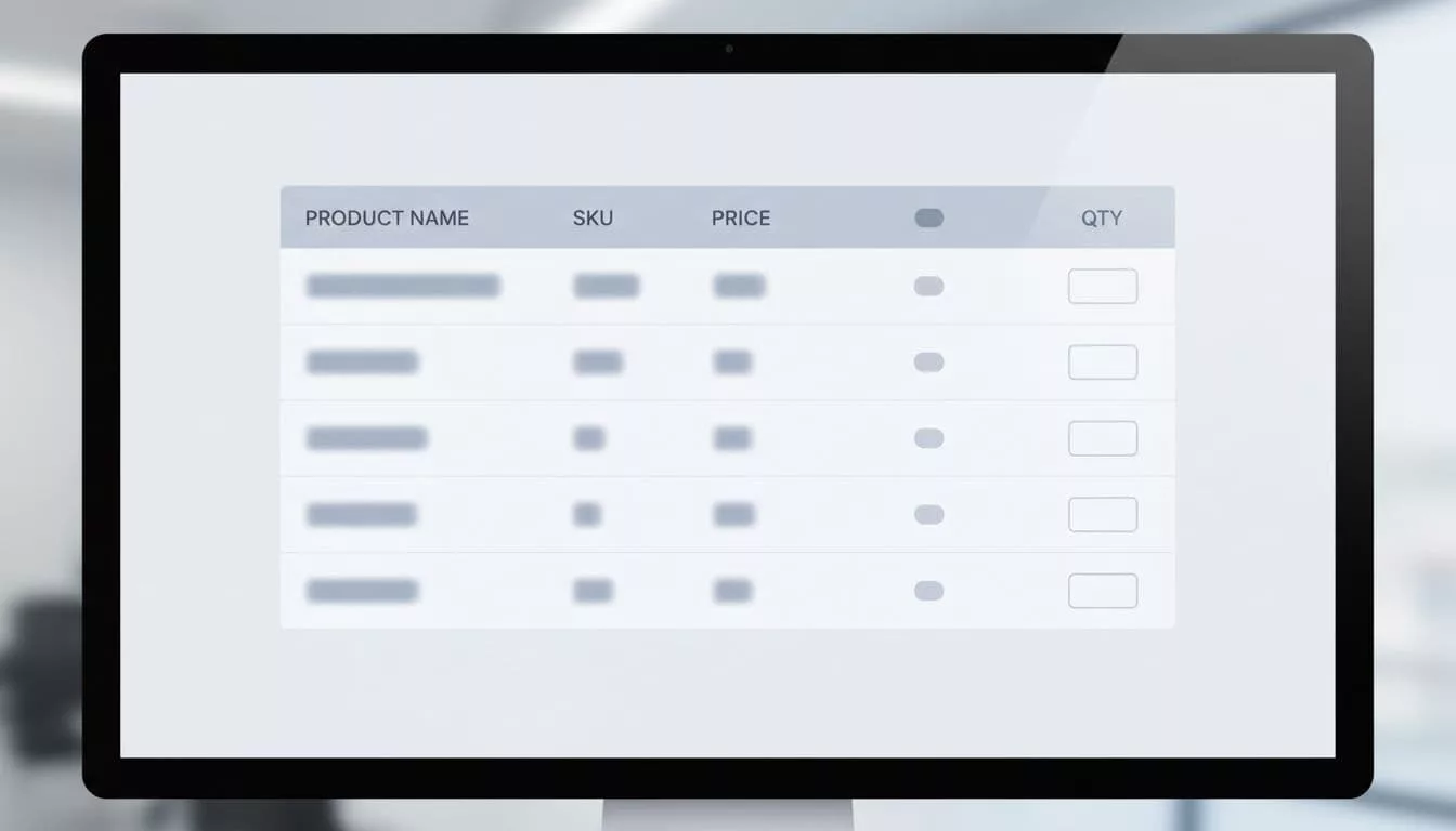
A useful pad starts with search, SKU entry, and quantity input. It should let users jump straight to line items, add multiple products in one pass, and review totals without leaving the page. The design should feel calm and predictable, because repeat buyers do not want surprises.
| Pad element | What the buyer needs | UX payoff |
|---|---|---|
| SKU and name search | Find exact items fast | Fewer wrong matches |
| Inline quantity fields | Enter bulk amounts quickly | Less clicking |
| Saved order lists | Repeat common purchases | Faster reorders |
| Stock and lead-time cues | See availability early | Fewer dead ends |
| Paste or import tools | Add many lines at once | Less manual work |
The table makes one thing clear. Buyers need short paths, not clever layouts. Every row should reduce a step or prevent a mistake.
A pad like this also supports the people around the buyer. Sales reps can share a saved list, procurement teams can review line items, and account managers can spot repeat patterns. That makes the interface useful across the whole buying process, not only at the final click.
For a stronger checkout handoff, the pad should connect cleanly with designing efficient checkout experiences. When the order is already complex, the next step should not add confusion.
Use memory and validation to prevent costly errors
Speed means little if the buyer has to fix mistakes later. In B2B, one wrong size, pack count, or variant can delay a shipment or create a support ticket. Good reorder UX lowers that risk before the order goes out.
Preserve the details from the last purchase whenever possible. That includes size, color, pack configuration, and quantity. If a buyer reordered ten cases last time, the pad should remember ten cases, not ask them to rebuild the line from scratch.
The interface should also flag problems where they happen. If an item is out of stock, show the issue in the row, not after checkout. If a minimum order quantity applies, show it next to the field. If a line needs approval, make that clear before submission.
This is where optimizing B2B reorder UX flows pays off. Reorder history, saved carts, and “buy again” paths work best when they preserve context instead of only copying a product list.
A better flow also gives buyers a safe way to correct themselves. For example, if a product is unavailable, the page can offer a substitute, a backorder option, or a note for the account team. Those choices keep the order moving.
Buyers forgive complexity more easily than they forgive lost information.
That matters because purchasing teams often share work. One person may build the cart, another may approve it, and a third may place the final order. The UX should support handoffs without making anyone start over.
Remove checkout friction and preserve context
A quick order pad is only half the job. Once buyers add items, the rest of the purchase still needs to stay simple. If checkout asks them to repeat what they already entered, the earlier speed gets lost.
Keep shipping, payment terms, and tax details visible, but do not bury the order under extra screens. Many B2B buyers already know their delivery rules and account terms. They want confirmation, not a fresh interrogation.
That is why checkout should carry over the context from the pad. Line-item quantities, notes, and approval flags should follow the order through to payment. If a buyer used a saved list, the checkout should honor that structure.
For teams that use purchase orders or net terms, the form should reflect that reality. A cluttered checkout often adds fields that do not help the buyer finish the order. A clear one asks only for what is still missing.
A strong account area also matters after the order is placed. Post-purchase account creation design should give buyers immediate value, such as order history, tracking, saved lists, and easy reorders. When the account page helps them do real work, they come back.
Think of the whole path as one continuous task. The pad, cart, checkout, and account area should all feel connected. If one part breaks the flow, the buyer feels it right away.
Measure what buyers feel, not just the dashboard
The best quick order pad UX is easy to measure if you look at the right signals. Start with the basics, then watch how they change after each design update.
Useful metrics include:
- Time to complete a reorder
- Number of quantity or SKU errors
- Checkout abandonment after cart creation
- Use of saved lists or repeat-order shortcuts
- Support tickets about stock, pricing, or missing line items
Those numbers tell part of the story. Pair them with direct user feedback, because buyers often explain friction faster than analytics can show it. A five-minute call with a purchasing coordinator can reveal a broken step that the report missed.
Session recordings and task-based tests help too. Watch where users pause, switch tabs, or copy data into the pad. Those moments usually point to the hidden work your design is making them do.
After that, test one change at a time. Improve SKU search, then measure the impact. Adjust quantity entry, then check reorder completion. Small changes often create the biggest lift because B2B buyers feel every extra click.
Conclusion
B2B reorder UX works best when it respects how wholesale teams already buy. They need speed, but they also need trust, memory, and clear error handling.
A strong quick order pad UX cuts the work buyers repeat every week. It keeps product lookup, quantity entry, checkout, and account access connected, so the order feels easy from start to finish.