
Purchase Order Upload UX for B2B Checkout in 2026
A purchase order upload should feel routine, not risky. Yet many B2B checkouts still hide the file step behind vague...
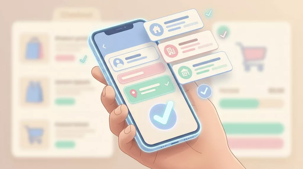
Address Book UX That Speeds Up Repeat Checkout in 2026
A returning customer can know exactly what they want and still stall at checkout if the address step feels slow....

Sample Request UX Patterns for B2B Product Pages
A sample request page has one job, get the right buyer to raise a hand without making them work too...
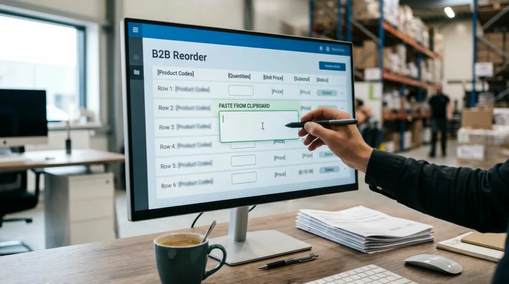
Quick Order Pad UX for B2B Reorders That Buyers Use Fast
A quick order pad UX can save minutes on every repeat purchase, and those minutes add up fast for wholesale...
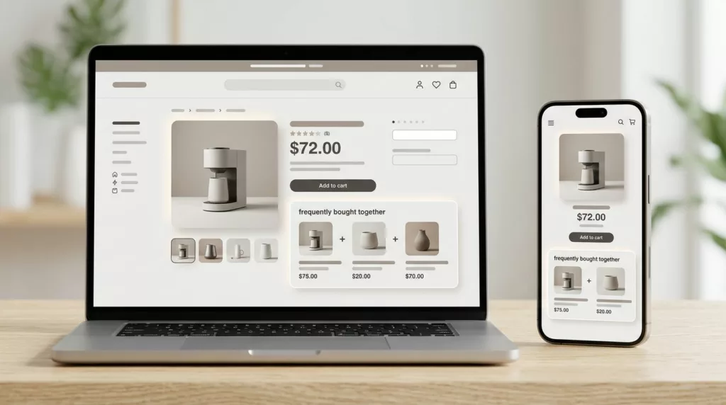
Frequently Bought Together UX That Increases Bundle Attach Rate
A bundle widget can sit on a product page and still do nothing. The difference is often not the offer...

Minimum Order Quantity UX That Prevents Cart Friction
A shopper who learns about a minimum only after adding items to the cart is already annoyed. They now have...

PO Number Field UX for B2B Checkout in 2026
A PO field can save a sale or slow one down. In B2B checkout, the difference often comes down to...
Partial Shipment Tracking UX That Reduces Support Tickets
Partial shipments are where order tracking pages lose people. A shopper sees one box on the way, one item delayed,...

Net Terms Application UX That Speeds B2B Account Approval
Every extra field in a net terms application can slow a sale. Buyers expect trade credit approval for net terms...
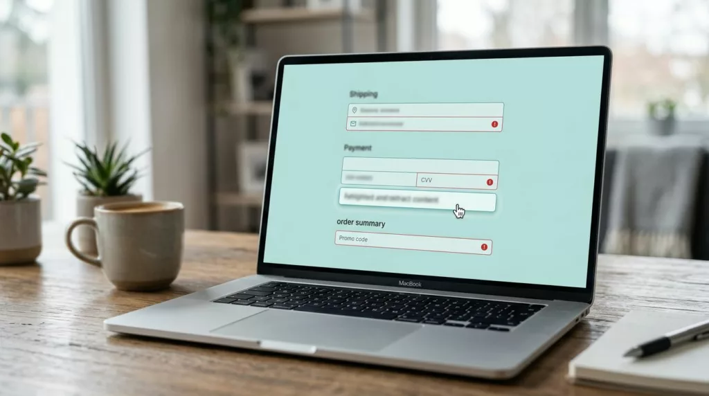
Checkout Error Summary UX That Helps Shoppers Fix Mistakes
Checkout errors happen at the worst moment during the checkout process on an e-commerce site. The shopper has already picked...