
A returning customer can know exactly what they want and still stall at checkout if the address step feels slow. In 2026, shoppers expect saved addresses, browser autofill, and mobile-friendly controls to do most of the work.
The gap is rarely the shipping form itself. It is the address book UX, the part that should make repeat buying feel familiar, accurate, and quick. When that part works, checkout feels lighter before the customer even reaches payment.
Why repeat buyers still slow down at checkout
Repeat buyers do not want to “manage addresses.” They want to pick the right one and move on. If your interface calls it an address book, hides the default, or makes edits harder than adding a new entry, you add friction where there should be none.
That is why better labels matter. “Saved addresses” or “Shipping addresses” is easier to understand than a term that sounds like an old contact list. It also helps on mobile, where people scan fast and tap with less patience.
If your team is already working through checkout UX fixes that reduce abandonment, saved addresses are one of the highest-value places to start. Baymard’s address book findings make the same point, many shoppers add and adjust addresses during checkout, not in a profile page.
If the best address is obvious, editable, and safe to reuse, repeat checkout gets easier fast.
The simple test is this: can a returning shopper find the right address in one glance, fix it in one move, and select it without hesitation? If the answer is no, the flow still has work to do.
Build saved addresses people can scan and trust
A good saved-address list acts like a clean label maker. It removes the need to think. Each entry should look the same, use the same order, and show only the details that help a shopper choose.
The most useful fields are easy to predict:
- Name, so the shopper knows whose address it is.
- Street, city, state or region, and postal code, so the entry can be checked at a glance.
- A simple label like Home, Work, or Default, so the list is easy to scan.
- Edit and Remove actions, placed where they are easy to reach.
That is enough for most repeat orders. Anything extra should earn its place.
The bigger issue is how the list behaves when an address changes. Many people move, split time between places, or ship gifts. If editing feels like a detour, they will create a duplicate instead. That leads to clutter, confusion, and the wrong address getting picked later.
So make editing the first-class action. Keep it beside the address, not buried in a menu. Let people set a default from the same screen. If deletion is allowed, make it safe with a confirm step, and consider archive instead of hard delete when the address is used often.
Mobile-first address book UX depends on input help
Mobile shoppers are less tolerant of long forms and tiny controls. They also expect the phone to help more than it used to. By 2026, that means address autocomplete, the right keyboard, and layouts that stay easy to tap with one thumb.
This is where many teams lose time. They polish desktop layouts, then squeeze the same pattern onto a small screen. The result is tiny edit icons, crowded cards, and fields that fight browser autofill instead of working with it.
A better mobile setup keeps the path short and predictable. It uses large tap targets, clear spacing, and inline validation that catches mistakes early. It also accepts browser and OS autofill without making the shopper guess which field to touch next. For a solid baseline, Google’s payment and address form best practices still cover the essentials, including autofill support and international address formats.
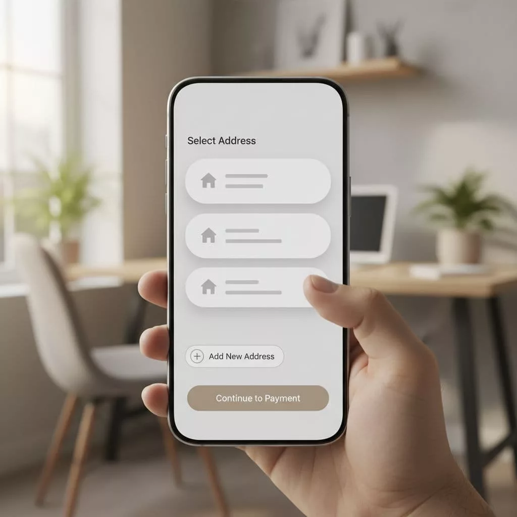
Accessibility matters here too. Every saved-address control needs a visible label, a clear focus state, and enough contrast to read quickly. Error messages should explain the problem in plain language, not hide behind color alone. If a screen reader user moves through the list, the order should make sense, and the active default should be announced clearly.
When mobile, autofill, and accessibility all work together, the address step stops feeling like a form. It feels like a shortcut.
Account, guest, and international addresses need different rules
A strong address system has to serve more than one checkout path. Some buyers are signed in. Some are guests. Some are ordering from another country, or shipping to one for the first time. The interface should handle each case without making users learn new rules.
Guest checkout should stay simple and open. Do not force account creation before the shipping step. If a guest later creates an account, save the address with permission so they do not need to type it again. If your team is tightening that path, guest checkout UX patterns are worth a look because they show how to keep the flow light without losing data quality.
Account and checkout should also stay in sync. If a shopper edits an address during checkout, that change should update the saved version when it makes sense. Otherwise, they end up fixing the same problem twice.
International checkout needs special care. Country-specific forms should adjust field names and validation rules instead of forcing one US-shaped template on everyone. Some regions need a province, others need a county, and many need address line 2 for apartment or building details. Postal code formats also vary, so the system should not reject valid entries just because they do not match a US pattern.
Measure the flow and test the right changes
The best address book UX is not chosen by taste. It is chosen by results. Track the steps that show where shoppers slow down, where errors happen, and where repeat buyers still hesitate.
Useful events include address list view, address select, add new address, edit address, save success, and validation error. Break those numbers down by device, country, order value, and returning versus new customer. That gives you a much clearer picture than a single checkout conversion rate.
A few tests usually give the clearest answers:
- Default address placement, especially whether the default is visible before the shopper clicks.
- Edit action layout, since some users need to fix old data fast.
- Label wording, such as “Saved addresses” versus “Shipping addresses”.
- Mobile tap area size, since a tiny button can block a lot of orders.
- Guest versus account path, to see where return buyers prefer to start.
If you want a broader test plan, checkout flow optimization strategy can help frame the rest of the experiment. The point is to test one friction point at a time, then watch how behavior changes across segments.
Also watch for side effects. A small lift in checkout completion can still create problems if support tickets rise or delivery errors increase. The right change makes repeat orders faster without creating new work for the customer or the team.
Conclusion
Repeat checkout gets faster when the address step feels obvious, not busy. That means clear labels, simple cards, strong defaults, and edit actions that are easy to find.
Mobile support, autofill, accessibility, and international formats all shape the result. When those pieces line up, saved addresses stop being a storage feature and start working like a shortcut for your best customers.