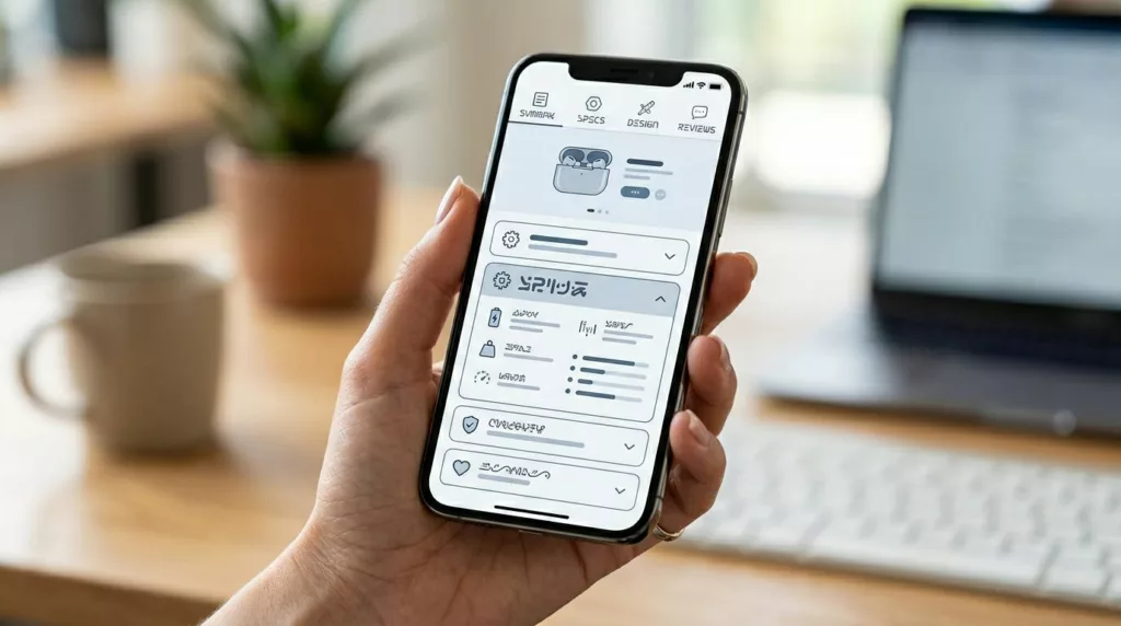
PDP Tabs vs Accordions UX for Mobile Product Pages
On a phone, every product page choice feels bigger. Space is tight, attention is short, and the wrong content pattern...
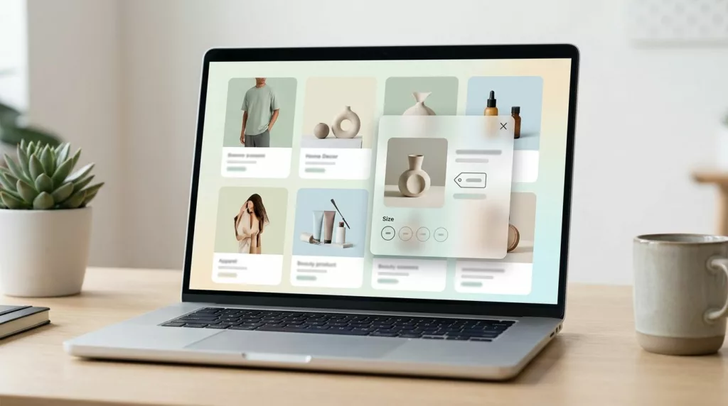
Quick View Modal UX Patterns That Boost Product Discovery
A quick view modal should feel like a tasting spoon, not a full meal. It lets shoppers sample key details,...
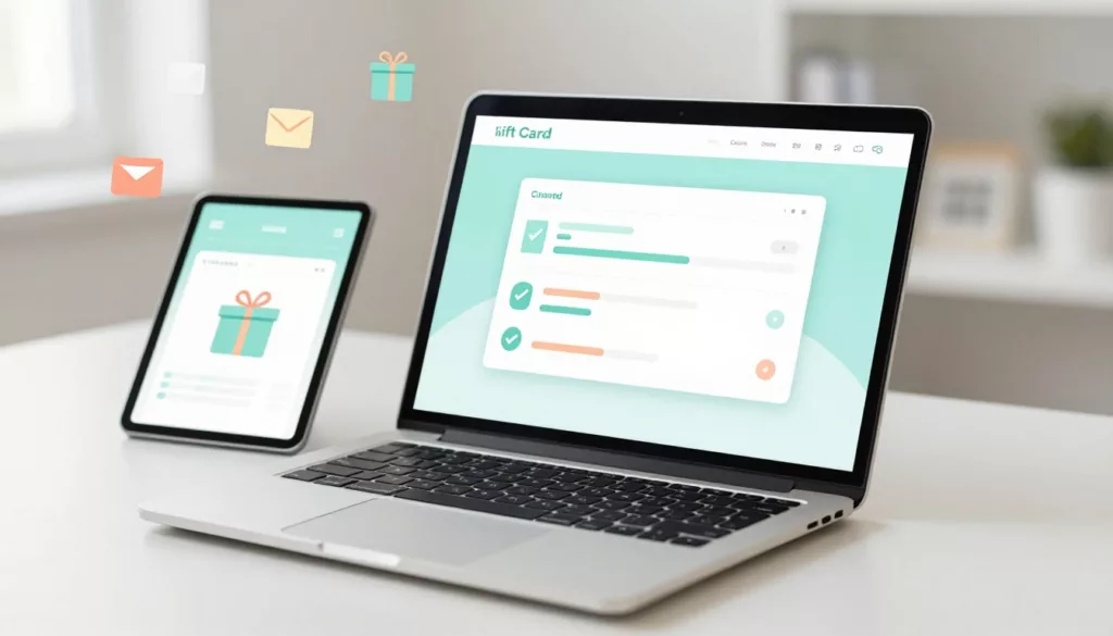
Gift Card Page UX That Increases Purchases and Cuts Confusion
Gift cards should be the easy win in your store. The shopper already wants to buy, they just need to...
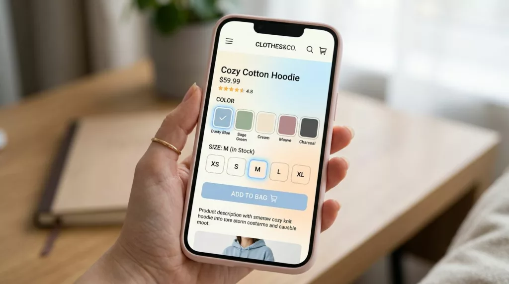
Variant Picker UX Patterns That Reduce Option Confusion On Mobile
Picking a size and color on a phone should feel like ordering coffee: quick, familiar, and hard to mess up....
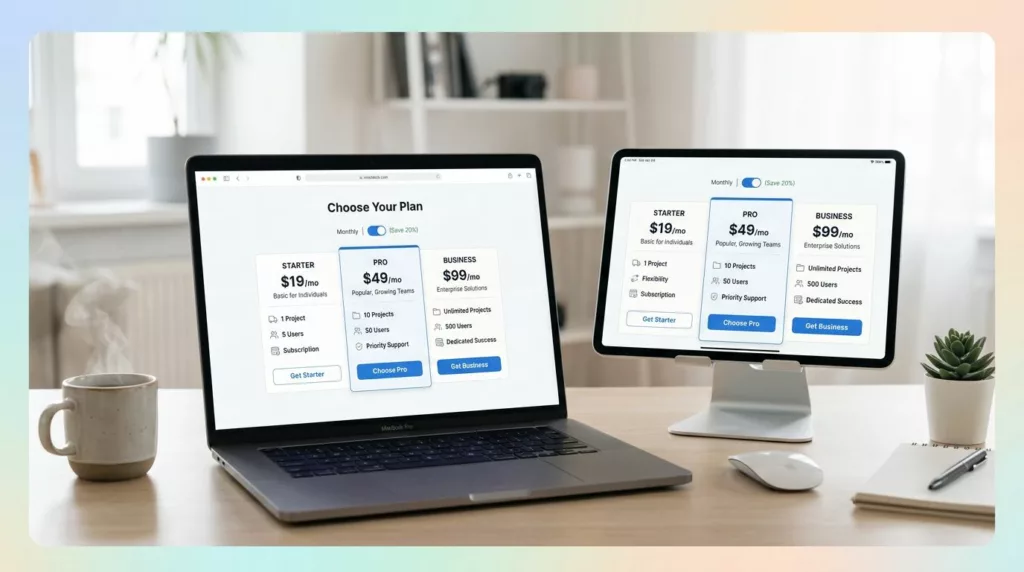
Pricing Page Design for DTC Subscriptions: Clarity, Anchoring, and Comparison Tables
If your best customers subscribe, why does your pricing page feel like a math test? Brands often seek landing page...
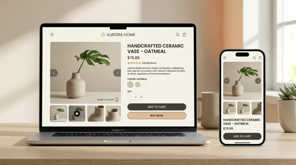
Product Media Gallery UX Patterns for Ecommerce: Zoom, Swipe, Video
Shoppers can forgive a lot, but they won’t forgive not seeing the product. On most product detail pages, the media...
Product Page Copy That Sells: 12 Product Page Copy Templates for Titles, Bullets, and Description
Most product pages don’t lose sales because the product is bad. They lose sales because the page makes shoppers work...
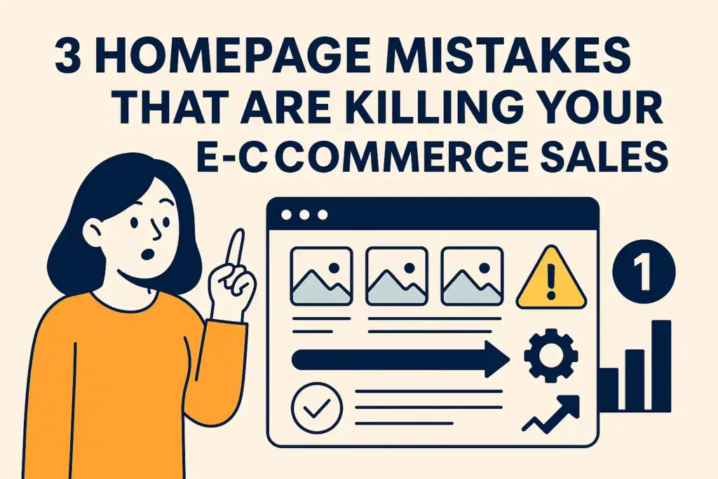
3 Homepage Mistakes That Are Killing Your E-Commerce Sales
Your homepage is like the face of your store online. It’s how customers decide if they want to stick around...