
Tiered Pricing Table UX That Speeds B2B Buying Decisions
Buyers rarely leave a pricing page because the price is too high. They leave because poor pricing page design hurts...
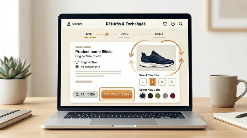
Exchange Offer UX That Recovers Revenue in Returns Portals
A return request doesn’t always mean the sale is lost. In many cases, the shopper still wants the product, only...
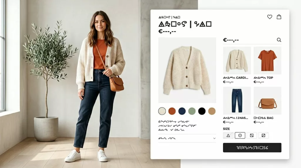
Shop the Look UX Patterns That Increase Outfit Adds
A shopper sees a styled outfit and wants the whole thing, not a scavenger hunt. Yet many Shop the Look...

Collection Page Quick Add UX That Lifts Product Adds
Collection pages often decide whether a shopper keeps moving or drops off. A weak quick add ux might save a...
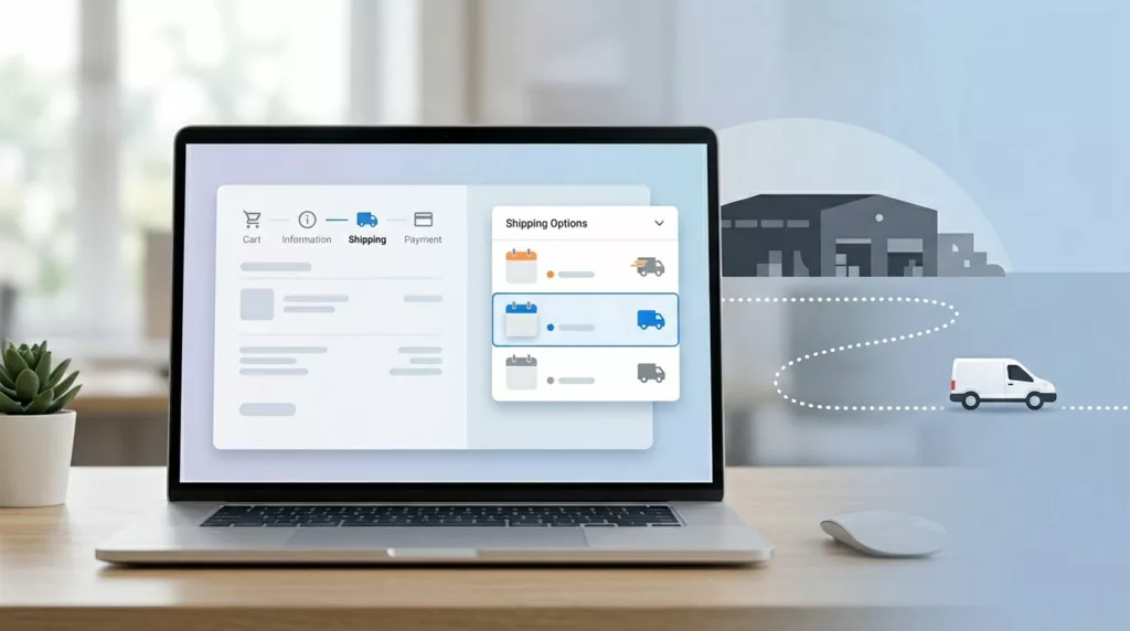
Shipping Option Selector UX That Prevents Delivery Mistakes
A shopper picks “Free Shipping” and expects it next week. Your warehouse treats that method as economy mail, the cutoff...

Search Results Page UX That Turns Intent Into Orders
A shopper uses site search when browsing has stopped working. They want an answer fast, and your results page has...

Credit Card Form UX Patterns That Cut Payment Errors
A checkout can lose a sale because of one mistyped digit. That is why credit card form UX still matters,...
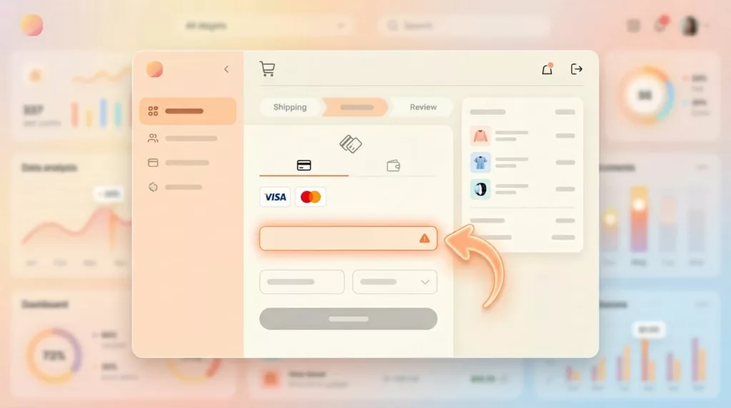
Payment Failure Recovery UX That Saves More Checkouts
A failed payment doesn’t always mean a lost sale. More often, it means a poor customer experience where the checkout...

One-Page Vs Multi-Step Checkout for Ecommerce in 2026
Your checkout is like a cashier line. If it looks slow or confusing, shoppers leave before they pay. In 2026,...

Low Stock Messaging UX That Creates Urgency, Not Doubt
Shoppers move fast, but they spot fake scarcity even faster. When low stock messaging feels inflated, urgency turns into doubt,...