
Bad sort order hides good products in plain sight. On a Shopify collection page, the first screen shapes clicks, filter use, and bounce rate.
If shoppers land on a category ranked in a way that doesn’t match their goal, they work harder than they should. That friction gets worse on phones, where sort and filter controls compete for the same small space.
Good Shopify collection sorting matches intent, supports merchandising, and makes product discovery feel easy. The work starts with the default order, not the dropdown itself.
Start with sort options that match shopper intent
Most shoppers never open the sort menu. They scan the first rows, judge the page in seconds, and either keep browsing or leave. Because of that, the default sort carries more weight than the extra options hidden in a drawer or dropdown.
Intent changes by collection. A “New Arrivals” page should feel fresh, so Newest first fits. A broad category, like women’s ankle boots, often performs better with Best selling because it lowers risk and surfaces proven products. Price low to high helps when shoppers compare basics or shop to a budget. On the other hand, price high to low works best only for premium assortments where high price can signal quality.
This quick guide helps match the default to the page’s job.
| Collection type | Strong default sort | Why it works |
|---|---|---|
| New arrivals | Newest first | Supports repeat visits and trend-led browsing |
| Broad evergreen category | Best selling | Shows proven products early |
| Seasonal edit or campaign | Featured | Lets you tell a story |
| Price-sensitive essentials | Price low to high | Speeds up comparison |
| Luxury assortment | Featured or best selling | Avoids leading with sticker shock |
Alphabetical sorting feels tidy, yet it rarely matches real shopping behavior. Unless buyers think in brand names or titles, A to Z adds noise. The same goes for long menus packed with low-value choices. In most stores, four or five strong options beat a long list of edge cases.
Also, make the label match the promise of the page. If the collection is called “Staff Picks,” then a price-based default creates friction. If the page is “New In,” best sellers sends a mixed signal.
If the collection is long, sort order also interacts with wayfinding. That’s why Shopify collection pagination vs infinite scroll matters to product discovery. People need to understand where they are, not only how results are ranked.
For fresh layout ideas, these current collection page examples show how merchants pair sorting with grid design and merchandising.
Use manual sorting when merchandising matters, automate when scale matters
In many Shopify themes, Featured maps to the collection’s manual order. Use that when product position has a clear business job. Think launches, gift guides, margin-focused edits, seasonal stories, and collections where visual flow matters as much as popularity.
The default sort is your silent merchandiser. It decides what most shoppers see before they touch a filter.
Manual sorting works best when the collection is small enough to maintain and important enough to curate. A sneaker drop may need hero colorways first for two weeks. A holiday gift edit may need entry-price products near the top, then premium items, then add-ons. In both cases, the first rows are not random inventory, they’re sales strategy.
Still, hand-sorting every collection doesn’t hold up at scale. Large evergreen categories change too fast. Best sellers shift, stock turns, and old curated rows go stale. That’s where automated logic helps. Let Shopify’s collection rules control membership, then choose a sort order that matches behavior, such as Best selling, Newest, or Price low to high.
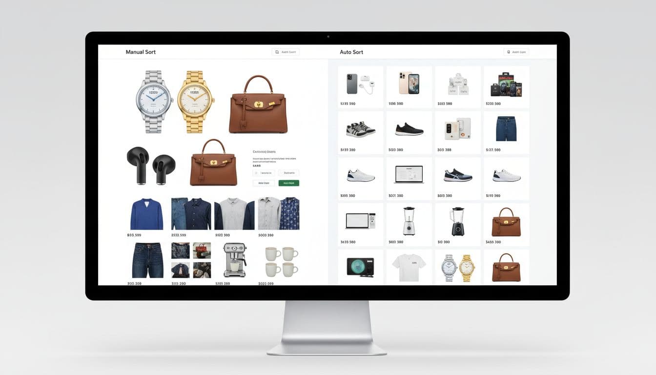
A hybrid model often works best. Curate campaign collections by hand. Let broad catalog pages run on automated logic. Then review the first screen on a set cadence, especially after launches, promos, and major stock changes. If sold-out items dominate the top rows, the sort order has already failed.
A broader Shopify collection page optimization guide reaches the same conclusion, sorting should help both upkeep and conversion.
Make sorting work with filters, search, and mobile
Sorting never works alone. Filters narrow the set, then sort decides what rises inside that set. When that relationship is clear, shoppers move fast. When it breaks, the page feels random.
The rule is simple: filters should refine, not reset shopper expectations. If someone chooses black, size 9, and under $100, the selected sort should remain active after each filter change. The same goes when they open a product and return to the collection. Losing the chosen sort is a quiet way to lose trust.
Search behavior matters too. Search pages and collection pages don’t serve the same mood. Search is hunt mode. Collections are browse mode. If a shopper searches for “linen shirt,” relevance should stay in charge. If they enter a summer shirts collection, Featured or Best selling often works better.
As of March 2026, Shopify teams also have better inputs for discovery. The Search & Discovery app supports stronger filters and search merchandising. Combined listings and category metafields can clean up dense catalogs. With Shopify now allowing up to 2,048 variants on a product, some stores can consolidate split items and reduce duplicate product cards. Cleaner inputs make sort order easier to trust.

Mobile is where weak sorting shows up first. Put Sort beside Filter, close to the top of the grid. Use short labels, like Featured, Best selling, Newest, and Price low to high. Show the active choice in the trigger label, and keep tap targets thumb-friendly. Also, pair sorting with breadcrumb navigation for category discovery so shoppers can step back without starting over.
The best collection pages feel predictable. Shoppers refine, sort, open a product, come back, and continue from the same place. That steady rhythm is what product discovery should feel like.
A better sort menu won’t fix a weak catalog. But a smart default can make a strong catalog much easier to shop.
Pick one default that matches intent, keep the option set tight, and review the first rows like they matter, because they do. If your collection pages feel random today, sorting is one of the fastest UX wins you can make this week.