

Most shoppers don’t arrive with a perfect query. They type fragments, brand hints, or a rough need. That is why search autocomplete UX matters so much in ecommerce, marketplaces, and large catalogs.
Done well, it shortens the path from vague intent to a useful click. Done poorly, it becomes a noisy dropdown that steals attention and adds friction. On big catalogs, browse paths alone rarely carry discovery, so autocomplete often does the first real sorting work.
Start by treating autocomplete as intent prediction
Autocomplete, autosuggest, and instant results are related, but they are not the same thing. Autocomplete completes the text. Autosuggest offers likely queries, categories, brands, or filters. Instant results show real products before the shopper reaches a search results page.
Good systems combine them, but they don’t show everything at once. The right mix depends on shopper confidence. Broad intent needs guidance. Precise intent needs fast access. Messy intent needs recovery.
A practical framework is predict, orient, recover.
Predict the next likely step from the typed prefix. Orient the shopper with cues like category labels, brand names, or lightweight product details. Then recover from misspellings, synonyms, and dead-end phrasing. For large catalogs, that often means blending taxonomy, query history, and live availability, not just replaying popular strings.
If the menu only predicts words, it saves keystrokes. If it predicts intent, it improves discovery.
This matters because search users usually buy with stronger intent than browsers. Broader site search best practices show why search flows deserve product-level attention, not just technical maintenance.
Pattern combinations that lift product discovery
The best autocomplete menus mix suggestion types, but ranking stays disciplined. A menu that only shows product hits can feel brittle. A menu that only shows query text can feel shallow. The sweet spot is a compact, mixed panel that adapts as the query becomes clearer. Many autocomplete best practices for e-commerce point in that direction.

This quick framework helps decide what to show first:
| Query signal | Show first | Why it works |
|---|---|---|
| Broad term, like “sofa” | Categories, filters, a few products | Helps users narrow without restarting |
| Brand plus model | Matching products, variants, stock cues | Rewards high-confidence intent |
| Misspelled or niche term | Corrected query, nearby categories, fallback search | Cuts zero-result paths |
The pattern mix should shift as confidence rises. Early in a query, categories and curated query suggestions do more work. Later, exact or near-exact products should take over. Rank with three inputs first, intent match, popularity, and availability. Use margin or campaign boosts as tie-breakers, not primary sort rules.
Keep the list tight. Desktop often works best with 6 to 8 options. Mobile usually needs 4 to 6. Past that point, the dropdown starts acting like a cramped results page.
Small details matter too. Highlight the matched part of a query, but don’t turn the panel into a wall of bold text. Use thumbnails when they help disambiguate similar items. Add price, stock, or pickup status only when that data is fresh. Stale cues break trust fast.
Recent A/B testing findings back this up. Tiny changes in ranking, grouping, and suggestion density can move both click-through and revenue assist. The warning is just as important: if clicks rise but search refinement rate also rises, the menu may attract attention without helping people find the right thing.
Measure impact, then close mobile and accessibility gaps
Without measurement, teams optimize what looks polished, not what helps shoppers discover products. Track performance by device, query length, and shopper type. New visitors and repeat buyers often behave very differently.
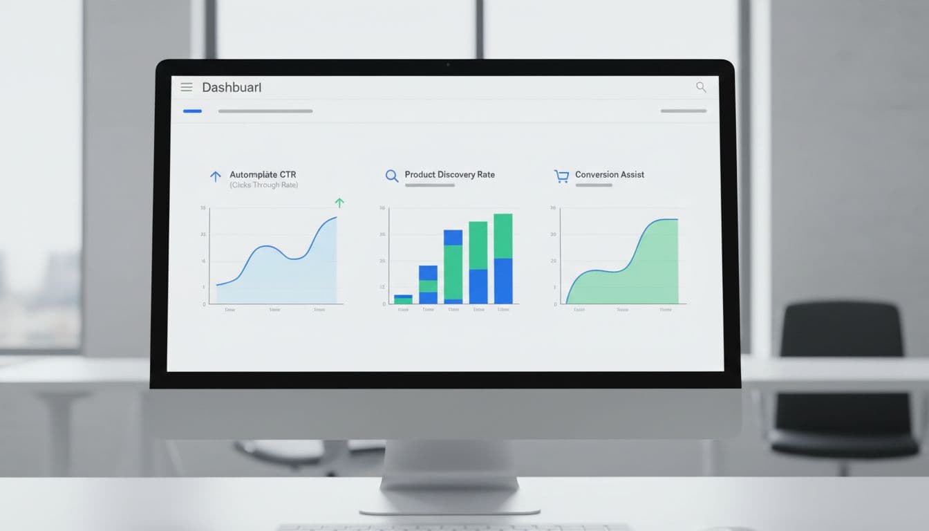
Focus on five metrics:
- Autocomplete CTR: the share of search sessions that produce a click from the dropdown.
- Product discovery rate: the share of autocomplete interactions that lead to a product page or useful listing page.
- Search refinement rate: how often shoppers rewrite the query after using suggestions.
- Conversion assist: orders where autocomplete played a role earlier in the session.
- Zero-result rate: how often the journey still ends with no useful results.
A healthy search autocomplete UX usually lifts CTR and discovery while lowering refinements and zero results. However, one metric alone can fool you. High CTR with weak product discovery often means the panel is persuasive, but poorly ranked.
Mobile deserves its own pass. Keep the search field visible, make rows thumb-sized, and stop the keyboard from covering top suggestions. Preserve the typed query while users inspect options. Also, avoid jitter. If items jump around between keystrokes, people lose their place.
Accessibility issues often hide inside “working” components. Support expected keyboard behavior, arrow keys move through options, Enter selects, Escape closes, Tab exits cleanly. Use proper combobox semantics and clear focus styling. Screen readers should hear concise, stable updates, not a burst of announcements on every character. For touch users and keyboard users alike, predictability is part of usability.
In short, autocomplete should feel like a smart store associate, not a slot machine. When the system predicts intent, ranks with discipline, and respects mobile and accessibility needs, product discovery improves in ways teams can actually measure. Better discovery starts before the results page ever loads.