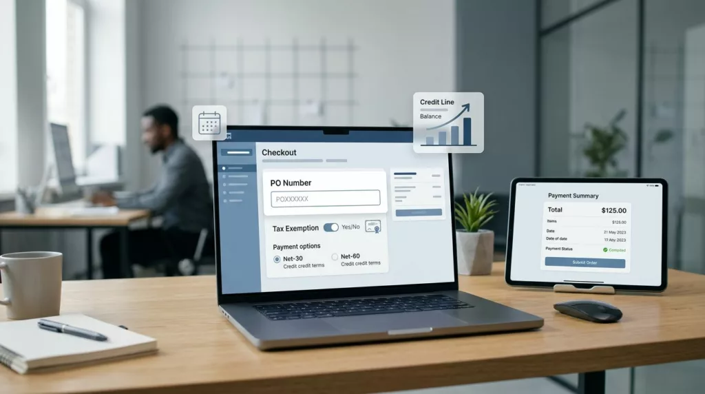
Designing Net Terms Checkout UX for B2B Ecommerce Stores
A checkout built for cards can disrupt cash flow management for B2B e-commerce stores the moment terms enter the picture....
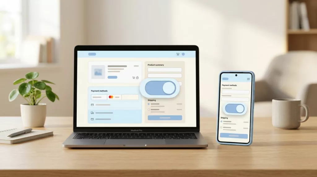
Billing Address Toggle UX That Cuts Checkout Errors
A billing address toggle can save more checkout sessions and improve the checkout experience more than a long list of...

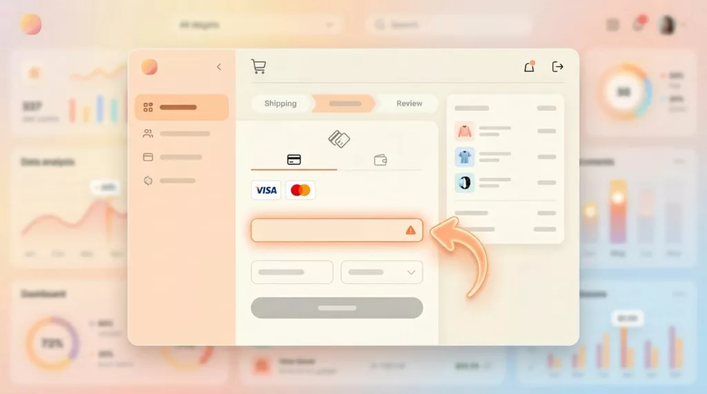
Credit Card Form UX Patterns That Cut Payment Errors
A checkout can lose a sale because of one mistyped digit. That is why credit card form UX still matters,...
Payment Failure Recovery UX That Saves More Checkouts
A failed payment doesn’t always mean a lost sale. More often, it means a poor customer experience where the checkout...

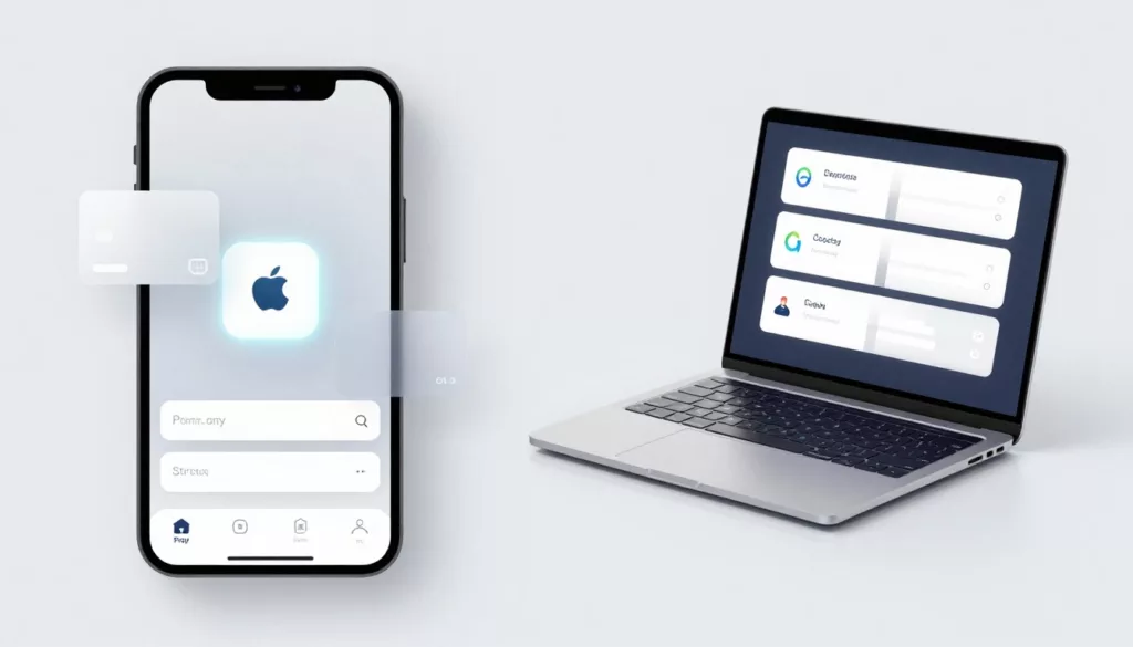
Payment Method Selector UX That Reduces Checkout Hesitation
A shopper can tolerate one more field. They usually won’t tolerate one more decision. That’s why the payment method selector...
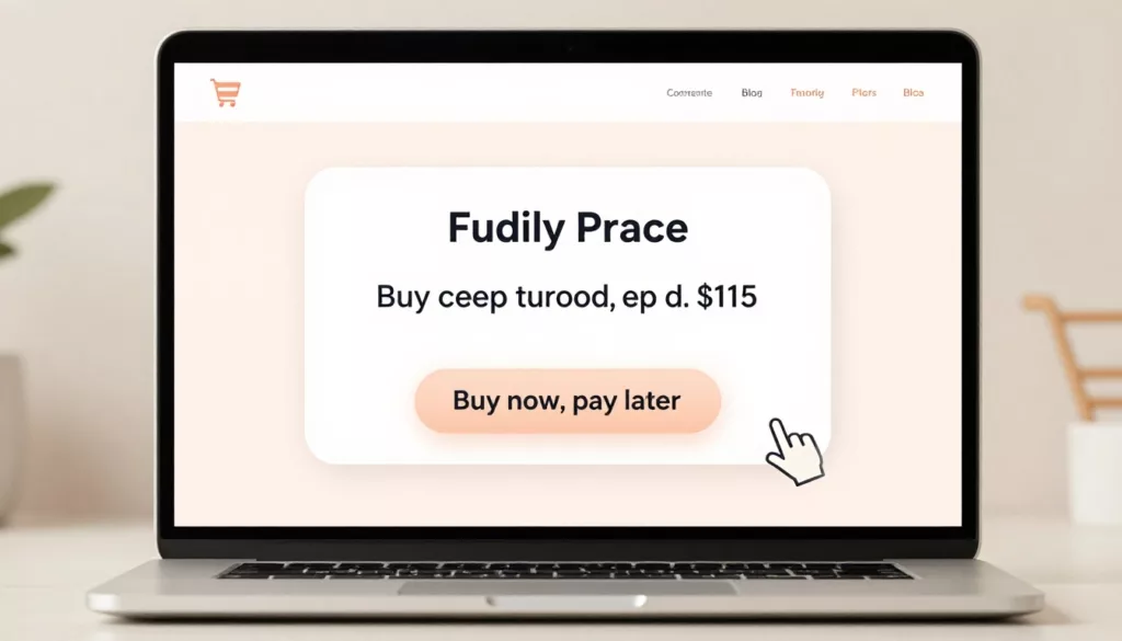
BNPL UX That Increases Conversion Without Trust Gaps
The fastest way to lose a BNPL sale is to make it feel slippery. Shoppers use buy now, pay later...
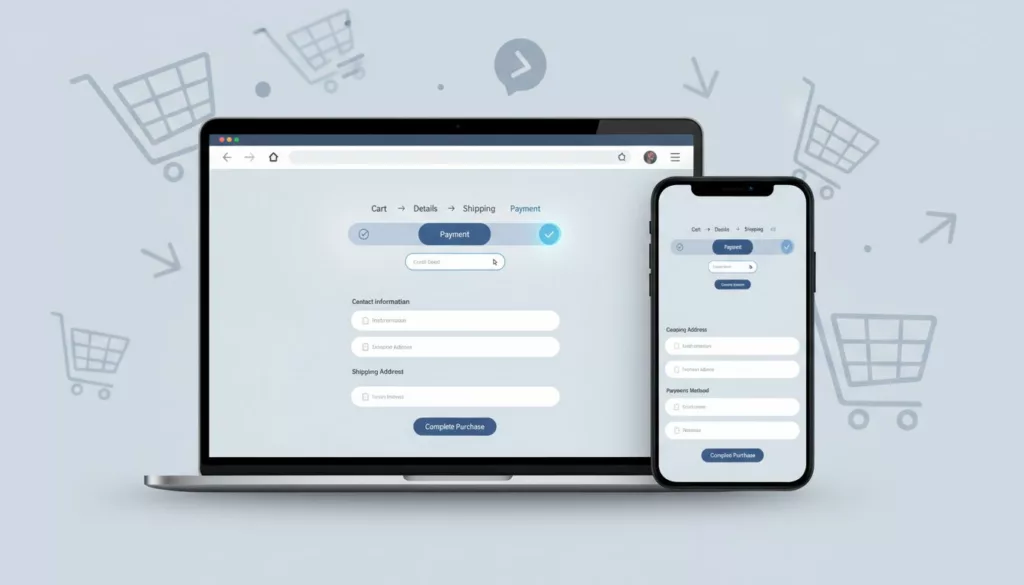
One-Page Vs Multi-Step Checkout for Ecommerce in 2026
Your checkout is like a cashier line. If it looks slow or confusing, shoppers leave before they pay. In 2026,...

Pre-Order Page UX Patterns That Prevent Refunds And Chargebacks
Pre-orders run on trust. The buyer is paying for a promise, not a box on a doorstep. When that promise...
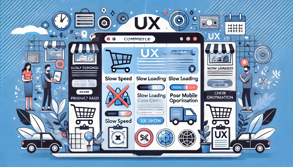
Checkout UX Fixes That Reduce Cart Abandonment, 21 practical changes (with examples)
Checkout is your cashier line. A high Cart Abandonment Rate here directly tanks your Ecommerce Conversion Rate. If it feels...
Challenging UX Mistakes To Avoid On E-commerce Sites
Understanding your audience inside and out isn’t just helpful; it’s downright essential. It all begins with user research. Ignore it,...