Your cart page is the last “pause” before checkout, and pauses invite doubt. If shoppers can’t confirm the total, delivery, and returns in a few seconds, they back out. That’s why a strong cart page UX checklist is a critical tool for improving the user experience (UX), less about design polish and more about removing reasons to hesitate.
In 2026, the cart abandonment rate still sits around 70 to 77% across studies, and mobile is usually worse (often 73 to 85%). Those aren’t “checkout process” problems only. Many drop-offs start in the cart, serving as the entry point to the final checkout process, when fees appear late, controls feel fiddly, or the next step isn’t obvious.
What a cart page must do in 2026 (before you tweak anything)
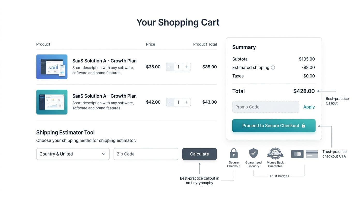
A shopping cart summary has one job: protect intent within the checkout process. Shoppers already said “yes” on the product page. Now they want proof they won’t get surprised.
Three expectations keep showing up in user experience (UX) research and analytics reviews:
First, cost clarity. If shipping costs, taxes, or fees are unclear, people assume the worst. The cart is where you either confirm the real total, or you create anxiety.
Second, control without friction. Users must adjust quantity, remove items, and change variants without page reloads or confusing UI states.
Third, trust and compliance cues. These are essential for the user experience (UX). People notice security signals, privacy details, and accessibility issues more when money is involved. If your cart feels risky, the sale dies quietly.
If you want a broader view of checkout flow priorities for this year, skim an updated eCommerce checkout optimization UX guide for 2026, then bring the same “costs and confidence” mindset back to the cart.
Also, cart UX doesn’t live alone. It connects to your site-wide patterns, content, and performance. A quick refresher on user experience strategies for checkout success helps teams align cart changes with the rest of the funnel.
The cart page UX checklist (downloadable-style table)
Use this table as a sprint-ready checklist and QA guide.
| Cart UX item | What good looks like | Common pitfall | How to test/measure |
|---|---|---|---|
| Product images and descriptions | High-quality product images with zoom capability, clearly visible product images for each item, detailed product descriptions | Blurry or low-res product images, incomplete product descriptions, or no zoom | Item interaction rates, time spent on cart items, support tickets about products |
| Transparent totals | Subtotal and total prominently shown with shipping, tax, discounts, fees clearly broken out and consistent | “Estimated” totals with no explanation, or fees revealed only at checkout | Cart-to-checkout rate, exit rate on cart, “unexpected cost” survey responses |
| Shipping estimator (early) | ZIP/postcode estimator in cart, remembers location, supports split shipping if needed, shows free shipping threshold | Estimator hidden behind links, or resets after edits | Usage rate of estimator, conversion by estimator use, support tickets about shipping |
| Delivery promise | Clear delivery window, ship-by date, or “arrives by” with conditions | Vague “standard shipping” language that doesn’t answer timing | Checkout completion by promise visibility, late delivery complaints, return rate |
| Returns snapshot | Short returns policy summary near totals, links to full policy | Long policy blocks, or policy only in footer | Clicks to returns page, abandonment after viewing policy, post-purchase NPS |
| Quantity and remove controls | Stepper plus direct input (desktop), undo for remove, wishlist option as alternative, no page reload | Tiny tap targets, accidental removals, or quantity updates that lag | Rage clicks, time on cart, error rate on quantity updates |
| Stock and backorder clarity | “In stock”, low stock, or backorder date shown per item | Hiding backorders until checkout or post-purchase email | Cancellation rate, backorder support contacts, conversion on low-stock items |
| Upsells, cross-sells, and related products | Subtle upsells and cross-sells, related products suggestions at bottom, easy to dismiss | Aggressive upsells that block flow, irrelevant suggestions | Upsell take rate, dismissal rate, impact on overall conversion |
| Discount codes handling | Field for discount codes available but visually secondary, supports auto-apply links | Discount codes field steals attention and triggers “I should search” behavior | Discount codes field engagement, conversion by discount codes users, A/B on field placement |
| Primary CTA clarity | One dominant primary CTA “Checkout”, consistent label, sticky on mobile | Competing CTAs, unclear next step, or disabled button with no reason | CTA click-through rate, scroll depth before click, heatmaps |
| Trust and payment cues | Trust badges, customer reviews snippets, payment options logos, additional trust badges, security note, and fraud protection copy near CTA | Overloaded badge wall, or none at all | Conversion by device, payment method selection, checkout-start completion |
| Guest checkout | Prominent guest checkout option, no forced account creation, clear toggle or default | Mandatory login to proceed, hidden guest path | Guest conversion rate, abandonment at login prompts, checkout starts by user type |
| Accessibility and compliance basics | Keyboard focus, contrast, error text announced, privacy link near data entry | Focus removed, color-only errors, unclear consent or tracking notices | Accessibility QA (keyboard only), form error rate, legal/compliance review outcomes |
If you fix only one thing, fix surprise costs. Nothing kills intent faster than a total that changes at the last second.
To cross-check patterns against more examples, this roundup of ecommerce shopping cart optimization strategies can help you spot gaps you’ve normalized.
Mobile Optimization Cart UX that Reduces Cart Abandonment Rate
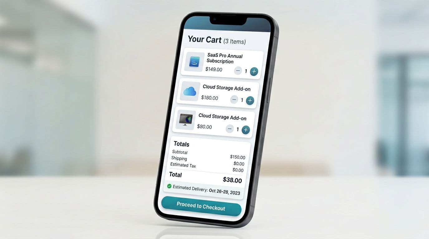
Mobile cart user experience (UX) fails in predictable ways: cramped controls, totals pushed below the fold, and a call to action button that disappears once users scroll. Treat the cart like a remote control, not a brochure. Big buttons, clear feedback, and no “where did the CTA go?” moments.
A few practical defaults for 2026:
- Sticky button checkout call to action button with safe-area padding, plus visible subtotal and total above it.
- Tap targets at least 44 × 44 px for quantity, remove, and collapsible sections.
- Instant UI feedback on quantity changes (disable double taps, show a small “Updated” state).
- No layout jumps when promo, shipping, or financing widgets expand.
If your team already works on sticky purchase actions on product pages, reuse those component rules here. The transition from mini cart to the main cart page requires strong visual hierarchy to keep subtotal and total visible above the fold. These mobile add-to-cart button design patterns translate well to sticky cart CTAs because they solve the same thumb-reach and feedback problems.
Microcopy that reduces hesitation (steal these patterns)
Microcopy should answer “What will it cost?” and “What happens if it doesn’t work out?” without sounding like legal text.
Shipping and delivery:
- “Shipping calculated at next step (enter ZIP). No extra fees at delivery.”
- “Arrives Tue to Thu with Standard Shipping.”
Returns and exchanges:
- “Free returns within 30 days. Final sale items excluded.”
- “Easy exchanges, we’ll send a return label.”
Fees and totals:
- “Tax shown after address. You’ll see the full total before paying.”
- “No handling fees.”
Cart errors (plain, fixable):
- “That code doesn’t match this cart. Check spelling or remove spaces.”
- “We couldn’t update quantity. Please try again (your cart is saved).”
For more checkout-focused UX language patterns, this checkout page UX guide offers good phrasing ideas you can adapt back into the cart.
Error prevention, accessibility, and compliance-friendly trust cues
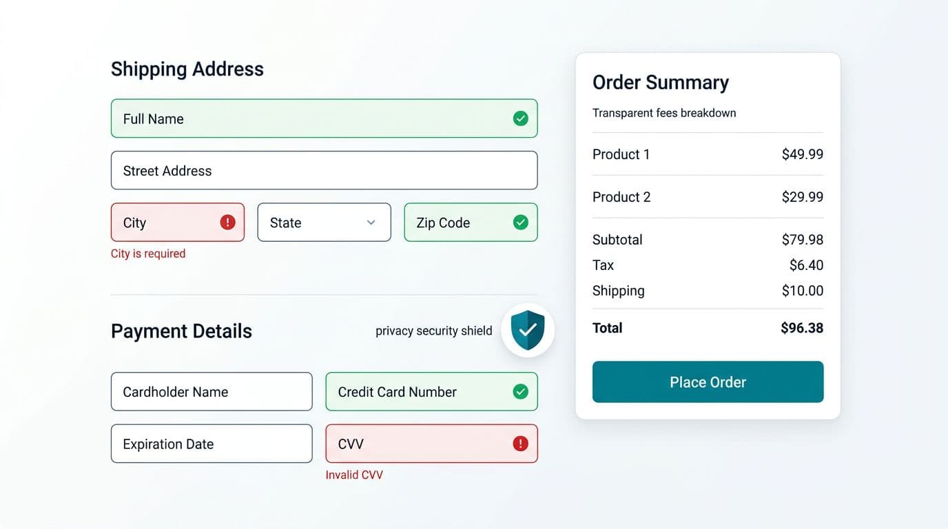
Cart issues often look small in QA, yet they hit real shoppers hard. A confusing error state, a missing focus ring, mismatched product images, or unclear product descriptions in the mini cart can turn purchase intent into avoidance.
Start with prevention:
- Validate promo codes, inventory, shipping constraints, and payment options inline, without full-page errors.
- Preview payment options like express pay and Buy Now Pay Later clearly to build trust.
- When something fails, keep the shopper in control with a clear next action (“Try again”, “Remove item”, “Choose another shipping method”, or “contact support”).
- Ensure product images and product descriptions in the cart match the main page previews and mini cart for consistency.
- If you collect location for shipping estimates, show a short privacy cue near the input, plus a link to your policy; reconfirm shipping costs and guest checkout paths upfront.
- Display social proof such as customer reviews near the call to action button.
Accessibility is part of conversion protection. If a user can’t adjust quantity with a keyboard, navigate wishlist or related products easily, or read low-contrast totals on mobile, you’re quietly excluding buyers. Build cart QA around keyboard navigation, visible focus, readable font sizes, and error text that doesn’t rely on color alone.
Finally, measure what changed. Don’t rely on “it looks better.”
Track:
- Cart-to-checkout click-through rate (by device)
- Coupon field opens and subsequent conversion
- Shipping estimator usage and conversion lift
- Error events (promo, inventory, quantity update)
- Support tickets tagged “shipping costs” and “can’t checkout”
Conclusion
A cart page doesn’t need more features, it needs fewer doubts. A conversion-friendly user experience (UX) relies on this cart page UX checklist to make totals clear in the shopping cart summary, controls easy with the continue shopping button and edit cart options, and trust cues obvious, especially on mobile or with guest checkout. Then validate the work with funnel metrics and error tracking, not opinions. Your next conversion lift might come from one sentence of microcopy and one removed surprise fee.