Most teams treat the thank you page like a receipt. Customers treat it like a front desk.
Right after purchase, people ask the same things: “Did it go through?”, “What happens next?”, “When will it arrive?”, “How do I log in?”, “Can I change my address?”, “What if I need a refund?” Strong thank you page UX answers those questions fast, helping mitigate buyer’s remorse, then offers the next best action.
This playbook is an essential tool for digital marketing experts looking to improve their conversion rate through an optimized thank you page. It gives you a practical layout order, four plug-and-play templates, microcopy you can paste today, plus tracking and testing ideas for 2026 expectations (privacy, accessibility, and AI support).
Start with the right module order for your confirmation page (so people don’t get lost)
A high-performing confirmation page has one job above the fold: confirm success and show the next step. Everything else supports that.
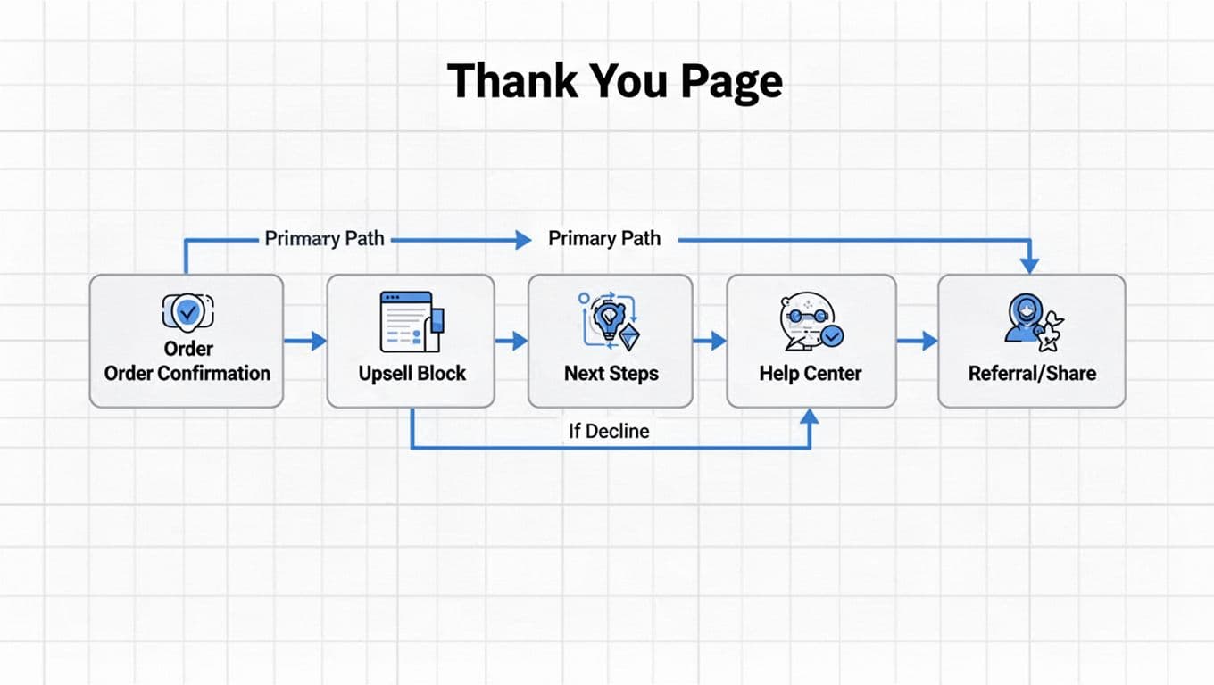
Recommended confirmation page module order (works for SaaS and ecommerce)
- Confirmation header: “Order confirmed” or “You’re in” plus date/time.
- Order summary: items, price, taxes, shipping method, billing, and “download invoice”.
- Primary call to action (one button): “Track order”, “Create password”, or “Book onboarding” to guide next steps.
- Contextual upsell (one offer): add-on that fits what they just bought.
- Setup and expectations: shipping window, access instructions, renewal terms, seat limits.
- Self-serve help: top 5 FAQs, returns policy, change address, manage subscription.
- Contact options (last): chat or ticket, with smart routing.
Two 2026 rules make this order work better:
- Privacy expectations: keep personalization explainable. If you recommend an add-on, don’t imply you “watched” them. Also, avoid auto-opting people into marketing. If you need consent, ask clearly.
- Accessibility and mobile responsiveness: treat this as a core page, not a marketing page. Use strong color contrast, clear focus states, keyboard-friendly accordions, and meaningful headings (WCAG 2.2 patterns) for optimal user experience.
For more layout inspiration, compare a few modern patterns in confirmation page examples that convert.
If customers can’t find “what happens next” in 5 seconds, you’ll pay for it in tickets.
Four thank you page templates you can copy this week
Each template below includes a wireframe description and modules in the right order. These thank you page templates can be implemented in any modern landing page builder. Keep the layout consistent across devices, then personalize the content.
Template A: Physical goods ecommerce (ship-to-home)
Wireframe: Confirmation header at top, order summary card, “Track your order” button, add-on offer, shipping timeline, FAQ accordion, then contact.
Modules: Confirmation → Order summary → Track order → Upsell add-on → Shipping timeline → FAQ → Contact
Best upsell and cross-sell types: warranty, accessory, refill, bundle upgrade.
Template B: SaaS purchase (new account created)
Wireframe: “You’re in” header, plan and seats summary, “Account creation: Set password” primary CTA, secondary “Invite teammate”, upgrade offer, setup checklist, help.
Modules: Confirmation → Plan summary → Account creation → Invite team → Upsell upgrade → Setup steps → Help/FAQ → Contact
Best upsell types: more seats, annual plan, priority support, onboarding call.
Template C: Digital product (instant access)
Wireframe: Confirmation, download/access card with “Open now”, license key (copy button), recommended add-on, how-to-start steps, FAQ for downloads and refunds.
Modules: Confirmation → Access card → License info → Upsell add-on → Getting started → FAQ → Contact
Best upsell types: templates pack, advanced module, extended license.
Template D: Subscription (reorder, box, consumables)
Wireframe: Confirmation, next ship date, “Manage subscription” primary CTA, swap or add-on offer, pause/cancel rules, FAQ, social sharing buttons, then contact.
Modules: Confirmation → Next ship date → Manage subscription → Add-on offer → Policy clarity → FAQ → Social sharing buttons → Contact
Best upsell types: add-on item, bigger size, faster shipping upgrade.
Microcopy pack (paste and tweak)
Use short, specific copy. Avoid hype. Make the “no thanks” path feel safe.
- Upsell block microcopy
- Headline: “Add a charger now (ships with your order)”
- Body: “Most customers grab this to avoid slow charging later (social proof from thousands of reviews).”
- Price line: “Add for $19, no extra shipping”
- CTA: “Add to my order”
- Decline: “No thanks, keep my order as is”
- Help/FAQ block microcopy
- “When will my order ship? Most orders ship in 1 to 2 business days.”
- “Need to change your address? Update it within 2 hours of purchase.”
- “Returns: Start a return within 30 days, print a label instantly.”
- Order/account next steps microcopy
- “Next: Create your password to access your dashboard.”
- “Your receipt is in your email. Download an invoice here too.”
- “Want faster setup? Book a 15-minute onboarding call.”
- Social sharing buttons microcopy
- Label: “Share your subscription love!”
- Include social sharing buttons for easy posts on social media.
- Referral program block microcopy
- Headline: “Refer a friend, build loyalty”
- Body: “You both get credits on next orders.”
- CTA: “Join referral program”
If you want a broader checklist of common thank you page elements, skim eCommerce thank-you page best practices and adapt the parts that match your support volume.
Reduce tickets with clarity first, contact second
A ticket usually starts as confusion in the user journey. Your page should remove the common triggers before the user hits chat, boosting customer retention.
Add “ticket killers” as short, scannable anticipatory content modules
Put these right below your upsell or next steps:
- Shipping timeline: show a range and the carrier handoff moment. Example: “Processing: 1 to 2 business days. Delivery: 2 to 5 business days after ship.”
- Change window: “Edits allowed for 2 hours” with a button to self-serve.
- Cancellations and returns: summarize eligibility, then link to the flow. Don’t hide fees.
- Login and setup (SaaS): “Your login email is @. Reset password if you didn’t get the invite.”
- Receipts and invoices: one-click download, plus where it was emailed.
Do/Don’t table for confirmation page UX
Use this table as a build review before shipping your confirmation page, the starting point for next steps.
| Do | Don’t |
|---|---|
| Put one primary CTA under the confirmation page | Show three equal CTAs that compete |
| Offer one relevant upsell with a clear benefit | Stack multiple offers and popups |
| State shipping/setup expectations in plain words | Send users to hunt in email for basics |
| Put self-serve actions before contact | Push everyone into chat for simple tasks |
| Use accessible accordions and headings | Hide FAQ in tiny links or low-contrast text |
| Confirm what email/number you used | Make users guess where updates will go |
| Explain data use for personalization | Personalize in a “creepy” way |
| Let users decline an upsell gracefully | Guilt users with harsh decline copy |
For email alignment (so the thank-you page matches what arrives in the inbox via your email marketing efforts and builds customer loyalty), see how to build a thank-you page for ecommerce and SaaS.
Track what matters and test without annoying customers
Good design needs proof. However, don’t “measure” by collecting more personal data than you need. In 2026, people notice. For some businesses, the thank you page is a great place to offer a secondary lead magnet to reinforce the value proposition.
Engagement metrics event tracking schema (names + properties)
Capture these events with minimal, non-sensitive properties. Hash identifiers if needed, and keep PII out of analytics tools.
| Event name | When it fires | Key properties |
|---|---|---|
thank_you_viewed | Page load | order_id, source, device_type, is_logged_in |
next_step_clicked | Primary CTA click | cta_name, destination |
upsell_viewed | Upsell module enters view | offer_id, placement, price |
upsell_added | Upsell accepted | offer_id, value, payment_type |
upsell_declined | Decline link clicked | offer_id, reason_prompt_shown |
faq_opened | FAQ item expanded | faq_id, topic |
self_serve_started | Return/address change/subscription flow started | flow_type |
contact_initiated | Chat, email, or form opened | channel, intent_selected |
Simple experimentation roadmap (quick wins vs high effort)
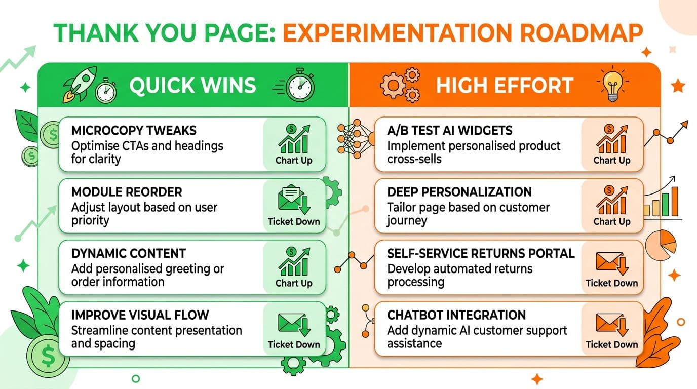
Here’s the rollout plan that usually pays off first:
| Quick wins (1 to 3 days) | High effort (2 to 6 weeks) |
|---|---|
| Reorder modules so “Next step” is above the fold (consistent design across the flow strengthens brand recognition) | Offer engine with eligibility rules per SKU/plan |
| Replace vague shipping text with a clear range | AI support widget that cites policy sources |
| Add top 5 FAQs based on ticket tags | Customer feedback loops for conversion optimization |
| Simplify upsell to one offer and one benefit | A/B testing with intent-based routing and authenticated self-serve |
One caution: AI support widgets can lower tickets, but only if they answer with policy-backed sources and offer clear handoff. Otherwise, they create new tickets.
Conclusion
The thank you page, or confirmation page, is the most overlooked asset in digital marketing post-conversion strategies, where trust either settles in or starts to wobble. Tight thank you page UX confirms the order, guides the next step, and answers predictable questions before they become tickets. Start with module order, ship one template, then measure upsell clicks and deflected contacts. After that, test carefully and keep privacy and accessibility as non-negotiables, making the thank you page a powerful tool for trust and growth.