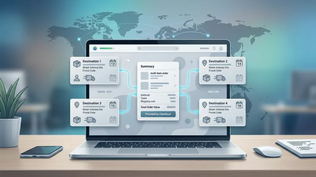

One order can now ship to five, ten, or fifty destinations, and B2B buyers expect that to feel normal. If your checkout still assumes one cart, one address, and one final delivery date, it creates friction right when the buyer is ready to spend.
In 2026, multi-address shipping UX is less about adding fields and more about reducing work. Buyers need to move fast, but they also need PO numbers, saved ship-to lists, split shipments, delivery windows, and approvals that fit their internal process.
That means the best checkout flows don’t try to hide complexity. They organize it, then keep the buyer in control. The sections below show how to do that without slowing the order down.
Why B2B multi-address shipping feels different
B2C checkout usually answers a simple question: where should this order go? B2B checkout has to answer a cluster of questions at once. Which branch gets which items? Which location needs freight? Who approves the order? Does finance need a PO? Can one line ship now while another waits for stock?
That difference matters because B2B buyers are not shopping for themselves. They are placing orders for stores, job sites, warehouses, plants, and departments. A single cart may cover several cost centers, several receiving teams, and several delivery dates. If the flow forces them into a home-delivery model, they end up copying data into spreadsheets or calling sales for help.
The right interface treats destination choice as part of the order, not as an afterthought. It lets a buyer assign items by destination, save those locations for later, and see shipping logic before payment. That matters even more for repeat buyers, because they already know the company rules and expect the system to remember them too.
Buyers will tolerate complex orders. They won’t tolerate a complex interface.
When you design for that reality, the checkout feels calmer. The buyer sees the shape of the order early, which reduces surprises at the last step.
Checkout patterns that work in 2026
The strongest B2B checkouts in 2026 follow a simple rule: show the shipping structure before you ask for payment. That usually means one cart can break into several shipment groups, each with its own address, method, and delivery date. It also means the interface should make it easy to edit those groups without losing the rest of the order.
Here’s a practical comparison.
| Checkout element | B2C default | B2B need | Better UX choice |
|---|---|---|---|
| Ship-to addresses | One address | Many destinations in one order | Let buyers assign by line item or shipment group |
| Shipping methods | One method per order | Parcel, freight, express, scheduled delivery | Show options per destination |
| Order ownership | One shopper | One buyer, many internal stakeholders | Support drafts, approvals, and shared review |
| Reordering | Nice to have | Common and expected | Save address books and prior shipping patterns |
The takeaway is clear. B2B checkout needs more branching, but the screen should still feel simple. Baymard’s checkout UX research keeps showing the same pattern, extra friction at the wrong step hurts completion. A clear multi-step flow helps too, and Digital Applied’s 2026 checkout guide makes a good case for visible progress indicators.
Good patterns are easy to spot. Buyers can add several destinations without leaving checkout. They can copy the same shipping method to multiple lines. They can see which items ship together and which items split off. They can change one address without resetting the whole order.
That matters because B2B orders are rarely static. Buyers edit them while they are checking stock, waiting on approval, or reacting to a delivery deadline. The interface needs to absorb those changes without punishing them.
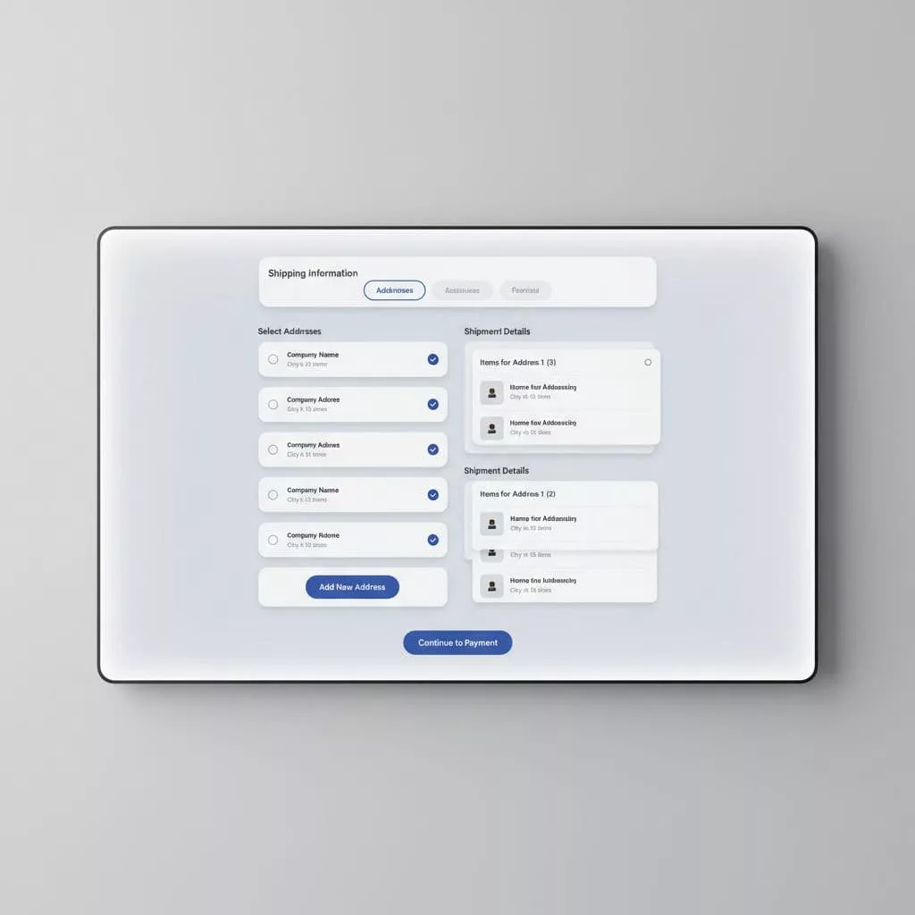
Saved address books, PO numbers, and approvals
A strong address book is more than a list of past shipments. It is a working tool for buyers who place the same types of orders every week. The best versions let them search by location name, job site, department, or internal code. They also preserve defaults for freight, delivery notes, and receiving hours.
That is where multi-address shipping UX gets more useful than basic address autocomplete. A buyer should not need to retype “Dallas warehouse” every time. They should pick it from a trusted account list, then move on. If a company has dozens of locations, the address book should support labels that make sense inside that company, not just standard postal data.
A few patterns help here:
- Keep address names editable by the account admin.
- Show the last used destinations first.
- Let buyers mark favorites for repeat orders.
- Validate delivery restrictions before payment, not after.
PO numbers need the same care. If the buyer must enter a PO, the field should appear at the point where it makes sense, usually after the ship-to step and before review. It should accept the format the business uses, then carry that value into the order record, confirmation, invoice, and admin view. The details matter, which is why many teams study purchase order field usability before they redesign checkout.
Account terms also change the flow. If your buyers use net 30 or net 60, a card-first path adds noise. The flow should fit the credit setup, not fight it. That is the reason designing B2B checkout for account terms is so closely tied to shipping UX. Approval logic, billing logic, and ship-to logic usually live in the same order.
Approvals should feel visible, not hidden. If a manager must review the order, show the state of the draft and what still needs sign-off. If procurement needs a PO before release, say so clearly. Buyers do not mind process steps when they can see them.
Split shipments, freight, and delivery timing
Multi-address shipping gets messy when shipping methods differ by location. One branch may get parcel delivery. Another may need freight with a liftgate. A third may require an appointment window because the receiving dock closes at 3 p.m. If your checkout treats all of those as one generic shipping choice, buyers lose trust fast.
The best pattern is to group by destination first, then by fulfillment method. That way the buyer sees why the order splits. Some items may ship from different warehouses. Others may be held for stock or combined to reduce cost. Either choice can work, as long as the buyer can understand it before placing the order.
This is also where delivery scheduling becomes important. B2B buyers often care less about the exact day and more about receiving the right load at the right time. If one destination needs weekday morning delivery and another can accept anytime, the checkout should reflect that. A simple date picker is not enough when receiving rules differ by site.
Tracking needs the same level of care. Each shipment should have its own status, and the order summary should make split shipments obvious. Otherwise the buyer sees one order number and no clue which package is delayed. That creates support tickets that could have been avoided.
A good receiving experience starts in checkout. If the buyer knows that items are splitting across destinations, they can warn the warehouse, notify site managers, or adjust the project schedule. That saves time on the back end and reduces blame when trucks arrive.
For teams handling bulk orders, this is where bulk order CSV upload UX connects nicely to checkout. Many buyers build large orders before they ever reach the shipping screen. If that input path is messy, the shipping flow inherits the mess.
Implementation choices that keep the flow fast
The best multi-address checkout can handle complexity without feeling heavy. That usually comes down to four choices. First, keep address data attached to the account, not trapped in the current session. Second, load shipping options as soon as the buyer assigns a destination. Third, keep errors close to the field that caused them. Fourth, preserve progress if the buyer steps away.
Validation matters early. If an address can’t accept freight, say so before payment. If a location has special hours, surface them before the buyer commits. If a region needs extra tax or delivery rules, show that before the final review. Buyers can deal with limits. They hate discovering limits after they think they are done.
It also helps to use a visible step structure. A compact order flow with a clear progress state reduces confusion, especially when the buyer is juggling multiple destinations. That does not mean adding more pages for the sake of it. It means giving the buyer a map. They should know where they are, what remains, and how to fix a mistake.
Mobile support deserves attention too. More B2B buyers now finish parts of the order on a phone or tablet. That means address selection, PO entry, and shipment review need touch-friendly controls. Tiny dropdowns and wide tables break down fast on a smaller screen.
Finally, connect checkout data to the systems that will use it next. Shipping rules often depend on ERP data, carrier rates, or account-level terms. If the checkout and back office disagree, buyers notice. So do support teams. A good implementation keeps the order record, invoice, packing slip, and shipment tracking in sync from the start.
Mistakes that make buyers leave
The most common mistake is forcing B2B buyers into a one-address mental model. If the cart only supports one ship-to field, buyers will work around it. They will split orders by hand, call customer service, or abandon the cart and come back later. None of those paths help conversion.
Another mistake is hiding the split logic. If items break into several shipments, say why. If one destination changes the shipping rate, show the reason near that destination. Silent changes feel like errors, even when they are correct.
A third problem is weak account memory. When a buyer has already saved twenty delivery locations, the system should not make them re-enter the same warehouse every month. If the address book is hard to search or poorly labeled, it defeats its own purpose.
Watch out for these traps:
- Requiring a PO number only at the final step.
- Showing freight options too late.
- Mixing billing and shipping concerns in one crowded form.
- Resetting the page when one destination has an error.
- Hiding per-shipment tracking after the order is placed.
Testing should mirror real B2B behavior. Don’t stop at a single buyer persona. Test with procurement teams, ops users, and repeat purchasers who already know the company rules. Then watch where they hesitate. The slowest step often reveals the real problem.
Small details matter in 2026 because buyers expect B2C speed, but they still live inside B2B rules. The winning checkout respects both.
Conclusion
Multi-address shipping in B2B checkout works when the buyer can see the order clearly and control each destination without extra effort. The best flows support saved address books, PO fields, approvals, split shipments, and delivery timing, then keep all of that out of the buyer’s way.
That is the real job of multi-address shipping UX in 2026. It turns a messy order into a readable one, which helps buyers place orders faster and with fewer mistakes.
If your checkout still treats every order like a single parcel, the gap is already visible. The stronger path is simpler, clearer, and built around the way B2B buyers actually ship.