
Net Terms Application UX That Speeds B2B Account Approval
Every extra field in a net terms application can slow a sale. Buyers expect trade credit approval for net terms...

Fit Finder UX to Reduce Returns
In apparel e-commerce, returns usually start before checkout, not after delivery. When shoppers can’t tell how a garment will fit,...
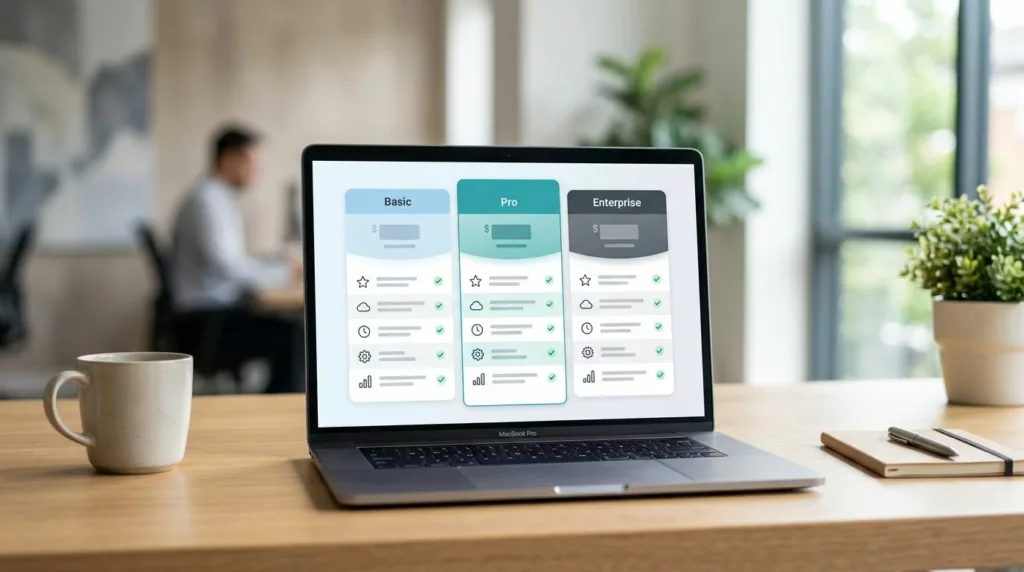
Tiered Pricing Table UX That Speeds B2B Buying Decisions
Buyers rarely leave a pricing page because the price is too high. They leave because poor pricing page design hurts...
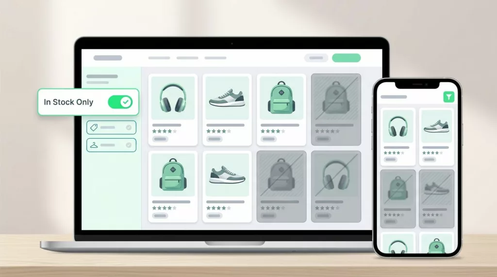
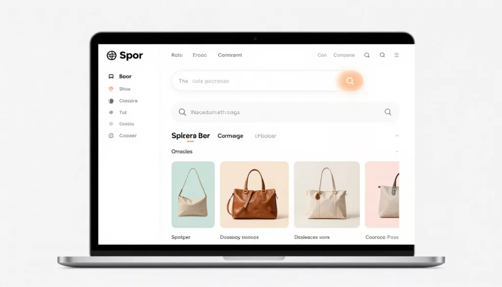
In-Stock Filter UX That Cuts Dead-End Product Browsing
Shoppers do not mind narrowing their options through sorting and filtering in filter UX. They mind wasting time on products...

Pickup Point Selector UX That Cuts Delivery Friction
Pickup point selection looks simple until shoppers have to use it. Then the clock starts, because every extra search, vague...
Category Page No-Results UX That Keeps Shoppers Moving
An empty category page looks small, but it can waste high-intent traffic fast. Shoppers have already chosen a path, applied...

Address Autocomplete UX That Turns Long Forms Into Faster Checkouts
A shopper can forgive one extra tap. They rarely forgive a long, error-prone address form in the e-commerce checkout. For...

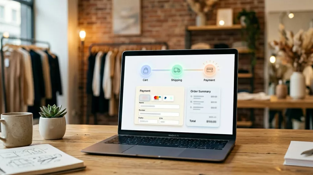
Payment Method Selector UX That Reduces Checkout Hesitation
A shopper can tolerate one more field. They usually won’t tolerate one more decision. That’s why the payment method selector...
Checkout Progress Indicator UX That Reduces Step Anxiety
Few things drain checkout momentum faster in online retail than not knowing how much is left. When shoppers hit payment...
Empty Cart UX Patterns That Bring Shoppers Back
An empty shopping cart page can feel like a dead end. If it only says your cart is empty, you...