
Shoppers can spot a trap fast. If your product page makes the buying model feel slippery, trust drops before price even matters.
That’s why subscription selector ux deserves more attention than a simple toggle or radio button. You’re asking people to choose between a single purchase and an ongoing relationship, so the interface has to feel clear, fair, and easy to compare.
A strong selector lowers friction and raises confidence. That’s where the real lift comes from.
Make the purchase choice feel like one clear decision
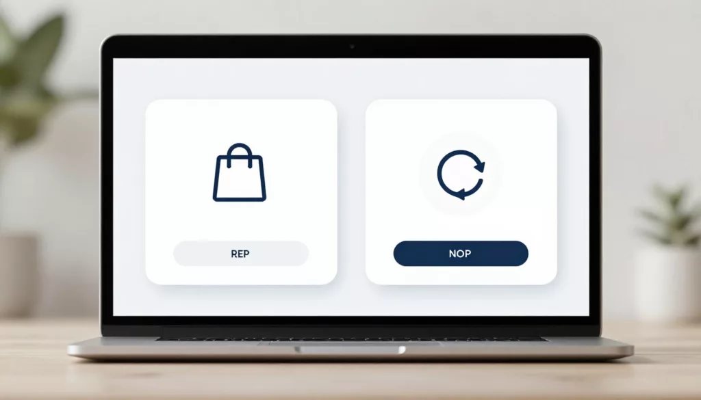
The best selectors treat one-time purchase and subscription as two options inside one decision block. Put them close to the product price, variant choices, and primary CTA. Don’t split them across separate modules or hide one inside an accordion.
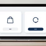
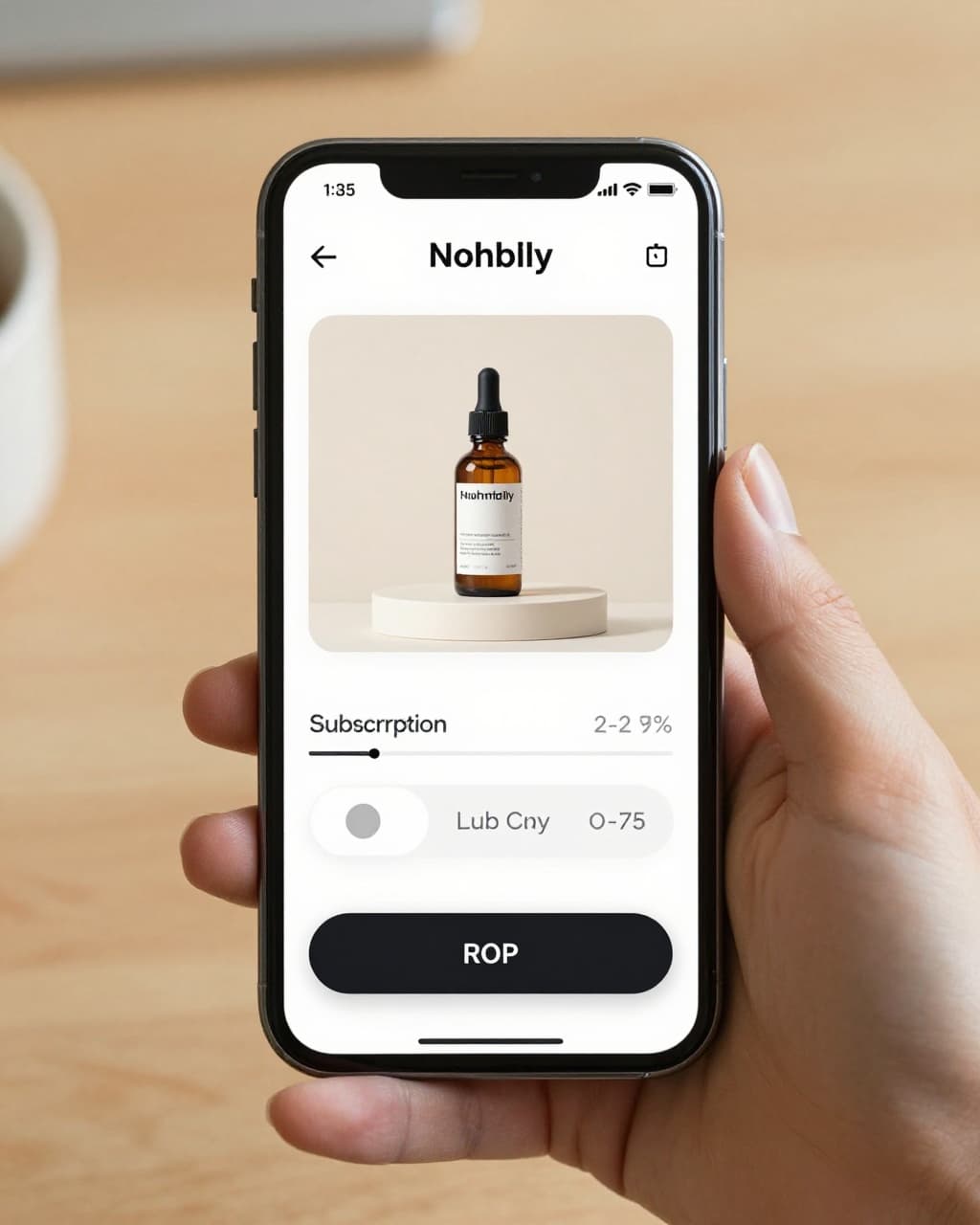
Use large, clickable cards or radio rows with a strong selected state. A shopper should know what’s active in one glance. Color alone isn’t enough. Add a border, icon, or filled background too.
Keep the labels plain. “One-time purchase” beats “Buy once.” “Subscribe and save” works better than vague wording like “Auto-delivery plan.” If the subscription has frequencies, show the first available cadence right away, then let users change it after selection.
A few selector choices make a big difference:
| Selector detail | Better pattern | Risky pattern |
|---|---|---|
| Option layout | Side-by-side cards or stacked radio rows | Tiny text links |
| Default state | Neutral or user-informed default | Preselected subscription without context |
| Frequency control | Visible after subscription is chosen | Always visible, even for one-time buyers |
| Terms summary | Short line under the option | Hidden behind tooltip only |
Defaulting to subscription can lift short-term attach rate. Still, it can also hurt trust, increase support load, and lower conversion quality. If you do preselect it, the choice must stay obvious and easy to reverse.
A subscription option should feel like a clear offer, not a hidden contract.
Keep supporting details close. Shipping timing, refill logic, return rules, and billing cadence shouldn’t live on another page alone. When buyers need more context, pair the selector with product page FAQ UX patterns that answer common concerns without forcing an exit.
Show pricing and subscription benefits without playing tricks
Pricing clarity is where many selectors fail. The shopper needs to know what they pay now, what they’ll pay later, how often they’ll be charged, and why the subscription is worth it.
That means each option should show its own full price presentation. If the one-time price is $32 and the subscription price is $27 every 30 days, say that plainly. If the first order is discounted more than future orders, say that too. Don’t let the lower first price carry the whole sales pitch.
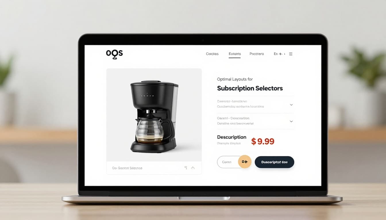
This is the minimum detail worth showing near the selector:
| Must-show detail | Why it matters |
|---|---|
| Per-order price | Sets the immediate cost clearly |
| Delivery or billing frequency | Prevents false expectations |
| Savings basis | Shows whether savings are real and ongoing |
| Cancellation or pause policy | Reduces commitment anxiety |
| Subscription perks | Explains the tradeoff beyond price |
Benefit messaging should stay concrete. “Save 15%,” “free shipping on recurring orders,” or “skip any shipment” works. “Best value” doesn’t tell the shopper much.
Avoid dark patterns here. Don’t gray out the one-time option. Don’t bury the cancel policy in fine print. Don’t use guilt-heavy copy when someone picks the non-subscription path. CRO gains that come from confusion are fragile. They often show up later as higher churn, refund requests, and angry tickets.
Cancellation transparency matters on the product page, not only in account settings. A short line like “Pause, skip, or cancel anytime” can calm hesitation fast, but only if it’s true. If the subscription has a minimum term, spell it out.
This part also connects to the post-purchase experience. If customers can’t manage the plan easily later, the product page promise falls apart. That’s why strong subscription management UX tips support better subscription conversion quality, not only more starts.
Design for mobile, accessibility, and honest testing
On mobile, the selector has to work with a thumb, limited space, and distracted attention. That changes the layout. Two cramped columns often fail on phones, so stacked cards usually work better. Keep tap targets large, spacing generous, and the selected state obvious.
If the product also has size, flavor, or bundle choices, avoid making the buyer manage too many controls at once. First pick the variant, then the purchase model. Many of the same patterns from mobile variant picker UX tips apply here because both problems come down to touch clarity and decision order.
Accessibility matters too. Group the options in a proper fieldset with a clear legend. Make the whole card tappable, not only the radio circle. Support keyboard focus, visible focus states, and screen reader labels that announce price and cadence. Also, don’t rely on green for “subscribe” and gray for “one-time” without text cues.
When the selection changes price, shipping, or perks, announce that update. For sighted users, show it inline near the selector. For screen readers, use a live region. Hidden changes feel like bugs.
Finally, test the selector like a revenue surface, not a design ornament. Track add-to-cart rate, subscription attach rate, checkout start, 30-day cancellation, and support contacts. If attach rate goes up but early cancellations spike, the UX didn’t improve.
A few A/B tests usually pay off:
- Card layout versus simple radio rows.
- Savings-first copy versus flexibility-first copy.
- Terms under each option versus a shared disclosure below.
- Neutral default versus remembered customer preference.
The winning version is the one that improves both conversion and confidence.
A shopper shouldn’t need detective skills to choose how to buy. The best subscription selector ux makes the difference between one-time purchase and subscription easy to scan, easy to trust, and easy to change.
Start with clarity, then test from there. Audit your selector on mobile, with a keyboard, and with real cancellation questions in mind, because trust is what turns a recurring order into a healthy one.