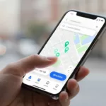

A shopper who wants your nearest store isn’t browsing, they’re deciding. If your store locator UX is slow, vague, or hard to use on a phone, that visit can disappear in seconds.
For multi-location brands, the locator now sits between search and sale. It helps people find a store, confirm services, and start actions like pickup, delivery, or reserve online. Done well, it cuts guesswork and moves people from intent to action.
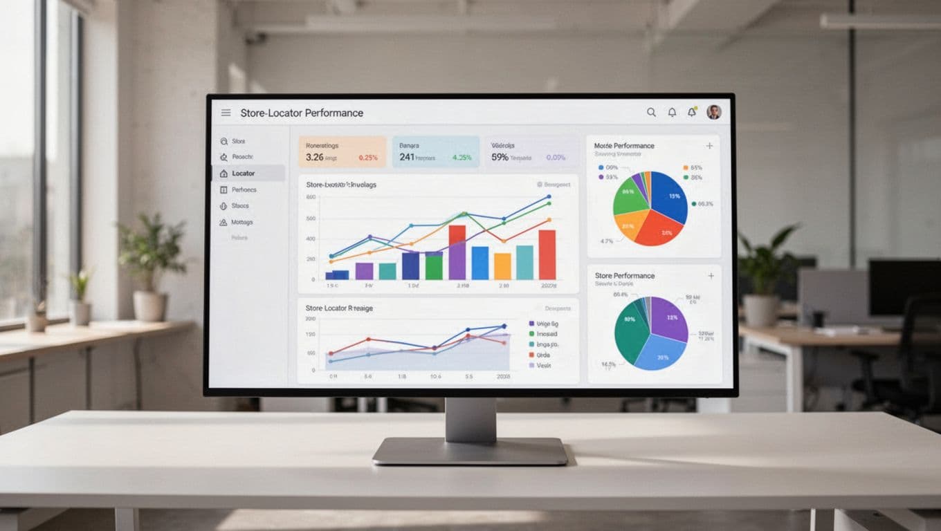
Why store locator UX now affects local revenue
Many location pages still act like a static directory. Shoppers expect more. They often arrive from Google Search, Maps, or a location extension with strong local intent. They want the closest store, current hours, available services, and a fast next step.
That makes the locator a conversion page, not a support page. When it answers the next question fast, customers tap directions, call the store, or place a local order. When it doesn’t, they bounce or pick a competitor nearby.
Current 2026 retail data shows that more than 60% of store searches happen on phones. The same trend data also points to click-and-collect and BOPIS lifting sales by 20% to 30%. So the locator has a direct link to revenue, not only discovery.
Mobile speed matters because people often search while commuting, comparing options, or already near a store. A locator that loads in under two seconds keeps momentum. A slow map or heavy script breaks it.
A store locator isn’t a directory. For local-intent shoppers, it’s the last step before the visit.
Brands that treat the experience like a real landing page usually get better results. These store locator design examples that convert show a clear pattern: strong locators combine search, trust signals, and action buttons instead of dropping users into a generic map.
For retail, that means surfacing stock and pickup options early. For restaurants, it often means clear filters for delivery, drive-thru, dine-in, or curbside. In both cases, the goal stays the same. Help users choose a location with confidence, then let them act without friction.
The features that turn a locator into a local conversion tool
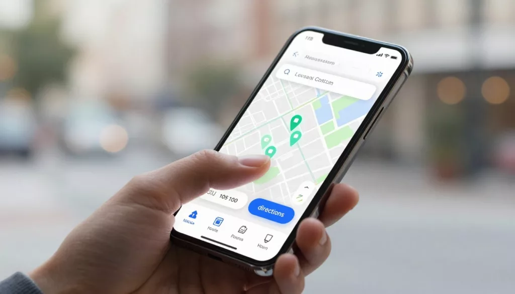
Start with search. Let people enter ZIP code, city, neighborhood, or use current location. Then offer filters that match the business model. Pickup, same-day delivery, curbside, returns, pharmacy, EV charging, or wheelchair access are not extra details when they decide the trip.
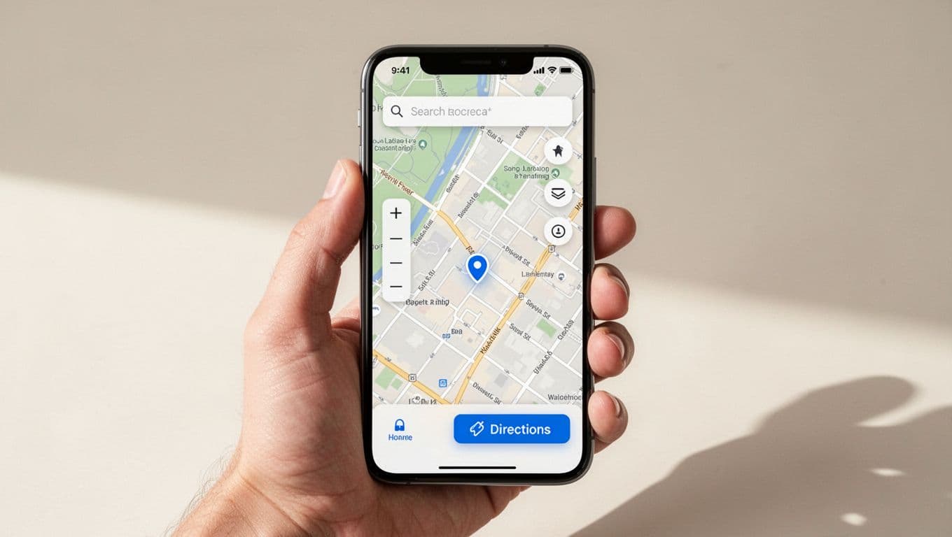
Each result card should do more than show an address. It should show today’s hours, distance, services, and one clear primary action. On mobile, that action is often directions. For shoppers close to purchase, it might be “Order pickup” or “Reserve now.”
A high-performing locator usually includes a few basics:
- A search bar that stays easy to find.
- Filters tied to real services, not internal labels.
- A map view and a readable list view.
- One-tap actions for directions, calling, and local ordering.
Accessibility also shapes conversion. As of 2026, people expect large tap targets, keyboard support, clear focus states, strong color contrast, and a text-based store list that works without the map. Add support for reduced motion, label every control, and don’t hide key details behind hover states. If a screen reader can’t tell someone which store is open now, the design is incomplete.
Local order flows need special care. If a location offers pickup, delivery, or reserve online, say so before the user enters checkout. Show cut-off times, stock status, and when the order will be ready. Then keep that message consistent on the location page, product page, cart, and confirmation screen. If you’re improving pickup after store selection, this guide to BOPIS pickup UX to cut store confusion is a useful next step.
These UX best practices for store locator pages reinforce the same point: the best locators reduce choices to the few details shoppers need right now.
Measure the steps that lead to visits and local orders
A better locator should change behavior, not only page views. Start by tracking the actions that show local intent: directions taps, click-to-call, “set my store,” pickup starts, reserve-online starts, and completed local orders. Break those metrics out by device, because mobile users behave differently and often convert with fewer page views.
This simple scorecard keeps teams focused on real outcomes.
| Metric | Why it matters |
|---|---|
| Directions clicks | Strong signal of store-visit intent |
| Call taps | Shows unresolved questions or high purchase intent |
| Pickup or reserve starts | Connects the locator to local revenue |
| Load time and map errors | Reveals friction before conversion |
The pattern is often easy to read. If directions clicks are high but order starts are low, your location pages may hide service availability. If searches succeed but bounce rate stays high, the results may lack trust signals like real hours, holiday updates, or service badges.
Field testing matters, too. Open the locator on an average phone, step outside one of your stores, and try common tasks with one thumb. Search by ZIP code. Tap directions. Switch to pickup. Turn on a screen reader. That small test often reveals problems dashboards miss.
Mobile expectations keep rising, as shown in these 2026 store locator software must-haves. Teams should review location data feeds, page speed, and accessibility with the same discipline they bring to checkout. After all, both journeys ask the customer to take the next step with confidence.
A strong store locator UX removes the last bits of doubt. It helps shoppers choose the right location, start the right action, and arrive with fewer questions.
Audit your locator like a customer on a phone, not like a team inside a meeting room. If directions, service filters, or pickup steps feel slow, fix those first.
Run that test this week at one of your busiest stores.