
A quote can stall for days while the buyer sends the same update request to sales, finance, and legal. That email pileup usually points to a visibility problem, not a difficult customer.
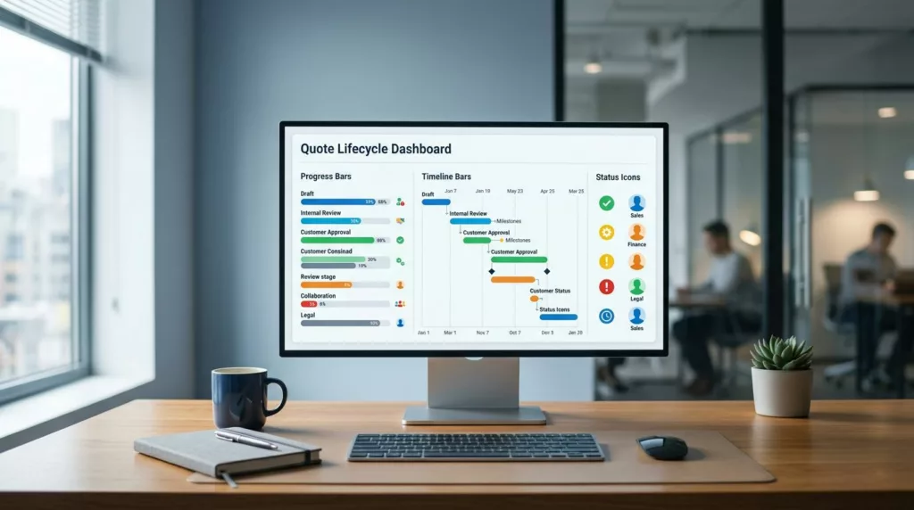
A strong quote status dashboard gives everyone the same answer at a glance. It shows where the quote is, who owns it, and what happens next, so people stop guessing and start moving.
When the status, timeline, and action cues are clear, follow-up emails drop fast. The best dashboards do this without adding clutter, so the details still feel easy to read.
Why quote follow-up emails pile up
Most quote workflows get messy after the rep hits send. The buyer can no longer see the next step, and the internal team may be juggling approval, pricing, and contract review in separate tools.
That gap creates the same question over and over: “What is happening with my quote?” If the dashboard cannot answer it, the inbox becomes the tracking system.
A useful dashboard answers four questions right away:
- Where is the quote now?
- Who owns the next move?
- What is blocking approval?
- When should someone follow up?
Once those answers are visible, fewer people need to ask for status by email. The buyer gets less frustrated, and the sales team spends more time closing deals than repeating updates.
The key is to design for decisions, not decoration. A pretty card that hides the owner or the delay is still a dead end.
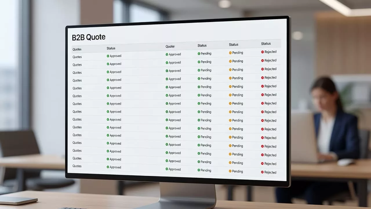
Status labels that answer one question
Status names should map to a real action. “In progress” and “Pending” sound harmless, but they force the buyer to decode the workflow.
A good label tells the user what stage the quote is in and what to expect next. It should also match how your team works, so support and sales use the same language.
| Status state | What the buyer needs to know | Useful dashboard cue |
|---|---|---|
| Draft | Can this still change? | Show the owner and last edit time |
| Sent | Has it reached the buyer? | Show sent date and view status |
| Waiting on approval | Who is blocking it? | Show approver name and age in state |
| Needs info | What is missing? | Show the exact missing item |
| Approved | What happens next? | Show conversion or next step |
| Expired | Can it be renewed? | Show a clear renewal path |
That kind of table is easy to scan, and it forces the team to think in terms of user needs. If a status does not help a buyer act, it probably belongs in an internal log, not the visible dashboard.
Microcopy that removes guesswork
Tiny bits of copy do a lot of work here. “Waiting on your approval” is better than “Pending.” “Needs one missing file” is better than “Action required.”
Short helper text also lowers anxiety. A buyer who sees “Reviewed by finance today, next review at 3:00 PM” can relax, because the process feels real.
If a status label hides the next step, it will create another email.
The same rule applies to timestamps. “Updated 12 minutes ago” beats a vague “Recently updated” every time.
Layout patterns that keep status visible
The dashboard should answer the status question in the first few seconds. That means the current state, owner, and next action need to sit near the top.
Put the current state first
A small status chip works well when it sits beside the quote name. Follow it with the amount, buyer name, and updated time. That order helps the eye move from identity to condition.
A simple top row might read like this:
- Quote 1042
- Acme Manufacturing
- Waiting on approval
- Updated 18 minutes ago
- Owner: Maya in Sales
That single line gives the buyer context and gives the rep a place to act. It also reduces the need for the usual “just checking in” email.
Below the headline area, use a timeline that shows key events in plain language. “Sent,” “Viewed,” “Approval requested,” and “Waiting on finance” tell a better story than a generic activity feed.
Make filters work for shared accounts
Shared accounts often need more than one view. A procurement lead wants approvals. A rep wants stalled quotes. A manager wants aging deals.
That is where filters earn their keep:
- by status, so users can isolate stalled or approved quotes
- by owner, so reps can see their own queue
- by age, so old quotes surface first
- by last activity, so fresh actions stay near the top
Saved views help even more when different roles share the same account. The same principle shows up in improving B2B order history dashboard UX, where one view rarely fits every user.
A good filter bar should feel light, not crowded. If the controls are hard to understand, buyers will fall back to email because it feels faster.
Escalation cues that prevent silent stalls
A quote only feels stuck when the dashboard stays silent. If the system knows a quote has sat too long, it should say so.
The most useful escalation cues are simple:
- age in state, such as “Waiting 2 days”
- ownership, such as “Assigned to Priya”
- next action, such as “Finance review due Thursday”
- trigger point, such as “Reminder sends in 4 hours”
These cues help both sides. Buyers see that work is moving, even if slowly. Internal teams get a clear nudge before the thread fills with emails.
Different states need different cues. A quote waiting on customer input should show the exact missing item. A quote stuck in legal review should show the reviewer and the date it was assigned. A quote past its SLA should change tone and make the delay obvious.
If you support high-touch sales, connect the dashboard to the quote-to-order handoff. The same clarity matters after approval, which is why B2B quote-to-order user experience design is so closely tied to quote visibility.
A buyer should never need to wonder whether a quote is lost or simply waiting. The dashboard should answer that before the email draft gets opened.
What to measure after launch
Good UX should show up in the numbers. Start with the metrics that reflect actual friction, not vanity counts.
Track these:
- follow-up emails per quote
- average time spent in each status
- quotes resolved without human follow-up
- percent of quotes older than your SLA
- self-serve status views versus support replies
If emails drop but cycle time stays flat, the dashboard may look clear without driving action. If cycle time drops but buyers still write for updates, the labels probably need more detail.
Watch the stuck states closely. They usually reveal the weakest step in the process, such as approval routing, missing documents, or unclear ownership. Those are the places where better microcopy and stronger escalation cues have the biggest payoff.
Buyers also notice consistency. When the dashboard, email, and rep conversation all use the same status language, confidence goes up. That matters because confidence keeps people from chasing updates before they are needed.
Conclusion
A strong quote dashboard does one job well, it tells people where the quote stands and what happens next. That clarity cuts down on follow-up emails because buyers no longer have to ask for the status they can already see.
The best versions use plain status names, short microcopy, visible ownership, and clear escalation cues. They also keep filters and timelines close at hand, so busy users can find what they need fast.
If your team is still fielding “any update?” messages all day, the dashboard is probably missing one of those pieces. Fix the visibility first, and the inbox gets quieter on its own.