

Shoppers can forgive a lot, but they won’t forgive not seeing the product. On most product detail pages, the media gallery is the closest thing to holding an item in hand in the online shopping experience, so tiny UX choices carry a lot of weight.
This guide breaks down practical product media gallery UX patterns for zoom, swipe, and video, with product imagery that drives first impressions and interaction details you can hand to engineers. The goal is simple: help people inspect faster, feel confident sooner, rely less on customer reviews, and commit with fewer doubts.
The baseline gallery: structure, ordering, and clear states
A gallery on ecommerce product pages should feel like a good store display: predictable layout, obvious controls, and no surprises. Before you add fancy media, get the skeleton right. If you want broader PDP layout guidance, pair this with research-backed e-commerce design best practices.
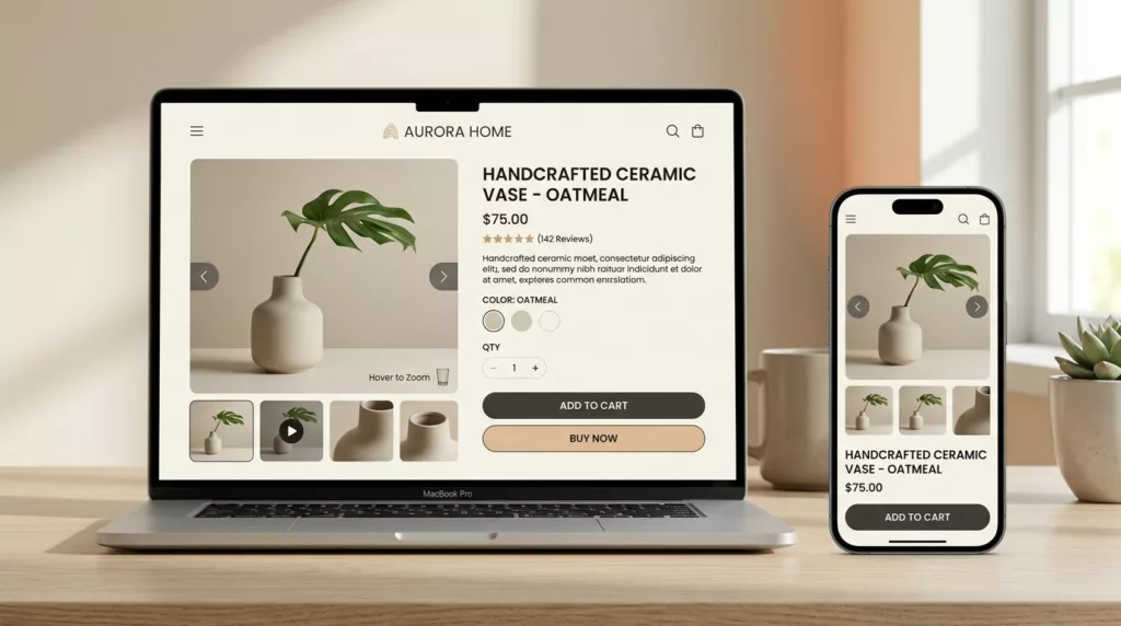
Pattern: Main stage + thumbnail strip (mixed media)
When to use: Almost always, especially when you have 4+ assets or mixed types (images, video, 360).
Behavior (interaction details):
- The main stage shows the selected asset, with a visible current state (selected thumbnail image, index, or both).
- Thumbnail images support tap/click, keyboard focus, and programmatic selection (for variants).
- Mixed media thumbnails use recognizable badges (play icon for video, spin icon for 360), and keep the hit area consistent.
Do:
- Keep the first thumbnail as the “best angle” (front or most informative).
- Preserve selection state when users scroll the page and return.
- Use skeletons for thumbnail images and a stable aspect ratio for the main stage to support accessibility.
Don’t:
- Hide media behind tiny dots only (hard to scan and hard to target).
- Reflow the page height when switching between assets.
Accessibility notes:
- Thumbnails need an accessible name (for example, “Image 3, back view”).
- Keyboard users should move through thumbnail images with Tab, and activate with Enter/Space.
- Announce selection changes politely (ARIA live, restrained).
Implementation tips:
- Preload the next 1 to 2 assets after first interaction, not on initial load.
- Serve responsive images (srcset) and clamp max width to prevent oversize downloads.
- Proper navigation and user experience design in the image gallery prevent layout shifts.
If people can’t quickly confirm “Is this the right item?” with strong product imagery, they’ll scroll, bounce, or hunt for reviews instead.
Pattern: Media ordering that matches decision questions
When to use: Any category where fit, finish, or condition matters (apparel, furniture, resale, beauty).
Behavior (interaction details):
- Put “decision-critical” views early: scale, texture, closure, underside, and any included accessories.
- If product variations exist, switching a product variation should update the gallery while keeping the user’s current “type” of view when possible (for example, stay on “side view” across colors).
Do:
- Treat the first 5 assets as your pitch deck.
- Add one “context” shot early (lifestyle images), then return to detail.
Don’t:
- Lead with video if it delays first paint or blocks fast scanning.
Accessibility notes:
- Ensure focus does not jump unexpectedly on product variation change.
- Respect reduced motion when animating asset transitions.
Implementation tips:
- Cache product variation media responses and reuse decoded thumbnails across product variations.
- Avoid shifting thumb positions when adding badges.
Zoom functionality UX: hint, intent, and a lightbox that earns its space
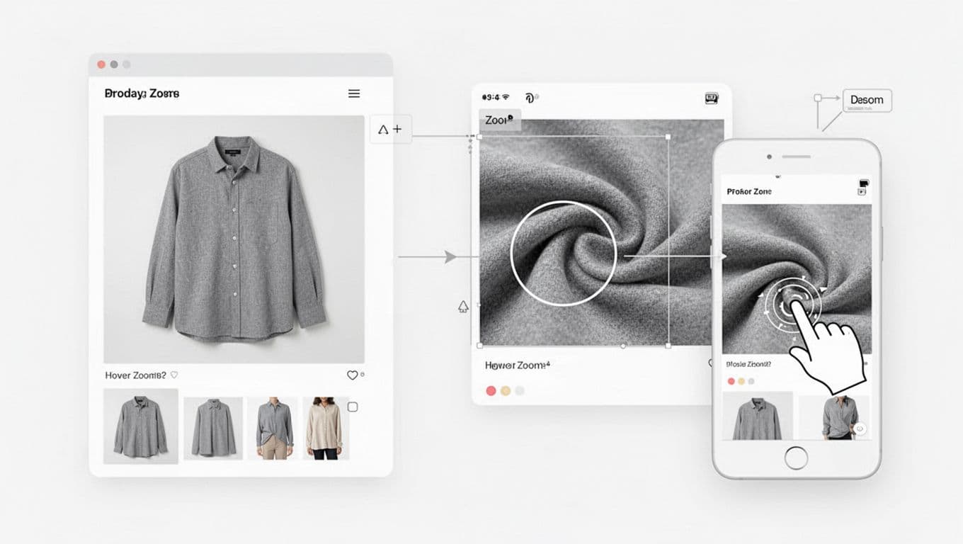
Zoom functionality is confidence fuel. If you offer it, it has to show real detail, not a blurry lie. Baymard’s testing highlights why high-resolution images and true zoom matter for purchase decisions, see Ensure Sufficient Image Resolution and Zoom.
Pattern: Zoom affordance + “progressive zoom” levels
When to use: Products with texture, craftsmanship, or specs people inspect (fabric, jewelry, electronics ports).
Behavior (interaction details):
- Desktop: show a subtle zoom affordance (icon or cursor change) in the image gallery. Support click-to-zoom, not hover-only. The image gallery should provide immediate feedback to user intent.
- Mobile: open lightbox on tap, then allow pinch-to-zoom inside the modal.
- Provide at least two zoom levels, so the first zoom feels immediate.
Do:
- Start zoom at the tap point (don’t force center).
- Keep a clear close control, plus swipe down to dismiss (optional).
Don’t:
- Trap users in zoom with no obvious exit.
- Disable page scroll unless the lightbox is open.
Accessibility notes:
- Lightbox must trap focus, then return focus to the trigger on close.
- Support Escape to close and arrow keys to move between assets.
- Don’t rely on hover to reveal essential info.
Implementation tips:
- Load high-res only on zoom intent (tap/click on main image).
- Use tiled or progressive images for deep zoom when assets are huge.
- Keep decoding off the main thread when possible; zoom jank kills trust.
For teams tuning the full product detail page journey, this fits nicely alongside guidance to optimize user experience in e-commerce stores.
Swipe UX on mobile: fast browsing without gesture fights
Swiping through product media should feel like flipping through photos in a chat. The risk is conflict: vertical scroll, horizontal swipe, pinch zoom, and add-to-cart all compete for the same thumb, creating gesture fights that impact user experience.
A useful research lens is the mobile gallery case study Swipe, Scroll, Add-To-Cart, which shows how small-screen gestures and mobile responsiveness shape shopping behavior.
Pattern: Horizontal swipe with “where am I?” feedback
When to use: Mobile-first PDPs, especially when thumbnails are below the fold.
Behavior (interaction details):
- Swiping changes assets with a clear snap. Keep momentum low, accuracy high.
- Show an index (like 3/10) or a subtle progress bar in the user interface for orientation.
- Update selected thumbnail image after swipe, and auto-scroll thumbnail images to keep it visible.
Do:
- Allow swipe on the main stage, not only on thumbnails.
- Keep tap targets near edges clear, so users don’t accidentally trigger zoom.
Don’t:
- Use full-screen swipe zones that hijack vertical scrolling too easily.
Accessibility notes:
- Provide non-gesture alternatives (thumb taps, arrow buttons).
- Keep focus visible and predictable as users change assets.
Implementation tips (gesture conflicts):
- Use directional locking after a short threshold (for example, 10 to 15px).
- Disable swipe while pinched zoom is active, then re-enable on reset.
- If the add-to-cart is sticky, test overlap and thumb reach for smooth navigation through the gallery; related patterns in mobile add-to-cart button design patterns often affect how safe swipe feels and user experience overall.
Video and 360 patterns: add clarity, not load time
On ecommerce product pages, video should answer a question product imagery can’t. Otherwise it’s just bytes. For a practical gallery-focused overview, compare your approach with best practices for a product image gallery and selective guidance like product image gallery best practices.
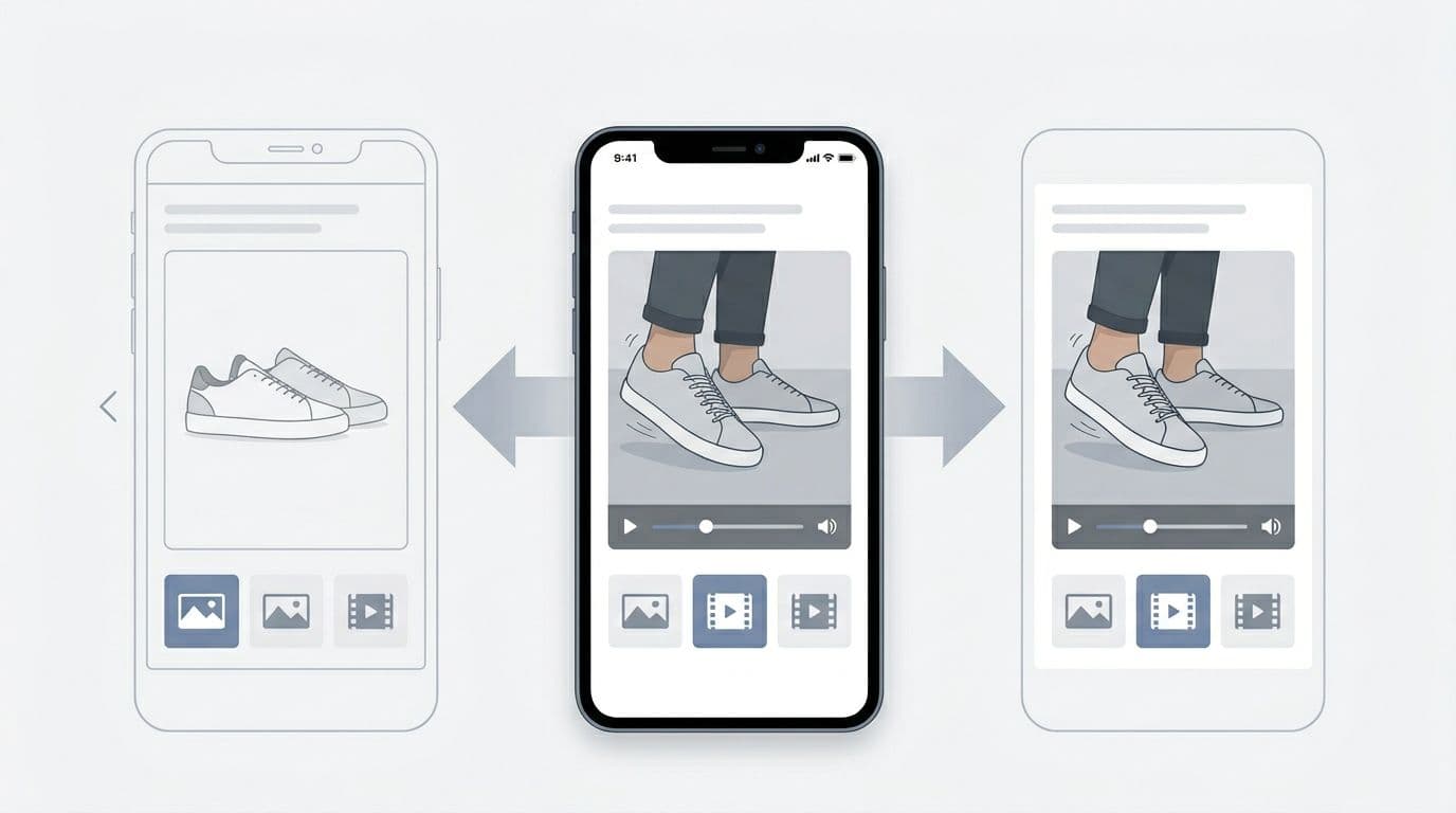
Pattern: Product video thumbnail with controlled playback
When to use: Demonstrations (movement, fit, assembly), or “proof” moments (shine, drape, before/after).
Behavior (interaction details):
- Product video appears as a thumbnail with a play badge and a poster frame.
- Tap opens inline playback in the main stage or in a lightbox, but keep controls consistent.
- Stop playback when the user swipes away or changes thumbnails.
Do:
- Use a strong poster frame, not a blank first frame.
- Mute by default, then let users unmute.
Don’t:
- Auto-play with sound.
- Replace the first image with product video if it slows initial load.
Accessibility notes:
- Provide captions or at least a transcript option if audio conveys meaning.
- Ensure controls are keyboard reachable and labeled.
Implementation tips (loading strategy):
- Lazy-load the product video player only after interaction, otherwise use a lightweight poster.
- Serve adaptive streams when available, and cap initial bitrate on mobile.
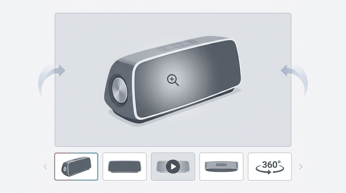
Optional pattern: 360-degree views for shape understanding
When to use: Products where form matters more than detail (shoes, bags, furniture).
Behavior: Drag to rotate, with clear reset and a “stop” state. High-end galleries may now include a 3D model viewer or augmented reality features.
Don’t: Hide key angles inside 360-degree views only; keep standard stills too.
Quick QA checklist for product media gallery UX
- The first image provides a clear visual representation of size and proportion, answering “What is it?” in under one second on 4G, while supplementing the product description.
- Media effectively supplements the product description and bridges to customer reviews.
- Include compatibility images to show real-world use alongside the core visual representation.
- Zoom shows real detail, and it exits cleanly.
- Swipe doesn’t block vertical scroll.
- Video has a poster frame, doesn’t auto-play sound, and pauses on navigation.
- Keyboard can reach thumbs, open lightbox, and close it reliably.
KPIs and analytics events to track
Set up events so teams can tie media behavior, user interface interactions, and customer reviews to conversion rate outcomes. Track how users bridge the gap between media, product text, and customer reviews for deeper insights.
| Event | Fire when | Why it matters |
|---|---|---|
gallery_thumbnail_select | User selects a thumbnail | Shows asset discoverability and ordering quality |
gallery_swipe_next | Swipe advances to next asset | Measures swipe adoption and “swipe depth” |
zoom_open | Lightbox or zoom activates | Indicates inspection intent and asset quality |
zoom_pan | User pans while zoomed | Detects whether detail exploration is working |
video_play | Video starts | Validates video value vs. novelty |
video_complete | Video ends | Useful for judging content length and engagement |
spin_360_interact | User rotates 360 | Confirms 360 usefulness vs. clutter |
ugc_interact | User engages with user-generated content | Gauges social proof and customer reviews impact |
review_media_view | Views media tied to customer reviews | Tracks how reviews enhance media-to-text bridging |
Conclusion
A strong product media gallery UX doesn’t feel fancy, it feels obvious. Start with predictable structure, then add zoom, swipe, and video in ways that match user intent and elevate the user experience. Finally, measure what people do, not what the team hopes they do. If your gallery answers questions faster, reducing the need for customer reviews while speeding up the purchase decision in the online shopping experience, the add-to-cart becomes the easy part.