
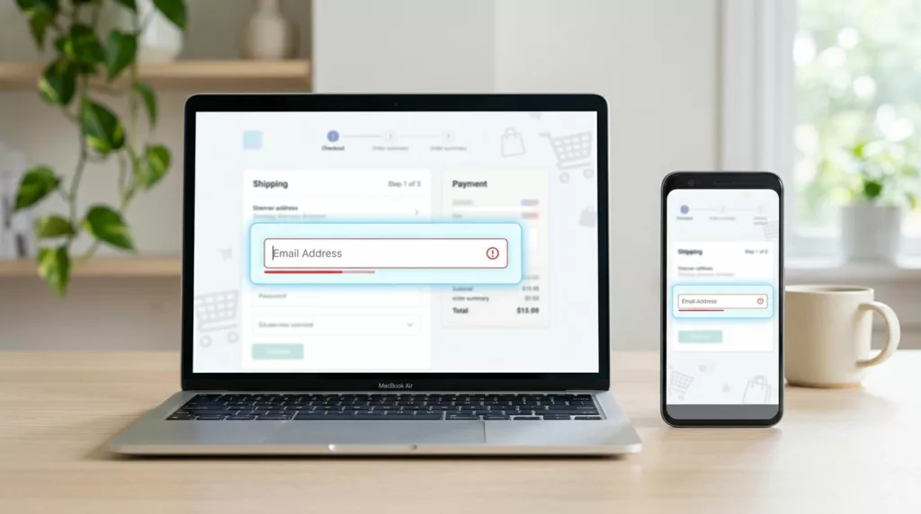

A single mistyped email address can wreck an otherwise smooth checkout. The order may go through, but the receipt, shipping updates, and password reset links won’t reach the customer.
That creates support work, lost trust, and avoidable friction. Good email field UX keeps shoppers moving, catches small mistakes early, and stops the form from fighting the person typing it.
Why checkout email typos happen so often
Shoppers reach the email field after they’ve already made several decisions. They have picked a product, chosen shipping, and committed payment details. At that point, they want speed, not another test.
That is why small slips happen. A thumb misses a key on mobile. Autocorrect changes a name. A pasted address includes a space. Sometimes the user types the right local part, then forgets a dot in the domain. Baymard’s checkout UX research keeps showing that form friction adds up, especially when a field looks simple but behaves poorly.
The fix starts with how the field is built. If the form makes people stop and think about every character, errors rise. If it accepts normal behavior and surfaces problems clearly, completion goes up.
That is also why broader checkout UX fixes to reduce cart abandonment should start with the fields shoppers touch most often.
Build one clear field that is hard to mistype
The simplest email field is often the best one. Use a single input, give it a visible label, and let the browser help where it can. type="email" gives a stronger hint than a plain text field, autocomplete="email" helps autofill, and autocapitalize="off" keeps mobile keyboards from changing the address in odd ways. Add spellcheck="false" too, because email addresses are identifiers, not prose.
Avoid placeholder-only labeling. A placeholder disappears the moment typing starts, which makes correction harder. Put the label above the field and keep helper text short. “We’ll send order updates here” works better than a long explanation.
Layout matters too. A full-width field is easier to scan on mobile. It also leaves room for error text without shifting other controls around. Short forms help here as well, and Shopify’s form UX best practices are a good reminder that clear structure beats extra decoration.
If your design system allows it, keep the field visually calm. Heavy borders, icons, and dense text can make a simple input feel more important than it is. The user should see one task, enter one address, and move on.
Validation that helps before the shopper submits
Validation should catch obvious problems without creating noise. The best pattern is to wait until the user leaves the field, then check again on submit. That gives them room to finish the address before the form starts talking back.
| Pattern | What it catches | Why it helps |
|---|---|---|
| Blur-time validation | Missing @, missing domain, bad spacing | Catches errors before the user reaches payment |
| Submit-time validation | Anything left unresolved | Prevents a broken order from moving forward |
| Plain-language message | Wrong format, incomplete address | Tells the user what to fix |
| Silent space trimming | Accidental leading or trailing spaces | Fixes a common paste mistake without extra work |
The message itself matters as much as the timing. “Invalid email” is weak because it doesn’t help the shopper recover. “Enter a complete email address, like name@example.com” is clearer and faster to act on.
The best error message is the one that appears before trust drops.
For more complex checkout forms, this same calm feedback pattern works across the page. It is the same idea behind credit card form UX best practices, keep the error near the problem and make the next step obvious.
When you can, normalize harmless input automatically. Trim leading and trailing spaces. Convert the domain to lower case. Keep the form from rejecting a valid address because of a tiny formatting slip. That kind of help feels invisible, and that’s the point.
Mobile keyboard choices make a bigger difference than you think
Email entry on a phone is a thumb exercise, not a typing exercise. If the keyboard makes the user hunt for @ and ., errors rise fast. Good input setup can remove that friction before it starts.
type="email" usually triggers a better keyboard on iOS and Android. Test it on both systems, because behavior can vary. On some devices, the email keyboard exposes common characters more quickly. On others, it still hides them behind extra taps, so the fallback behavior matters.
The field should also stay stable while typing. Don’t shift focus too early. Don’t collapse the form or jump the user to the next step before validation finishes. Those small changes break rhythm, and rhythm matters on mobile.
NNGroup’s mobile checkout guidance is useful here, because it treats the phone as a different environment, not a smaller desktop. People hold it one-handed, type in motion, and rely on autofill more often.
A few mobile checks are worth doing every time:
- Make the field large enough to tap without precision.
- Keep error text under the field, not far away.
- Leave enough spacing so the wrong control doesn’t get tapped.
- Test with one thumb, because that is how many people actually type.
The goal is simple. The keyboard should help the shopper enter the address once, not force them to edit it three times.
Paste, autofill, and confirmation should all work together
Many shoppers do not type their email at all. They paste it from a password manager, pull it from browser autofill, or choose a saved address. Your field should welcome that behavior.
That means the input needs to accept pasted text cleanly. Strip extra spaces. Keep hidden characters from triggering pointless errors. Do not block autofill with awkward markup or a custom component that ignores browser hints. The same habits that make checkout form address patterns work, stable labels, correct autocomplete tokens, and one job per field, also help email entry.
Confirmation strategy needs care. A second email field can reduce typos, but it also adds friction. Use it only when the risk is high, such as expensive subscriptions, B2B orders, or workflows where account recovery matters a lot. If you do use confirmation, label it plainly and place it close to the first field.
For many stores, a better option is a light review step later in checkout or a receipt preview after submission. That gives the user one more chance to notice a typo without making every shopper type the same address twice.
This is also where microcopy can help. A line like “We send order updates and receipts here” gives the field a clear purpose. It reminds the user why accuracy matters, without sounding alarmist.
Accessibility and testing catch the mistakes screenshots miss
An email field can look polished and still fail real users. Accessibility problems often hide in the small details, like contrast, focus order, and error text that only works by color.
Start with the basics. Keep the label visible. Use a clear focus state. Make error text readable without relying on red alone. If you show an error, connect it to the field so screen readers announce it. In a busy checkout, that small connection prevents confusion.
Test the field with assistive tech, not only in a browser. VoiceOver and NVDA can expose weak labels fast. So can browser zoom and dark mode. If the field breaks when text scales up, it is not ready for real traffic.
Measure what happens after launch too. Field-level error rate, correction loops, and time to completion tell you more than a screenshot ever will. If users keep failing on one domain or one device type, the problem is probably in the pattern, not the person.
The same discipline belongs in every checkout form, not only email. If a field is hard to see, hard to tap, or hard to fix, it will slow the order down. Good design removes those traps before they show up in support tickets.
Conclusion
Checkout email errors are small on the surface and expensive underneath. A good field accepts normal typing, supports autofill, and catches mistakes without interrupting the flow.
When the label is clear, the keyboard is right, and the error message is useful, shoppers move through checkout with less hesitation. That is the real test of email field UX, it should feel quiet when the address is right and helpful when it is not.