
On a phone, every extra reach, tap, and pause costs money. That’s why mobile bottom navigation has become one of the clearest UX wins for ecommerce in 2026.
The right bar cuts friction without adding clutter. Done poorly, though, it turns into a noisy strip that steals space and attention. That starts with knowing which actions deserve permanent space.
Why bottom navigation matters more on mobile shopping journeys
Most mobile sessions are task-driven. Shoppers want Search, Cart, or Orders fast. Recent mobile UX best practices for ecommerce keep making the same case: key actions should stay visible, not hidden in a menu.
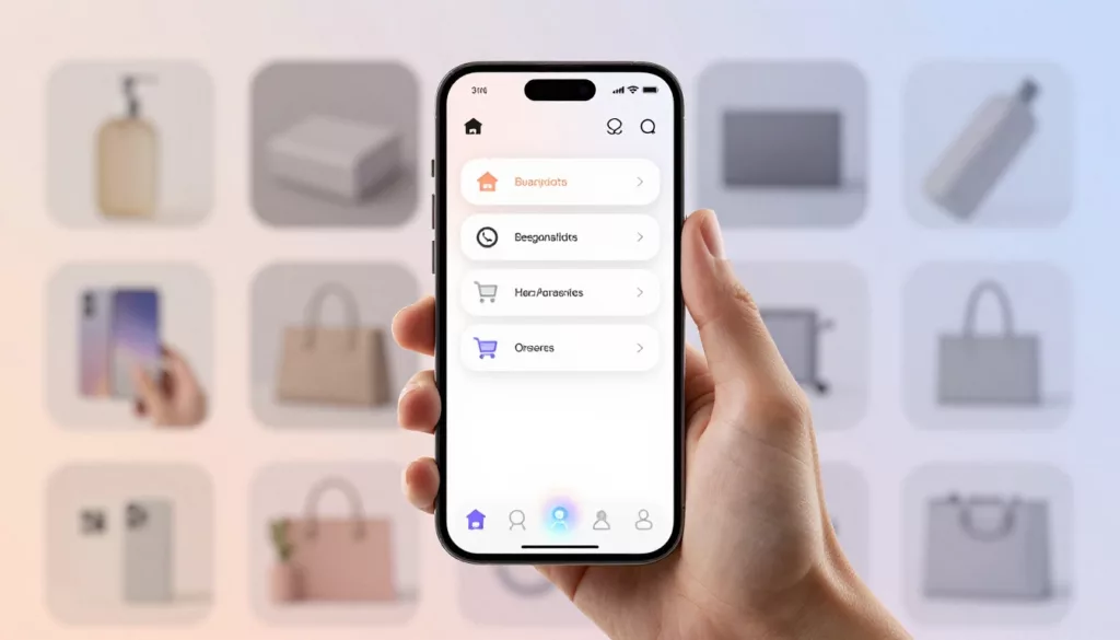
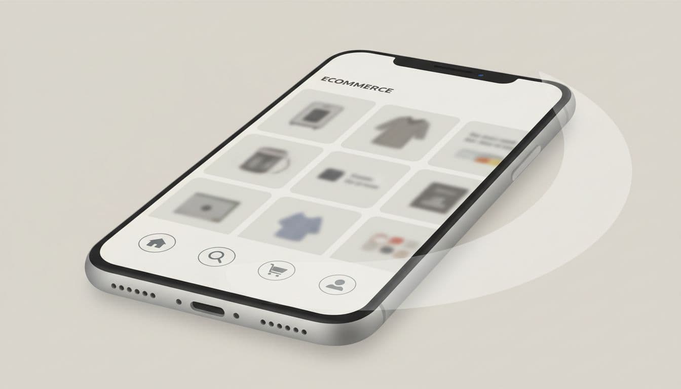
For ecommerce, the safest default is four or five tabs. Home or Categories, Search, Cart, Orders, and Account cover most high-intent paths. Search can take the center spot when shoppers arrive knowing what they want.
The bottom bar works because it sits in the thumb zone. It’s quicker to scan and easier to reopen after interruptions. On long product pages, it pairs well with sticky add-to-cart bars on mobile PDPs. The navigation moves shoppers around the store, while the CTA closes the sale.
Keep it light, though. A smart-hide pattern on downward scroll can free space, then bring the bar back when the user reverses direction. That keeps the store easy to use without making Search or Cart disappear.
Bottom navigation setups that fit different ecommerce stores
Good bottom navigation follows shopper intent, not your org chart. If every department wants a tab, the bar becomes noise.
A few setups work well in practice:
- Fashion and beauty stores often use Home, Search, Wishlist, Cart, and Account. Wishlist earns space because consideration runs high.
- Grocery, pet, and refill brands can replace Wishlist with Orders or Buy Again, because repeat shopping and tracking happen often.
- Large catalogs do well with Categories, Search, Cart, Orders, and Account. Categories becomes the front door.
Notice what stays out. Support, blog content, policy pages, and promo hubs rarely deserve permanent placement. That lines up with broader ecommerce navigation UX best practices.
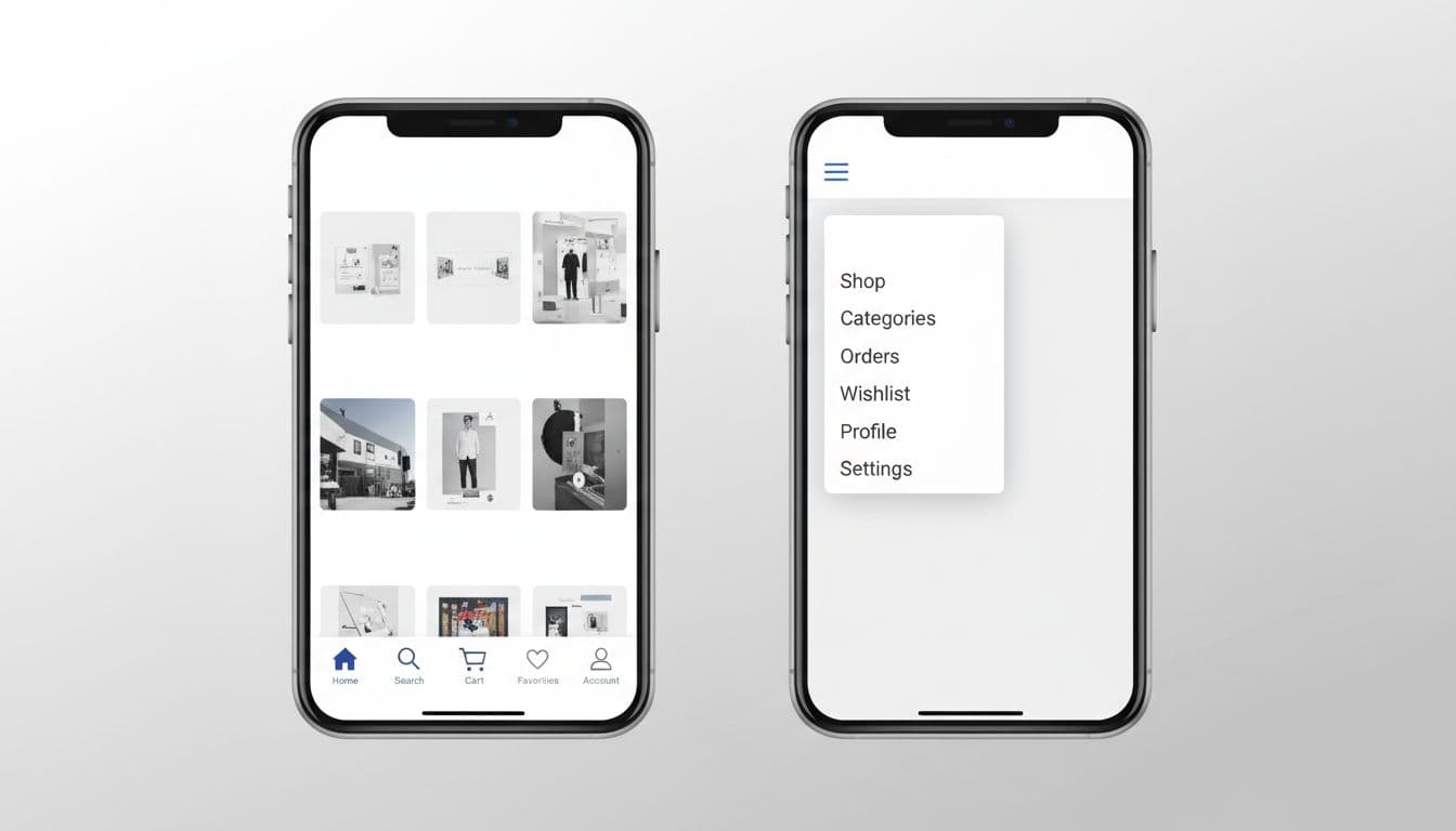
Also, use labels under icons, not icons alone. A bag icon, a cart icon, and a profile icon can blur together at speed. Clear labels reduce guesswork for everyone, and they help screen readers too.
Keep one active state obvious. Use badges sparingly, because constant dots and counters feel like alarm bells. A cart count makes sense. A badge on every tab does not.
Tabs, hamburger menus, and gestures each have a place
Bottom tabs are best for top tasks, but not every navigation problem. Secondary content still needs a home.
This quick comparison helps when teams argue over patterns.
| Pattern | Best use in ecommerce | Strength | Main risk |
|---|---|---|---|
| Bottom tabs | Search, cart, orders, account, home | Always visible, thumb-friendly | Only 4 or 5 slots |
| Hamburger menu | Deep category trees, help, brand pages | Holds complexity without crowding the screen | Hides high-value actions |
| Gestures | Image galleries, dismiss actions, optional tab switching | Fast once learned | Hard to discover |
Tabs are explicit. Hamburger menus are compact. Gestures are fast only after the shopper learns them.
For most stores, a hybrid model wins. Put Search, Cart, and Account in mobile bottom navigation. Put deep category layers, brand content, and support links inside a menu or category hub. That matches many 2026 mobile navigation pattern roundups, which treat gestures as helpers, not as the main map.
A swipe between tabs can feel smooth, especially in category-heavy browsing. Still, it should never be the only way to move. If users can’t see the path, many won’t trust it.
Hamburger menus still work for big catalogs. They fail when teams hide revenue routes inside them. If Search or Cart lives behind the icon, shoppers have to open a door before they can even see the hallway.
Accessibility, checkout focus, and conversion impact
A bottom bar that looks neat but misses taps is expensive. Keep every target at least 44 by 44 CSS pixels. Add text labels below icons. Make the active tab clear with more than color alone. Also leave enough bottom safe-area padding so the bar doesn’t fight the phone’s system UI.
Bottom navigation should expose the top shopper tasks, not the full site map.
Accessibility shapes conversion here. Screen readers need clear tab names. Focus states must stay visible. Cart badges can’t be the only status cue. If your product pages rely on size or color choices, don’t let the bottom bar crowd those controls or cover key messages.
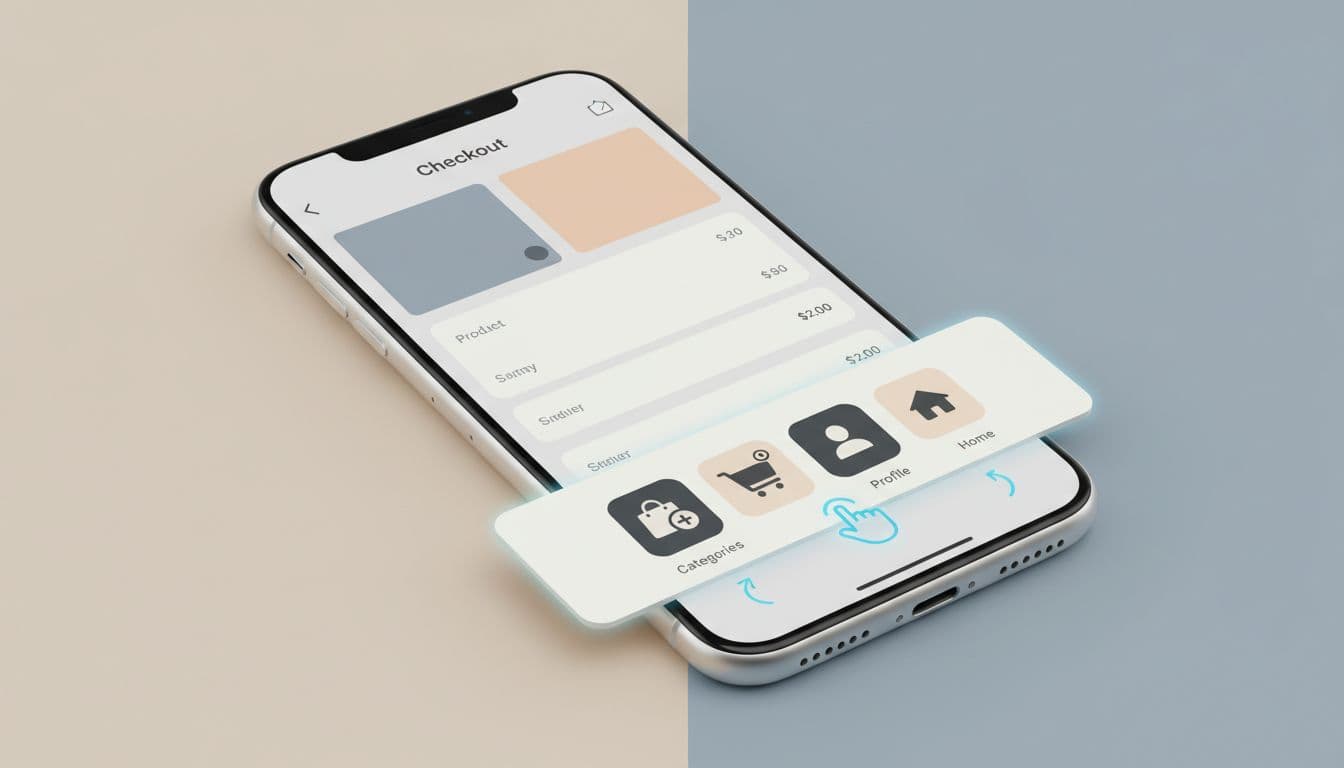
Once checkout starts, reduce distraction. Many stores hide or quiet the bottom bar and lean on stronger guest checkout UX patterns for mobile. That’s usually better than showing Home and Search next to the pay button.
Then measure the result. Track search use, cart opens, checkout starts, and order completion by device. If you need the why behind the numbers, use session replays spotting mobile UX issues to catch mis-taps, ignored tabs, and rage taps near fixed UI.
On mobile, navigation is like store signage at thumb height. When it points to the right places, shoppers move with less effort and more confidence.
Start with the top four or five tasks, not the full sitemap. Then test the bar on real phones. Mobile bottom navigation works best when it feels almost invisible, right up until it helps someone buy.