
A B2B buyer rarely abandons checkout because they changed their mind. More often, the order stops because the account has exceeded its available credit, the system provided unclear information, or the next step felt risky.
That kind of failure is expensive. It can delay inventory replenishment, slow production, or prevent a buyer from accessing their monthly allowance, ultimately forcing them to chase approval through email or phone.
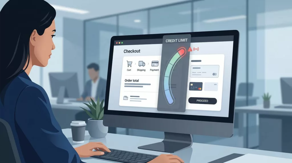
Strong credit limit messaging keeps the order moving. It gives buyers a clear status, a fair path forward, and enough trust to finish the job when hitting a credit limit.
Key Takeaways
- Context is critical: B2B checkout failures due to credit limits often signal broken business processes; clear messaging must explain what happened, why, and how to proceed to maintain buyer trust.
- Tailor messaging by status: UX copy should be segmented based on the buyer’s state, providing gentle alerts when near a limit and clear, actionable alternatives when a purchase is fully blocked.
- Provide recovery paths: Never present “contact support” as the sole solution; offer immediate self-service options like partial payments, limit increase requests, or saving the cart for later.
- Synchronize with the back office: To maintain credibility, ensure front-end messaging is backed by real-time data from ERP and credit systems to avoid showing stale or conflicting information.
Silent credit-limit failures cost more than a canceled cart
A consumer shopper can usually try another card and move on. In contrast, a B2B buyer is often working inside an established account where they are bound by specific account history, payment history, and internal procurement workflows.
When a checkout fails without context, the buyer does not see a simple error. They see a broken business process.

Baymard’s checkout UX best practices show how small friction points still hurt conversion. In B2B, a credit-related block is even sharper because the buyer may not control the account limit, the invoice terms, or the approval chain. These blocks are often directly influenced by the buyer’s credit history and current credit score, making the messaging critical for maintaining trust.
When buyers hit a wall, the message should answer three things fast:
- What happened, such as exceeding credit limit
- Why it happened
- What they can do now
If any of those are missing, the order often dies in silence.
Why B2B credit-limit messaging needs different rules
Consumer checkout often treats payment as a single-user event, whereas B2B checkout is typically handled as an account event. This fundamental difference changes the required copy, the available controls, and the necessary fallback paths. For businesses operating on enterprise plans, this credit limit is often determined by a formal credit report, making the messaging even more critical to professional standards.
Here is the basic split.
| Aspect | Consumer checkout | B2B checkout |
|---|---|---|
| Account ownership | One buyer, one payment method | Shared account, shared terms, shared limit |
| Failure handling | Try another card or pay later | Use approved recovery paths tied to the account |
| Trust needs | Confirm payment worked | Confirm order status, credit status, and next steps |
| Approval flow | Rare | Common, often influenced by a business’s internal debt-to-income ratio or spending thresholds |
| Recovery choices | Usually simple | Often multiple, with role-based permissions |
B2B buyers also work inside procurement rules. A warning that sounds casual can feel careless, while a warning that sounds hostile can feel like a dead end.
CommerceV3’s B2B online store UX case study points to the same pattern. Buyers want clear pricing, self-service, and a path back to purchase. Effective credit-limit messaging has to support that expectation to keep the procurement process moving smoothly.
Write messages for the three moments that matter
Good credit-limit UX changes with the state of the account. The wording for a buyer who is close to the limit should not match the wording for a buyer who is already blocked.
Near limit
A near-limit state should feel like a heads-up, not a warning siren. The buyer still has time to adjust the cart or choose a different payment mix. For instance, on platforms selling SMS credits or message credits, users need timely alerts about character limit and character count issues before they exceed their balance. Because each message segment consumes a portion of the credit, keeping the user informed prevents frustration.
Use copy that is direct and specific:
- “You have $1,200 of credit left on this account.”
- “This order is close to the available limit.”
- “Reduce the total or choose another payment option to continue.”
Add the number whenever you can. A vague warning makes buyers guess, and guessing slows checkout.
At limit
At the limit, the message needs a stronger tone and a clear action. The buyer already knows there is a problem. The page should help them solve it. A well-placed usage warning serves as a guide for the user to understand exactly where they stand.
Try copy like this:
- “This order exceeds your available credit by $320.”
- “You can pay part now and bill the rest to terms.”
- “Request a limit review, or switch to another payment method.”
A short inline helper works well near the payment section. A pop-up alone does not. It hides the problem and interrupts the flow.
Over limit or pending review
Sometimes the buyer is blocked for reasons they do not control. The account may be under review, the limit may be frozen, or the order may need a manager’s approval.
In those cases, the message should reduce anxiety and explain the path:
- “Your account is waiting for credit approval.”
- “This order can be saved and completed after review.”
- “Your account manager can help release this order.”
The best warning state does not feel like a locked door. It feels like a clear fork in the road.
A useful pattern is to show the status near the order total, then repeat the same message near the payment action. That repetition helps busy buyers scan quickly without hunting for answers.
Recovery paths that keep the order moving
A blocked checkout should never end with “contact support” as the only option. That creates delay, and delay often becomes abandonment.
The recovery options need to match how B2B teams actually buy.
Partial payment works when the buyer can cover part of the order now. The message should spell out the split in plain language, such as “Pay $500 now and bill the rest to terms.”
Limit increase request helps when the buyer wants to keep moving but needs more room. When a customer requires a credit limit increase, a short form is better than a blank email. Include account name, order value, and a reason code if your team needs it to process the credit limit increase efficiently.
Contact account rep is useful for strategic customers. Make the handoff specific. “Email your account manager” is weaker than “Send this order to Maya, your account manager, with the cart attached.”
Alternate payment method gives buyers an immediate route out of the block. Card, ACH, wire, or deposit options can work, as long as the available methods match your finance policy. Offering these alternatives allows a buyer to complete their purchase immediately, helping them avoid over-the-limit fees that might otherwise complicate their billing cycle.
Save cart for later helps when approval cannot happen now. This should preserve items, quantities, pricing, and notes, then return the buyer to the same cart state later.
A short recovery table can also help product teams choose the right fallback.
| Buyer state | Best recovery option | UX detail that matters |
|---|---|---|
| Close to limit | Partial payment or cart edit | Show the exact available credit left |
| Over limit | Request increase or alternate payment | Explain the overage clearly |
| Under review | Save cart or contact rep | Preserve the cart and status |
| Approval needed | Send for approval | Name the approver or workflow |
The key is choice. Buyers stay calmer when they see more than one path forward.
Design the message where the decision happens
Credit-limit UX should live near the amount that triggered the threshold. A buyer should not need to scroll, reload, or open a support panel to understand the issue.
Use inline validation beside the order total or payment section. If your platform involves purchasing resources like virtual phone numbers, the maximum amount of credit available should be clearly displayed alongside the order total to provide immediate context. Pair the text with a visual state that fits the seriousness of the problem. Yellow works for warnings, while red works for blocked states. Avoid overdoing color alone, because color blind users still need the message.
Keep the wording short and practical. Good microcopy sounds like this:
- “Available credit: $1,200”
- “Order exceeds limit by $320”
- “Payment split available”
- “Send for approval”
- “Message sent: Request for limit increase received”
When reviewing the cart, remember that each line item contributes to the overall credit cost, which can quickly impact your available balance. If your checkout has multiple steps, repeat the status in the final review step. A buyer may miss the first warning while adding shipping notes or changing quantities.
Role-based accounts need one more layer. A purchaser may not have permission to approve a limit increase, but they may still need to save the cart or route it to finance. Make those options visible only when the role allows them. That avoids dead buttons and false hope.
Connect the UX to the back office
Credit messaging fails when the front end and back office disagree. If the UI indicates the buyer has $1,200 left, the order service, ERP, card issuer, and credit system must agree in real time to ensure accuracy.
That means product and operations teams have to align on a few rules:
- When the limit is checked
- Which threshold triggers a warning
- Who can override a block
- How approval status returns to checkout
- What happens when the network call fails
This is where many teams get stuck. The UI looks fine, but the data is stale. Then a buyer approves an order, refreshes the page, and sees a different status. Trust drops fast after that. For businesses operating across borders, different country codes might change the credit consumption rate, making real-time syncing even more critical. Additionally, services such as text messaging require high-frequency credit checks to ensure the buyer stays within their allotted budget without service interruptions.
If the rest of your checkout still creates friction, practical checkout UX fixes and checkout flow best practices for 2026 can help clear the other blockers before credit rules even come into play.
The operational side should also support audit trails. Finance teams often need to monitor the credit utilization ratio to understand account health, while also tracking who saw the warning, who approved the exception, and what payment path the buyer chose. That data makes future limit decisions easier, and it reduces back-and-forth later.
Frequently Asked Questions
Why is B2B credit limit messaging different from B2C?
Unlike consumer shopping, B2B purchasing is tied to complex account hierarchies, pre-negotiated terms, and multi-step approval workflows. Messaging must respect these organizational structures rather than assuming a simple payment method swap will resolve the block.
Where should credit limit warnings be placed in the checkout flow?
Warning messages should be positioned directly beside the order total or payment selection area. This ensures the buyer sees the status at the exact moment they make a decision, preventing the need for them to hunt for information or navigate away from the checkout.
How can we reduce cart abandonment when a buyer exceeds their limit?
Focus on providing immediate, actionable recovery paths such as partial payment, requesting a limit increase via a form, or saving the cart for later review by an account manager. By offering multiple, role-appropriate options, you transform a hard stop into a managed business decision.
What should be included in a credit limit error message?
A helpful message must clearly state the current status, explain the reason for the blockage—such as exceeding a specific credit amount—and offer a direct pathway to resolution. Avoid vague warnings; use specific numbers and actionable instructions to minimize buyer frustration.
Conclusion
Credit limit failures do more than stop an order. They break trust at the exact moment a buyer expects clarity.
Effective credit limit messaging acts as a critical bridge, transforming a blocked checkout experience into a successful transaction. The best communication provides the buyer with a clear status, a specific reason, and an actionable next step. It also fits the complex realities of B2B buying, which involves shared accounts, approval chains, and recovery paths that extend far beyond a single payment card.
When your credit limit notifications are transparent and the fallback options are genuinely useful, a failed checkout turns into a managed business decision instead of a lost order. Mastering this level of communication is the difference between a minor friction point and a dead end for your customers.