Credit Limit Messaging UX That Prevents B2B Checkout Failures
A B2B buyer rarely abandons checkout because they changed their mind. More often, the order stops because the account has...
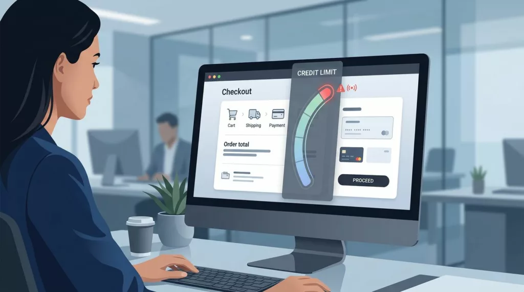
Credit Limit Messaging UX That Prevents B2B Checkout Failures
A B2B buyer rarely abandons checkout because they changed their mind. More often, the order stops because the account has...

Branch Inventory Messaging UX for Distributor Product Pages
Buyers do not mind seeing limited stock. They mind uncertainty. When branch inventory messaging is vague, they hesitate, call the...

Quote Expiration Messaging UX That Keeps B2B Orders Moving
A quote that expires without clear guidance often dies in the inbox, not in the system. Buyers get busy, sales...
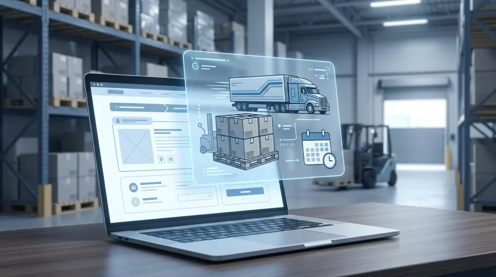
Freight Shipping UX That Prevents Heavy Item Checkout Friction
Heavy items rarely fail on the product page. They fail when checkout turns vague, slow, and expensive. That is where...
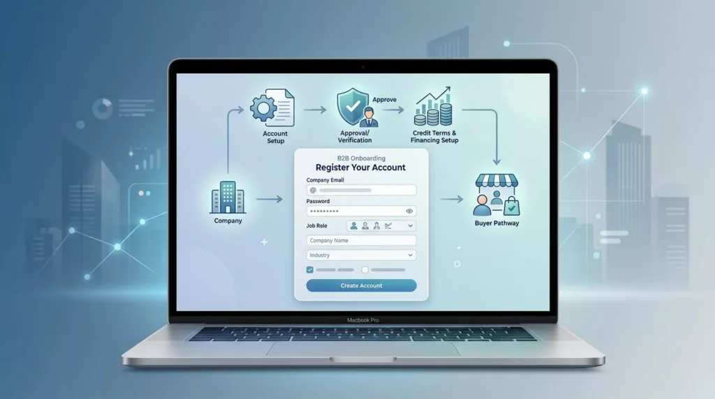
B2B Account Registration UX That Qualifies Buyers Without Drop-Off
The first form a B2B buyer sees can decide whether they keep going. If it asks for too much too...
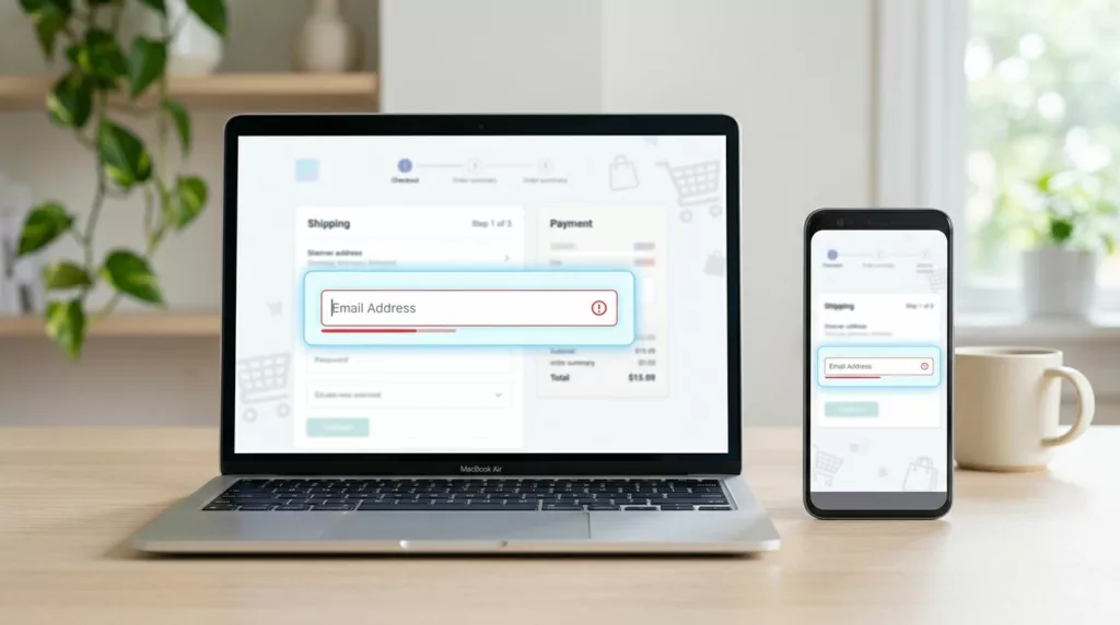
Email Field UX That Cuts Checkout Typos
A single mistyped email address can wreck an otherwise smooth checkout. The order may go through, but the receipt, shipping...

Backorder Messaging UX That Keeps Shoppers Confident
Backorder pages lose trust when they hide the one thing shoppers want most, timing. If people can’t tell whether a...
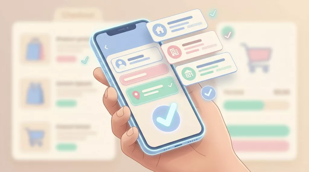
Address Book UX That Speeds Up Repeat Checkout in 2026
A returning customer can know exactly what they want and still stall at checkout if the address step feels slow....
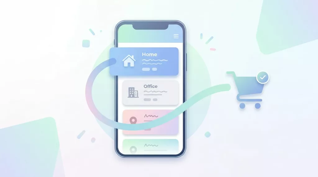
Saved Address Book UX for Faster Repeat Checkout
The fastest checkout is the one a returning customer barely notices. A good saved address book cuts typing, cuts mistakes,...