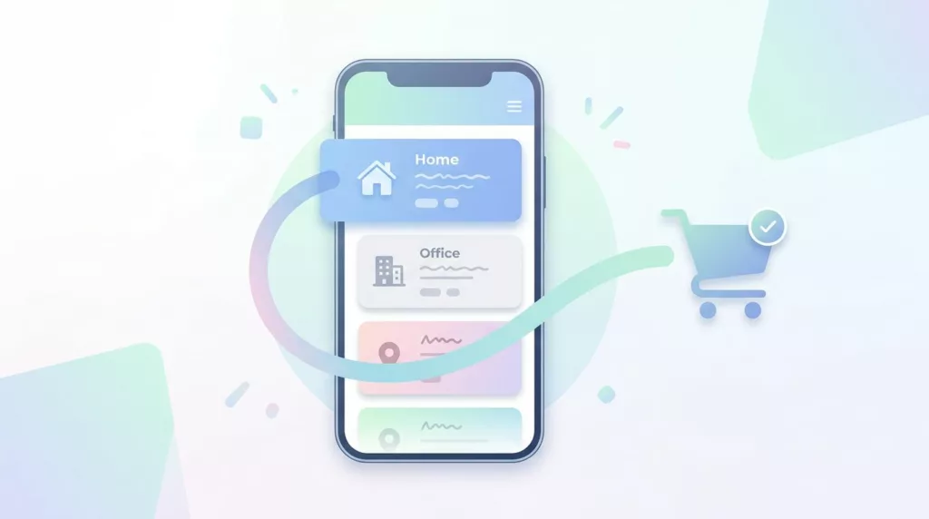
The fastest checkout is the one a returning customer barely notices. A good saved address book cuts typing, cuts mistakes, and keeps the order moving.
When the pattern is clumsy, the opposite happens. Shoppers hunt for a hidden list, retype a familiar address, or hit a wall because the store wants a new account first.
The best saved address book UX feels calm and direct. It gives people speed, but it still leaves room to edit, switch, and confirm before they pay.
Why repeat buyers move faster with a saved address book
Saved address book checkout works because it removes three small jobs: remember, type, and review. Returning customers already know where the order should go, so the interface should make that choice obvious.
That matters most on mobile. A thumb-sized list beats six fields and a small keyboard, especially when autofill guesses wrong or the user needs to switch between home and office. If you want the address book to earn its place, treat it as part of broader checkout flow optimization strategies, not as a profile feature hidden off to the side.
Repeat orders also show up in more than one buying pattern. A shopper may be reordering household goods, sending a gift, or buying for work. In each case, the saved address book helps because the customer does not have to reconstruct a known decision.
That said, speed only helps if the saved data is visible at the right moment. If the user has to leave checkout to find old addresses, the gain disappears. If the list shows up too late, after payment details are already in play, it can feel like an extra task instead of a shortcut.
A solid setup keeps the address choice inside the checkout path. It also makes the next step clear, so people never wonder whether they are still editing shipping or already moving to payment.
Build the address list for one-tap selection
Start with a single default address card if one address is used most often. Preselect it, label it with a friendly name, and show enough detail for quick recognition. “Home”, “Office”, and “Gift to Mom” are easier to scan than a raw block of address data.
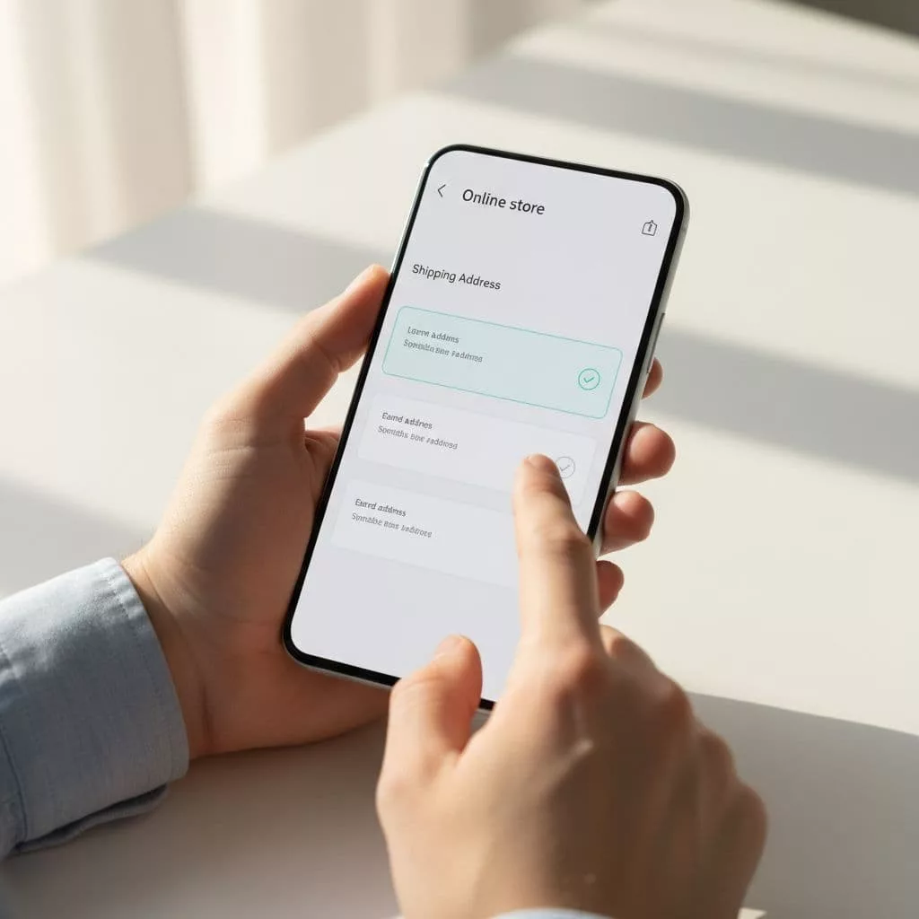
Each card should show the data that helps the decision, not every field in the database. Name, street, city, region, and postal code are usually enough. If the shopper needs apartment, company, or delivery notes, keep those visible inside the card.
The controls around the list matter just as much as the list itself. Put edit, delete, and “make primary” on the card, so the user never has to leave checkout to fix a small mistake. Keep the full card tappable on mobile, because a tiny radio button creates avoidable misses.
A few patterns work well here:
- Put “Add new address” next to the saved list, so people can switch without losing their place.
- Show the selected address with a clear visual state, not a faint border that blends into the page.
- Let billing and shipping addresses change independently when the order needs it.
- Keep labels short and descriptive, especially when users have many saved addresses.
Google’s checkout implementation guide is a useful reference for this part of the flow, because it shows how address autocomplete can cut keystrokes and reduce entry errors. Saved addresses and autocomplete work well together when one helps returning shoppers and the other helps everyone else.
The main goal is to make the choice feel instant. If a customer has to open a second page or expand three panels, the address book turns into another form.
Common checkout mistakes that erase the speed win
A saved address list speeds checkout only when it removes decisions, not when it creates a hunt.
The biggest mistake is forcing account creation before the shopper can use a saved address. Many buyers are fine with sign-in later, but they do not want a hard stop before shipping is selected. If the store wants an account, ask after the order is complete, or make it optional during checkout.
Another mistake is hiding edit controls in a menu that only appears on hover or after a tap. That works on a desktop mockup, then falls apart on a phone. If the selected address is wrong by one line, the user should be able to fix it in place without losing progress.
Vague labels also slow people down. Buttons like “Next” and “Continue” do not tell users what changes. Clear labels such as “Use this address” or “Continue to shipping” help the page feel predictable. web.dev’s payment and address form best practices makes that point well, and it matches what checkout teams see in real carts.
A few common problems show up again and again:
- Long saved address lists without any sorting, so the right choice is buried.
- Small dropdowns on mobile, where every tap feels risky.
- Missing secondary address lines, which makes apartment and suite data hard to confirm.
- A selected address that changes the page layout after the tap, which breaks the user’s focus.
The fix is to keep the list compact, but not cramped. Group by recency or label if the customer has many addresses. If the list gets long, add a search field only when it truly helps. Otherwise, the search box becomes one more thing to scan.
For a wider set of fixes that remove friction across the checkout, checkout UX fixes to reduce abandonment pairs well with the address book pattern. The address list works best when the rest of the flow already feels clear and light.
Accessibility and localization details that matter
Use real controls for the address list, such as buttons or radio groups. Screen readers need a clear selected state, and keyboard users need to move through the options without tabbing through hidden icons. High-contrast focus styles help people see where they are, especially on a busy checkout page.
Touch targets matter just as much. A saved address card should be large enough to tap once, and the edit action should stay separate from the selection action. That lowers accidental changes on small screens, where a stray tap can slow the whole order.
Localization needs the same care. A form built for US addresses can break for people who need province, prefecture, district, building, or multiple address lines. Let the checkout adapt by country, keep field order local, and avoid assuming every address fits the same shape.
This is also where account prompts can get in the way. Baymard’s checkout UX best practices research keeps showing that account requests during checkout distract from the purchase. If you want people to save an address, make that option easy after the order or after payment.
Validation should help, not block. If an address is close but needs a fix, show the issue plainly and keep the customer in control. A saved address book should reduce doubt, not create a new reason to leave.
Conclusion
The strongest saved address book UX does one job well. It makes repeat checkout feel shorter without making people feel trapped inside a form.
When the list is visible, editable, mobile-friendly, accessible, and local enough for real addresses, customers move faster with less doubt. That balance matters more than any single feature.
A good address book gives speed and control at the same time. That is what makes repeat checkout feel effortless.