
A cart can hold more than products. An anonymous cart captures a shopper’s choices, budget, promotion, and intent to buy before sign-in. When sign-in suddenly changes that cart, confidence can disappear in seconds.
Strong cart merge UX makes the transition visible, reversible, and easy to understand. Good shopping cart UX shows shoppers which cart is active and what changed. It also gives them control over the next step, a core part of effective shopping cart UX.
Key Takeaways
- An anonymous cart belongs to the current browsing session, while an account cart is tied to a recognized customer profile and may contain items saved earlier.
- In shopping cart UX, treat a merge as a shopper decision when both carts contain products. Don’t silently replace one cart with the other.
- Group duplicates for review instead of automatically adding quantities together, especially when stock limits or promotions apply.
- Strong shopping cart UX revalidates prices, inventory, variants, delivery rules, and discounts before showing the post-merge total.
- Preserve the original cart if a merge fails. A retry option is safer than an empty or altered cart.
- Measure merge completion, conflict resolution, checkout starts, and support contacts by device and shopper state to improve shopping cart UX.
Guest and Account Carts Have Different Meanings
A guest-to-account transition isn’t only a technical event. It changes how an anonymous cart is handled, so shopping cart UX needs to protect the shopper’s choices.
A guest cart is temporary but still meaningful
An anonymous cart is created while someone browses without signing in. It may rely on session persistence through browser storage, a session, or an anonymous server-side record. Regardless of implementation, it reflects decisions made moments ago, which makes shopping cart UX important.
A shopper may have selected a specific size, added a promotional item, or adjusted quantity for a household purchase. The anonymous cart may be temporary, but treating it as disposable undermines good shopping cart UX.
Keep guest checkout available, too. Baymard’s 2025 checkout benchmark found that 62% of sites did not make guest checkout the most prominent option. A visible sign-in path should never make guest checkout feel like a mistake or imply that account creation is required.
An account cart carries prior intent
An active customer cart is the cart currently associated with the signed-in profile. It can include items saved on another device, products left from an earlier visit, or quantities a customer deliberately set aside.
The account cart may also contain a saved shipping address or other account context. These details shouldn’t silently override the shopper’s current choices. Shopping cart UX should make those differences clear.
The account cart may be older, but age alone doesn’t make it less important. Show both sources when there is a conflict. Custom cart merging logic and matching logic determine which records correspond, but the interface should show the shopper the result. Magento’s quote lifecycle documentation recognizes active, merged, converted, and expired cart states, including anonymous shopping that merges on login.
For the shopper, the useful distinction is simple: “Items in this visit” and “Items saved to your account.” These labels make shopping cart UX easier to understand. Technical labels such as “session quote” create confusion without helping anyone decide.
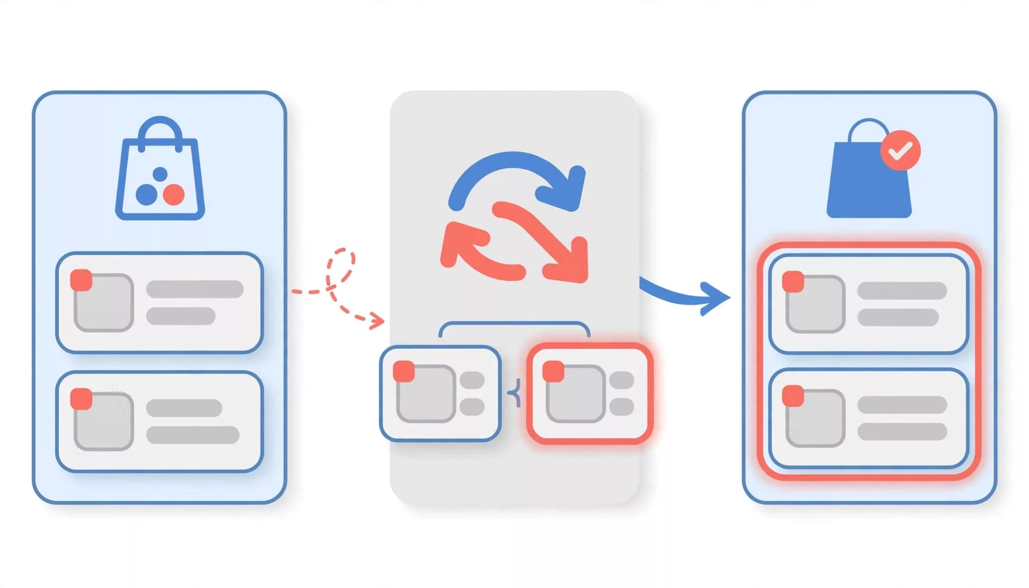
Cart Merge UX Should Make the Choice Visible
Silent merging feels efficient only when nothing changes. Strong shopping cart UX gives shoppers a clear review point when carts contain overlapping products, different quantities, or different pricing.
Before authentication, keep guest checkout and express payment options visible. Sign-in shouldn’t feel like the only way to resume a purchase.
Show what each cart contains
A compact merge panel works well after authentication and before checkout resumes. Show the current anonymous cart and saved account cart with item images, selected variants, quantities, current prices, and the shipping address or delivery context when they affect the result. Label each source in plain language.
| UI pattern | What the shopper sees | Best use |
|---|---|---|
| Merge preview | Both carts and the proposed result | Two non-empty carts |
| Merge existing customer cart | The anonymous cart combines with the saved account cart | Shopper wants one active cart |
| Use as new active customer cart | The saved account cart replaces the current cart | Shopper intentionally wants the saved cart restored |
| Review changes | Only affected products and prices appear | Duplicates or eligibility conflicts |
This shopping cart UX pattern keeps the state transition visible. Custom cart merging logic may propose a result, but it shouldn’t hide the decision or its consequences.
Place the primary action near the comparison, not below a long cart page. For mobile cart UX, let shoppers expand each cart without losing sight of the proposed total. A sticky footer can hold the total and actions, with controls kept within the thumb zone. Keep the comparison summary within the thumb zone as shoppers review changes.
A useful prompt might say: “You have items in this cart and in your saved cart. Review them before continuing.” Avoid a vague button such as “Continue,” which hides the consequence. Preserving the visible total can reduce cart abandonment and protect average order value during review.
Let shoppers undo the result
After a merge, show a short confirmation near the cart heading: “Your cart was updated with 5 items. Review changes.” Include an immediate “Undo merge” action while the original state is still available. Good shopping cart UX makes the recovery path as visible as the merge itself.
A merge should create an audit trail for the shopper and the system. If an item disappears, the team needs to know whether inventory, eligibility, or a merge rule caused it.
This approach protects data integrity and reduces support friction. It also gives frontend teams a clear state model: pending review, confirmed merge, canceled merge, and failed merge.
For broader shopping cart UX guidance on keeping cart decisions visible before checkout, use this shopping cart UX checklist.
Resolve Cart Conflicts Without Hiding Them
Cart conflicts are normal. Poor shopping cart UX begins when a system changes products, quantities, or totals without a clear explanation.
Handle duplicates and quantity limits deliberately
A duplicate is an affected line item defined by product identity, selected product variant, and quantity. Good shopping cart UX uses matching logic to distinguish genuinely identical purchasable items from similar products.
When an anonymous cart is merged, don’t assume two identical line items should become one larger quantity. The carts may represent different shopping intentions.
First, propose a result. Then explain the rule in plain language. For example: “This item appears in both carts. We combined the quantities, for a total of 3.” If stock or a per-customer limit prevents that quantity, state the actual result: “Only 2 are available right now. Your cart has been updated to 2.”
For shopping cart UX that respects intent, give shoppers a direct choice when quantity carries meaning, such as gifts, bulk items, or subscription products. Options like “Keep quantity 1,” “Keep quantity 2,” and “Use total quantity 3” make the decision concrete. Use custom cart merging logic for quantity caps, bundles, subscriptions, or gift quantities. Clear choices can also explain changes that affect average order value without pressuring the shopper.
Recheck prices, promotions, and availability
Good shopping cart UX revalidates each line item before confirming the merge. A product’s price may have changed because a sale ended, a regional price applied, or the selected product variant is no longer available. Include tax recalculation alongside price, inventory, and eligibility checks.
The shipping address can change tax, delivery eligibility, shipping cost, and the promised delivery date. A promotion may also depend on the customer, cart subtotal, quantity, location, or delivery method.
Use direct microcopy:
- “The price changed from $24 to $28 since this item was added.”
- “Your saved promotion no longer applies after the cart update.”
- “The blue, medium variant is sold out. Remove it or choose another option.”
- “This item can’t ship to your selected destination.”
- “Your merged quantity no longer qualifies for free shipping.”
- “Your free shipping threshold changed after the cart update.”
Keep the affected product in view and preserve the rest of the cart. Effective shopping cart UX uses inline editing to adjust quantity or remove an item without losing review context. If a promotion disappears, show a full cost breakdown with the subtotal, discount, shipping, tax, and new total together. Shoppers should never have to hunt for the reason a total changed.

Write Merge Microcopy That Builds Confidence
Good copy explains what the system knows, what changed, and what the shopper controls. It should never imply that a price or promotion is guaranteed before validation.
Explain the action before sign-in
If the sign-in screen appears from the cart, prepare people for the possible merge before they enter credentials. This shopping cart UX step should explain what happens next:
“After customer sign in, we’ll compare this anonymous cart with your saved cart. You’ll review any changes before checkout.”
That message prevents an unpleasant surprise after authentication. It also keeps guest checkout credible. Clear guest checkout UX patterns place the guest option beside sign-in rather than hiding it behind a weak secondary link.
In sign in mode, the system evaluates both carts using its custom cart merging logic. Different account, promotion, or inventory rules may produce different results.
Avoid language such as “We’ll save your cart” unless the system can preserve every product, variant, and offer. A more accurate version is: “We’ll try to carry your current items into your account.”
Confirm the final state in the cart
After the shopper approves a merge, good shopping cart UX confirms the result with a concise status message. For example: “Cart updated. Two items were combined, and one unavailable item was removed.” Link “Review changes” to a focused list of affected lines.
Before the checkout flow continues, revalidate the shipping address, delivery eligibility, and delivery date. Preserve express payment options when the checkout context supports them.
For screen-reader users, accessible shopping cart UX announces important changes through a live region. Focus should move to the merge notice or first unresolved conflict, not to the top of the page. Don’t rely on color alone for price changes, stock warnings, or failed promotions. On mobile, a sticky footer can keep the decision and total available in the thumb zone.
The final cart should remain editable. Editable shopping cart UX supports inline editing for quantity and variant repair, giving shoppers an obvious route to fix unexpected changes before payment.
Protect Intent When a Merge Fails
A failed merge can result from expired sessions, network loss, account-state conflicts, or server validation. The recovery experience matters more than the error code, and strong shopping cart UX restores control quickly.
Preserve both cart states
Never clear the anonymous cart before the saved account cart update succeeds. The anonymous cart remains recoverable, while the saved account cart holds the shopper’s existing items. Session persistence must retain both references until the shopper confirms the result or completes checkout.
With custom cart merging logic, server-side failure handling must be transactional and must not clear either cart. If the request fails, say what happened without exposing internal details: “We couldn’t combine your carts right now. Your anonymous cart is still available.” Then offer “Try again,” “Continue with this anonymous cart,” and “View saved cart” where those choices are supported.
Don’t bounce the shopper to a blank cart or a generic account page. Reliable shopping cart UX restores control immediately, reducing the risk of cart abandonment.
Keep checkout context intact
A resilient shopping cart UX preserves the current shipping address, shipping selections, entered promo codes, selected variants, and current page position where possible. Recheck details that depend on account status or destination, including the shipping address, tax recalculation, inventory, or delivery date.
If a code is rejected after sign-in, keep the entered code visible and explain the rule that changed. Use inline editing to repair a rejected code, quantity, or affected product without restarting. If inventory drops during the merge, remove only the affected line item after informing the shopper. This follows the same principle behind solid checkout UX fixes: valid progress should survive an error throughout the checkout flow.
Account creation can also wait until after payment when sign-in isn’t required. During guest checkout, preserve valid express payment options when the shopper continues without an account. Good shopping cart UX supports a post-purchase account creation flow that lets first-time buyers complete the order before deciding whether an account is useful.
Test the Merge as a Full Purchase Journey
The merge interface can look correct in a prototype and still fail under real cart conditions. Test shopping cart UX across the entire path, from product selection through order confirmation.
Cover the conflict matrix
Run scenarios with an empty account cart, an empty anonymous cart, exact duplicates, different variants, quantity caps, out-of-stock items, price changes, expired promotions, and restricted shipping destinations. Include sign-in failures, slow connections, expired sessions, and repeated merge attempts.
Test both saved and newly entered shipping address states. Check destination-dependent tax recalculation, delivery date changes, guest checkout, express payment options, and custom cart merging logic. Recheck the shipping address after each merge outcome.
For mobile cart UX, verify a sticky footer, thumb zone reachability, and inline editing without losing the review state. Test session persistence across the checkout flow, including keyboards, zoomed text, and screen readers. A shopper should be able to identify a changed item, understand its status, and repair the cart without re-entering unrelated details.
Baymard’s checkout usability research covers account selection and creation across guest, signed-in, and account-creation flows. Accessible shopping cart UX deserves the same journey-level scrutiny.
Measure confidence as well as conversion
Instrument the merge prompt, review view, selected option, conflict type, retry, undo, and successful merge. Connect those events to average order value, cart abandonment, checkout starts, purchases, and support contacts.
Segment results by cart source, guest versus returning shopper, device type, destination, cart value, product category, promotion status, and delivery date. Review session recordings for repeated taps, backtracking, or exits after a cart total changes. Measure shopping cart UX outcomes to find where uncertainty drives another cart abandonment.
Baymard places average cart abandonment at 70.22% in its checkout flow research. That figure does not isolate cart merges, but it reinforces the need to measure shopping cart UX and remove late-stage uncertainty instead of adding another hidden decision.
Frequently Asked Questions
Should a store automatically merge two carts?
Automatic merging can support shopping cart UX when the account cart is empty and the guest cart has no conflicts. When both sources contain items, shopping cart UX should show the proposed result and let the shopper review it. Automatic replacement risks deleting intent that the shopper can’t reconstruct, and merging shouldn’t make an account mandatory when guest checkout remains available.
What happens when duplicate products exceed stock?
Show the requested combined quantity, the available quantity, and the result the shopping cart UX can support. Identify the anonymous cart as the current source, then let the shopper adjust the quantity or remove the item. Don’t silently reduce quantity without a visible message.
Should promotions survive a cart merge?
Carry a promotion forward only after rechecking its eligibility as part of the shopping cart UX. Login status, product mix, quantity, tax recalculation, shipping address, and delivery date can affect the outcome. If it no longer applies, preserve the cart and state the reason beside the updated total.
Conclusion
The best shopping cart UX treats sign-in as a continuation of shopping, not a reset. It protects the guest cart, respects the account cart, and keeps the shipping address, delivery date, and editable total transparent through the final checkout flow.
A clear shopping cart UX keeps the primary review or recovery control within the thumb zone. It preserves the shopper’s chosen quantity and promotion, protecting average order value without creating conversion pressure. Reliable shopping cart UX reduces cart abandonment caused by hidden changes or lost cart contents. When the final cart is accurate, editable, and easy to recover, shoppers keep control of their purchase intent.