
A bundle should feel like help, not homework. When shoppers see clear steps, honest pricing, and fewer chances to make a mistake, they add more with less hesitation.
That’s the heart of strong bundle builder UX. The goal isn’t to cram in upsells. It’s to guide people toward a larger order while keeping the path calm, clear, and easy to finish. For Shopify and DTC teams, that means reducing cognitive load at every step.
Turn the bundle into a guided path
Many bundle builders fail for one simple reason, they start with a blank canvas. Shoppers land on a page full of options and have to figure out the rules on their own. That feels less like shopping and more like filling out a form.
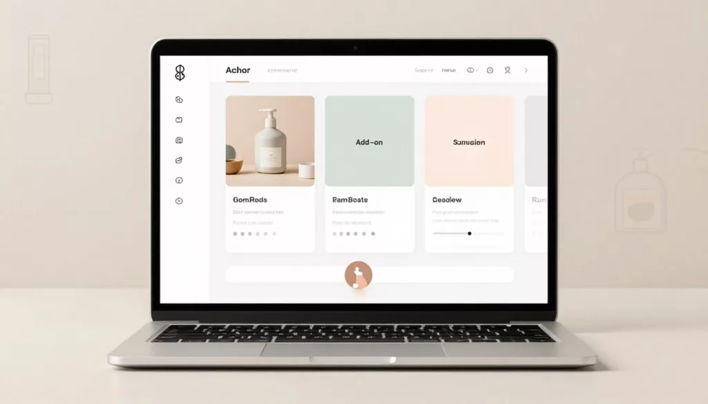
A better pattern is a step-by-step flow. Start with the anchor product, then move to compatible add-ons, then show a final review. Keep it to three to five steps. Anything longer starts to feel heavy.
Progress indicators help because they answer two quiet questions fast: “Where am I?” and “How much is left?” Keep the progress bar simple and informational. It should guide, not push. The same restraint used in smart progress bars for free shipping without pressure works here too.
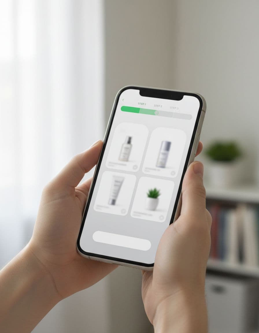
Defaults also matter. If a shopper is building a skincare set, preselect the best-selling cleanser size or the most common shade match. Then let them edit it without penalty. Smart defaults reduce effort, while still keeping control in the shopper’s hands.
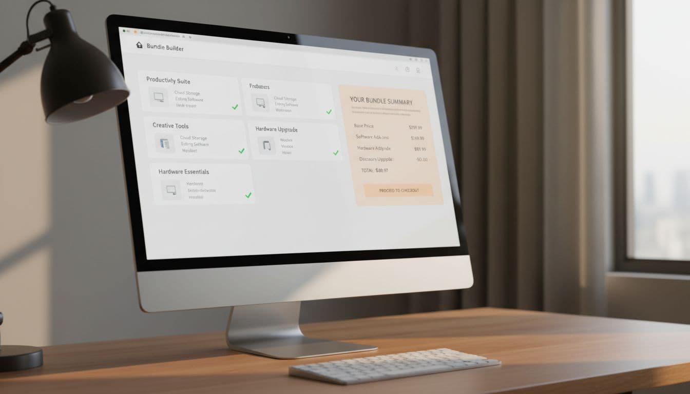
Keep the running summary visible as they build. On desktop, a sticky sidebar works well. On mobile, use a compact footer summary with item count and subtotal. That way, people don’t need to hold details in memory while moving through the flow.
If shoppers have to remember the rules while they shop, the interface is asking them to do your job.
Show price, compatibility, and stock before shoppers ask
The fastest way to kill bundle conversion is hidden math. Shoppers won’t keep adding items if they can’t tell what the total will be, what they’re saving, or whether the products work together.
Show pricing in real time. Update subtotal, discount, and final total the moment a choice changes. If the bundle unlocks a price break at three items, say that early. If shipping or subscription savings change the final amount, show that too.
This quick comparison shows which patterns reduce friction most:
| Pattern | What shoppers see | Why it helps AOV |
|---|---|---|
| Live subtotal | Price updates instantly | Builds confidence to add more |
| Variant states | Selected size, color, or flavor shown inline | Prevents wrong-item doubt |
| Stock messaging | Low stock or out-of-stock shown early | Avoids dead ends late in flow |
| Inline errors | Clear fix near the problem | Keeps people moving |
Variant handling deserves extra care. Don’t default to the first variant if compatibility matters. Default to the best match, or prompt for the missing choice inline. Better yet, disable impossible combinations before they can be selected.
Inventory messaging should reduce doubt, not create false urgency. “Only 2 left” helps only when it’s true and current. If an item is out of stock, offer a substitute, back-in-stock alert, or a way to keep building without losing the rest of the bundle.
Error prevention should feel quiet. If a bundle needs one base item and two accessories, don’t wait until checkout to say so. Use inline rules, disabled states, and plain language near the action. When bundles are meant for repeat kits, connect them to reorder flow UX strategies so returning customers can rebuild fast.
Build for mobile thumbs, accessibility, and Shopify constraints
Most shoppers won’t build a bundle from a large desktop monitor. They’ll do it one-handed, while distracted, on a phone. So mobile-first design isn’t a nice extra, it’s the baseline.
Keep one primary action visible at a time. Avoid stacked CTAs, crowded carousels, and long modal layers. A bottom sticky bar with subtotal and “Next” or “Add bundle” usually works better than floating controls scattered through the page.
Tap targets need room. Variant chips should be easy to hit, summary drawers should open fast, and accordions should preserve state if the shopper backs up a step. If the page reloads and clears their choices, trust drops fast.
Accessibility fixes often improve conversion for everyone. Use real form labels, not placeholder-only text. Make focus states visible. Don’t rely on color alone to show selection or errors. Also, announce price changes and validation messages clearly for screen readers.
For Shopify teams comparing bundle builder tools, test the messy cases before you buy:
- Variant sync: Does the builder respect real product variants and inventory?
- Discount logic: Can it show bundle savings clearly without odd cart behavior?
- Mobile behavior: Does the flow stay usable on a small screen and slow network?
- Tracking: Can you capture events like bundle start, step completion, add-to-cart, and validation errors?
A good bundle builder should fit your theme, your merchandising logic, and your reporting. If it looks polished in a demo but breaks on variant edge cases, it will cost more than it earns.
Conclusion
The best bundle builders raise order value by removing doubt, not by adding pressure. Clear steps, transparent pricing, and strong guardrails help shoppers build with confidence. For teams improving bundle builder UX, the simplest test is this: does the interface feel like a helpful guide, or a puzzle with a checkout button? When it feels easy to build, it also becomes easier to buy more.