
What turns a convenient pickup order into a support ticket? Usually, it’s not the product. It’s the gap between what the customer expects and what the experience actually says.
Good BOPIS UX closes that gap early. It tells people when the order will be ready, where to go, what to bring, and what happens if something changes. In other words, it treats pickup like a guided path, not a treasure hunt.
Why BOPIS UX breaks before the store visit
Pickup confusion often starts long before the customer reaches the parking lot. A shopper picks a store, sees a vague pickup promise, then gets a confirmation that says almost nothing. From there, every missing detail adds friction.
The biggest issue is simple: teams design the order flow, but not the handoff story. The site may show “pickup available” without saying whether that means curbside, locker, service desk, or a back-of-store counter. Then the email repeats the same label, so the customer still doesn’t know where to stand.
Mobile makes this worse because space is tight. Store choice, inventory status, and pickup timing all compete with the main action. The same thinking behind mobile add-to-cart button design patterns applies here too: keep one clear action, show immediate feedback, and avoid vague states.
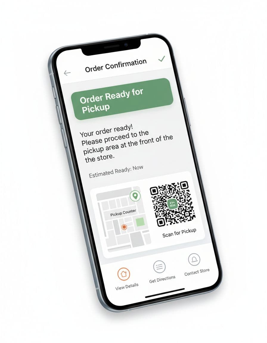
In 2026, shoppers expect live status, not soft promises. “We’ll email you soon” is too loose. A stronger flow uses clear states such as order received, being prepared, ready for pickup, and picked up. That reduces double visits and angry chats because customers stop guessing.
A good rule is this: every touchpoint should answer the customer’s next question before they ask it.
Design digital touchpoints that answer the next question
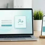
The digital side of BOPIS UX should feel like a smart store associate walking beside the customer. It should guide, confirm, and narrow choices at the right moment.
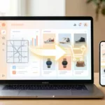
Start on the product page and in the cart. Show store stock, pickup window, and cutoff time near the pickup option. If an item isn’t ready today, say that plainly. Don’t hide it until checkout.
Then fix the post-purchase flow, because that’s where confusion grows fast. The confirmation page, email, SMS, and order-status screen should all match. Each one should include the pickup method, store address, map link, hours, parking guidance, ID or QR needs, and a note for proxy pickup if allowed.
Real examples show how much this matters. This Five Below BOPIS UI case study highlights how clearer pickup cues can reduce hesitation across the journey.
Most importantly, write notifications like directions, not receipts. “Ready for pickup at the north entrance counter” beats “Order available.” If you offer lockers, send the code, timer, and exact locker zone in the same message. If you offer curbside, ask for car details only when the order is truly ready.
If the message doesn’t tell customers where to go next, it isn’t finished.
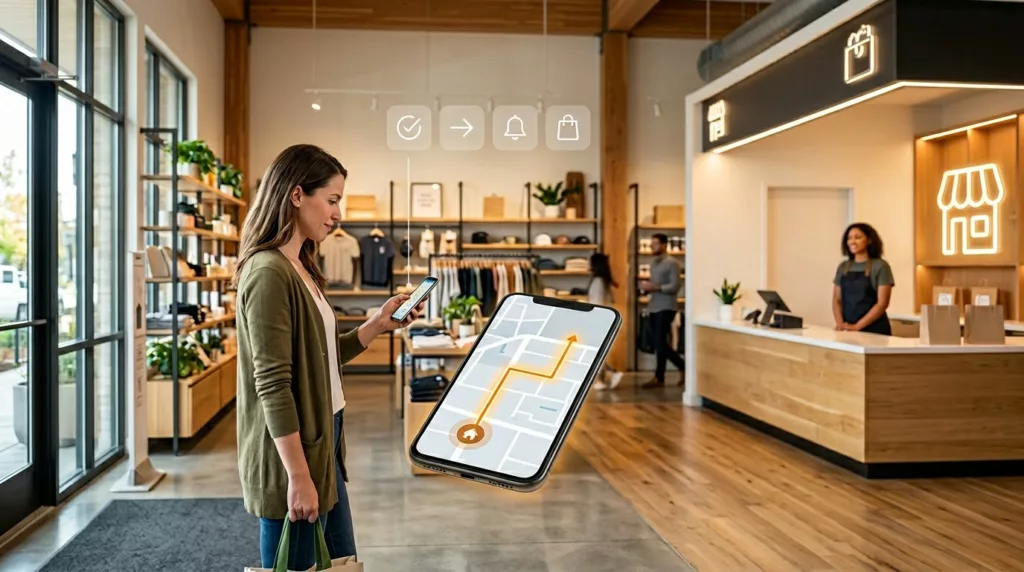
Make the store easy to read from parking lot to counter
Once the customer arrives, the physical environment has to carry the same clarity. That’s where many BOPIS programs fall apart. The site may be polished, yet the store still feels like a maze.
Wayfinding starts outside. Parking signs should be visible before the customer passes the pickup area. Entrance signs should confirm whether pickup is curbside, in-store, or locker-based. Inside the store, use one naming system everywhere. If the email says “Pickup Counter,” the overhead sign shouldn’t say “Guest Services.”
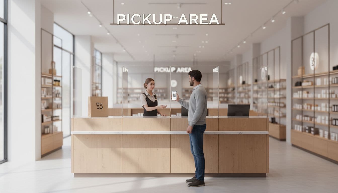
Counters, lockers, and curbside bays each need a slightly different UX. Lockers work best when they sit near a known entrance and use short unlock steps. Counters need a visible queue, a clear pickup line, and fast scanning tools. Curbside needs arrival detection that doesn’t fire too early, plus a backup “I’m here” action in case location fails.
Staff handoff matters just as much. Train associates to confirm name, item count, and handoff state in one short script. Also give them a recovery path for common problems, like “order not found,” “arrived too early,” or “wrong entrance.” That matches the focus on speed and clarity in MillerZell’s look at customer satisfaction with BOPIS.
A simple BOPIS UX audit for 2026 teams
A useful audit looks at the whole chain, not isolated screens. If one link fails, the customer feels the break.
Use this quick framework during reviews:
| Touchpoint | Customer needs | What to test |
|---|---|---|
| Store selection | Confidence in stock and ready time | Stock labels, cutoff copy, default store logic |
| Ready notification | Clear next step | Pickup method, map, code, hours, what to bring |
| Arrival | Easy wayfinding | Parking signs, entrance cues, counter or locker visibility |
| Handoff | Fast, trusted completion | QR scan speed, ID fallback, issue recovery, wait time |
After pickup, don’t stop learning. A strong handoff supports repeat behavior and helps later reorder flow UX for repeat purchases, because customers are more likely to choose pickup again when the first trip felt easy.
Watch a few simple metrics: pickup-related support contacts, arrival-to-handoff time, “not ready” incidents, and failed first-attempt pickups. Those numbers usually reveal the rough spots faster than opinions do.
The best BOPIS UX feels boring in the best way. Customers know what to do, where to go, and who will help them. When each touchpoint answers the next question before it appears, pickup confusion drops, store labor gets easier, and trust grows.