
When a buyer can’t find a clear credit application status, the next step often becomes an email, phone call, or second submission. Each vague update creates work for the buyer, the sales team, and credit operations.
A useful status experience answers three questions immediately: What happened, what happens next, and when should the buyer expect movement? The right labels, messages, and alerts can reduce avoidable contacts without removing the human review that responsible credit decisions require.
Why credit application status UX affects support volume
Credit applications create uncertainty because several teams may touch the same record. Sales might collect the application, credit staff might verify trade references, and finance might request additional documents. The buyer sees only a waiting period unless the portal connects those actions into a visible timeline.
A generic message such as “Your application is being processed” gives the customer no reason to wait. It doesn’t say whether the file is complete, whether someone needs information, or whether the company should contact a credit analyst. Buyers often respond by asking for an update before the team has anything new to share.
That behavior creates predictable operational costs:
- Sales representatives spend time checking with credit teams.
- Credit analysts answer repeat questions instead of reviewing files.
- Buyers submit duplicate applications when they assume the first one failed.
- Customer service teams forward messages between departments.
- Orders may wait because nobody knows whether terms approval is pending.
A status page should work as a shared source of truth. The buyer sees the current state, while internal teams see the same state with the supporting details and audit history. Credit management software for B2B teams commonly connects application intake with decisioning and customer monitoring, but the interface still needs clear customer-facing language.
The status view also needs to distinguish waiting on the business from waiting on the applicant. Those situations require different actions. A buyer can’t fix an internal queue, but they can upload a missing tax document or correct a legal business name.
Design a transparent credit application tracker
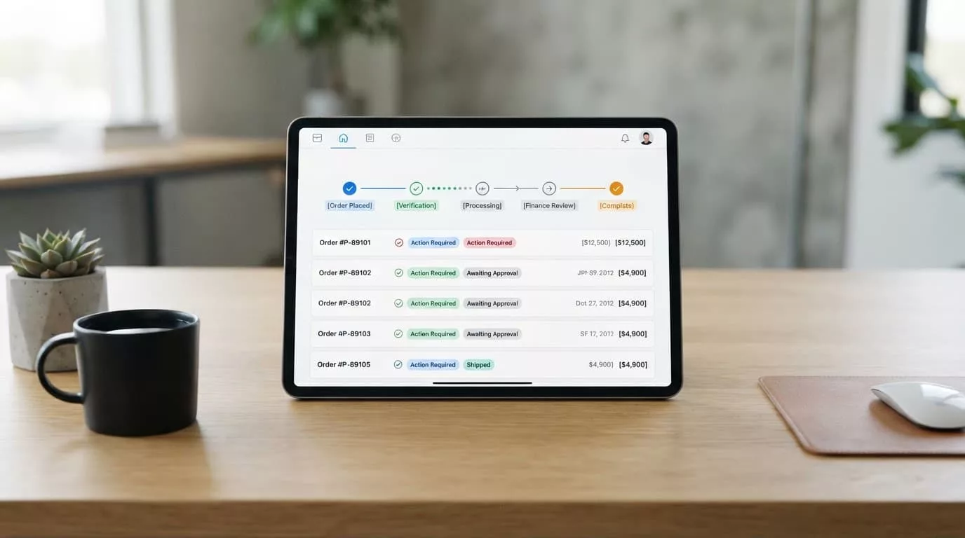
A useful tracker combines a current status, a short explanation, a next action, and a time expectation. Avoid displaying a long internal workflow that exposes routing rules or creates confusion. Buyers need enough detail to act, not every handoff behind the scenes.
A practical layout includes:
- A prominent current status at the top.
- A progress timeline showing completed and upcoming stages.
- A clear notice when the buyer must provide information.
- A document area showing received, rejected, and missing files.
- The submission date and latest update timestamp.
- A named contact path for cases requiring human assistance.
Use plain dates and times. “Updated July 14, 2026 at 10:30 AM Eastern Time” is more useful than “updated recently.” If the review time varies, state the range your team can support. For example, “A credit analyst usually reviews complete applications within two business days.” Don’t promise an automatic decision when manual review remains possible.

The tracker should persist across sessions and devices. A buyer who starts an application on a laptop may need to collect a bank letter from a colleague before finishing. Save-and-resume functionality prevents unnecessary restarts and reduces duplicate records. The net terms application UX guidance on Ecom Design Pro also highlights progress indicators, reviewer routing, and transparency around manual versus automatic processing.
Notifications should support the tracker rather than replace it. Email and SMS alerts can tell a buyer that the status changed, but each alert should link to the same authenticated status page. Don’t place sensitive financial details in an unsecured email.
A practical credit application status label framework
Labels should describe a real state in your workflow. They shouldn’t be vague marketing copy or internal abbreviations. Keep the label short, then add the detail that tells the buyer what to do.
| Status label | What the buyer should see | Required next step |
|---|---|---|
| Draft | Your application is saved but hasn’t been submitted. | Review and submit the application. |
| Submitted | We received your application on [date]. | No action is needed unless we contact you. |
| Needs information | We need one or more items before review can continue. | Upload or correct the listed items. |
| In review | A credit analyst is reviewing your complete application. | Wait for the next update. |
| On hold | Review is paused while we verify a detail or wait for a third party. | Check the reason and contact instructions. |
| Approved | Your account has approved credit terms. | Review the limit, terms, and ordering instructions. |
| Declined | We couldn’t approve credit terms at this time. | Review the notice and available payment options. |
| Cancelled or expired | This application is no longer active. | Start a new application if your needs have changed. |
The credit application status label should remain stable until the underlying state changes. Avoid changing “In review” to “Processing” because a different department opened the file. Every visible change should help the buyer understand progress.
For “Needs information,” list each missing item separately. Name the document, explain why it is needed, and show accepted formats or size limits. A message such as “Upload a current resale certificate as a PDF or JPG, up to 10 MB” gives the buyer a direct path forward.
“On hold” needs careful handling. Explain whether the team is verifying a trade reference, waiting for a response, or reviewing an exception. Don’t reveal confidential third-party information or expose internal risk scores. If the buyer cannot take action, provide the next expected update instead.
Approved and declined states need equal care. An approval should show the approved limit, payment terms, effective date, and any conditions. A decline notice should follow your legal and compliance requirements, use approved wording, and provide a legitimate contact path for questions. The interface can clarify the process, but it shouldn’t replace required notices or human judgment.
Write updates that answer the buyer’s next question
Every status message should contain four pieces of information:
- The current state in plain language.
- The event that caused the state.
- The next action, if the buyer has one.
- The next update point or expected time.
For example:
We received your application and all required documents on July 14. A credit analyst will review the file within two business days. You don’t need to submit another application.
That final sentence matters because it prevents a common source of duplicate submissions. When the buyer must act, make the action prominent:
We can’t begin the review because the bank reference is missing. Upload the document by selecting “Add file.” After submission, the application will return to review.
Avoid vague phrases such as “under consideration,” “pending approval,” or “contact us for more information.” They force the buyer to ask the same question the page should answer.
Your system can trigger updates when an application is submitted, a document is rejected, a reviewer requests information, a decision is recorded, or the expected review time changes. Workflow platforms can support configurable forms and trade-reference collection, as described in this overview of digital credit application software. Still, your credit team should approve the rules, message templates, and escalation paths before launch.
Make the status experience accessible on every screen
B2B buyers often check application updates between meetings or from a phone at a warehouse. A responsive status page should load the current state first, keep the primary action visible, and avoid forcing users to zoom into a wide table.
Accessibility details affect whether buyers can act without help. Use text and icons with color, never color alone, to distinguish approved, pending, or blocked states. Give each status a clear heading and expose timeline changes to screen readers. Form errors should identify the field, explain the problem, and preserve correctly entered information.
Document uploads need equal attention. Provide a large touch target, show upload progress, and confirm when a file has been received. If a file fails validation, state the reason in text. “Upload failed” doesn’t tell a buyer whether the problem is the file type, size, connection, or server.
Keep session and security controls clear. A timeout message should explain how to sign in again without losing saved progress. Sensitive application data should stay behind authentication, while notification emails should reveal only enough information to prompt a secure visit.
The B2B account registration UX principles around conditional fields also apply here. Show credit-specific questions when the buyer requests terms, rather than adding unrelated finance fields to every account flow. Fewer irrelevant questions make the application easier to complete and easier to maintain.
Measure whether status UX reduces follow-ups
Track outcomes before and after the redesign. The goal isn’t to make every contact disappear. Buyers still need a human response for exceptions, disputes, and regulated notices. The goal is to remove contacts caused by missing information.
Useful KPIs include:
- Status-related contact rate: calls and emails about an application, divided by submitted applications.
- Duplicate submission rate: applications sharing the same business identity within a defined period.
- Time to first complete submission: time from application start to receipt of all required information.
- Applicant action completion: percentage of “Needs information” cases resolved through the portal.
- Review interruption rate: applications paused because staff must request information manually.
- Median time in each state: time spent in submitted, review, hold, and other workflow stages.
- Notification engagement: delivery, open, and status-page visit rates for update messages.
- Escalation rate: cases that require a credit or compliance specialist.
Segment the data by device, customer type, application channel, and status. A low overall contact rate can hide a serious mobile upload problem or a high duplicate rate among new wholesale buyers.
Start with a small release. Instrument every status transition, message click, document action, and support contact reason. Review transcripts with credit and service teams, then refine labels and rules. Keep an audit trail for every decision and communication so operational improvements don’t weaken review controls.
Clear status communication earns its place
A buyer shouldn’t need to call your team to learn whether an application was received or which document is missing. A well-designed credit application status experience makes those answers visible, current, and actionable.
Use labels that match real workflow states. Pair each one with a next step, time expectation, and safe path to human help. Measure duplicate submissions and status-related contacts alongside approval speed, because a fast decision still creates friction when the buyer can’t tell what happens next.
When the portal gives customers a reliable answer, sales and credit teams can spend less time reconstructing application history and more time handling decisions that require judgment.