
Tax exemption status often gets buried until a buyer needs it most. When that happens, support gets the call about sales tax, finance gets the email, and the account team starts searching through records.
A strong tax exemption dashboard UX makes the current status obvious, the next step clear, and the proof easy to review. By keeping compliance details separate from the information a buyer needs to act quickly, you significantly improve the overall merchant experience.
When the dashboard performs these functions well, it stops feeling like a back-office record screen. It becomes a useful control center for buyers, admins, and support teams alike.
Key Takeaways
- Make the first screen answer the basic question. Buyers should see their tax exempt status, expiry, covered jurisdictions, and the next action without hunting.
- Use labels that match real system states. Approved, pending admin approval, expiring soon, expired, and rejected each need a different call to action.
- Treat compliance data and user experience design separately. The legal record needs precision, while the interface requires clarity.
- Build for errors, renewals, and support handoff. Good empty states and clean escalation paths cut down on support tickets.
- Keep the dashboard connected to the rest of the account. Tax status, payment terms, invoices, and order history often belong in one account experience.
Start with the answer buyers need
The first panel should tell a buyer one thing fast, “Am I covered right now?” That means the status badge belongs at the top, not buried in a settings drawer.
A clear status card usually includes the current label, the effective date, the expiration date, covered jurisdictions, and the legal entity attached to the customer profile. If one certificate covers only certain states or provinces, say that plainly. A buyer should never have to decode complex tax rules or policy notes to understand where their exemptions apply.
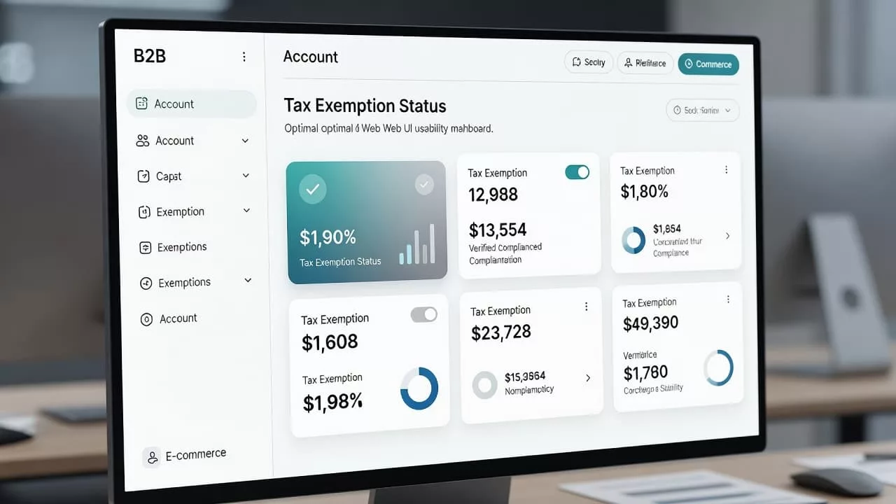
A good dashboard also gives the next step a visible home, ideally linking directly to the checkout page where these rules are applied. That might be Upload certificate, Renew exemption, View reason, Contact support, or a prompt to complete a new tax exemption form. The label should match the state on screen, so users never guess what happens next.
A few modules tend to earn their place near the top:
- Current exemption status with a color tag and plain-language label
- Jurisdiction coverage with a short list of valid locations
- Document summary with file name, upload date, and version
- Renewal date with a visible countdown or warning
- Primary action button tied to the current state
If the answer to “Am I exempt?” is not visible in five seconds, the dashboard is already behind.
This is also where the broader account experience matters. Buyers who register a business account expect the same clarity they saw in B2B account registration UX. If the first upload is confusing, the rest of the workflow starts on the wrong foot.
Design the workflow around the account, not the tax file
Tax exemption status never lives alone. It sits beside payment terms, invoice data, shipping rules, and account permissions. For that reason, the dashboard should feel like part of the same account settings, not a detached compliance tool.
That matters even more when buyers also manage billing in an invoice payment portal UX or review credit in net terms checkout UX. If the account already handles finance settings, exemption status should use the same logic and the same language. This integration ensures that your tax calculation system accurately reflects the buyer’s status at the point of purchase.
The workflow usually breaks into three moments.
Submission and review
The first state is often the most stressful for users. They have uploaded something, but they do not know if it worked. A dashboard should show that the file arrived, what was accepted, what is still missing, and how long review usually takes.
If manual review is part of the process, say so. A label like Under review is better than a vague spinner that never explains itself. At this stage, it is also helpful to clarify which user roles have permission to upload documents or modify these settings.
Active and expiring
Once approved, the screen should turn from a task list into a living record. Users need the approval date, the expiry date, and a short summary of the jurisdictions covered. By clearly mapping these against your conditional tax rules, you provide users with transparency regarding why certain taxes are or are not being applied.
A reminder can live here too. A small note such as “Renews in 32 days” is enough for most buyers. It is more useful than a long paragraph about policy.
Renewing and rechecking
Renewal should feel like a continuation of the same flow, not a fresh application with no context. Preserve the old certificate, highlight what needs updating, and show any differences in the new submission.
That is where support burden drops. Buyers can compare the old record with the new one, and they do not need to call just to confirm the basics.
Write status labels that users can trust
The label is a promise. If it says approved, the dashboard should mean approved. If the document is expired, the UI should not hide that behind a softer word.
Good labels do not just sound friendly. They reflect real system states that the tax engine, compliance team, and support team all agree on. That distinction matters because UX best practices and tax laws are not the same thing. Maintaining this accuracy is essential for precise tax reporting, ensuring that finance teams have a clear audit trail.
This UI concept keeps the difference visible through a clear table layout:
| Status label | What it means | Best next action |
|---|---|---|
| Approved | Exemption is valid and active | View certificate |
| Pending review | A person or system still needs to check it | Wait or add missing documents |
| Expiring soon | The certificate will lapse soon | Renew now |
| Expired | The exemption is no longer valid | Re-submit certificate |
| Rejected | The submission failed validation | View reason and fix issue |
The UI can be plain. The legal record cannot be sloppy. A dashboard may shorten text and simplify layout, but it should never change the meaning of the status.
For many teams, the hardest part is matching that clean interface to a real certificate workflow. Different jurisdictions, entity structures, and specific item categories can make exemption management more complex than a single approval toggle. Certificate management workflows show why one-size-fits-all labeling falls apart fast.
If finance or operations teams scan many accounts at once, the design should help them move quickly. The same scan-friendly logic behind order history filters works here too, because people need to spot status, date, and action without opening every record.
Handle empty states, errors, and renewal reminders
Empty states matter because they shape first-time behavior. A blank panel should not look broken or unfinished. For guest users who have not yet registered their certificates, the dashboard should explain what an exemption is, what documents are typically accepted, and the specific actions they need to take next.
A strong empty state might show three things: no certificate on file, why that matters for their account, and a button such as Upload certificate. If the account is waiting on approval, the empty area can show a short timeline and a support link. That makes the screen feel active even before the exemption is officially approved.
Error states need the same care. A failed upload, unsupported file type, expired file, or entity mismatch should each produce a specific message. Vague alerts like “Upload failed” are unhelpful. Instead, specific feedback like “The tax ID on this certificate does not match the legal entity on the account” helps the user fix the problem quickly. Furthermore, if the user selects a specific fulfillment method, the system should trigger relevant error messages that clarify why tax is still being applied. Precise error handling is essential for maintaining accurate automated tax calculation throughout the customer journey.
Good error copy does three jobs:
- It explains what went wrong in plain language.
- It says what the user can do now.
- It points to the right fallback, whether that is support, re-upload, or review.
Renewal reminders should feel helpful, not noisy. An in-app reminder 30 days before expiry is useful. A second reminder closer to the date can help buyers who missed the first one. Email reminders work best when they link back to the dashboard, not to a dead-end message thread.
Reminders should reduce uncertainty, not create another inbox to manage.
Support handoff also belongs in this section. When a buyer escalates, the ticket should include the account name, legal entity, current status, upload date, and reason for rejection if one exists. This level of detail cuts back-and-forth and gives agents enough context to handle the request without needing manual tax removal. A hidden friction audit, like the one Baymard outlines in its checkout flow review framework, is a good model for finding these weak spots before they turn into support tickets.
Frequently Asked Questions
What should be the primary focus of a tax exemption dashboard?
The primary focus must be clarity regarding the buyer’s current status, such as whether they are covered and when their exemption expires. This information should be immediately visible at the top of the dashboard so users can take action without digging through settings.
How should I handle tax exemption status labels in the UI?
Labels should reflect real, agreed-upon system states—like Approved, Expired, or Pending Review—to ensure consistency between the interface and your back-office compliance records. Avoid using vague or overly simplified language that could confuse a buyer or misrepresent their actual tax status.
Why is it important to integrate tax status with other account information?
Tax exemption does not exist in a vacuum and is often linked to payment terms, invoice history, and shipping rules. Integrating these features into a unified account experience prevents the dashboard from feeling like a detached tool and ensures tax rules are applied correctly at checkout.
What is the best way to handle document renewals?
Renewal should be treated as a continuation of the existing record rather than a brand-new application process. By preserving the old certificate and highlighting only what needs to be updated, you reduce user friction and cut down on support requests related to verification.
Conclusion
A well-designed tax exemption dashboard UX provides buyers with three immediate answers: what their current status is, what proof is on file, and what specific steps are required next. By offering this level of clarity, you significantly lower support demand and help business buyers achieve efficient tax reduction within your ecommerce platform.
The best versions of these interfaces keep compliance and usability in the right places. The regulatory rules remain accurate, the language remains accessible, and the next necessary action remains visible.
When a dashboard can handle approval, expiry, renewal, and error states without forcing users to hunt for information, it does more than simply display static tax data. It provides business buyers with a clean, professional path through a task they want to complete once and never think about again.