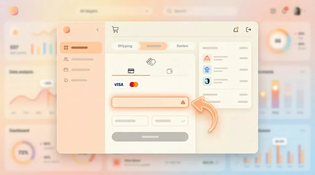
Payment Failure Recovery UX That Saves More Checkouts
A failed payment doesn’t always mean a lost sale. More often, it means a poor customer experience where the checkout...
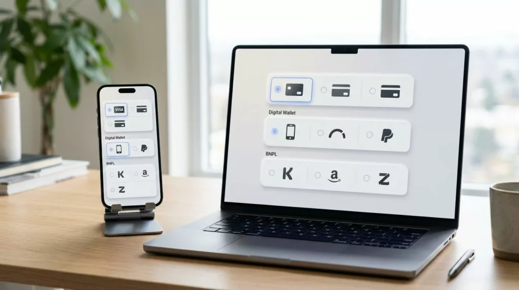
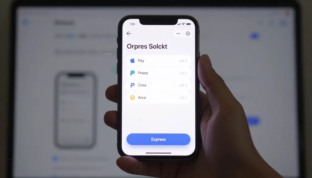
Payment Method Selector UX That Reduces Checkout Hesitation
A shopper can tolerate one more field. They usually won’t tolerate one more decision. That’s why the payment method selector...
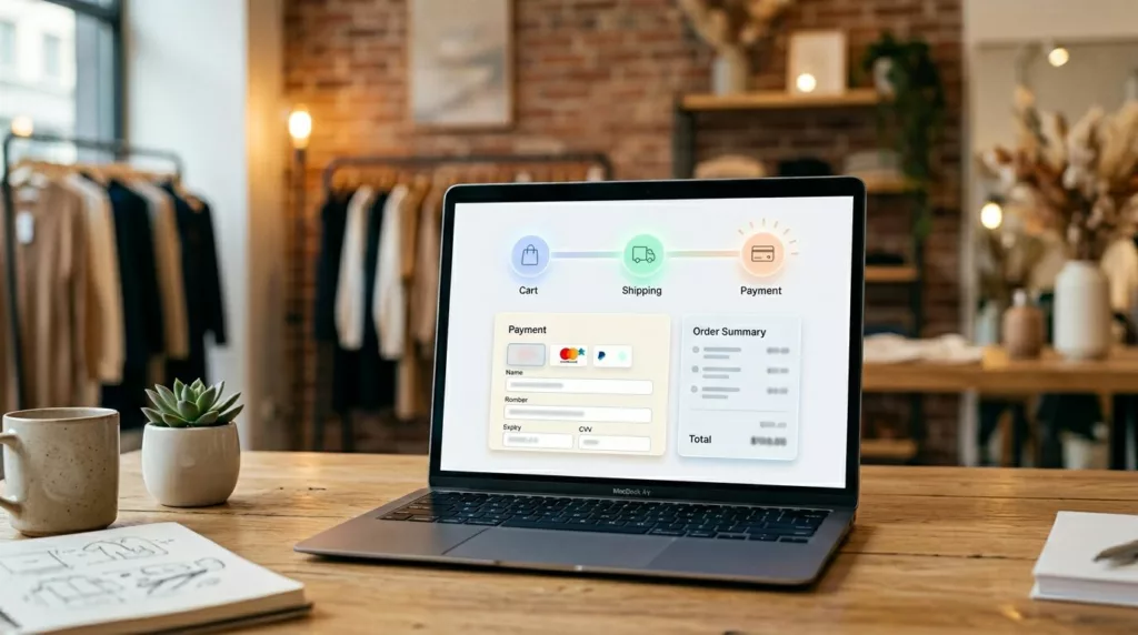
Checkout Progress Indicator UX That Reduces Step Anxiety
Few things drain checkout momentum faster in online retail than not knowing how much is left. When shoppers hit payment...

Empty Cart UX Patterns That Bring Shoppers Back
An empty shopping cart page can feel like a dead end. If it only says your cart is empty, you...
One-Page Vs Multi-Step Checkout for Ecommerce in 2026
Your checkout is like a cashier line. If it looks slow or confusing, shoppers leave before they pay. In 2026,...

Save for Later UX Patterns That Recover Abandoned Carts
Seven out of ten carts die before checkout. Recent 2026 benchmarks put average cart abandonment at 70.22%, and mobile climbs...

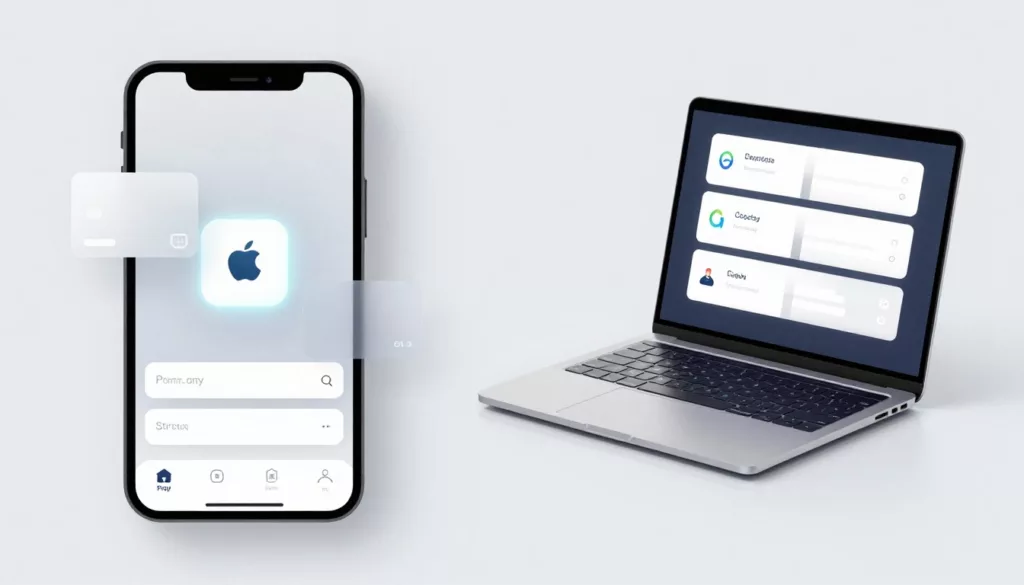
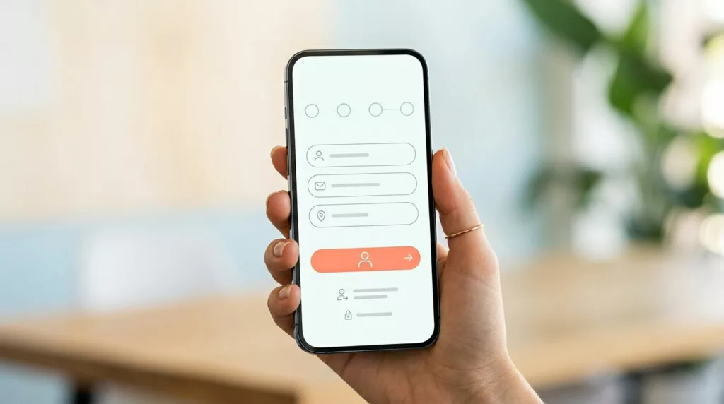
Express Checkout UX That Lifts Mobile Checkout Completion
On mobile, checkout is a thumb test. Every extra field, scroll, and second of doubt cuts intent. Strong express checkout...
Express Checkout UX That Lifts Mobile Completion
On mobile, checkout is a thumb test. If the fastest path is hard to spot, the sale slips away. Good...

Guest Checkout UX Patterns That Cut Friction and Cart Abandonment
A shopper who wants to buy now isn’t looking for a registration chore. They’re trying to finish a task with...
Guest Checkout UX Patterns That Reduce Mobile Checkout Friction
On a phone, checkout fails for small reasons. A hidden guest option, a long form, one bad error message, and...