
Support tickets often start with a small moment of doubt in the post-purchase journey. A user tries to change a plan, fix a card, or find an invoice, then stops and asks for help.
For subscription businesses, subscription portal ux is not a settings detail. It shapes customer retention. When the portal makes common tasks clear through user experience design, customers stay in control, support volume falls, and avoidable churn drops.
A good customer portal works like a calm front desk. It answers the obvious questions fast, then gets out of the way.
Key Takeaways
- Build the portal around top customer tasks like plan changes, billing updates, and seat management, showing essentials such as current plan, next renewal, and payment status upfront to cut confusion and tickets.
- Make billing friction self-service with clear dunning alerts, renewal reminders, and easy invoice access, turning potential churn moments into quick fixes.
- Prioritize transparency in upgrades, downgrades, pauses, and seat adjustments, explaining impacts like pricing, features, and timing to build trust and reduce support volume.
- Focus fixes on your top three ticket drivers first—watch churn, CSAT, and support drop as self-service takes hold.
Build the portal around customer decisions, not menu trees
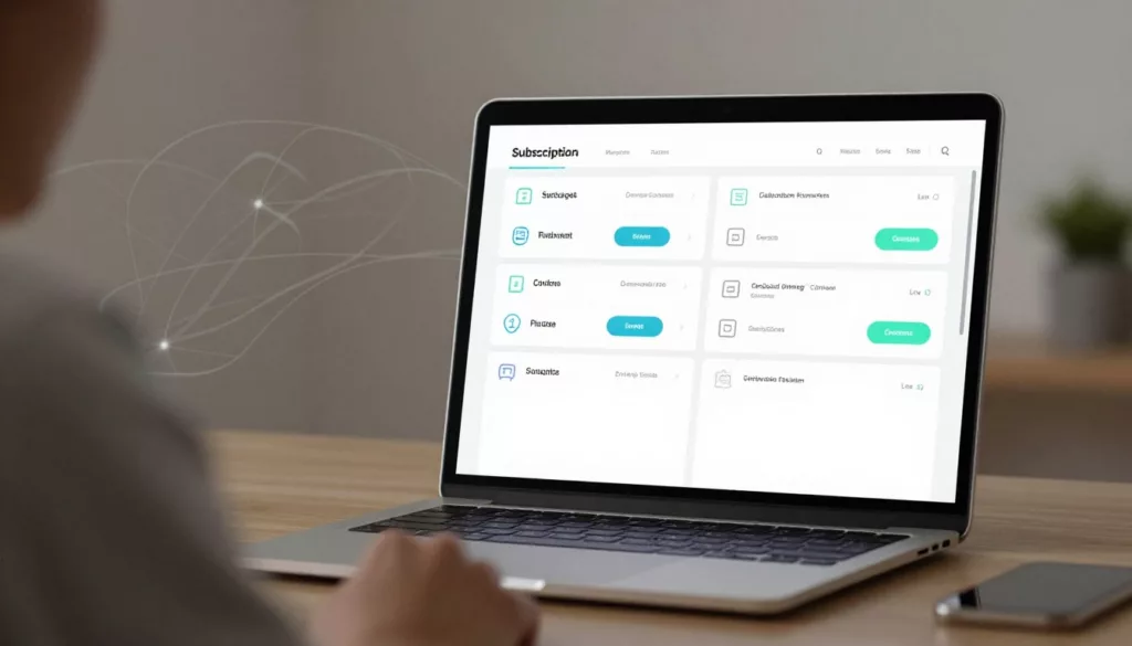
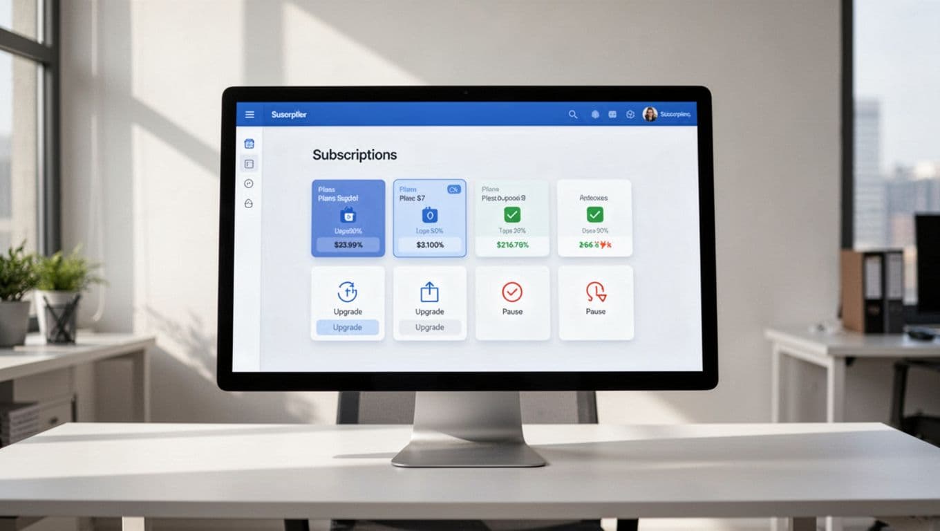
Most customers visit a subscription portal for subscription management with one job in mind. They want to change a plan, pause service, update payment, add users, or check what renews next. If they land in a maze of tabs, the portal becomes a ticket generator.
In effective user experience design, start with the essentials at the top of the page. Show the current plan, next renewal date, upcoming charge, payment status, and seat count in one view. That reduces the “What am I paying for?” ticket before it starts.
Plan changes deserve extra care. An upgrade flow should offer pricing transparency by showing the new price, what changes today, and whether billing adjusts now or at renewal. A downgrade flow should explain any feature loss before the customer confirms. If those answers are hidden, customers hesitate, then contact support.
Pause versus cancel is another common failure point. To fight voluntary churn and churn rate, if a customer wants temporary relief, offer pause, skip, or a lower tier before cancellation; this taps into loss aversion. However, embrace white-hat UX by following the click to cancel rule and keep cancel visible and honest. Hiding it may lift short-term saves, but it also raises frustration, chargebacks, and angry tickets.
A simple example makes the point. If a user clicks “Downgrade,” the next screen should say when the lower price starts, what seats or features change, and whether data stays intact, with a flow as smooth as a sign-up process. That single step can reduce both churn and support demand.
Many of the same patterns show up in account pages that boost retention. The page works best when it prioritizes next actions, not admin clutter.
If users have to guess what happens after they click, the portal is already losing trust.
Turn billing friction into self-service
Billing is where retention and support meet, especially in ecommerce subscription models. A failed card, missing invoice, or surprise renewal can push a healthy account into churn.
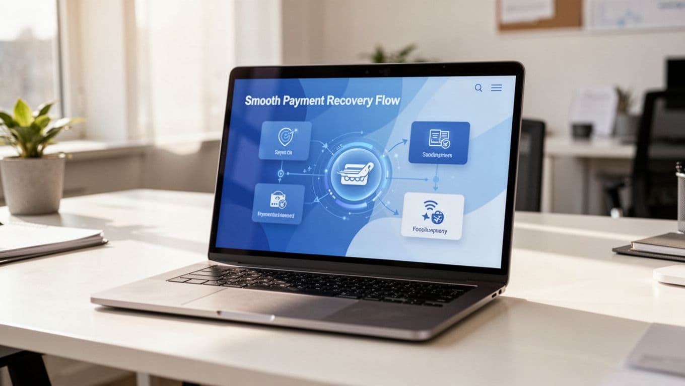
Effective dunning management makes payment failure recovery feel direct, not alarming. Show the issue in plain language, explain whether service is at risk, and give one clear action to fix it. If you retry the charge, say when. If a grace period applies, say that too. Silence creates panic, and panic creates tickets.
Renewal reminders for automatic renewals matter for the same reason. Before a renewal, deliver personalized experiences with the date, amount, and current plan. Then link directly to the page where they can review seats, payment method, and billing contact. That one path can prevent “I didn’t mean to renew” complaints.
Invoice access is another quiet support driver. Finance teams should not need an agent to download receipts, past invoices, or tax details. Keep billing history easy to find, searchable, exportable, and optimized for a seamless mobile experience on the go. For B2B accounts, let users update PO references and billing contacts without opening a case.
This quick comparison shows where portals often go wrong:
| Portal task | Better UX pattern | Likely result |
|---|---|---|
| Failed payment | Alert with fix path, retry timing, and updated total | Less involuntary churn |
| Upcoming renewal | Reminder with date, amount, and edit link | Fewer renewal disputes |
| Need an invoice | One-click billing history and downloads | Lower finance ticket volume |
| Update account details | Clear settings by role and purpose | Faster self-service completion |
The same rule behind strong returns portal UX patterns applies here too: answer the question inside the flow, before the user opens chat.
Frequently Asked Questions
What should appear at the top of a subscription portal?
Show the current plan, next renewal date, upcoming charge, payment status, and seat count in one clear view. This answers “What am I paying for?” before it becomes a ticket. It keeps users in control from the first glance.
How do you handle failed payments without alarming users?
Display the issue in plain language, explain service risk, retry timing, and grace periods, with one clear fix path. Silence breeds panic and tickets; transparency turns recovery into self-service. This cuts involuntary churn effectively.
What’s the best way to manage plan changes and pauses?
Offer pricing transparency for upgrades, feature loss warnings for downgrades, and pause/skip options before cancel to tap loss aversion. Keep cancel visible and honest per click-to-cancel rules. Smooth flows like sign-up reduce hesitation and support demand.
Why prioritize seat management in B2B portals?
Make adding/removing seats predictable with cost impacts, access changes, and confirmations clear. Separate roles like billing vs. product admins to avoid access tickets. This speeds time-to-value and prevents admin frustration leading to churn.
How does portal UX impact churn and support?
Clean self-service for common tasks keeps customers calm, reduces hand-holding needs, and fights avoidable churn. Start with top ticket drivers for quick wins in retention, CSAT, and volume. It boosts lifetime value through trusted subscription management.
Make team admin work easy for seat management and settings
B2B churn often starts with admin pain, not product dislike, especially when it builds on a shaky onboarding experience or sign-up process. When account owners can’t add seats, remove users, or change roles without support, frustration grows across the whole team.
Seat management should be plain and predictable as part of a smooth subscription flow. Show how many seats are active, how many are available, and what happens to cost when the admin adds more. This minimizes time-to-value for new teams. If charges apply now, say so. If the change starts next cycle, say that instead.
Removing seats needs the same clarity. Will access end today or at renewal? Will data be archived, deleted, or reassigned? A vague offboarding flow can trigger urgent tickets from both admins and end users.
Role design also matters. Separate billing admins from product admins when possible. That reduces risk and keeps the wrong person from contacting support for basic access changes. For larger accounts, bulk invite, bulk remove, ownership transfer, and upgrade prompts with social proof are worth the effort because they cut high-touch support work.
Account settings should follow task frequency. Put billing, seats, and security near the top. Move rare preferences lower. This mirrors the logic behind self-service account page tips: the page should help customers finish a task fast, not hunt through settings.
The portal should also confirm every important change. A short summary after a seat update or role change lowers uncertainty and gives admins confidence that the system did what they asked. This approach supports conversion rate optimization by building trust in self-service.
A subscription portal should never feel like a locked back office. It should feel like a clear control room. The same principles can extend to B2C portals handling ecommerce subscription features like flexible delivery schedules and product swaps.
When plan changes, billing recovery, invoice access, renewal reminders, seat management, and account settings all work cleanly, customers stay calmer. They need less hand-holding, fewer reasons to leave, and stronger customer retention through better subscription management. This drives up customer lifetime value while echoing user experience design that fights issues like cart abandonment.
Start with the top three ticket drivers in your current portal. Fix those flows first, then watch what happens to churn, CSAT, and support volume.