
Most merchants spend hard to win the first order, then send repeat buyers into an account area that feels like a filing cabinet. That gap costs revenue. A better Shopify customer account page can shorten the path to the next order, reduce support load, and lift customer lifetime value.
For Shopify teams in 2026, the account page isn’t just a place to check old orders. It’s a post-purchase hub. When it shows the right action at the right moment, customers come back faster and buy with less friction.
Why the account page matters more on Shopify in 2026
Repeat purchases usually happen when intent is still warm. A customer gets the product, likes it, and comes back with a simple goal. They want to track, reorder, swap, return, or manage a subscription. If the account area makes them hunt, that intent fades.
Shopify’s newer customer accounts remove some old friction by default. As of March 2026, sign-in uses a 6-digit email code instead of a password. That sounds small, but it removes a common dead end. Customers don’t want to reset a password just to buy the same vitamins again. Shopify also supports built-in post-purchase tools like store credit, saved payment methods, self-serve returns, and subscription controls.
Because these accounts sit outside the theme layer, teams can add app blocks and extensions with less risk to the storefront. Shopify’s own UX guidance for customer accounts is worth reviewing before you add loyalty, wishlist, or reorder modules. If you’re still weighing account options, this updated customer accounts guide gives a clear snapshot of current setup choices, which matters because legacy accounts are being phased out later in 2026.
Treat the account page like a mini storefront for returning customers, not a settings archive.
That shift changes the layout. Instead of leading with profile edits, lead with the next order, the next shipment, or the next problem the shopper wants solved. When the page helps first, selling gets easier.
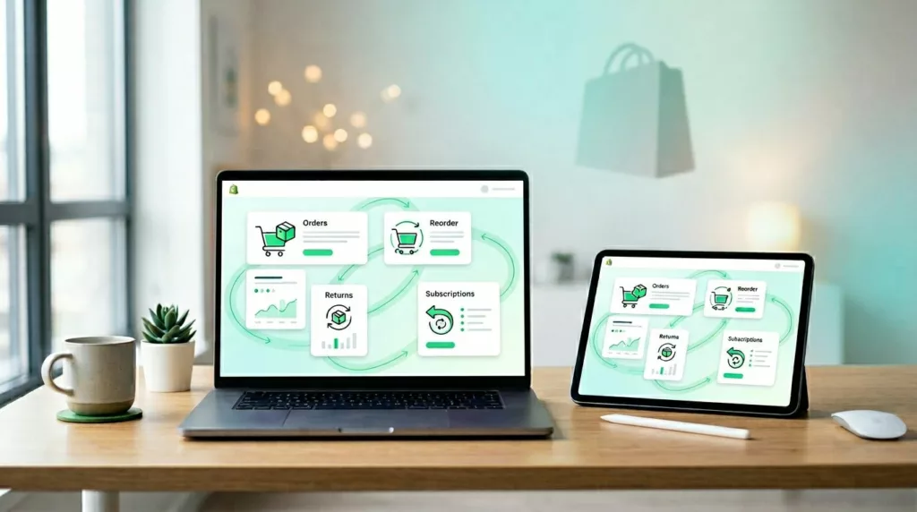
Build the dashboard around next actions, not account settings
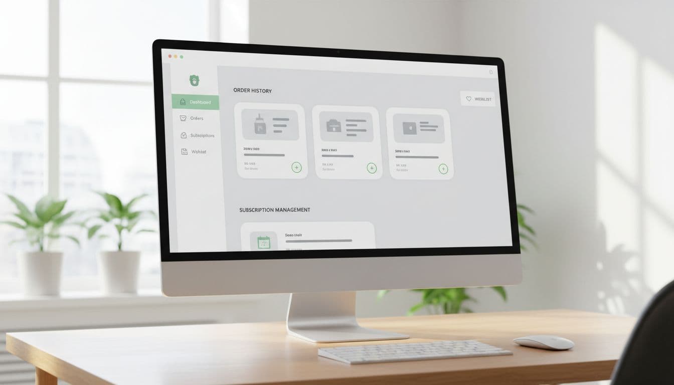
A strong Shopify customer account page answers three things fast: what did I buy, where is it, and how do I get it again? Put order history, tracking, and reorder actions above addresses, preferences, and account details.
For most stores, these account blocks do the most work:
- Recent orders with Buy again: Show the last few orders first, with the last purchased variant and quantity ready to go.
- Track order and return status: Keep shipment updates and return actions close to the order, not buried in help pages.
- Subscriptions and replenishment: Let customers pause, skip, edit frequency, or swap products without contacting support.
- Wallet, store credit, and rewards: Surface balances where they can influence the next purchase.
The best dashboards feel like a shortcut. A shopper who bought coffee 30 days ago shouldn’t have to open a product page, pick the same grind, and rebuild the cart. Show that last order on top, preselect the last choice, and make reorder the main action. If the product is out of stock, offer the closest in-stock option or a back-in-stock alert. Dead ends kill repeat sales.
Context matters too. Put the help around the task. If a payment method failed for a subscription, link directly to update payment from that order or subscription card. If a return is in progress, show the refund status next to the original order. Every extra page adds friction.
If you’re also refining the full purchase path, this guide on reorder flow UX for repeat purchases pairs well with account-page work. The account page gets the click, but the reorder flow closes the sale.
Keep the visual hierarchy quiet. One strong primary action beats five equal buttons. Also keep promos below task-based content. Returning customers didn’t come back to browse a hero banner.
Personalize for mobile users, then measure what actually moves retention
Most return visits to the account page happen on mobile, often from an email, a delivery update, or the Shop app. So the page should open in the exact context the customer expects. Send them to the relevant order, keep tap targets large, and place recent purchases above less-used account tools.

Personalization works when it feels helpful. Good examples include replenishment reminders based on past cadence, a wishlist shown near related order history, or a subscribe-and-save prompt only after a shopper has reordered once or twice. Shopify’s account ecosystem now supports hundreds of compatible extensions, so loyalty balances, wishlists, post-purchase offers, and profile tools can live inside the account experience instead of sending users across disconnected pages.
Still, better UX only matters if it changes behavior. Use a simple scorecard to keep the team honest.
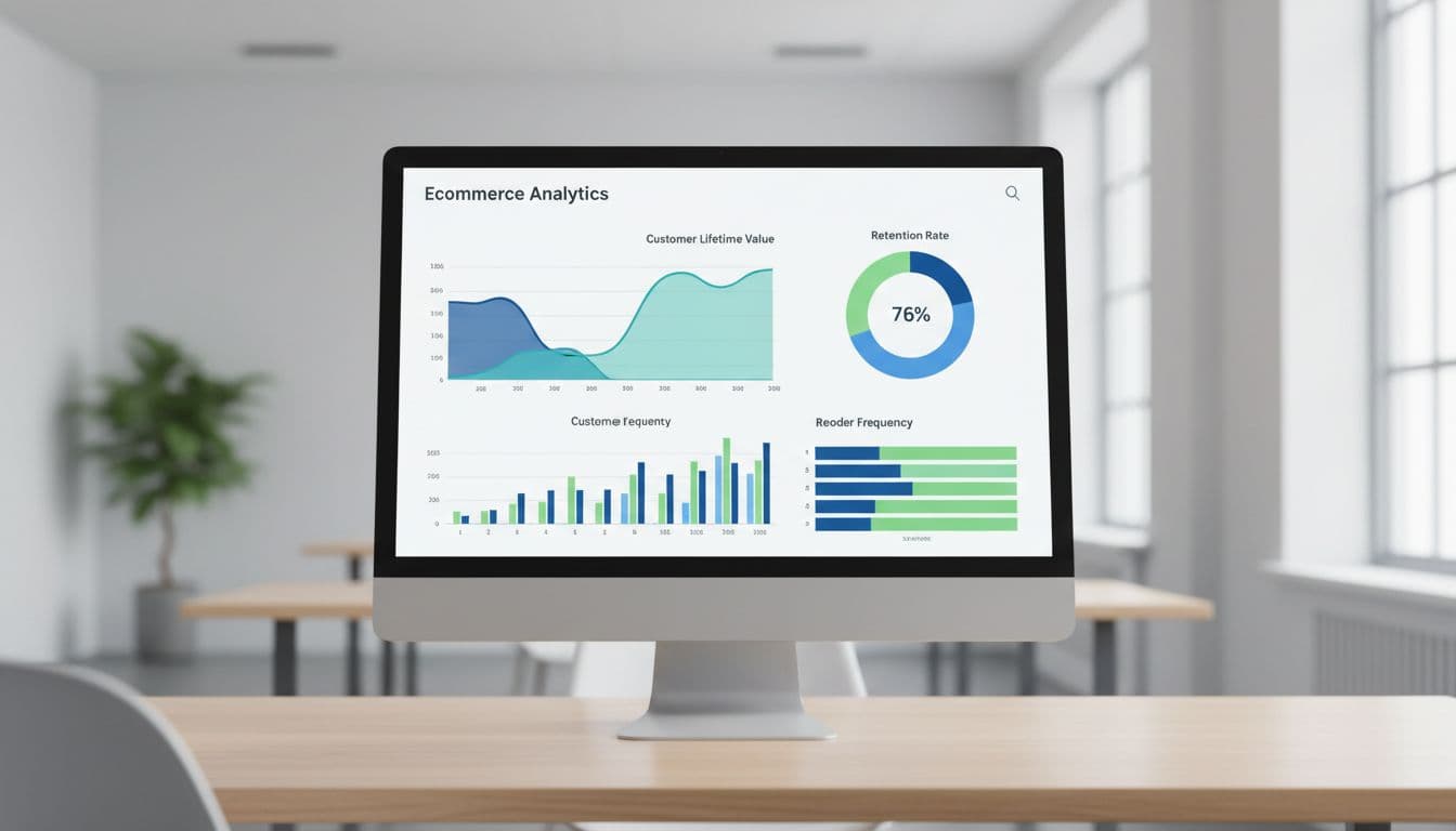
| KPI | What it tells you | Example signal |
|---|---|---|
| Repeat purchase rate | Are customers coming back? | Customers with 2+ orders in 90 days |
| Reorder conversion | Does Buy again actually work? | Reorders divided by reorder clicks |
| Subscription save rate | Do account controls reduce churn? | Pause or skip accepted during cancel flow |
| Self-service completion rate | Does the page reduce support demand? | Returns, tracking, or payment updates finished without an agent |
| 90-day CLV | Are returning customers worth more? | Revenue per customer after account UX changes |
The takeaway is simple. Track module views and clicks, not just completed orders. If customers see Buy again but ignore it, the module isn’t convincing. If they click but don’t finish, the problem sits later in the flow.
A customer who already trusts your brand shouldn’t have to work for the next purchase. Treat the customer account page like a return-visitor storefront, and every order-history visit becomes a retention chance. Start with order history, add smarter reorders and self-service controls, then measure adoption. Small fixes here often pay back faster than another acquisition campaign.