
Shoppers rarely leave a product behind because they stopped caring. More often, they leave because your store makes them start over.
That’s why recently viewed products matter. Done well, they help people resume intent, skip another search, and get back to the buying decision fast.
The catch is simple. If the module feels stale, noisy, or invasive, it stops helping. Good UX makes it feel like memory, not tracking.
Why recently viewed products work when they reduce memory load
A recently viewed module should do one job first: help shoppers pick up where they left off. That sounds small, but it removes a real point of friction on large catalogs. People compare options, open tabs, get distracted, then return later on a different mission and a shorter attention span.
That’s why the feature works best on pages tied to action, such as the homepage for return visitors, product pages, search results, and the cart. It works less well when buried in a footer or mixed into generic recommendations.
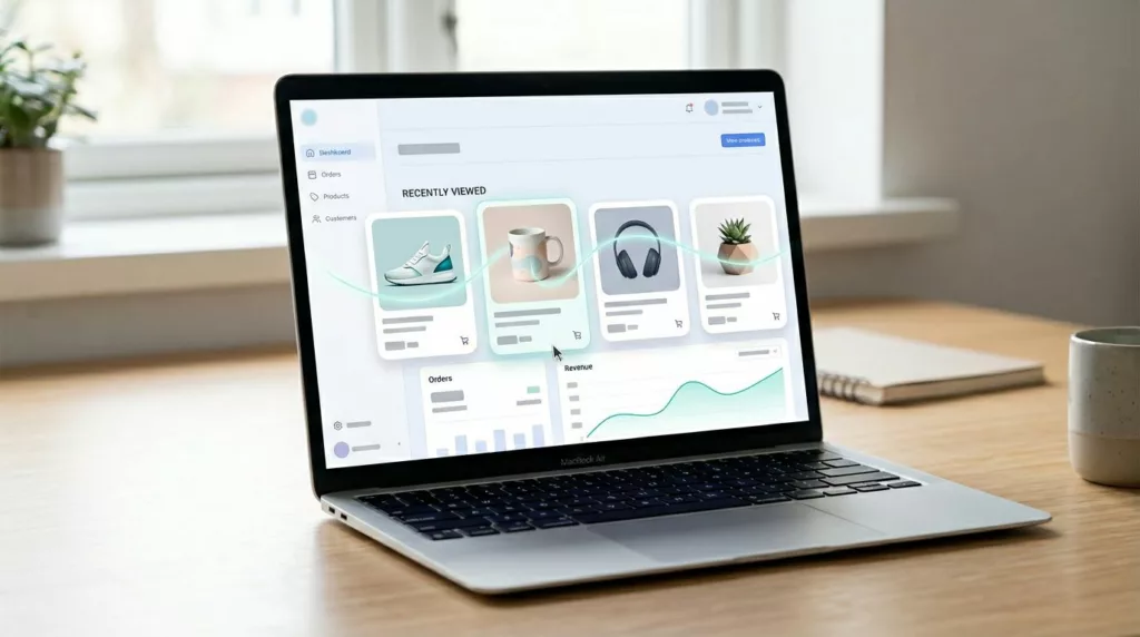
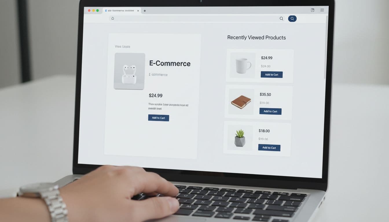
As NN/G’s guidance on ecommerce product pages makes clear, product pages are decision pages. Recently viewed products support that decision when each card carries enough context to be useful: thumbnail, name, current price, stock state, and the selected variant when one exists.
The best recently viewed experience answers one need fast: “Take me back to that item.”
Keep the set tight. Four to eight items is usually enough. Sort newest first. Also, give shoppers a simple way to clear the list. That matters on shared devices, during gift shopping, and when browsing turns into a dead end.
Recently viewed history also shouldn’t compete with a wishlist. A wishlist captures active saving. Recently viewed captures passive interest. Used together, they cover both short-term memory and longer-term planning, much like these wishlist UX patterns for return visits and AOV.
Desktop and mobile patterns that remove friction
On desktop, recently viewed often works best as a right-rail block on long product pages, or as a compact row near the cart. The goal is visibility without stealing focus from the main task.
Placement should shift with screen size and shopper intent.
| Context | Best desktop pattern | Best mobile pattern |
|---|---|---|
| Product page | Right rail or row below details | Swipeable strip below core buying info |
| Cart page | Compact row under cart items | Single-row carousel above secondary modules |
| Return visit homepage | Mid-page “Continue shopping” shelf | Early-page row with 2 to 2.5 cards visible |
The pattern is simple: keep resume-focused content close to the next likely action.
Card design matters as much as placement. Each item should show a strong image, current price, stock state, and a clear reopen or add action. If a shopper viewed a blue medium jacket, the card should reopen that state when possible. If not, send them back to the product page with the missing choice highlighted.
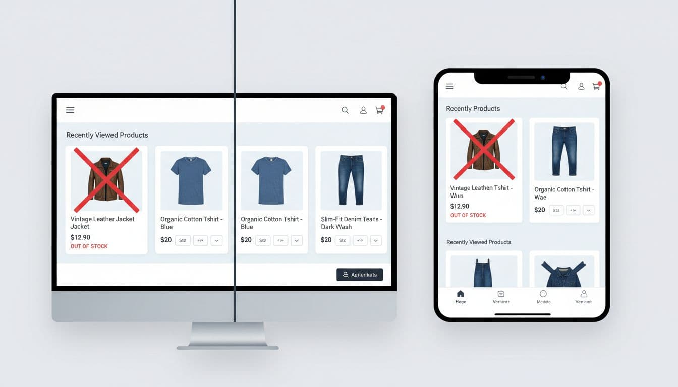
Mobile needs extra discipline. Horizontal carousels work because they save space, but they fail when touch targets are tiny or cards look identical. Keep the whole card tappable, avoid burying price under long titles, and don’t hide variant status. If your team is tuning small-screen details, these guides on mobile product variant UX patterns and mobile add-to-cart button patterns pair well with recently viewed work.
Edge cases that protect trust instead of breaking it
A recently viewed module can lift conversion one day and create doubt the next if edge cases are sloppy. Trust drops fast when a shopper returns to an item that vanished, changed, or no longer reflects what they picked.
A few rules keep the module honest:
- Out-of-stock items should stay visible, but muted, with a clear next step such as “View similar” or restock alerts.
- Variant choice should persist when the shopper made an explicit selection, especially for size and color.
- Current price should always replace stale cached pricing.
- Cross-device history should sync for signed-in users, but guest behavior should stay local unless consent covers broader tracking.
- Privacy controls should include an easy clear-history action.
For guests, recently viewed often relies on local storage or cookies. That’s useful, but it changes the privacy conversation. If your consent setup treats that storage as non-essential, gate the module behind consent or keep it session-based. Either way, tell the truth about what the store remembers.
Cross-device behavior is another common miss. Signed-in shoppers expect continuity between laptop and phone. Guests don’t. Don’t hint at account-level memory unless you actually sync it. If you’re planning this on Shopify, this overview of browsing-history recommendations in Shopify shows common implementation paths.
Use recently viewed with recommendations, not instead of them
Recently viewed products are not a replacement for related items, accessories, or personalized recommendations. They solve a different problem.
Recently viewed helps shoppers resume a path they already started. Related products help them compare. Recommendations help them explore beyond what they’ve already touched. Mix those jobs together, and every module becomes weaker.
On product pages, recently viewed usually belongs lower than the main buying block, because the shopper’s current item still comes first. On the cart page, a compact “Continue where you left off” row can sit near accessory suggestions, as long as the two modules don’t repeat the same SKUs. On a return visit homepage, recently viewed often deserves the higher slot because it reflects unfinished intent.
Keep the logic clean. Hide duplicates. Don’t show products already in cart. If an item appears in recently viewed and in a recommendation set, let the resume-oriented placement win. Teams using more advanced personalization can also treat recently viewed as a strong intent signal, much like Recombee’s recently viewed recipe does in broader merchandising logic.
Recently viewed products don’t need fancy visuals to perform. They need accuracy, context, and a low-friction path back to action.
Audit one template this week. If a returning shopper can’t find the last item, confirm availability, and act in one or two taps, that’s the friction to fix.