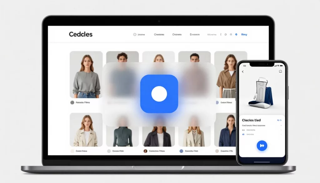

Shoppers use product listing pages like a shelf scan in a store, fast, selective, and impatient. A quick view can turn that scan into an add without forcing a full product page detour.
The catch is that quick view modal UX only works when the modal answers the “can I buy this?” questions in seconds. If it adds steps, hides decisions, or feels shaky on mobile, you’ll see clicks but not carts.
Below are practical patterns that reliably increase adds, plus tracking events and a pre-launch checklist your team can run before shipping.
When quick view helps (and when it hurts)
Quick view is strongest when the decision is simple: apparel basics, repeat buys, gifts, accessories, and any catalog where most users compare several items quickly. It’s weaker for spec-heavy products where details decide the purchase (think complex electronics or gear). Baymard’s research warns that many quick views fail for spec-driven categories because shoppers still need deep comparison and reassurance (see Baymard’s quick view findings).
The goal is not “replace the PDP.” The goal is “get to a confident add faster.” Some teams even remove quick view if it steals attention from better actions, which is why it’s worth reading a counterpoint like replacing quick view to lift conversions before you commit.
A quick view should be a purchase checkpoint, not a mini catalog. If it can’t lead to an add, it’s just another click.
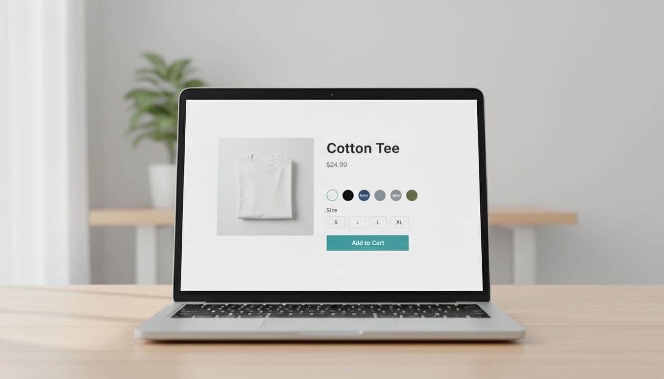
Pattern 1: Keep “Add to Cart” visible, specific, and stateful
What it is
A primary CTA that stays in view, reflects the current selection, and tells the truth about what happens next. On scrollable modals, this usually means a sticky CTA row pinned to the bottom.
Why it improves adds
People scroll to check photos, materials, or fit notes. If the CTA disappears, the user has to hunt for it again, and that friction kills impulse adds. A visible CTA also reduces “where am I?” anxiety inside a modal.
Implementation tips
Use a sticky footer with a clear label and a tight summary of the chosen variant. Good button copy examples:
- Add to Cart (default)
- Add size M to cart (after selection)
- Sold out (disabled state)
- Notify me (if you support back-in-stock inside quick view)
Also, show inline validation near the selector and near the CTA. Example microcopy:
- Under size: “Pick a size to add.”
- Near CTA after click: “Select a size first.”
Make the close affordance predictable (top-right icon, Esc closes, clicking the backdrop closes), and trap focus for accessibility. For general modal mechanics and pitfalls, reference modal UX best practices.
Common mistakes
- CTA scrolls away: users lose the action after checking details.
- Misleading state: the button says “Add to Cart” even though a size is required and not chosen.
Pattern 2: Make variant selection fast with smart defaults and clear guardrails
What it is
A variant block (color, size, width, pack size) designed to prevent dead ends. It includes defaults when safe, constraints when needed, and instant feedback when a choice is invalid.
Why it improves adds
Most quick view drop-offs happen right at variants. Shoppers want to act, but they hit uncertainty: “Is my size available?”, “Did I pick the right color?”, “Why won’t it add?” Tight variant UX removes that hesitation.
Implementation tips
Start with a simple rule: default only what shoppers rarely debate.
- Default color if it matches the thumbnail they clicked (the user already expressed intent).
- Don’t default size for apparel unless you have strong signals (previous purchases, saved preference). Instead, prompt it.
Use availability-aware UI:
- Disable unavailable sizes, and show “Out of stock” on hover or tap.
- If selecting a color changes size availability, update immediately and keep the user anchored (no layout jump).
Keep microcopy short and close to the control:
- Size helper link: “Size guide”
- Fit hint under sizes: “Runs small, size up”
- Error message: “Size is required.”
Common mistakes
- Auto-selecting the first available size: adds go up, returns also go up.
- Resetting choices: changing color wipes size silently, then the add fails later.
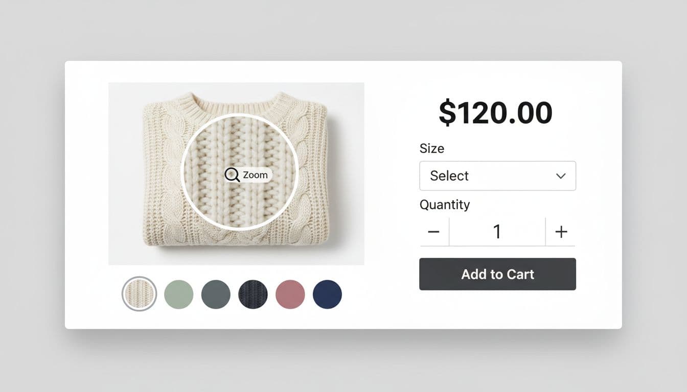
Pattern 3: Build confidence inside the modal (photos, zoom, and the right reassurance)
What it is
A “confidence stack” that answers the top questions without turning into a full PDP: strong imagery, zoom, 1 or 2 key bullets, and one reassurance line about shipping or returns.
Why it improves adds
Quick view works because it compresses time. Confidence features compress doubt. If the shopper can confirm texture, finish, or fit, they’ll add now and learn more later.
Implementation tips
Prioritize interactive media over long copy:
- Allow swipe on mobile, and arrow keys on desktop image carousels.
- Add zoom on hover (desktop) and pinch-to-zoom (mobile) when the product benefits (fabric, detail work, prints).
- Put 2 scannable bullets near price, for example: “100% cotton”, “Machine washable”.
For reassurance, pick one line that removes fear without crowding:
- “Free returns within 30 days”
- “Ships in 1 to 2 business days”
If FAQs often block adds on your PDP, mirror one high-impact answer inside quick view (shipping cutoff, return window, warranty). For ideas on what converts, see product page FAQ UX that lifts conversion.
Common mistakes
- Tiny images and no zoom: users bounce back to the grid to keep browsing.
- Too much copy: the modal becomes a cramped PDP, and scanning slows down.
Measurement: quick view events that explain add-to-cart lift (or loss)
Track quick view as its own funnel, not just “adds.” Fire these events with consistent properties so you can segment by device, category, and variant complexity.
A simple instrumentation map:
| Event | When it fires | Key properties |
|---|---|---|
| quick_view_open | Modal becomes visible | product_id, list_id, position, device |
| quick_view_variant_change | Any option changes | product_id, option_name, option_value, available |
| quick_view_add_to_cart_click | CTA pressed | product_id, variant_id (if known), required_missing (true/false) |
| quick_view_add_to_cart_success | Cart API confirms | product_id, variant_id, qty |
| quick_view_close | Modal dismissed | product_id, close_method (esc, backdrop, x), time_open_ms |
One extra metric that pays off: time from open to success. If it rises after a UI change, you probably added friction even if adds look flat.
Pre-launch checklist for higher adds from quick view
- The CTA stays visible, and the label updates after selection (example: “Add size M to cart”).
- Required options can’t fail silently, errors appear near the control and near the CTA.
- Color reflects the clicked thumbnail, and availability updates instantly.
- Zoom or high-detail imagery exists where it matters, and it works on mobile gestures.
- Close behavior is consistent (X, Esc, backdrop), and focus stays inside the modal.
- Analytics events cover open, variant change, add click, add success, and close reasons.
Conclusion
Quick view is like a fitting room mirror on the sales floor: it should help someone decide, not make them wander. When your quick view modal UX keeps the CTA in reach, makes variants painless, and builds confidence with the right details, adds rise without forcing more page loads. Run the checklist, ship the tracking, then watch where people hesitate, because the best improvements usually live in the two seconds before the click.