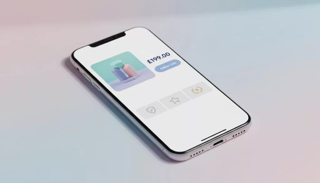
Your product detail page is where intent turns into money through Conversion Rate Optimization, or into a bounce. In 2026, shoppers don’t “browse” product pages the way they used to. Driven by search intent, they scan, compare, and decide fast, usually on a phone.
This product page checklist focuses on the parts that change outcomes: the layout modules that reduce effort and improve user experience, the copy that answers doubts, and the trust cues that stop second-guessing. Use it as a build spec for new templates, or as an audit guide for your best-selling SKUs.
Above-the-fold layout that makes buying feel effortless
Treat the top of your PDP like a store shelf plus a helpful sales associate. It should answer three questions in seconds: What is it, what does it cost, and how soon can I have it?
Start with a clean, Mobile-First Design structure that works like a bento grid: media on one side (or top on mobile), purchase box on the other, then supporting proof below. If you want a broader UX baseline for the rest of the store experience, align your PDP layout with the patterns in user experience strategies for 2026 online stores. For Shopify Optimization, ensure these layout modules perform correctly on that platform.
Key modules to prioritize above the fold:
- Product Imagery that earns trust: Show 6 to 10 images minimum, plus zoom. Put “detail” shots early (texture, seams, ports, labels).
- Variant selection that can’t be missed: Use buttons or tiles, not tiny dropdowns. Ensure smooth interactions that respect Core Web Vitals, particularly Interaction to Next Paint, for responsive performance. On mobile, keep the selector close to the Call to Action.
- A sticky purchase bar: Price, chosen variant, and an Add to cart Call to Action button that stays reachable in the thumb zone.
- Fast checkout options: Show express buttons near the main Call to Action (wallets, BNPL, saved payments). Even if users don’t click them, they signal “this will be quick.”
Add microcopy that prevents hesitation, with Page Speed as a critical factor above the fold. Examples you can lift:
- Shipping promise (near CTA): “Order in the next 2h 10m, ships today. Delivery shown at checkout.”
- Stock clarity (near variants): “Only 7 left in Medium, restocking Feb 28.”
- Price transparency (under price): “Includes VAT. Duties calculated at checkout if needed.”
If the page asks shoppers to scroll to learn basics (shipping, returns, or delivery date), it’s like hiding the price tag in a physical store.
Product Descriptions that reduce returns and support tickets
In 2026, content isn’t about “more words.” It’s about the right answers, in the right format, with proof. Your product page checklist should separate persuasion content (why it’s great) from decision content (will it work for me), while incorporating essentials like Internal Linking and Breadcrumb Navigation for better site navigation.
Build content in blocks that match real questions:
1) A short, specific Product Description
Open with 2 to 3 lines that name the job the product does. Avoid brand poetry. Write what it is, who it’s for, and what’s different in your Product Description.
Example:
- “A 20 oz insulated bottle that stays cold for 24 hours. Slim enough for car cup holders. Includes leak-proof lid.”
2) Scannable specs and compatibility
Specs should be structured with Structured Data and Schema Markup, not buried in paragraphs. This feeds product information to search engines for rich snippets. For items with fit or compatibility (apparel, parts, tech), add a “Will this fit?” module.
Example UI copy:
- “Works with: iPhone 15 and newer”
- “Fit: true to size. Between sizes? Size up.”
3) User Generated Content that answers “what’s it like in real life?”
Add a customer photo strip or short video carousel under the gallery. Make it filterable by variant when possible (color, size).
A simple label helps credibility:
- “Customer photos (unfiltered)”
- “Videos from verified buyers”
4) Policies written like humans
Put the key promise on the PDP, then link to the full policy page.
Snippets that support Conversion Rate Optimization without sounding legal:
- Returns: “Free returns for 30 days. Try it at home, send it back if it’s not right.”
- Warranty: “2-year warranty against defects. We replace, not repair.”
- Shipping: “Tracked delivery on every order. You’ll get a tracking link by email and SMS.”
For extra benchmarking on what high-performing PDPs tend to include, compare your template against high-performing product page elements.
Trust elements shoppers expect (and how to show them without clutter)
Trust in 2026 is more specific than “add a Trust Badge.” Shoppers look for signs your store is real, your Customer Reviews are legit, and your checkout won’t become a problem.
Social Proof: Review quality beats review quantity
A 4.7 rating with vague one-liners feels weaker than a 4.5 rating with detailed, searchable Customer Reviews. Add:
- A review summary line like “Most mention: comfort, easy setup, accurate sizing”
- Personalization filters users actually need (size, height, skin type, device model)
- “Verified buyer” labeling, and a visible date
Example microcopy for the summary:
- “4.6 average from 1,248 verified buyers. 78% rate it 5 stars.”
Anti-fraud and checkout confidence cues
These help honest customers as much as they stop fraud.
- “Secure checkout” plus recognizable payment icons near the CTA
- Address and card verification language that doesn’t sound scary
- A clear support link near purchase actions
Microcopy that feels calm:
- “Secure payment. We never store full card details.”
- “Need help before buying? Chat with us, reply in under 5 minutes.”
Privacy and tracking clarity (post-cookie-banner reality)
With tighter consent expectations, your PDP should still function well even when users opt out. This supports Technical SEO. Keep scripts lean, and use plain-language notices where it matters.
Add a short line near email capture or chat:
- “We use your email for order updates and support, not for resale. Manage preferences anytime.”
Accessibility is part of trust
If buttons are hard to read, users assume the business is sloppy. Strong contrast, visible focus states, and descriptive labels matter and boost overall User Experience. For practical design rules, use WCAG-compliant color choices for online stores and apply them to CTA buttons, error text, and variant states.
For a wider set of store-wide patterns that support trust (navigation, search, and consistency), keep a reference to e-commerce design best practices.
QA Audit Worksheet and A/B Testing to Run Next
Use this worksheet to audit one PDP template, then spot-check 10 top sellers.
| Area | What to verify on the PDP | How to QA quickly | Pass/Fail | Fix owner |
|---|---|---|---|---|
| Above the fold | Price, variants, CTA visible on mobile without zoom | iPhone + Android real device check | ||
| Sticky buy | Sticky bar doesn’t cover key UI, includes chosen variant | Scroll from top to reviews | ||
| Delivery | Delivery date or delivery range shown before checkout, updates reflect inventory management for stock clarity | Change ZIP/postcode, observe updates | ||
| Shipping cost | Shipping costs aren’t a surprise at checkout | Add to cart, view shipping estimate | ||
| Returns | Returns summary appears on PDP (not only policy page) | Scan near CTA and below fold | ||
| Reviews | Review summary, filters, and “verified buyer” present | Open reviews, filter, sort | ||
| UGC | Customer photos or videos included and labeled | Check media module under gallery | ||
| Anti-fraud cues | Payment icons and secure checkout copy present | Inspect near CTA and cart | ||
| Privacy | Consent choice doesn’t break core PDP features | Opt out, reload, test add to cart | ||
| Site Speed | Page loads quickly, no lag on images or variants | Time full load on real devices | ||
| Site Architecture | Clear URL structure, navigation breadcrumbs present | Check URL patterns, nav flow | ||
| Accessibility | Contrast, focus states, alt text basics | Keyboard tab test, quick contrast spot-check |
A/B Testing ideas that usually produce clean learnings:
- Sticky CTA vs no sticky CTA on mobile PDPs.
- Delivery promise and value proposition placement: near price vs under CTA.
- UGC strip location: under gallery vs under reviews.
- Returns snippet wording: “Free returns” vs “30-day returns” (watch margin impact).
- Review summary format: “Most mention…” tags vs plain star average.
A 2026-ready product page checklist isn’t about copying a “perfect” PDP. It’s about removing friction, proving claims, and making the next step feel safe, while helping products appear in AI Overviews through clear, structured data and high-quality product descriptions. Audit your top template, ship two improvements, then measure add-to-cart rate, checkout starts, and abandoned cart recovery. The best PDP is the one that makes buying feel obvious, driving conversion rate optimization and superior user experience.


