
A comparison table should feel like a helpful salesperson aiding decision making, not a math test. Yet many “compare” tables end up ignored because they’re dense, inconsistent, or painful on mobile.
Good product comparison UX does one job well: it helps a real person in their purchase journey pick an option with confidence. That means fewer surprises, faster scanning for high scannability, and clear next steps, whether you’re comparing SaaS plans or three nearly identical headphones.
Below is a practical approach you can implement this week, with UI specs, accessibility details, mobile patterns, analytics events, and fixes for the most common failure modes.
What a comparison table UX needs to solve (before you design UI)
Most compare tables fail because they start with internal product thinking, not user decisions. People aren’t comparing “product attributes,” they’re answering questions like:
- Will this plan cover my security needs (SSO, audit logs)?
- Will I hit limits (seats, storage, API calls)?
- What changes if I upgrade later?
Start by defining the decision moment and the audience through solid information architecture. For a self-serve SaaS pricing page, the reader is often a power user and a budget owner at once. For e-commerce product listing pages, it’s often “which is best for me” plus “is it worth the price.”
Pick rows that reduce risk, not rows that show off
Product attribute rows should focus on deal-breakers and thresholds. Put “Seats included” and “Storage limit” above “Custom themes.” Add “Audit logs” above “Integrations count” if buyers care about compliance. Users engage in noncompensatory decision making to initially filter out plans that fail these thresholds.
A fast filter for “Differences only” usually beats a longer table. It respects expert users while still letting cautious buyers expand details for compensatory decision making where they weigh pros and cons of the remaining options. Also, keep wording consistent across your app and docs. If your product calls it “SAML SSO,” don’t label the row “Enterprise login.”
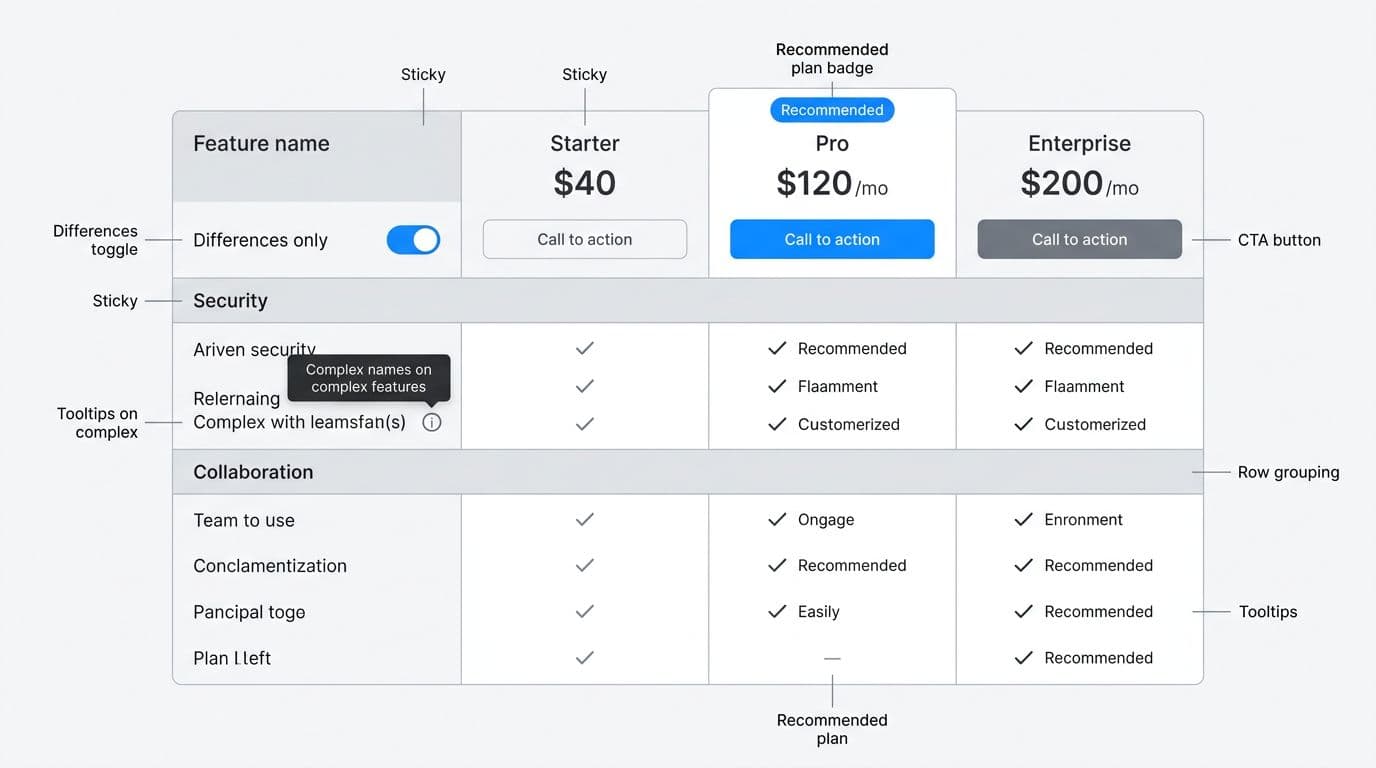
If a row needs a sales call to interpret, it doesn’t belong in the main compare view. Put it behind a tooltip or “Learn more.”
Decide how many plans you’re truly asking people to compare
Three columns is the sweet spot to avoid choice paralysis. Four can work with strong grouping and sticky headers. Once you hit five, scanning drops and horizontal scrolling becomes the default behavior, not a backup.
If your business needs more tiers, don’t force them into one grid. Consider a primary 3-plan compare, plus an “All plans” drawer, or a filter that narrows plans by audience (for example, “Teams” vs “Enterprise”) on your product listing page.
For SaaS pricing layouts and examples of side-by-side comparison, cross-check patterns in SaaS pricing page design guidance and adapt them to your product’s constraints.
Concrete UI specs for compare tables people can scan and act on
Treat the feature comparison chart like a mini application: it needs structure, controls, and clear states. Here are implementation specs that hold up in production.
UI specs that reduce scanning friction and boost scannability
Use this spec table as a build checklist with your engineers.
| Component | Spec you can ship | Why it works |
|---|---|---|
| Sticky column headers | Make plan name, monthly price, and CTA sticky after ~64 px scroll | Users keep context while scanning long feature lists |
| Sticky column headers | Keep feature names sticky, truncate with tooltip at 2 lines | Prevents “what row am I on?” during horizontal scroll |
| Column count | 3 plans default grid view; at 4, add stronger grouping; at 5+, add filters or audience tabs | Preserves comparability without forcing sideways scanning |
| Row grouping | 3–6 sections max (Security, Collaboration, Support) with section headers | Helps chunking and reduces perceived length |
| Differences control | “Differences only” toggle, remember state for session | Power users reach answers in seconds |
| Icon rules | Don’t use icon-only meaning; pair with text or accessible labels | Prevents misread symbols and improves accessibility |
| Recommended plan | One subtle badge only, plus a short rationale line | Guidance without feeling pushy |
A simple, consistent row pattern matters more than flashy visuals. These technical specifications ensure readability. For example:
- SSO (SAML): Not available, Available, Available
- Audit logs: 7 days, 90 days, 1 year
- Seats included: 3, 10, Unlimited
- Storage: 10 GB, 1 TB, Custom
Notice how each row in the grid view reads left to right without translation. For specific data types like custom integrations, a list view can complement the grid view.
Prioritized checklist (Must-have / Should-have / Nice-to-have) for comparison tables
This keeps scope realistic when you’re working with tight cycles.
| Must-have | Should-have | Nice-to-have |
|---|---|---|
| Clear plan names, price, billing cadence | “Differences only” toggle | Column pinning (user-selected) |
| Consistent row terminology | Grouped sections with anchors | Save/share comparison state |
| One sticky CTA per plan column | Tooltips for complex terms | Export to PDF (B2B) |
| Sticky top row (long tables) | Sticky first column (wide tables) | Inline calculator for add-ons |
| Plain-language limits (seats, storage) | Recommended plan with restraint | Personalization by persona |
If you need inspiration for layout variations (especially for website builders and e-commerce), review how platform comparisons are presented in a Best E-Commerce Website Builders Comparison and borrow the scannable side-by-side comparison structure, not the marketing tone.
For additional examples of pricing table layouts, see pricing table design examples for Elementor, then sanity-check them against the accessibility and “differences” rules above.
Accessibility, mobile patterns, and analytics that make “compare” measurable
Accessibility: table semantics and keyboard behavior
If it looks like a table, code it like one. Use a semantic <table> when the content is truly tabular, such as technical specifications. Add a <caption> that explains what’s being compared (even if visually hidden). Mark plan headers as <th scope="col"> and feature names as <th scope="row">. That structure improves screen reader navigation and supports “read row” and “read column” commands.
For controls:
- Differences only toggle: Use a real checkbox or switch, not a div, to filter and compare in dynamic comparison tables. Announce state changes with
aria-live="polite"if the table updates dynamically. - Tooltips: Trigger on focus and hover, dismiss on Escape, and keep them reachable by keyboard. Tie the trigger to content via
aria-describedby. - Sticky headers: Don’t break focus order. If you clone headers for stickiness, ensure only one set is focusable and announced.
Keyboard expectations should be boring and predictable: Tab moves through controls and CTAs, arrow keys scroll the page normally, Escape closes open popovers, and focus states stay high-contrast.
Mobile: when to switch from table to cards
On phones, a dense grid becomes a thumb trap, hurting mobile responsiveness. Two patterns work well:
- Plan cards with progressive disclosure: Show price, CTA, customer reviews, and 6–10 key rows. Add “See all features” to expand a grouped list (Security, Collaboration, Support).
- One-plan-at-a-time compare: Keep feature names in a list view, then let users swipe between plans while the feature list stays fixed.
Keep “Differences only” on mobile too, but apply it within the expanded view so users don’t feel like content vanished. Ensure strong mobile responsiveness throughout.
If you’re building a new store and need mobile-first thinking, the UX considerations in a launch online store from home guide can help you prioritize scannability on small screens when every pixel costs attention.
Analytics: events to track (and what they indicate)
Instrumenting dynamic comparison tables versus static comparison tables is how you stop guessing.
compare_toggle_differences(on/off): High usage suggests rows are too long or too similar in dynamic comparison tables.compare_tooltip_open(row name): Repeated opens on “Audit logs” or customer reviews means the label needs clarity, or buyers care a lot.compare_horizontal_scroll(distance): High scroll with low CTA clicks often signals too many columns or missing sticky cues.compare_section_expand(section): Shows which groups matter (Security vs Support).plan_cta_click(plan, location=table): Your main conversion signal that impacts conversion rates, segment by device and traffic source.compare_shareable_link(plan): Tracks sharing behavior for deeper insights.compare_limit_hover(seats, storage): Spikes can point to pricing confusion or fear of overages.
Tie these events to outcomes: trial starts, checkout starts, and plan upgrades. Then compare cohorts who used the table versus those who didn’t to reveal user intent in decision making.
Common anti-patterns (with fixes)
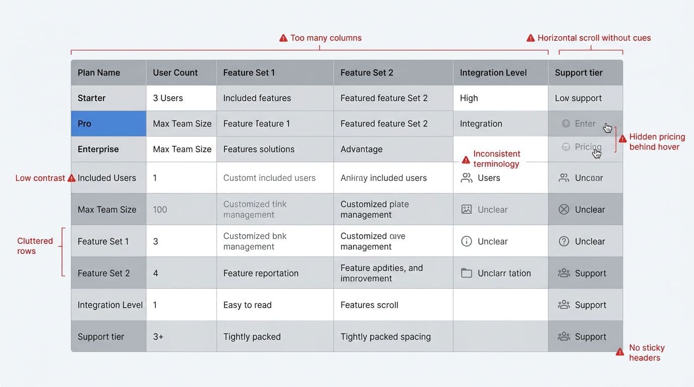
- Too many columns: In your comparison matrix, collapse to 3 primary plans, add filters or persona tabs to filter and compare the rest.
- Hidden pricing: Show total price and billing cadence in the header, always. No hover reveals.
- Unclear icons: Replace mystery symbols with “Included,” “Not included,” or a labeled value (especially for customer reviews).
- Horizontal scroll with no cues: Creates user friction; add sticky first column, edge fade, and a visible scroll hint on first interaction.
- Low contrast text: Meet WCAG contrast, especially for disabled states and secondary notes.
- Inconsistent terms: Standardize labels across the site for metadata consistency (SSO vs SAML login), then update docs later.
Conclusion
People making considered purchases use a comparison table when it respects their time. Keep the grid tight, show meaningful product attributes (seats, storage), and make differences easy to spot. Then back it up with accessibility that works for keyboards and screen readers, plus analytics that tell you what’s confusing. The best product comparison UX delivers a side-by-side comparison that supports decision making throughout the purchase journey, helping someone choose and feel good about it.