
A failed payment doesn’t always mean a lost sale. More often, it means a poor customer experience where the checkout asks the buyer to solve a problem with too little help.
Recent 2026 reporting shows 56% of US consumers had a valid card rejected in the prior 90 days. When that happens, failed payment recovery decides whether they retry, switch methods, or leave.
For ecommerce and SaaS teams, this is where UX earns its place by preventing revenue leakage. Good recovery flows keep trust intact, preserve progress, and turn a shaky moment into a completed order.
Key Takeaways
- Failed payments hit 56% of US consumers recently; smart recovery UX prevents revenue loss by maintaining trust, preserving cart progress, and guiding clear next actions.
- Craft error messages like a helpful cashier: explain the issue plainly, suggest one primary fix (retry, update, or switch methods), and reassure that order details stay intact.
- Streamline recovery to one step—smart retry first, inline card edits next, then alternatives like Apple Pay—without form resets, logins, or mazes that kill intent.
- Treat recovery as a revenue driver: track failure/recovery rates, churn, and support tickets split by device, method, and buyer type; review top errors weekly with replays.
- Pair UX fixes with account updaters, dunning emails, and tokenization to maximize salvaged sales and curb passive churn.
Why failed payments kill ready-to-buy intent
By the time a shopper reaches payment, most persuasion work is done. They’ve picked the product, accepted the price, and decided to buy. Then a vague error appears, and the whole flow feels unsafe.
That’s why payment failure recovery has an outsized effect on conversion. A generic message like “Transaction failed” from the payment gateway, often stemming from card networks, turns many different issues into one dead end. Yet soft declines, hard declines, expired cards, 3DS timeouts, and false fraud flags don’t need the same response.
A failed card screen should feel like a helpful cashier, not a locked door. The interface needs to say what likely happened, what the shopper can do now with their payment method, and what data is still safe. When it doesn’t, people assume the order is broken.
This is even more costly on mobile, where patience is thinner and re-entry is painful. If your checkout already carries friction, such as weak guest access or long forms, recovery gets harder. That’s why solid guest checkout UX patterns for mobile friction reduction and strong recovery design work together.
Broader Salesforce checkout best practices for 2026, including approval rate optimization, point to the same rule: keep the next action obvious. At this stage, even a small lift matters. A one-point gain at payment often beats bigger changes higher in the funnel because the buyer is already ready to pay.
Write error states like a helpful cashier
Good error states do three jobs at once. They explain the issue in plain language, guide the next step, and reassure the shopper that their cart and details are still there.
A payment error should answer three things fast: what happened, what to do now, and what stayed saved.
This quick comparison shows the difference:
| Failure state | Weak copy | Better recovery copy |
|---|---|---|
| Expired card | Payment failed | Your card has expired. Update the expiry date or use another card. |
| Soft declines | Transaction declined | Your bank didn’t approve this payment. Try again or choose another method. |
| 3DS timeout | Authentication error | Verification timed out. Retry the secure check, your cart is still saved. |
| Billing address | Invalid payment | Check your billing ZIP and street number. Everything else is saved. |
| Insufficient funds | Declined | Your account has insufficient funds. Try another payment method. |
The takeaway is simple: be clear without sounding technical or blame-heavy.
Microcopy matters because it shapes trust in seconds, supporting customer retention. “Try again later” feels like a shrug. “Use another card” can feel abrupt if a simple retry would work. Instead, map the message to the decline codes when possible. If the issue looks temporary, make Retry payment the main CTA. If the card data is stale, lead with Update card details. If the decline came from the bank, offer Try another payment method as the next best path.
Also, don’t wipe the page. Keep the order summary, shipping choice, and totals visible. If delivery timing affects hesitation, stable expectations matter too. That’s why calm, visible estimated delivery date UX for checkout supports recovery, even when the error happens at payment.
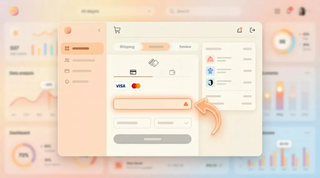
Give shoppers a fast retry path, not a maze
Recovery works best when the next move takes one step, not five. Too many checkouts still send users back to the top of the form, clear fields, or force a new login. That’s a conversion leak.
For ecommerce, the best fallback order is usually simple. Start with a smart retry for temporary issues. Then let the shopper edit card details inline. After that, offer other methods such as Apple Pay, Google Pay, PayPal, bank pay, or local options. A narrow set of choices works better than a wall of buttons.
For subscription businesses, the flow often happens after an invoice fails or a renewal is declined for recurring payments. In that case, to fight involuntary churn, send users from the email or in-app alert straight to a billing page with payment update links, the amount due, the failed payment method, and a one-tap retry after update. Don’t dump them into generic account settings.
Recent 2026 reporting shows 72% of merchants now use tokenization, and 43% accept real-time payment methods. That creates better recovery options for recurring payments. Saved, tokenized methods can support automated retries, while lower-friction payment rails can rescue orders that card flows would lose. Teams refining this flow can borrow ideas from guides on how to reduce payment recovery friction.
If login blocks billing updates, reduce that barrier too. Lighter access patterns, like passwordless login UX in ecommerce, can help shoppers fix payment issues without a password reset detour.
Track recovery UX like a revenue feature
Payment recovery shouldn’t sit in a design backlog as “error copy.” It should be measured like a revenue surface.
Start with key numbers like payment failure rate by reason, recovery rate in-session, recovered monthly recurring revenue after 24 hours, involuntary churn from failed payments, and support contacts triggered by payment errors. Then split those metrics by device, payment method, merchant ID, first-time buyer, and returning customer. A desktop card decline and a mobile wallet failure often need different fixes.
Also, compare what the user saw against what the payment processor returned. In 2026, false declines still come from overcautious fraud prevention rules, poor routing by the payment processor, and messy data formatting. So UX changes work best when product, risk, and payments teams review the same failure reasons together.
A simple weekly habit helps: pull the top 10 failure states, watch session replays, and rewrite the three most common messages. Then test CTA order, field persistence, and fallback visibility. Teams that want a broader playbook can review this failed payment recovery guide and adapt the patterns to their own stack.
Frequently Asked Questions
Why do failed payments have such a big impact on conversions?
Shoppers reach payment with high buy intent after product selection and price acceptance. A vague error erodes trust and feels like a broken process, prompting abandons. Good recovery restores confidence fast, often yielding higher lifts than funnel-top changes.
How do you write effective payment error copy?
Map decline codes to plain-language explanations without jargon or blame, like “Your card expired—update the date or try another.” Always include what to do next and confirm saved data. This shapes trust in seconds and guides the optimal action.
What’s the ideal order for recovery options?
Lead with one-click retry for soft/temporary issues, then inline card updates, followed by a shortlist of alternatives (wallets, PayPal). Avoid overwhelming buttons or sending users back to form tops. For subscriptions, link emails directly to a focused billing update page.
How should teams measure and improve recovery UX?
Track payment failure rate by reason, in-session recovery rate, recovered revenue, and churn, split by device/method/customer. Pull top 10 failures weekly, watch session replays, and A/B test messages/CTAs with product/risk/payments input. This turns errors into a measured revenue feature.
Recovery starts with the next click
The best failed payment recovery doesn’t try to explain the whole payment system. It simply makes the next step feel safe, clear, and low effort. Pair it with an account updater to handle stale data before the next click, and include dunning emails or grace periods in your broader recovery toolkit to fight passive churn.
Start with your top three payment errors this week. Keep every valid field intact, rewrite the copy in plain language, add smart retry logic, and trim each failure state to one strong primary action. When payment fails, your UX either powers failed payment recovery to save the sale or gives it away.