
Picking a size and color on a phone should feel like ordering coffee: quick, familiar, and hard to mess up. Yet on many product pages, the mobile variant picker for product variants turns into a guessing game. Tiny swatches, unclear selection states, and surprise “not available” messages push shoppers into backtracking.
The fix usually isn’t more UI. It’s clearer structure, better feedback, and fewer “what just happened?” moments. Below are patterns that reduce cognitive load, prevent errors, and deliver a frictionless buyer experience all the way to Add to cart.
Make variant selection feel like one clear decision (not a form)
On mobile, confusion starts when options don’t look tappable, or they look tappable but don’t confirm a choice. Treat the variant selector block in the product information section like a single, guided step. The UI should answer three questions at a glance: What do I need to pick, what did I pick, what happens next?
Start with labels that remove ambiguity. Use “Size” and “Color” (not “Options”), and add unit helpers when needed (for example, “US size”). If you support both men’s and women’s sizing, don’t hide that behind a tooltip. Put it in the label.
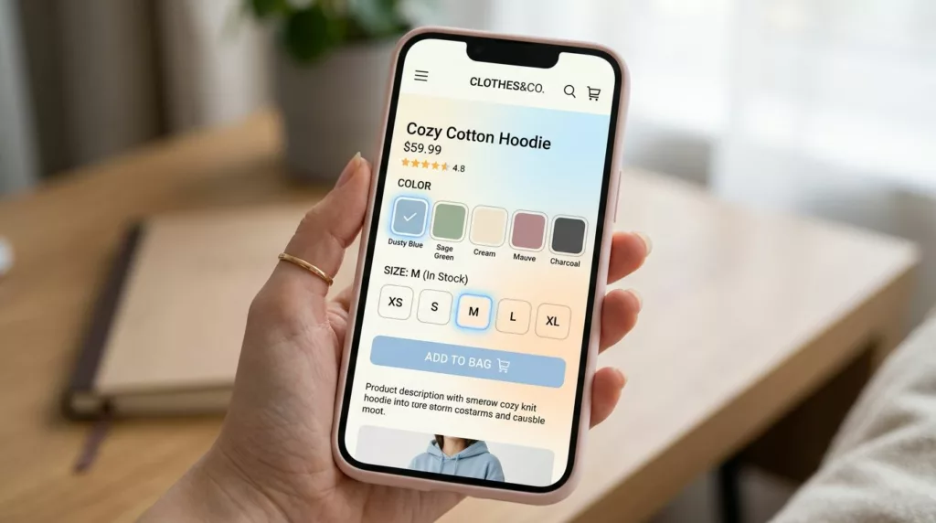
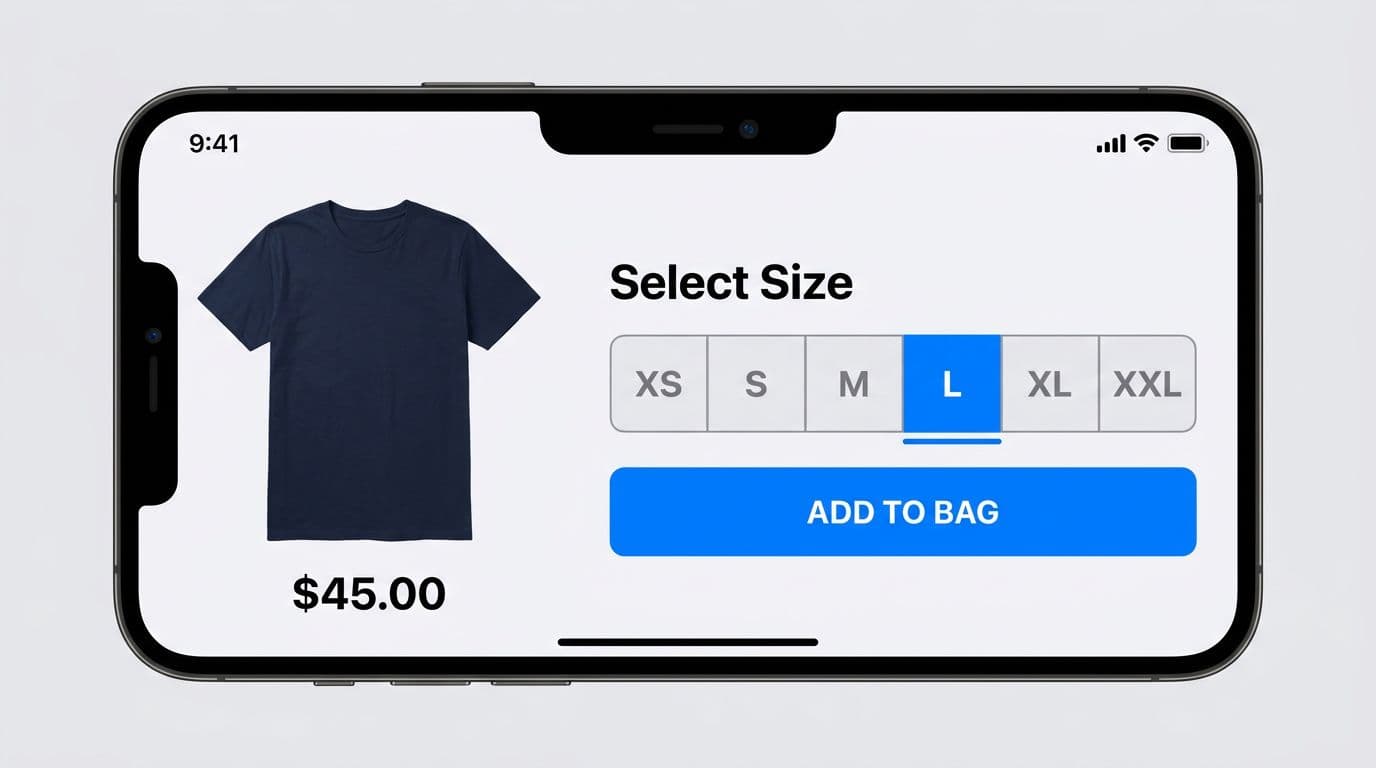
For short lists (2 to 6 choices), pill style buttons or segmented controls beat dropdown menu style on touch devices. They show all variant options, reduce taps, and lower memory burden. For longer lists (10+ sizes, long dimensions, dozens of colors), move the selection into a bottom sheet so the page stays calm. In your product template, streamline the variant selection process with a responsive layout for variant options.
Recommended interaction patterns (iOS and Android):
- iOS: segmented control for sizes (highlighting the selected variant or default variant), or a bottom sheet with a clear “Done” action for long lists.
- Android: Material-style choice chips for short lists (highlighting the selected variant or default variant), and a modal bottom sheet for long lists (with a sticky confirm row if needed).
Small text UI example (what “clear” looks like in plain words):
- Size: XS, S, M (Selected), L, XL
- Helper line under picker: “Selected: M, in stock”
Do and don’t rules for reducing mis-taps
- Do show an explicit selected state (filled background, border, and check icon if it fits).
- Do keep each option label visible (avoid icon-only sizes or color-only dots).
- Do keep tap targets large (48 px feels safer than 44 px).
- Don’t hide required choices behind a collapsed accordion right above the CTA.
- Don’t reset a selection silently when another option changes. Explain it.
A helpful reference point for thumb-first UI behavior is practical mobile guidance like mobile-first product page optimization tips, especially when teams inherit cramped theme layouts.
Use swatches and availability cues that don’t make people guess
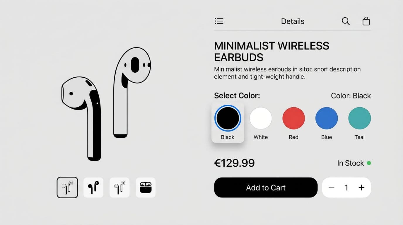
Color swatches are great for scanning, but they fail when they rely on memory. “Is that navy or black?” “Did I tap the right one?” Your job is to remove doubt.
Pair every color swatch or image swatch with a text label using custom color definitions, at least for the selected state. Even better, show labels for all swatches if space allows. This lines up with research on mobile behavior and why color swatches need to be fully available and understandable, as discussed in Baymard’s mobile color swatches guidance.
Make the selected state unmistakable with clear visual feedback. A thin border often isn’t enough on bright colors. Combine at least two signals:
- Border or outline
- Check icon or filled background
- A “Selected: Black” line under the row showing the option value
If selecting a color swatch changes price, stock, or product media, update it immediately and clearly, without jumping the layout. Keep the price area height fixed, then swap values. Also, consider a short confirmation toast only when the change is easy to miss, like “Color changed to Red.”
Gotcha: if two swatches look similar, people will “correct” the selection by tapping again, and they often land on the wrong one. Labels and strong selected states reduce double-taps.
Handle long option lists without turning the PDP into a scroll trap
When option values exceed what fits on one row based on column count settings, avoid a horizontal swatch rail that scrolls forever. Instead, add a “More colors” entry that opens a modal view or popover. In that view, support quick scanning and fast narrowing, updating the product media gallery as needed.
Text UI example for the view header and search:
- Title: “Choose color”
- Search placeholder: “Search colors”
- Group hint: “In stock first”
If you’re working in Shopify and need a practical overview of how color swatches and variant images behave on phones, this guide on mobile-friendly color swatches and variant images is useful for implementation constraints.
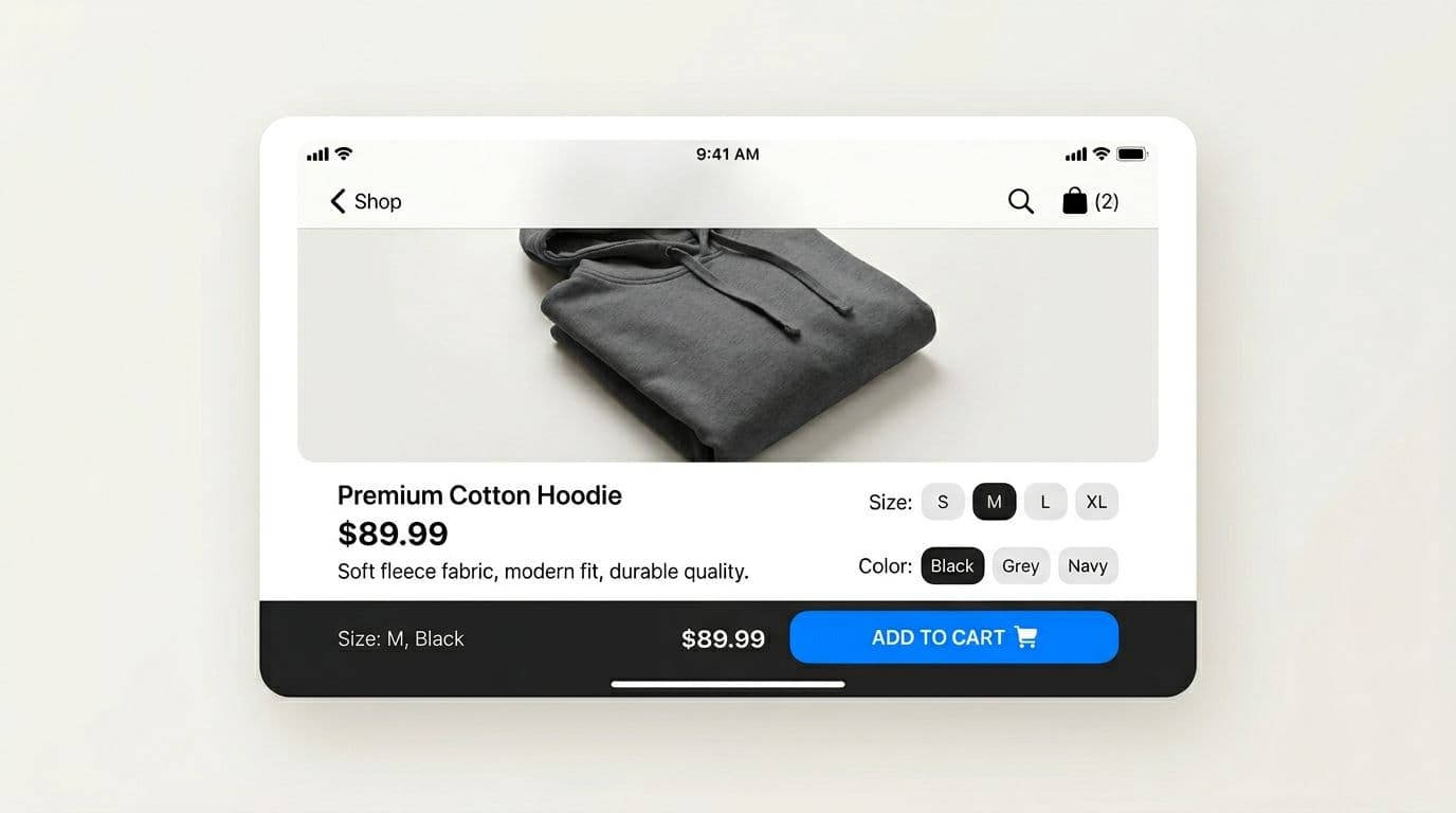
Make dependencies obvious, then keep a persistent summary by the CTA
Variant dependency rules cause the most confusion. Size changes availability, color changes stock, and suddenly half the grid grays out. When a variant combination triggers that, the UI must explain the “why,” not just the “no.”
Instead of disabling options with no context, add short microcopy that matches the reason:
- Disabled size: “XL, Out of stock”
- Disabled color: “Red, Not available in M”
- After a change: “Black is only available in S to L”
Keep this microcopy close to the picker, not hidden in a toast. People shouldn’t need to remember it.
Just as important, keep a persistent selection summary near the CTA. A sticky add-to-cart bar works well because it reduces backtracking, pairing nicely with variant deep links to preserve state on shared URLs. It also stops “wrong variant” adds when users scroll reviews and forget what they chose, a bigger issue on mobile variant pickers versus desktop variants.
A solid pattern is: sticky bar shows “Size: M, Color: Black” plus the price, and the button label changes based on state.
Microcopy examples that prevent dead-end taps:
- Default: “Add to cart”
- Missing size: “Select size”
- Missing color: “Select color”
- Missing both: “Select options”
- Unavailable combination: “Choose another option”
If you’re refining the CTA area around variant selection, these internal references pair well with this work: mobile add-to-cart button patterns and variant-aware add-to-cart buttons.
Implementation checklist (touch, accessibility, and announcements)
Small build details decide whether these patterns work in the real world. Leverage your platform’s theme editor for quick configuration of these elements:
- Tap targets: 44 × 44 px minimum, 48 × 48 px preferred for options.
- Spacing: 8 to 12 px between options prevents wrong taps, 16 px between groups.
- Safe-area padding: keep sticky bars above iOS home indicator and Android gesture nav.
- Accessibility: each option needs a meaningful label (for example, “Color, Black”) with support for keyboard editing.
- Selected state for screen readers: expose
aria-pressed="true"(or equivalent) on the chosen option. - Announce changes: when price, stock, or delivery changes after selection, announce it in an
aria-liveregion (for example, “Price updated, now $42,” or “Out of stock for size XL”). - No surprise resets: if selecting Color changes Size availability, preserve the Size when possible, otherwise explain the reset inline.
Usability testing that catches option confusion fast
Run tests that force dependency edges, not just the happy path. Here’s a simple way to score outcomes and compare designs.
| Scenario | What you observe | Success metric |
|---|---|---|
| Choose size + color, then add to cart | Hesitation, mis-taps, backtracking | Time-to-select, add-to-cart conversion |
| Pick an out-of-stock size | Whether users understand why it’s disabled | Selection error rate, rage taps |
| Trigger dependency conflict (Color blocks Size) | Whether people recover without leaving | Backtracking count, recovery rate |
| Screen reader flow through variants | Whether changes are announced | Task completion rate, missed announcements |
Track these weekly: selection error rate, time-to-select, backtracking, and add-to-cart conversion. When the picker improves, you’ll usually see time-to-select drop first, then conversion rise.
Conclusion
Option confusion isn’t a copy problem or a “users are careless” problem. It’s usually missing state, unclear rules, and hidden context. A better mobile variant picker makes required variant options obvious, shows what’s selected, explains what’s unavailable, and keeps a clear summary next to the CTA.
Audit your top PDPs, instrument the metrics above, then test one pattern at a time. The best outcome is simple: fewer wrong product variants, fewer dead ends, and more confident taps.