
Mobile shoppers in your online store are ready to buy, but the small screens of mobile devices fight them. Your product page photos, reviews, and details push the main CTA out of reach, then one scroll becomes five.
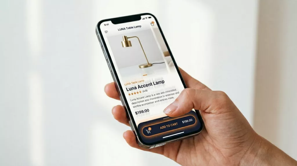
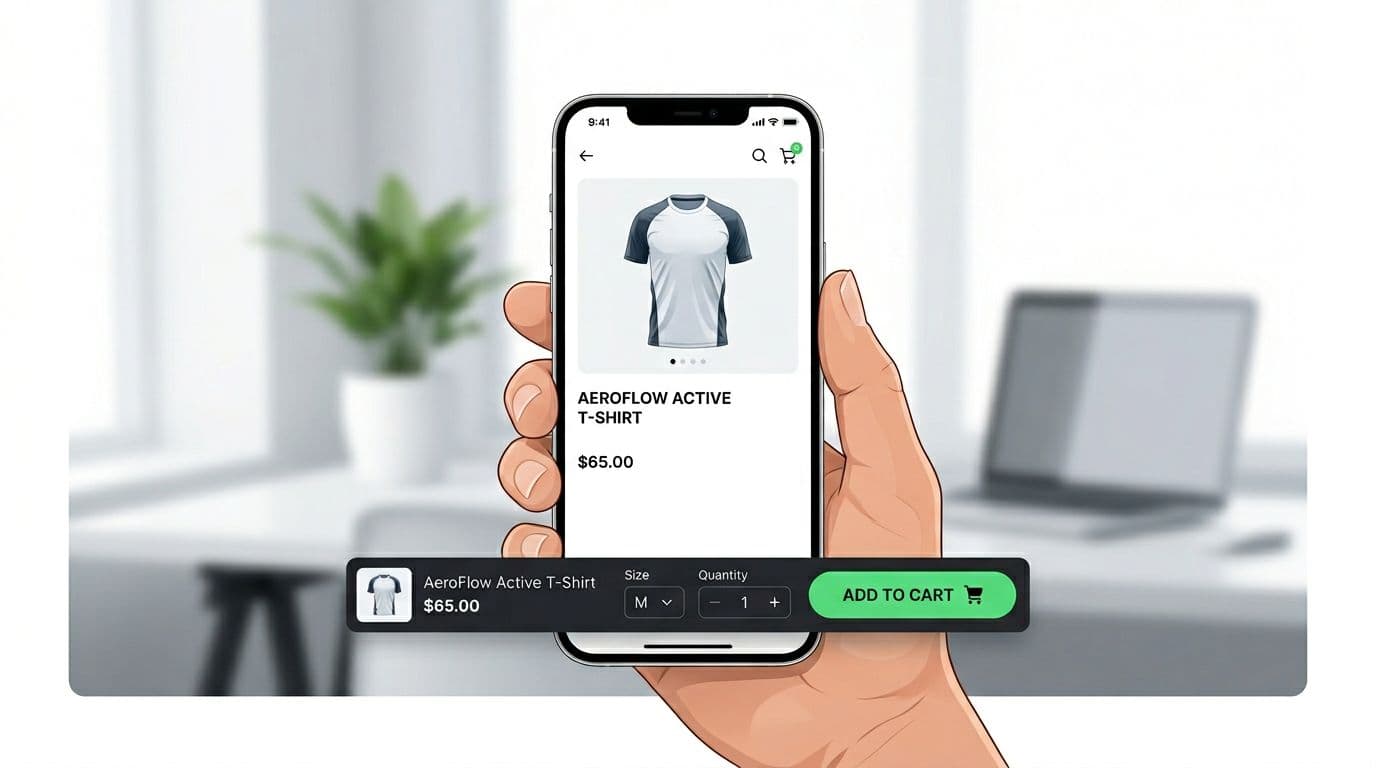
That’s why a sticky add to cart bar keeps showing up in winning mobile tests. It pins the buying action to the thumb zone while shoppers browse.
Recent benchmarks still show the gap: mobile ecommerce conversion rates often sit around 1.8% to 2.5%, while desktop trends closer to 3.5% to 4%. Meanwhile, mobile cart abandonment can run as high as 85%+. Small UX friction adds up fast, and sticky purchase UI targets one of the biggest friction points: “I’m interested, but where’s the button?” These UI improvements can boost sales for mobile traffic.
What sticky add to cart bars fix (and what they don’t)
A sticky add to cart bar works because it shortens the distance between intent and action. On a long product details page, customers bounce between images, size charts, reviews, and shipping info. Each time the call to action disappears, you risk losing the moment.
In practice, a good sticky add to cart bar, or quick buy button, improves three mobile behaviors:
- Call to action visibility: the action stays available without forcing a scroll back to the top or bottom.
- One-handed use: bottom placement matches how most people hold phones.
- Decision support: the bar can repeat key info (price, selected variant) at the tap moment.
There’s also a psychology angle: persistent calls to action reduce “where do I go next?” uncertainty, improving the overall customer experience. If you want supporting context on how sticky CTAs tend to affect engagement, note that ecommerce websites often see varying results; see sticky CTA data and research.
Still, sticky add to cart bars don’t fix deeper problems. If your shipping logic surprises people at checkout, even a Shopify store cannot rely on a sticky bar to save you. If your size selection is confusing, it can even make things worse by surfacing a broken variant flow more often. For the bigger product details page picture, pair this pattern with stronger add to cart button patterns for mobile success.
A sticky add to cart bar shouldn’t “sell harder.” It should remove work, reduce mis-taps, and confirm the next step.
UI specs and behavior that lift mobile add-to-cart rate
Before you build a sticky add to cart bar for product pages on mobile devices, decide what the bar must do. For most Shopify, WooCommerce, and headless PDPs, the sticky add to cart bar should mirror the main add to cart button logic (same variant state, same validation, same price). If it behaves differently, users notice.
Here are UI defaults that work well across catalogs. Use customizable CSS to ensure the bar fits your site’s branding:
| Element | Recommended spec (mobile) | Why it matters |
|---|---|---|
| Sticky bar height | 64 to 80 px | Big enough to tap, not so big it hides content |
| Primary button (Add to Cart or Buy Now) tap target | 44 × 44 px minimum (48 × 48 safer) | Reduces mis-taps and rage taps |
| Spacing between controls | 12 to 16 px | Prevents accidental quantity changes |
| Bottom safe-area padding | 16 to 24 px plus env(safe-area-inset-bottom) | Keeps CTA above iOS home indicator |
| Text contrast | Aim for 4.5:1 for button text | Keeps the CTA readable outdoors and on low-end screens |
Behavior matters as much as sizing:
- Variant required? Don’t “fail” after the tap. If size is required, tapping Add to Cart should open the variant selector and focus the missing option.
- Show fast feedback states. Use pressed, loading, and success states without changing layout. Disable repeat taps during loading.
- Keep secondary actions secondary. Wishlist and share belong as icons, not competing buttons.
- Include one trust cue, not five. A short line like “Free shipping over $X” or “30-day returns” can lower hesitation.
These behaviors remove friction and facilitate quick checkout.
If your current CTA is hard to reach or too small, start with these mobile add-to-cart button designs, then add stickiness after the base button is solid.
Implementation note: For any Shopify store, treat the sticky add to cart bar as a “subscriber” to PDP state. It should read from the same selected variant, quantity, price, and availability, and it should call the same add-to-cart function (keeping synced with the back-end state). Avoid duplicating logic.
Analytics, A/B testing, and mobile UX troubleshooting for sticky add to cart bars
Sticky add to cart bars rank among top conversion boosters for mobile ecommerce. Store owners often deploy them via a Shopify app.
Sample events to track (GA4 or Segment)
You’ll want both standard commerce events and sticky-specific events to track shopping cart interactions precisely. Keep names consistent and pass the same item payload each time (item_id, item_name, price, currency, item_variant, quantity).
A practical event set:
pdp_sticky_atc_impression(properties:placement= bottom,is_visible,variant_selected)pdp_sticky_atc_tap(properties:variant_selected,quantity)pdp_sticky_variant_opened(properties:missing_optionwhen relevant)add_to_cart(use GA4 recommended event, include item array)pdp_atc_error(properties:error_type= out_of_stock, network, validation)
Also add a simple guardrail event for frustration, for example pdp_rage_tap if you already detect rapid taps.
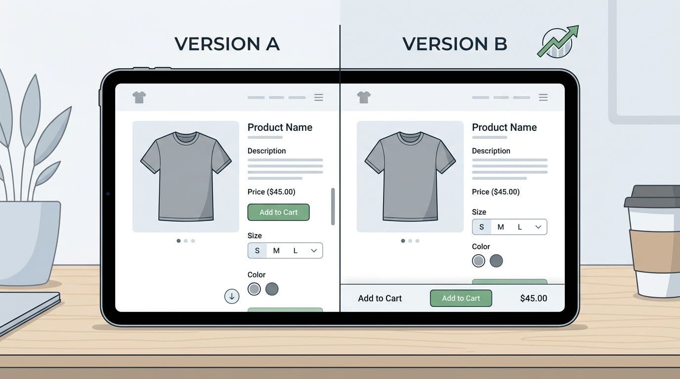
A/B testing methodology (with success metrics)
Run the test like you’d test checkout, because it affects revenue.
- Define the hypothesis: “Showing a sticky add to cart bar on mobile PDPs increases ATC rate, sales and revenue per session, and AOV by keeping the CTA reachable during the browsing and checkout process.”
- Choose primary metrics: ATC rate, CVR, revenue per session (RPS), sales and revenue, AOV increase. Include cart upsell considerations.
- Set guardrails: bounce rate, PDP scroll depth, page speed (LCP), refund rate (if you can), and support contacts about cart issues.
- Build variants: Control (no sticky bar) vs Variant (sticky bar, optionally with a countdown timer as an urgency feature). Testing a sticky checkout bar is a common alternative. Keep everything else identical.
- QA the messy paths: out of stock, low inventory, required variant missing, discount pricing, subscriptions, bundles.
- Analyze by segment: new vs returning, iOS vs Android, and top PDP templates. A lift on one template can hide a loss on another.
Proof points vary by store, but sticky CTAs often show measurable lifts in controlled tests. For examples, see Blend Commerce’s sticky CTA test with a 7.17% CVR lift and Clean Commit’s mobile sticky add-to-cart test result.
Don’t call it a win on clicks alone. A sticky bar can raise ATC rate while lowering CVR if it creates variant errors or duplicates cart lines.
Troubleshooting common mobile issues
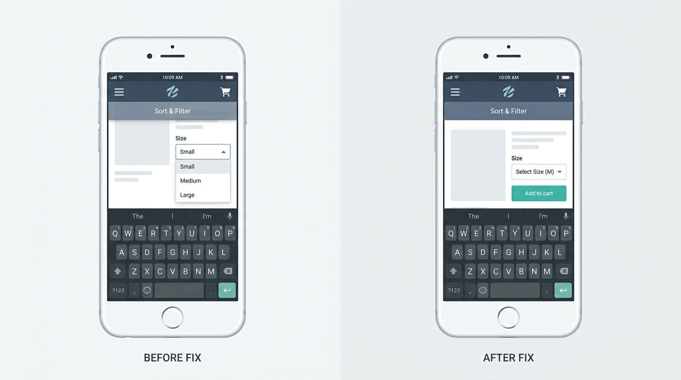
Most sticky bar bugs come from stacking and viewport quirks:
- Overlapping nav, chat widgets, cart sliders, or cart drawers: reserve space and set a clear stacking order (
z-index), then audit all fixed elements together. - Safe-area issues on iPhone: add
padding-bottom: env(safe-area-inset-bottom)so the button never sits on the home indicator. - Keyboard covering the bar: when a selector opens or an input focuses, switch the bar to a compact mode, or temporarily hide it until the keyboard closes.
- Variant selection mismatch: never keep a separate “sticky variant state.” Bind it to the main PDP state, or you’ll add the wrong variant.
- Layout shift: mount the bar with a reserved spacer so the page doesn’t jump when it appears.
Conclusion
A sticky add to cart bar is essential for any modern online store, especially on the product page for mobile users. It’s simple, but not small. Done right, it keeps the buying action visible, reduces thumb strain, and improves the tap moment with clear feedback. Done wrong, it blocks UI, breaks variants, and inflates click metrics without growing revenue per session.
While simple, it significantly impacts the customer experience and bottom-line growth. If mobile PDPs are your bottleneck, ship the pattern, instrument it well, and let an A/B test decide.