
Gift cards should be the easy win in your store. The shopper already wants to buy, they just need to finish the form.
Yet gift card pages often feel like a paperwork desk. One unclear field, one hidden rule, and the buyer bails. That’s why gift card UX has an outsized impact on conversion rate, form error rate, and support tickets.
Below are practical patterns to reduce confusion, raise completion, and make results easy to measure.
Make the gift card page feel predictable (so intent doesn’t leak)
A gift card isn’t a normal product. Still, shoppers expect the same confidence signals they get from a product page: clear price, clear delivery, and clear rules. When those basics are missing, buyers slow down, second-guess, and abandon.
Gift card friction also stacks because the buyer is doing “two-person shopping.” They’re thinking about the recipient’s email, timing, and preferences. FinUXlab explains why gift cards work better as a step-by-step pathway than a single “product” decision in their breakdown of the gift card user pathway.
Keep the top of the page focused on four decisions, in this order:
- Amount (presets plus custom)
- Delivery method (email vs physical)
- Delivery timing (send now vs schedule)
- Who it’s for (recipient details, then message)
Everything else should support those choices, not compete with them. If policy content is long, collapse it behind “Gift card details” with a short summary visible.
Common confusion triggers to remove:
- Surprises like fees, shipping costs, or delivery timelines shown late
- A single mixed form that asks for both email and shipping address at once
- Gift card “rules” written like legal terms instead of shopper language
- Forcing account creation before purchase (a reliable drop-off source)
If you need stakeholder buy-in, tie your changes to measurable outcomes and known UX impact. A small clarity fix on a high-intent page can outperform bigger visual redesigns. This maps closely to how UX improvements drive revenue, as covered in the impact of UX design on conversion rates.
Treat the gift card page like a checkout pre-step. If it feels risky or unclear, buyers won’t even reach checkout.
Design the form to prevent mistakes (amount, delivery, scheduling, message)
Most gift card “bugs” aren’t technical. They’re human: typos, wrong delivery method, wrong date, or a custom amount that doesn’t fit the rules. Your job is to make the right path feel obvious.
Start with the amount selector. Presets reduce thinking, while a clean custom input handles edge cases (like matching a budget).
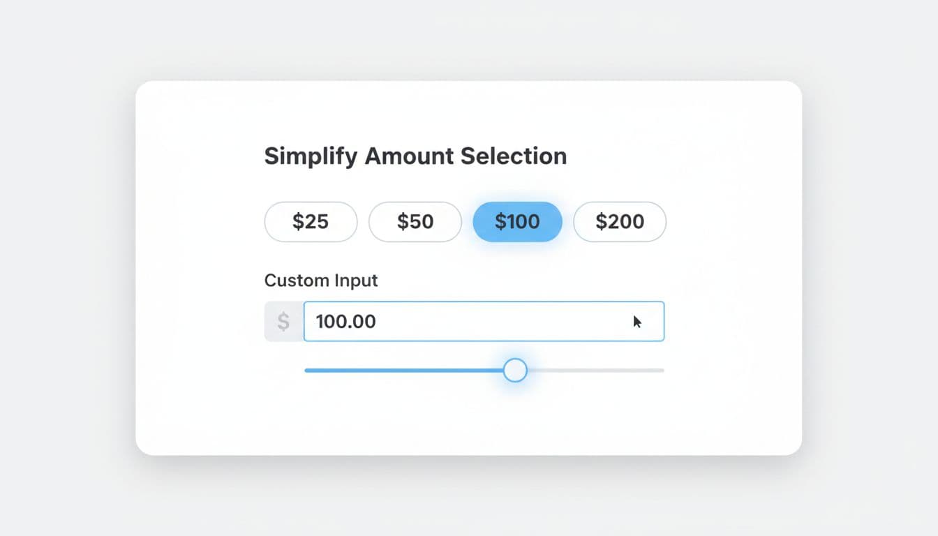
Recommended defaults and behaviors:
- Default to the most common preset (based on your data). If you don’t have data, don’t preselect. Highlight popular choices instead.
- Use a numeric keypad on mobile, auto-format currency, and accept “50” as “$50”.
- Show min and max near the input, not buried in fine print.
Example microcopy that prevents errors:
- Amount label: Gift card amount
- Helper text: “Choose a preset or enter any amount from $10 to $500.”
- Error (below field): “Enter an amount between $10 and $500.”
Next, make delivery a clear fork in the road. Use radio buttons with short descriptions, and reveal only the fields needed for that path.
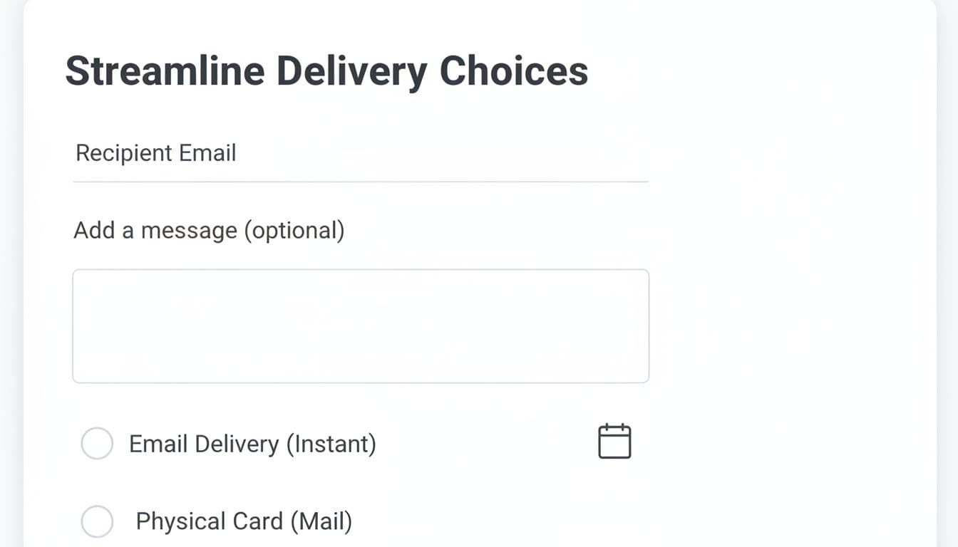
Microcopy patterns that cut support tickets:
- Delivery label: How should we send it?
- Email option hint: “Delivered by email in minutes.”
- Physical option hint: “Ships in 2 to 5 business days.”
- Recipient email label: Recipient email
- Confirm email label: Re-enter recipient email
- Email mismatch error: “Emails don’t match. Check for typos.”
Scheduling is another frequent failure point, especially around time zones. Make “Send now” the default, and let scheduling be an optional switch.
- Scheduling label: When should it arrive?
- Default: “Send now”
- Scheduled helper: “We’ll send it at 9:00 AM in your store’s time zone.”
- Date error: “Choose a future date.”
Finally, keep the message truly optional, with a live character counter. If you restrict emojis or special characters, say so before the user types, not after.
For broader guardrails that apply to this flow (mobile form patterns, clarity, and trust), keep a short reference like ecommerce UX tips for 2026 handy when you review designs.
Optimize confirmation and run experiments that prove the lift
Even after payment, gift card UX can fail. Buyers often ask: Did it send? When will it arrive? Can I resend it? If the confirmation page doesn’t answer those, your support inbox will.
A strong confirmation screen is part reassurance, part control panel. It should show delivery status in plain language and offer next steps without digging through email.
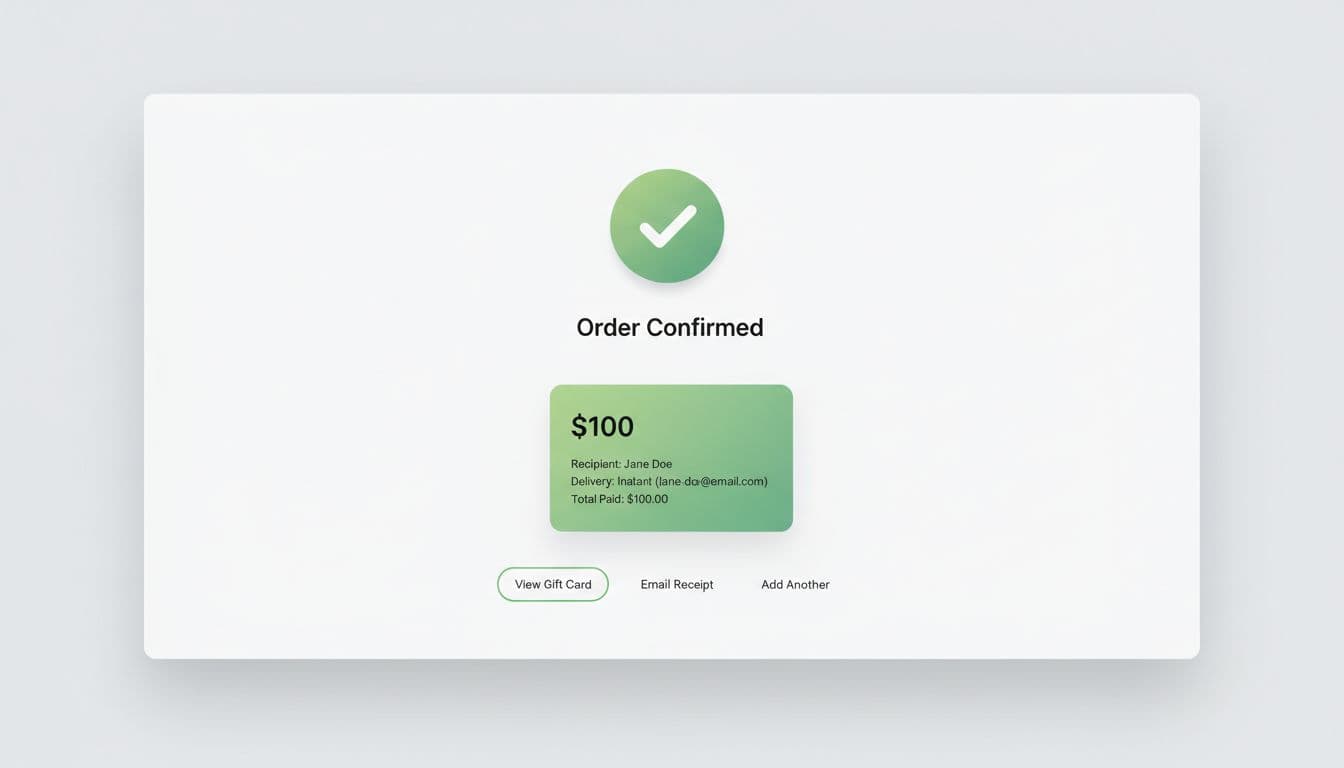
Use a simple do/don’t check to keep teams aligned:
| Area | Do | Don’t |
|---|---|---|
| Delivery status | Show “Sent” or “Scheduled for Mar 18, 9:00 AM (ET)” | Say “Processing” with no timing |
| Recipient details | Show masked email, plus “Edit and resend” when allowed | Hide recipient info entirely |
| Next actions | Offer “Resend email”, “Send to myself”, and “Download receipt” | Force a support contact for basic actions |
| Expectations | Restate key rules (expiry, redemption) in 2 lines | Bury rules in long terms text |
Track these metrics so improvements don’t rely on opinions:
- Drop-off rate from gift card page to checkout start
- Form error rate (per field and per session)
- Time to complete gift card configuration
- Support tickets per 1,000 gift card orders (tag: delivery, resend, wrong email, scheduling)
- Refund and chargeback reasons tied to gift cards
Then run focused experiments. Keep each test tied to a single metric change:
- Preset amounts test: reorder presets (common first vs high first). Measure completion and AOV.
- Delivery default test: default to email delivery vs no default. Measure form errors and checkout start.
- “Send to myself” option: add a one-tap toggle that fills buyer email. Measure error rate and “wrong recipient” tickets.
- Early policy clarity: show key rules under the CTA. Measure exit rate and chat starts.
- Confirmation actions: add “Resend” and “View gift card” buttons. Measure support tickets and repeat purchases.
If checkout changes are part of the same project, align them with proven checkout UX ideas like this eCommerce checkout optimization guide. For platform-specific considerations and edge cases (like Shopify’s setup and behaviors), reference a current overview such as Shopify gift cards guidance.
Conclusion
The best gift card pages feel like filling out a greeting card, not a tax form. When gift card UX is clear, buyers move faster, make fewer mistakes, and contact support less. Pick one high-friction spot (amount, delivery, scheduling, or confirmation), ship a fix, and measure the impact. Which metric would make the biggest difference for your team this month: conversion rate lift, fewer form errors, or fewer “did it send?” tickets?