
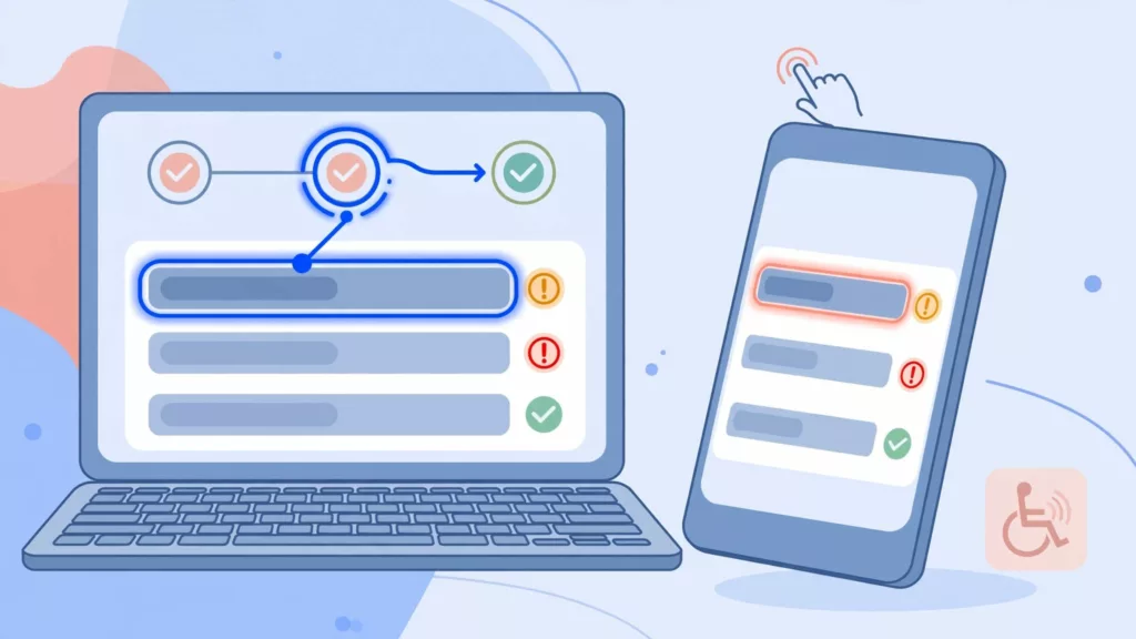
A checkout error can push a willing shopper toward form abandonment in seconds. Ecommerce form errors must help people recover quickly, whether they use a keyboard, a screen reader, assistive technologies, a thumb on a small screen, or all three.
A red border and “invalid value” message don’t tell a shopper what to fix. Clear labels, useful instructions, preserved data, and predictable focus improve the user experience and make recovery easier without leaving anyone behind.
Key Takeaways
- Clear labels, instructions, preserved input, and useful repair guidance help shoppers recover from checkout errors without abandoning the form.
- Use native HTML, visible labels, appropriate autocomplete and input types, and validation timing that matches the complexity of each field.
- After failed submission, provide a concise error summary, consistent inline messages, and a predictable focus destination without disrupting shoppers while they type.
- Use ARIA to expose invalid states, relationships, and important status updates, but avoid duplicate announcements and never rely on color alone.
- Test complete checkout journeys with keyboards, screen readers, mobile devices, client-side and server-side failures, then measure correction time and abandonment to reduce repair friction.
Fix ecommerce form errors without making checkout harder
Form validation should prevent avoidable mistakes, not interrupt every keystroke. A shopper with one missing address field needs useful error messages and a clear path back, not a blank page or generic warning.
A same-page reload can still work, but it fails when it wipes valid entries, returns focus to the page start, or gives no clear notice that the checkout process failed. Keyboard and screen reader users may have to hunt through a long checkout to find the problem. On mobile, repeated scrolling through shipping options and order totals, plus re-entry of valid details, increase cognitive load.
Use both client-side validation and server-side validation. Client-side checks catch simple formatting problems before the request. Server checks remain necessary because browsers can bypass client code, inventory can change, payment providers can reject a request, and address services can return new results.
Preserve every valid answer
Keep the shopper’s valid contact, delivery, and preference data after a failed submission. Don’t force them to re-enter a phone number because the postal code needs attention.
If checkout has several long steps, an error fields only view can reduce mobile effort as an optional responsive recovery pattern. Keep completed sections collapsed, show controls for the erroneous fields, and retain an obvious way to edit previous details. An error fields only view must preserve valid data and provide access to earlier details. Don’t hide successful fields so completely that shoppers can’t review their order.
Treat errors as recovery instructions
Good error text names the field and gives the next action. “Enter a valid email address, such as name@example.com” is useful. “Invalid input” is not.
“Your payment wasn’t approved. Try another payment method or contact your bank. Your order hasn’t been placed.”
This message states the condition, offers a safe next step, and removes doubt about the order status.
Start with semantic HTML and visible labels
Native HTML provides a dependable baseline for online forms, carrying much of the accessibility work assistive technologies rely on. Each of the input fields needs a visible <label> connected to its matching control with for and id. Placeholder text can disappear during entry and doesn’t replace a label.
The W3C’s guidance on labels and instructions supports this baseline. Use type="email" for email fields, autocomplete tokens such as email, postal-code, and cc-number, and appropriate input modes for mobile keyboards.
Keep help text available while people type
Place stable instructions near the control. For example, an address field might include guidance for postal addresses: “Apartment, suite, or unit, if applicable.” Connect that help text with aria-describedby when it adds information that isn’t already in the label. It supplements the label rather than replacing it.
After an error, add the error message’s ID to the same aria-describedby relationship. When focus returns, a screen reader can announce the label, invalid state, and repair instruction together if the error description identifies the erroneous fields.
For an email field, the accessible pattern is simple:
- The visible label reads “Email address.”
- After failed validation, the input has
aria-invalid="true". - Its
aria-describedbypoints to visible text such as “Enter an email address in the format name@example.com.”
The invalid-state marker doesn’t provide the repair instruction by itself, so the described text must explain the fix.
Don’t communicate required status or an error state only through color, or use an asterisk with no explanation. Say “Required” in visible text or expose it programmatically through the native required attribute and clear instructions.
Use the right control for the data
Reliable checkout form design starts with native controls: a checkbox needs a visible label that describes the choice. A radio group for delivery speed needs a real group label for related form fields, usually with fieldset and legend. Custom dropdowns, masked card fields, and address widgets need extra testing because they can lose native behavior.
For address design patterns that reduce both typing and correction work, use checkout autofill and address lookup. Any lookup must retain a manual-entry option for addresses it can’t recognize.
Choose validation timing field by field
Effective inline validation works well when the rule is simple and the correction is obvious. It works poorly when the system judges incomplete information too early. Timing choices are implementation guidance, not a fixed WCAG success criterion.
Give feedback after a meaningful action
Use inline validation after a meaningful action. Validate a required first-name field after the shopper leaves it empty, or after they try to submit. Check an email format after focus leaves the field, not after the first character. Choose among blur, submit, and logical-group checks as validation techniques based on what the shopper has completed.
A warning after typing “a” into an email box creates noise. It raises cognitive load because the person is still entering it.
Don’t move focus while someone types. Don’t announce every field change through a live region. The shopper already has focus on that control and needs space to complete it.
Delay complex checks until enough data exists
Addresses, credit cards, and international phone numbers rarely fit a rigid pattern. Postal addresses vary by country. An address service may not recognize a new building. Card entry can occur inside a payment provider’s secure iframe, where your checkout has limited control.
Immediate feedback helps with clear rules, but inline validation should wait until enough data exists for complex checks. Use forgiving formatting, allow paste, and wait until the shopper finishes a logical group before running expensive or uncertain checks. Treat uncertain address or payment results as signals, not proof, and let shoppers correct erroneous fields themselves. If an address suggestion is available, present it as an option rather than silently replacing what the shopper typed.
On a small screen, keep the message close to the field and above the keyboard when possible. Showing error fields only can simplify recovery, but it’s a presentation pattern, not a WCAG requirement. Mobile-friendly checkout practices such as inputmode, browser autofill, and wide tap targets also prevent many form errors before they occur.
Make failed submission easy to recover from
When a shopper presses “Place order,” validate the whole form and give them a clear starting point. An error summary works best for multi-field failures, while inline validation supports field-level repair and shows how many issues need attention.
Move focus to one useful destination
Put the error summary near the top of the form. Give it a heading, make it programmatically focusable with tabindex="-1", and move focus there after submission. The page should communicate an error state, and each summary item should link to its related erroneous fields.
Keep other form fields in their normal tab order. Summary links should target the related controls for the erroneous fields, not decorative text.
For a single obvious error, moving focus directly to the invalid field can be reasonable when an error suggestion gives shoppers a safe correction. However, don’t jump focus for every live validation event. That behavior interrupts typing and disorients keyboard users.
A strong summary might read:
“There are 3 errors in your checkout: enter an email address, select a shipping method, and check your postal code.”
The summary and inline error messages must use the same wording. Keep Accessible checkout error summaries short, and show error fields only on mobile when the list is long.
Separate field errors from system failures
A declined card, expired checkout session, stock change, or server timeout isn’t a field-formatting issue. System error messages belong near the payment or order action, state what happened, and explain whether the order went through.
Use plain language such as “We couldn’t save your checkout. Try again in a moment.” Only promise that a cart is saved if the platform actually saved it. Never expose card details, fraud rules, or raw server responses.
For final-sale acknowledgements and other policy confirmations, use the same plain terms found on the product page, confirmation page, and transactional email. “Select the box to confirm this item is final sale and can’t be returned or exchanged” is clearer than “You must accept applicable conditions.”
Know what WCAG 2.2 requires
WCAG conformance is not a matter of adding ARIA attributes until an audit tool turns green. These accessibility standards define outcomes through success criteria, not one prescribed layout. Design patterns such as summaries and inline messages help meet those outcomes across devices and input methods.
The W3C’s explanation of Error Identification makes the central requirement clear: when a system detects an error, users must be able to identify the field and understand the problem.
| WCAG 2.2 criterion | Level | Checkout expectation |
|---|---|---|
| 3.3.1 Error Identification | A | Identify the error and describe it in text. |
| 3.3.2 Labels or Instructions | A | Provide labels and instructions for required input. |
| 3.3.3 Error Suggestion | AA | Offer a correction when the system knows one. |
| 4.1.3 Status Messages | AA | Expose important dynamic updates to assistive technology. |
| 1.4.1 Use of Color | A | Don’t rely on red alone to show an error. |
| 2.4.11 Focus Not Obscured (Minimum) | AA | Keep the focused field at least partly visible. |
Use an icon, border, and text message for a visual error state. Check contrast for error text and borders. For dynamic information, expose important updates to assistive technologies, and verify sticky headers or mobile keyboards don’t cover focused controls.
An error summary, focus move, and inline repair copy are strong implementation practices. WCAG doesn’t require a specific error-summary layout. The chosen pattern must still deliver the required information and operability.
Use ARIA without duplicate announcements
ARIA exposes relationships and dynamic updates to assistive technologies when native HTML alone can’t express them. It doesn’t repair an unlabeled input, a vague message, or a broken focus order.
Set invalid state only after validation fails
Set aria-invalid="true" only on erroneous fields after validation fails, then remove it or return it to false after correction. The W3C’s ARIA21 technique pairs this state with a descriptive error message.
Keep the message visible beside the field. aria-invalid tells screen readers that something is wrong, but it doesn’t explain how to fix it. aria-describedby supplies that explanation when focus reaches the control.
Pick one announcement channel per moment
Don’t make the same error summary both a focus target and role="alert". Focus already causes a screen reader to read the summary, while the alert can trigger a duplicate interruption.
Likewise, don’t mark every inline error as a live region when it also appears in aria-describedby. The error messages may be announced when they appear, then repeat when the shopper returns to the field.
Use one pre-existing live region for important asynchronous status messages that don’t receive focus, such as “Address suggestions updated” or a payment response. The W3C’s ARIA19 live-region technique advises adding the empty container before injecting the message, so assistive technologies can announce the update reliably. Reserve assertive alerts for urgent failures that need to interrupt speech.
Test the checkout path and measure repair friction
Automated scans can catch missing labels and weak ARIA relationships, but they can’t tell you whether a shopper heard an error twice or got trapped behind a sticky footer. Pair them with manual validation techniques, then test actual purchase journeys with form validation in context.
Run keyboard and screen reader checks
Before release, test the full checkout process across guest checkout, logged-in checkout, autofill, payment failures involving credit cards, address lookup, expired sessions, and any one-time-code or 3DS handoff. Also test client-side validation, browser bypasses, provider responses, and server-side validation failures.
- Tab through every control, submit invalid data, and confirm focus lands on the summary or first invalid field.
- Activate every error-summary link and verify it moves focus to the matching field.
- Test NVDA with a common Windows browser, VoiceOver on macOS and iPhone, plus TalkBack on Android where mobile traffic matters.
- Confirm each invalid control announces its label, invalid state, and visible error messages with repair guidance once.
- Zoom the page and use a narrow mobile viewport with error fields only, checking that focused fields remain visible.
A fuller keyboard navigation testing guide helps teams test focus order, visible focus, and error recovery as one flow.
Track where shoppers get stuck
Send privacy-safe analytics events when validation fails, when a summary link is selected, when erroneous fields are corrected, and when an order succeeds after an error. Record the affected form fields, error category, checkout step, device type, and locale. Don’t capture entered payment data or personal values.
Compare error frequency with error-to-correction time and checkout abandonment. A high rate of postal-code errors may point to a country-format problem. Repeated payment failures may indicate unclear payment messaging or a provider issue. Use those findings to fix the form, not merely rewrite the warning. This supports conversion rate optimization by reducing repair friction without weakening accessibility.
Frequently Asked Questions
What makes an ecommerce form error accessible?
An accessible error identifies the affected field, explains what went wrong, and gives a clear next action in text. It should preserve valid entries, remain visible, and be available to keyboard and screen reader users without relying on color alone.
Should checkout focus move to the first invalid field?
For several errors, move focus to a concise, programmatically focusable error summary with links to the affected fields. For one obvious error, focusing the invalid field can work, but focus should not move during typing or on every live validation event.
When should ecommerce forms show validation errors?
Validate after a meaningful action, such as leaving an empty required field or submitting the form. Delay complex address, payment, and phone checks until enough information exists, and avoid warning shoppers while they are still entering a value.
Does WCAG 2.2 require an error summary?
WCAG 2.2 requires users to identify errors and understand how to correct them, but it does not require one specific error-summary layout. An error summary, inline messages, and deliberate focus management are strong implementation practices for meeting those outcomes.
How should ARIA support checkout error recovery?
Set aria-invalid="true" only after a field fails validation, and connect visible repair instructions with aria-describedby. Use one announcement channel for each update so screen readers do not repeat the same error through focus, live regions, and alerts.
Build checkout errors people can recover from
The most helpful checkout errors make the next action obvious without punishing shoppers for small mistakes. Native labels, visible instructions, preserved input, calm copy, and deliberate focus behavior create a workable path to payment for every customer.
Accessible error recovery supports a smoother user experience, cleaner checkout data, and fewer abandoned attempts. Explain problems once with clear error messages so shoppers can fix them and continue with confidence.
On mobile, moving focus through error fields only can help, as long as valid information stays visible and shoppers can still review the full order.