
Your checkout is like a cashier line. If it looks slow or confusing, shoppers leave before they pay. In 2026, that choice often comes down to one-page checkout versus multi-step checkout.
The catch is simple: there isn’t one winner for every store. The best setup depends on cart complexity, device mix, traffic source, payment options, and how much confidence the buyer needs before clicking pay.
Why this decision matters more in 2026
Recent checkout conversion benchmarks for ecommerce in 2026 show how much results still swing by device and channel. Mobile keeps growing, yet mobile buyers have less patience, less screen space, and more ways to pay. Recent 2026 reports also suggest mobile lifts can reach 15% to 35% when a clunky step flow becomes a clean one-page experience, but the lift depends on what was broken before.
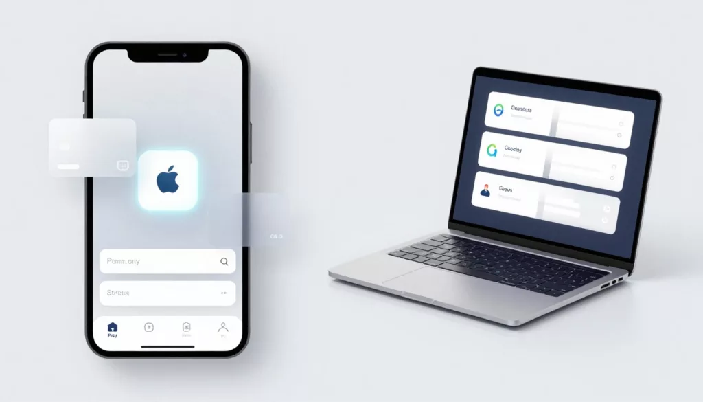
That changes the rules for checkout optimization. Express wallets like Shop Pay, Apple Pay, and Google Pay cut form time. BNPL adds another decision point. Guest checkout, autofill, and local payment methods now matter as much as page structure.
This quick comparison helps frame the tradeoff:
| Factor | One-page checkout | Multi-step checkout |
|---|---|---|
| Mobile speed | Best for short, wallet-first flows | Works if each step is tiny |
| Trust and clarity | Strong for simple orders | Better for complex choices |
| Payment mix | Great for Shop Pay, Apple Pay, Google Pay | Better when payment depends on shipping or tax |
| International orders | Can feel crowded | Easier to explain duties, dates, and local options |
The pattern is simple. When buying feels easy, one page often wins. When the order needs more thought, a guided path can convert better.
A shorter checkout only feels easier when the screen stays calm.
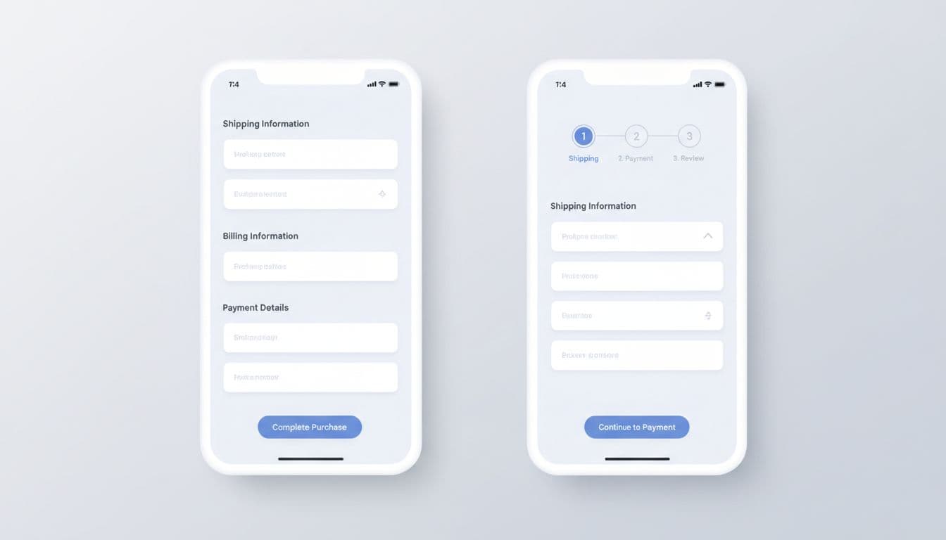
When one-page checkout wins
One-page checkout does its best work when intent is high and the order is simple. Think beauty reorders, fast fashion, supplements, or a shopper coming from Instagram to buy one item. In those cases, speed matters more than structure.
A good one-page flow keeps everything visible without feeling packed. Autofill handles the dull parts. Express buttons sit near the top. Guest checkout stays obvious, not buried. If you’re tightening that entry point, these guest checkout UX patterns are worth reviewing.
Recent Shopify coverage on one-page checkout in 2026 reflects the same shift. Stores with strong wallet use often see bigger gains because typing drops hard on mobile. The same is true for Shop Pay and Apple Pay, which help repeat buyers finish in seconds. BNPL can also work well here, especially for mid-priced fashion or electronics, as long as it doesn’t crowd the page.
Still, one page isn’t magic. It can fail when merchants stuff it with coupon boxes, upsells, long forms, and account prompts. If the screen turns into a wall of fields, it stops feeling fast. It feels like homework.
When multi-step checkout wins
Multi-step checkout shines when the buyer needs guidance. Furniture, custom products, B2B orders, subscriptions with plan choices, and cross-border carts often fit this pattern. Each step answers one small question, which lowers mental load.
It also helps when shipping is part of the decision. If delivery speed, duties, tax, or address rules change the total, separating those moments can build trust. For stores where timing affects conversion, trustworthy shipping date displays can calm hesitation before payment.
International ecommerce is a common case. A buyer in Germany may want Klarna or Apple Pay. A shopper in India may prefer Google Pay. Another customer may need to see duties before paying. In that setup, a well-paced multi-step flow can present local methods, currency, and compliance details without cramming one screen.
The risk is obvious. Too many steps kill momentum, especially on phones. If each page reloads, hides the progress bar, or asks for login first, drop-off climbs fast. Broader ecommerce conversion optimization trends keep pointing to the same lesson: trust, speed, and payment choice matter more than ideology.
Common mistakes, and what to test next
The biggest mistake is blaming the format when the real issue is friction. A one-page checkout with slow scripts, weak autofill, and hidden wallets will lose. A multi-step checkout with clear progress, saved inputs, and smart defaults can beat it.
Watch for these problems:
- Hidden guest checkout: New shoppers don’t want an account wall.
- Late shipping surprises: Fix the checkout cost breakdown UX before changing layout.
- Too many required fields: Phone, company, and second address lines shouldn’t be mandatory by default.
- Weak wallet placement: Put Apple Pay, Google Pay, PayPal, Shop Pay, or BNPL where people can see them fast.
- Poor mobile performance: A long page is fine, but a slow page isn’t.
- No recovery path: Card errors shouldn’t erase entered data.
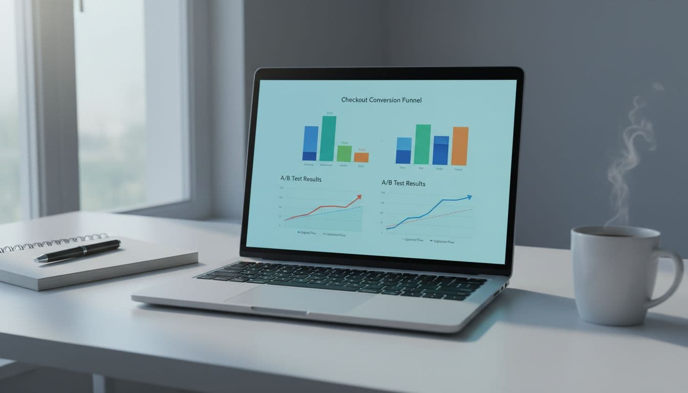
Then test the right variables. Compare one-page versus multi-step by device, traffic source, order value, and new versus returning customers. Run A/B tests on express wallet position, guest-first entry, step count, and autofill support. Track checkout start, completion rate, field errors, wallet usage, and time to purchase. Also watch refund rate and support tickets, because a lift at checkout means less if confusion rises after the sale.
Pick the checkout that fits the order
The best checkout in 2026 is the one that asks for the least effort for that purchase. One-page checkout often wins on mobile, impulse buys, and wallet-heavy flows. Multi-step checkout often wins when shipping, trust, financing, or international rules need room.
Start with your analytics, not opinions. Then test one clear change at a time, and let shopper behavior decide.