
Your category page is like a store aisle with a cart at the entrance. If the signs confuse people, they grab one item and leave. If the aisle helps them compare and add fast, Average Order Value increases.
That’s why category page design, with Product Discovery as a primary goal of the page layout, is an AOV project, not just a layout task. The big levers are simple: show better products first, make narrowing feel effortless, and remove steps between “that looks good” and “it’s in my cart”.
These principles apply whether you are building a new store or undergoing an Ecommerce Site Migration.
Below are practical defaults, guardrails, and instrumentation that teams can ship and test without re-platforming, with Mega Menu Navigation serving as the entry point to these optimized pages.
Sorting rules that raise AOV without breaking trust
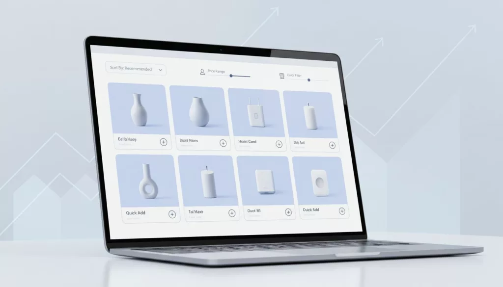
Effective Category Page Design Strategies
Default sort is a promise. If “Best sellers” feels random, people stop using sort at all. Sorting supports Conversion Rate Optimization by narrowing choices to match shopper intent, so start with a default that aligns with the most common shopping goals for that category, then add a few high-signal options. Baymard’s research on product list and filtering UX backs the idea that sorting and filtering are decision tools, not decoration.
Use this as a practical starting point:
| Category type | Recommended default sort | Good secondary sorts | Notes to protect AOV |
|---|---|---|---|
| Apparel, shoes | Best sellers (in-stock weighted) | New arrivals, Price: low to high | Favor in-stock sizes; don’t float items with broken size runs. |
| Beauty, wellness | Best sellers (rating weighted) | Top rated, New arrivals | Social Proof through ratings drives this sort; if reviews are sparse, use “Most reviewed” before “Top rated.” |
| Electronics | Popularity (RPV-weighted) | Price: low to high, New, Top rated | Keep compatibility signals visible (model, version, “works with”). |
| Home, decor | Best sellers (margin-aware blend) | New arrivals, Price: high to low | High to low can lift AOV, but only if value cues are strong. |
When to use best sellers vs RPV vs margin-aware sorting
Best sellers works when social proof reduces risk. It’s also safer on broad categories with mixed prices. Shopify Collection Pages often benefit from these logic-based defaults. For tighter AOV control, consider these rules of thumb:
- Best sellers: choose it when purchase confidence matters more than specs (apparel, beauty, gifts).
- Revenue per visitor (RPV): use it when add-to-cart rates vary a lot by product, and you want “sells well when seen,” not just “sells a lot overall.”
- Margin-aware: use it when the catalog has known margin swings, and you can blend margin with relevance (never pure margin first).
A simple decision table helps teams avoid endless debates:
| If this is true… | Prefer this sort | Guardrail to avoid “dead-end” sorts |
|---|---|---|
| Category has long-tail items with low traffic | RPV-weighted | Require a minimum view count before an item can rank high. |
| Inventory is volatile | In-stock weighted best sellers | Demote items with low size coverage or frequent stockouts; stock-level indicators can create a sense of Scarcity and Urgency to encourage immediate adds. |
| Brand has heavy promo cadence | Best sellers + promo boost | Cap “boosted” slots so the grid still feels honest. |
| Lots of similar SKUs | Top rated or most reviewed | Hide rating sort if too many items have zero reviews. |
If a sort creates empty grids after common filters, it’s not a feature, it’s a trap.
To prevent “dead-end” sorts, add two behaviors: (1) disable or hide sorts that won’t change results meaningfully, (2) fall back gracefully when the current sort plus filters returns too few items (for example, auto-switch to relevance and show a clear message).
For broader category page ideas and test patterns, this Invesp guide is a helpful scan: essential elements of successful category pages.
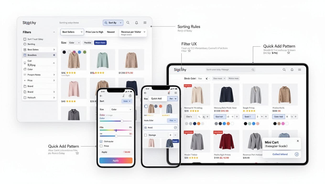
Filter UX that helps people narrow down without feeling stuck
Faceted Navigation should feel like narrowing a flashlight beam, not solving a puzzle. Good filter UX starts with information architecture, then earns trust with speed and clear state.
Facet ordering and dynamic facets
Put high-impact facets first, based on what most shoppers use to decide. In many stores, that means Size, Price, Color, Brand. Still, predictive filtering can beat a fixed list.
A practical approach: promote facets when they have both (1) high usage and (2) high ability to reduce the set. If “Material” barely changes results, keep it collapsed. If “Compatible with iPhone 16” cuts the set in half, surface it early.
Also, don’t show dead facets. If only one brand exists in the current result set, remove Brand or show it disabled with a hint.
Mobile bottom-sheet patterns that don’t lose context
A mobile-first UX on mobile uses a bottom sheet well because it preserves the mental model of “I’m still in this category.” Make it feel controlled:
- Show Clear and Apply as sticky actions.
- Display a results count near Apply (but don’t block Apply on slow count updates).
- Keep applied filters visible as removable chips after closing.
Progressive disclosure matters more on mobile. Start with the 4 to 6 most-used facets, then tuck the rest under “More filters.”
Latency and performance considerations
Filtering is interaction-heavy, so performance is part of UX and ties directly to Core Web Vitals and page load speed. If results take too long, people stop exploring, and AOV drops.
Keep these checks tight (and share them with engineering early):
- Optimistic UI: update chips and filter state instantly, even if the grid is still loading.
- Skeletons over spinners: show a stable grid skeleton so the page doesn’t jump.
- Debounce expensive facets: sliders can wait until release, checkboxes shouldn’t.
- Preserve scroll position: don’t bounce users back to the top after every change.
If you need to balance filter UX with crawl control and parameter handling, this internal guide pairs well with the UX work: Magento category page SEO audit checklist.
Quick Add Patterns that increase basket size (without annoying people)
Quick Add Patterns work when shoppers already know the product type. Think socks, tees, consumables, and “I need two more” items. The Quick Buy Button can also work in electronics accessories, where the variant choice is light.
The trick is variant selection in Product Card Design. Get it wrong, and quick add becomes a modal maze.
Size first vs color first (a simple rule)
Pick the first selector based on what most often blocks purchase:
- Choose size first when fit is the main constraint (apparel, shoes).
- Choose color first when color is the reason to buy (home textiles, cosmetics shades).
- If both matter, show one Variation Swatch inline and move the second into a lightweight popover.
When variants are complex (bundles, multipacks, compatibility), treat quick add as “quick view light.” Let users choose the key option, then jump to PDP for the rest.
Out-of-stock handling that still feels helpful
Never let quick add fail silently. If a size is out, disable it and keep it visible. If all variants are out, swap the button to “Notify me” (or “Email me when available”) and keep the card usable.
Also, avoid adding backordered items from the category page unless your shipping messaging is crystal clear.
Accessibility and confirmation UX
Quick add must be keyboard-friendly. Focus should move predictably, and the user must get a clear confirmation.
A practical default: show a toast for single-item adds, and use a mini-cart slide-in when (1) the item has add-ons, (2) you want to encourage Upsell and Cross-sell, or (3) the shopper adds multiple items quickly. These patterns reduce Checkout Friction by bypassing the product detail page.
For more baseline UI patterns that support trust and clarity across the site, see e-commerce design best practices.
Instrumentation and KPI guardrails (so AOV gains don’t hide problems)
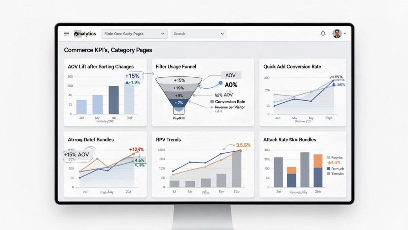
Track category changes like product changes for effective Conversion Rate Optimization. That means event clarity and guardrails that keep teams honest while driving Conversion Rate Optimization.
Suggested analytics events (implementation-agnostic):
- plp_sort_changed (from, to, category_id)
- plp_filter_opened (entry point, device)
- plp_filter_applied (facet, value_count, results_count)
- plp_zero_results_shown (active_facets, active_sort; monitor for Technical SEO and crawlability concerns)
- plp_quick_add_opened (product_id)
- plp_quick_add_success (product_id, variant_id, qty)
- plp_quick_add_failed (reason: oos, variant_missing, error)
Then set KPI guardrails per experiment: AOV, conversion rate, revenue per visitor, attach rate (items per order, or bundle attach), Shopping Cart Abandonment relative to quick-add usage, Product Recommendations performance alongside standard grid items, and return rate. Watch for false wins, like AOV up but revenue per visitor flat, or conversion down enough to cancel gains. If filters are underused, teams should investigate Site Search Functionality as a primary alternative for users.
If you want another set of category-page benchmarks and examples, Inflow’s roundup can be useful: category page best practices to increase conversions.
Conclusion
If category pages feel like helpful aisles, shoppers buy with confidence and add more. This approach is part of a larger Customer Journey Optimization effort. Start with honest sorting defaults, then make filters fast and predictable, and finally add quick add where it fits the product. For certain high-velocity categories, a Sticky Add to Cart feature can further boost Average Order Value. Most importantly, protect AOV with guardrails so you don’t trade long-term revenue for short-term lifts; utilize Responsive Design to ensure it works across all devices. These strategies are vital for high-performing Shopify Collection Pages. What would happen if your top Shopify Collection Pages became easier to buy from than your product pages?