
A shopper adds an item for $5, returns later, and sees $10 at checkout because a 50% promotion ended. Without an explanation, that increase looks like a mistake or a broken promise.
Good cart price change UX makes the new purchase terms visible before payment, while preserving the shopper’s choices. Show the previous price, current price, reason, and affected item together.
Set a clear pricing policy and let shoppers review updates. Unexplained increases can undermine confidence and contribute to shopping cart abandonment.
Key Takeaways
- Recalculate prices consistently, but never charge a higher amount without a visible review opportunity.
- Explain changes beside affected items, including their effect on discounts, shipping, and the final total.
- Preserve valid checkout progress and provide easy editing, removal, and save-for-later controls.
Set a Clear Cart Repricing Policy
Adding something to a cart doesn’t necessarily reserve its price or inventory. However, your interface shouldn’t leave shoppers guessing about either.
Recalculate on retrieval and meaningful changes
For a live-price cart, retrieve current prices whenever the shopper opens it. Recalculate after quantity edits, variant changes, sign-in, destination changes, and promotion updates.
Don’t refresh prices only when quantity changes. Otherwise, an untouched item can display an expired sale until payment.
If a sale ended while an item was in the cart, explain that the promotion expired and show when the change took effect, if known. Removing a percentage discount can restore the regular price immediately.
If you promise a price hold, define its duration and eligible items. Honor that promise through the stated window rather than silently reverting to live pricing.
Keep pricing separate from cart display
Use a separate pricing system to calculate authoritative prices, discounts, and eligibility. The cart should display its output alongside product data, rather than maintain competing pricing rules.
Store the previously displayed amount, currency, promotion reference, and pricing version. That gives the interface a trustworthy comparison when something changes.
A pricing response should identify the affected line, previous amount, current amount, reason, and effective time when available. Revalidate before order creation so a stale browser total can’t become an unexpected charge.
Show Exactly What Changed and Why
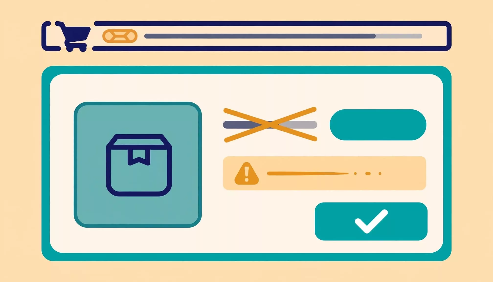
Put the notice beside affected items
Keep the product image, selected variant, and quantity visible beside the explanation. A page-level notice can summarize multiple updates, but each changed line needs its own explanation.
Use labels such as “Previous price” and “Current price.” A strikethrough alone may look like a new discount.
The expired-promotion example needs this comparison:
| Price detail | Previously shown | Current amount |
|---|---|---|
| Unit price | $5 | $10 |
| Quantity | 1 | 1 |
| Item total | $5 | $10 |
The item total has increased by $5; show that difference before the shopper continues.
Sample copy: “This item is now $10, previously $5. The site-wide 50% promotion ended after you added it.”
When you have the promotion’s exact end time, include its timezone. Don’t invent a timestamp or substitute vague copy such as “Prices updated.”
Give shoppers control over the new total
Place quantity editing, removal, and save-for-later actions beside the affected item. Also provide an easy-to-find “Edit cart” control at checkout.
Show the subtotal, discount, shipping, taxes, fees, and updated total together. If delivery or tax requires an address, label those amounts as estimates or unresolved costs.
For price decreases, apply the saving and announce it without forcing another confirmation step. Our guidance on price drop alert UX covers keeping returning shoppers aligned with the current offer.
Require Review Before Payment
A $5 item charged at $10 after a promotion expires can create complaints, refund requests, and chargeback risk. The shopper needs a meaningful decision before order submission.
Resolve changes at order confirmation
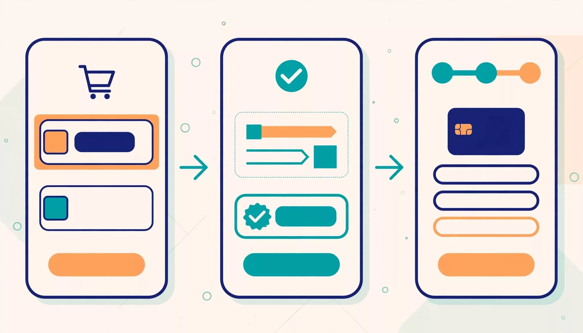
Before converting a cart into an order, highlight changed prices, expired offers, and unavailable items. Group unresolved changes in a focused review area.
Show the old and new prices beside a clear action such as “Accept updated total and continue.” These trust signals let shoppers see the amount they’re authorizing. Keep “Edit cart” available beside it.
Accepting one updated total shouldn’t authorize a later increase. If pricing changes again before submission, show the new amount for review.
Once accepted, record the reviewed pricing version. Order creation should either honor that valid version or return a new review state.
Keep express checkout under the same rule
Apple Pay and PayPal can shorten checkout, but they shouldn’t bypass price-change disclosure. Present the current payable amount before the shopper authorizes payment.
If a wallet opens with stale pricing, interrupt the submission and return to review. Don’t charge a higher amount automatically.
Also keep retries safe: a failed submission mustn’t create duplicate orders or erase unrelated checkout details.
Handle Promotions, Bundles, and Stock Conflicts
Price changes often follow eligibility changes rather than a seller editing the base price. Explain the actual rule that changed.
Explain lost eligibility without rearranging items
A bundle may require a particular quantity, product combination, customer status, or delivery method. When eligibility disappears, show the lost discount and revised total.
Use direct copy: “This discount requires three eligible shirts. Your cart now contains two.”
Keep the entered promo code visible if it fails after sign-in or a cart update. Explain the rejection beside it, with inline editing available.
Avoid automatically rearranging the cart to group bundle items. Preserve the shopper’s order and add a bundle label or expandable breakdown instead.
Sign-in can introduce saved-cart conflicts, too. Our cart merge UX guidance covers reviewing those changes without deleting existing intent.
Separate inventory and minimum-order errors
An unavailable variant needs a stock message, not a generic pricing warning. Preserve the affected line for review, then offer removal or another available variant.
Likewise, a minimum order requirement can cause “No payment methods available” independently of a price change. Name the minimum and the remaining shortfall instead of leaving that technical message unexplained.
W3C’s error identification guidance supports identifying errors in text. Pair each message with a clear recovery action.
Make Price Updates Usable on Mobile and Assistive Technology
A notice that works on desktop can disappear beneath a sticky checkout button on mobile. Design the entire review path for small screens.
Keep changes and actions within reach
Use a compact inline notice rather than a wide comparison table in the production interface. Stack previous price, current price, and reason vertically when space is limited.
A sticky footer can hold the current total and review action. However, it mustn’t cover the changed item, error text, or keyboard-focused controls. If checkout uses a progress indicator, keep it visible on small screens without covering the changed item or review controls.
Preserve scroll position after quantity edits. Don’t send shoppers to the top of the page whenever a total recalculates.
Apply WCAG 2.2 accessibility requirements across the flow, including target size, keyboard access, and visible focus.
Announce changes without disrupting interaction
Don’t rely on red text, strikethrough, or an icon alone. Include readable labels explaining the change.
Use an appropriate live region for asynchronous updates. A concise announcement might say: “Price updated. This item increased from $5 to $10.”
W3C’s status message guidance explains how assistive technology can announce updates without receiving focus.
Routine recalculation shouldn’t move keyboard focus. When submission is blocked, provide a focused review heading and a direct route to unresolved items.
Reduce Checkout Friction Without Hiding Costs
Price transparency belongs in a checkout process that’s easy to use. It won’t compensate for forced registration or lost form entries.
Mopinion’s older abandonment guidance cited a Forrester estimate that unexpected delivery costs accounted for nearly 44% of abandonment. It also described nearly 84% of online shoppers as comparison shoppers who moved between sites.
Those historical figures reinforce the importance of clear costs. Meanwhile, Baymard’s cart abandonment research reports an average rate of 70.22%. That isn’t a friction-only rate; browsing and purchase readiness also matter.
Unexpected costs, poor mobile support, confusing layouts, and weak trust cues are preventable sources of friction. Avoid claiming one cause explains every abandoned cart.
Show the cost breakdown before checkout starts, then update it when destination-dependent amounts become known. Offer guest checkout, available payment methods, and supported express payment options.
Use a clear progress indicator with steps such as “Billing/Shipping,” “Shipping Method,” and “Payment/Order Summary.” Remove distracting standard navigation and promotional footer content, but keep help and policy access visible as trust signals. Never hide a price increase to keep checkout moving.
Test Changed Prices Across the Full Journey
Test more than the happy path, including standard checkout and express checkout. A shopper may return through a saved cart, recovery email, expired checkout session, or another device.
Useful test cases include:
- Let a 50% sale expire while its $5 item remains in the cart, then open checkout without editing quantity.
- Change bundle eligibility through quantity edits, sign-in, or removal of an eligible product.
- Trigger a stock reduction or minimum-order failure while preserving valid address and delivery selections.
- Repeat the flow with keyboard navigation, screen readers, zoomed text, and express payment.
Our checkout session expiration guidance covers restoring progress while revalidating current purchase terms.
Track shopping cart abandonment alongside change-notice exposure, review completion, cart edits, exits, purchases, and pricing-related support contacts. Segment increases separately from decreases.
Recovery messages should reflect the current offer. Repeated onsite confusion needs a UX fix, not another reminder email.
Explain Marketplace Price Changes Without Overpromising
Marketplace shoppers may assume that adding an item tells its seller they’re about to purchase. That isn’t always how the platform works.
On BrickLink, sellers can’t see individual buyers’ carts, and an item’s listed price can change while it remains there. A seller may simply have ended a percentage-based sale.
Don’t extend that visibility rule to every store. Some commerce platforms expose abandoned-cart information to merchants.
Similarly, a cart price isn’t a universal legal guarantee. Contract formation, advertised promises, platform terms, and local law affect what a seller can change.
The practical UX rule remains consistent: disclose the current purchase terms before payment. If your store promises a held price, the checkout should honor it.
Frequently Asked Questions
What should a cart show when an item’s price changes?
Show the previous price, current price, reason for the change, and affected item together. Update the subtotal and total so shoppers can review the full cost before payment.
Can a store change a price after an item is added to the cart?
Adding an item doesn’t necessarily reserve its price. If the store promises a price hold, it should honor that promise for the stated period and eligible items.
Do shoppers need to confirm a price decrease?
Apply the lower price and announce the saving without requiring another confirmation. Keep the updated total visible in the cart.
Should express checkout require review of a price change?
Yes. Show the current payable amount before the shopper authorizes payment, and return them to review if the wallet opens with stale pricing.
Make the Updated Total a Deliberate Choice
Effective cart price change UX gives shoppers a clear comparison, a concrete explanation, and an editable path forward.
Preserve valid progress, but require review whenever a higher price changes the purchase they’re approving. A promotion ending shouldn’t turn a $5 selection into an unexplained $10 charge.
The final payment action should approve a visible, reviewed total.