
B2B buyers rarely open an account portal to admire a list of past orders. They open it because a PO changed, a line item needs proof, or finance wants the exact revision that triggered a shipment.
When order revision history is vague, people start emailing each other for screenshots and timestamps. That slows approvals, creates disputes, and makes the portal feel unreliable.
The fix is not more data. It’s better structure, clearer attribution, and a display that answers the next question before the user has to ask it.
Key Takeaways
- B2B revision history has to show who changed what, when it changed, and what the values were before and after.
- Buyers, approvers, finance teams, reps, and support staff all need different details from the same record.
- Approval status, PO changes, price edits, line-item revisions, and customer service notes belong in the same view.
- Filters, search, and expandable diffs matter more than decorative timelines.
- Accessibility and role-based visibility keep the log useful in real account work.
Why B2B order history needs more than a list
A consumer order history can get away with order number, shipping status, and reorder. B2B cannot. One account may include multiple buyers, approvers, subsidiaries, and billing contacts, so the history has to explain how an order changed across people and steps.
| Need | B2C order history | B2B order revision history |
|---|---|---|
| Main purpose | Track a purchase and delivery | Track edits, approvals, and accountability |
| Users | One shopper | Buyer, approver, AP, rep, support |
| Key data | Tracking number, receipt, return status | Who changed what, when, before vs after values, PO, pricing, line items |
| Typical action | Reorder or return | Approve, reconcile, dispute, export, repeat |
That difference changes the interface. A simple chronological feed works for shoppers, but B2B users need evidence. If the portal hides approval history or edit ownership, support tickets turn into detective work.
Search and filtering need to support that reality, so optimizing B2B order history filters belongs in the same conversation as revision history. A buyer who can filter by PO, date, status, or person gets to the right change faster. A buyer who cannot filter ends up opening every order and hoping for the best.
Baymard’s order overview examples make the same point in a different way. The best order screens surface the current state first, then reveal deeper detail on demand.
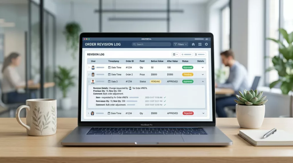
What every revision entry should show
A revision log earns trust when each entry tells a complete story. The user should never wonder who made the change, whether it was approved, or what the previous value was.
Core fields that belong in every row
Each change entry should include:
- Action label: price updated, line item added, ship-to address changed, PO replaced, order approved, or cancellation requested.
- Actor: the person or system that made the change, plus role when it helps.
- Timestamp: date, time, and timezone, especially for global accounts.
- Previous and current values: show both sides of the change for quantity, unit price, discount, tax, shipping method, and promised date.
- Approval state: pending, approved, rejected, superseded, or canceled.
- Context: order number, PO number, quote ID, line-item SKU, or support case reference.
When the revision touches pricing, display the old amount and new amount on the same line or in the same expanded panel. When it affects a line item, show the SKU, quantity, and unit price together. That keeps the user from hunting across screens for one answer.
Salesforce’s change history guidance shows why this matters. A useful log is filterable by person and date, then expandable for detail. That structure works because it puts the audit trail ahead of the decoration.
If a user has to open three screens to understand one change, the log has failed.
Customer service interactions deserve the same treatment. If a rep changed a delivery date or rewrote a line item, the entry should show the case number, rep name, and reason. Otherwise, the portal records an event without explaining it.
How to present the history without slowing people down
The best revision views do less on the surface and more on expansion. A table with clear rows and compact metadata is easier to scan than a wall of notes. Then, when someone needs details, the row opens into a side panel or inline diff.
Start with the latest activity, then let users change the sort order. In a B2B portal, that often means sorting by date, approval status, PO number, buyer, or sales rep. If the account has heavy usage, add saved filters so users can return to the same view every time.
A good row should show enough to answer the first question at a glance. The expanded view should answer the second question. For example, the collapsed row can say “Price updated by Alex R., approved.” The open state can show the previous price, current price, related quote, and a note from the approving manager.
Accessibility matters here because many users work from dense, repetitive screens. Use text labels for status, not color alone. Keep focus states visible for keyboard users. Make expand and collapse controls obvious. If the table is long, preserve column headers while scrolling so the user never loses context.
For teams with large accounts and many revisions, designing intuitive company account controls helps decide which users see which fields. A buyer may need the change summary, while an admin may need the full audit trail. That separation keeps the interface honest without exposing internal notes everywhere.
The edge cases that break trust
The hard parts are usually the ones that reveal whether the design is working. Partial shipments, split POs, cancellations, backorders, and credit memos all create moments where the history must stay clear.
A revision log should never blur together different kinds of change. If a customer service agent edited a shipping address, that should read differently from a pricing approval. If a PO was replaced, the old PO and new PO should both remain visible. If an order was partially fulfilled, the line-item status should show which items shipped, which stayed open, and why.
Approval history needs careful handling too. Buyers often need to know who approved a change, who rejected it, and whether the latest revision replaced an older one. A simple “approved” badge is not enough when there are multiple approvers or conditional approvals. The portal should keep the chain intact.
Export and print options matter more than many teams expect. Finance teams still paste order revisions into email threads, audit packets, and internal reports. A clean CSV export, PDF download, or copyable summary gives them a paper trail without extra support work.
The same applies to performance. Long histories need lazy loading or a clear “load more” pattern, not endless scroll. Users should be able to jump to a date range or search by PO, SKU, or case number without waiting on a huge page load. BigCommerce and Adobe Commerce both treat B2B account behavior as role-based, and revision history should follow the same logic, with the right data available to the right person.
Conclusion
B2B order history works when it feels like proof, not a receipt shelf. The strongest experiences show who changed the order, what changed, when it changed, and how the change was approved.
If the portal can answer those questions in a few seconds, finance moves faster, support gets fewer follow-up emails, and buyers trust the account more. In a B2B workflow, clarity is the feature that keeps every other feature useful.